After some reluctance, much procrastination and a lot of shaky filming, I bring you some short video clips that give some insight into the processes I use in making my work. Katazome and Yuzen are mixed together in these but I have made them abstract on purpose - I just want to show the many and diverse steps in making a piece using these traditional methods. I hope you enjoy them!
Here's part one and two
and here's where these works will be on show from the 13th of August (one week from now!!)
"Somé: Dyeing the Australian Environment" will be on show at the Japan Foundation Gallery in Sydney from August 13 to September 17!!
It's a large space to work with and it means I can show some of my older works alongside new ones - all incorporating varying ratios of Australian imagery x Japanese dyeing techniques.
I titled the show "Somé : Dyeing the Australian Environment" to emphasise a few things.
One is that I've been coming more and more to the conclusion that the term Textiles, in the manner that it exists in Australia, doesn't fully explain the work I do. I don't mean that in an arrogant way like "I'm so unique, the categories don't apply to me". I mean that the term Textiles in a bit misleading. I don't think just saying "dyeing" comes across the right way either. Especially with the surge of popularity in Natural dyeing and "eco-dyeing" in the last few years, perhaps the wrong image of simmering fabric in a pot is what people will think.
Somé (pronounced so, as in socks and me as in melinda)
means "dye" or "dyed work" and in Japan that is understood to include all manner of dyeing work - wax resist, paste resist, dip dyeing, natural dyes, hand painted dyes - plus more.
Textiles in Australia tends more to refer to woven, embroidered, printed and sculptural fibre-work. Though there are plenty of artists using dyeing as their medium in Australia, I don't know that the term Textiles alone describes pictoral dyed textiles.
It would be a whole lot easier if the term somé just existed in English!
There are already plenty of Japanese words bouncing around in everyday English. How about karate, sushi, manga, tempura, wabi-Sabi, bokeh and lately even Kaizen and Kintsugi! Why not add a new concept to the import list? After all sometimes a word in another language just does a feeling or concept better justice.
So I titled the exhibition to reflect that aspect of textile work that doesn't tend to feature for Australians.
Also, it's about the Australian environment - and more broadly, imagery of Australian nature. When I first started learning katazome, my first urge was to mix in some Aussie influence - parrots, english lettering, rusty orange and bright blues. I think I went a bit too far in those early works on the "cheesy scale" but the same intent still remains: I want to show what the techniques can do when turned toward a whole new set of imagery and cultural connotations.
Instead of plum blossoms and sparrows or cranes and pine trees, my works depict Rainbow Lorikeets and Banksias, Cockatoos and Gumtrees. In place of subdued landscapes with bamboo or chrysanthemums, I'm dyeing vibrant colours of wild-flowers and dry grasses.
I'm excited to be showing so much of my work all at once in Australia, especially in Sydney where I've never had the chance to do so before. I've also been lucky enough to get a grant from ArtsACT which means I can be present at the opening and run a couple of workshops too!
You can see the information about the exhibition here:
http://www.jpf.org.au/jpfevents/16-some/index.html
Oh hi there, world.
It's been a while between posts lately. I've been a bit stuck, uninspired and dragging my feet through the mud of procrastination. I've also been stewing over a bunch of posts and been too much of a perfectionist to let any of them go out into the ether. But done is better than good, so here we go...
It's just ticked over 5 months since I came back to Canberra after finishing up my Graduate studies in Japan. Returning to Australia, I was most worried about leaving behind a supportive art network that I had built up over more than 5 years. I also felt the pressure of continuing to make work (and because I'm a perfectionist, good work) when my teachers had taught me so much and told me they expect big things from me. (gah!)
But it's all a process and I refuse to let all the things I have learnt, practiced and developed sit shriveling in the corner out of fear.
New work since coming back to Canberra, "Call of Crimson Rosellas" July 2015. 184cm wide. silk, katazome, yuzen.
Hacking "sacred" techniques.
Katazome and yuzen and many other Japanese-conceived ways of getting dye onto fabric (and making it stay there!) are complicated.
It's not like Painting, where you could pick up rolled canvas and paints and brushes almost anywhere around the world and you'd be set to go. That makes me incredibly jealous. It makes artists like painters ideal for artists' residencies or Studio rental because their materials are easy to procure anywhere and easy to move. (not to mention easy to market and the fact that they are a culturally understood format/genre - but that's another kettle of fish)
Katazome and yuzen require tools and materials that just aren't part of the culture outside of Japan. Rice bran, used for pickling vegetables in Japan, is not a supermarket staple in Australia. Bamboo, as used in making fabric stretching rods "shinshi", is the jack of all trades in Japanese construction, gardening and even cuisine, but it's often considered a pest plant in Australia. As for katagami stencil paper made from mulberry fibre paper, that has been painted with astrigent persimmon juice and then smoked for 10 days? YEAH RIGHT!
Beautiful Nuka (Rice-Bran) pickles - something I came to love but they are definitely not part of Australian culture and hence, neither is the crucial ingredient, Rice bran (image by Max Wheeler)
But using the lack of perfectly suited tools and materials as an excuse not to do anything is a mistake.
I'm figuring out how to "hack" these techniques in Australia, tool by tool and ingredient by ingredient. I'm finding out which ones are non-negotiable and which can actually be easily replaced with something else. Bye-bye toxic lacquer for applying mesh to stencils, hello Dulux wall paint! (yay, washes off in water!) Bye-bye giant, beautiful bamboo sifter and oversized rice paddle for making resist-paste, hello $2 shop sieve and a Kmart giant wooden spoon.
Using Dulux house paint to adhere mesh to the front of the stencils in the foreground. Thanks to hints from a process John Marshall in the U.S has pioneered.
Even just figuring out what the real ingredient in some of the Japanese-sold auxilliaries has been helpful. Turns out funori, a shrivelled up seaweed used as a thickener in Japan is just the same as Manutex, a product we use here in textile printing and as a food thickener. Or something simply known as "Fixer 10" in Japan is actually sodium silicate or "Maypro-gum" used in thickening dye in Japan is pretty much the same as Guar Gum - a.k.a the gluten-free baker's favourite assistant.
So it's do-able! It may not be very travel-friendly but certainly the sketching/designing stage can be portable. It may not be as elegant of a set-up or as Japan but hey, here's a secret, even my very successful professor just washes stencils in a bath tub and had the old guy down the street rig up a board with nails in it and castors on the base to hold her dye brushes. Done is better than good, it would seem.
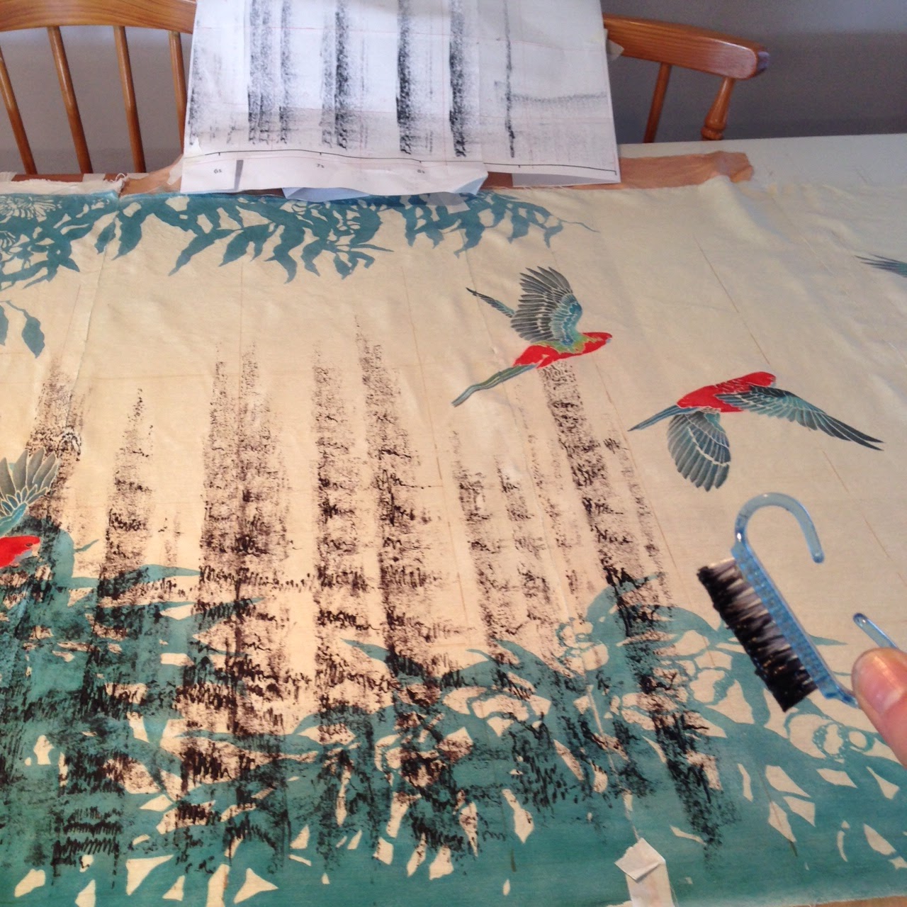
Sure, the setup is a little bit "sticky-tape and cardboard" but it works!
Dining table + sticky-tape + $1nailbrush = good enough
Even though Katazome and Yuzen are traditional techniques, they are not sacred. Culture is not static, and traditions grow and change with it.
So I can't use the lack of materials or tools as an excuse anymore. I have new ideas, some people interested in commissioned pieces, and the means to make them.
Consider this my jump back into regular posts. Less perfectionism, more output coming your way!
I was only back in Australia for 10 weeks to the day when I found myself in Canberra setting up my next exhibition with my Dad. (Thanks Dad!)
オーストラリアへ帰国したばかりという気持ちがした10週目のところで、キャンベラでの個展の搬入なんてしていました!
My first solo show in Australia, "The Traces Between" opened on August 6th in the long and narrow space of Gallery 3 at M16 Artspace. The opening was a packed event as three separate shows opened all at once. It was great that the visitors who came to see the group show in the main gallery then drifted through to both mine and Keith Bailey's Solo shows in the two smaller galleries. Hooray for capitalising on other people's friends!
オーストラリアで初ての個展です。キャンベラのM16 Artspaceで細長いギャラリーで展示しています。そのArtspaceにて、三つのギャラリースペースがあって、同時に三つの展覧会も開きます。オープニングにたくさんの人が来ました。
Me explaining some of my work on opening night オープニングのパーティーで、友人に作品を説明している私。
Yay! other people's friends (plus lots of my friends and family too :)) 三つの展覧会が同時に始まるので、三つの作家さんの知り合いや友だちが来るわけ。いいシステムですね!
I called my exhibition the slightly vague and arty sounding "The Traces Between". I wasn't trying to be vague or sound arty (goodness knows I've learnt a whole dictionary of meaningless arty tripe I could roll out if I wanted to). Instead I was referring to a variety of gaps both literal and not.
One is the physical and visible gap that appears between areas of dyed colour when you use a resist technique like Katazome or Yuzen. In yuzen, that will be where you have drawn fine lines of paste with a metal-tipped tube. They leave behind the colour of the fabric below; white traces. A stencil is used for katazome, so you get a distinctive silhouette-style image. This positive image is merely the reverse of lots of blank gaps and spaces where resist paste was applied.
一つの「間」は、作品に見える防染された間です。友禅の場合では、防染糊の線の所ですね。型染の型紙を通した糊のところは出来上がった作品には、ただの間にすぎないです。
That is to say, resist-paste techniques rely on the preservation of the under fabric and then upon revealing them in the final piece.
つまり、防染糊の技法を使うと、糊が守った生地の色は、完成した作品には跡になります。
Yuzen detail: the writing is where the resist paste was. In the final piece it is just a trace. A blank space. 友禅の防染した文字。染め上がった作品から糊の存在が消されて、跡しか残らない。
In the case of Katazome, the blank negative space forms the image. In between all those gaps, the imagery is brought to life. 型染の場合、余白があるからこそ、イメージが見えてくる。
Another gap I was trying to allude to is the physical space between layers of fabric; the gaps that air can flow through. Since late 2012, I have been layering sheer silks in my pieces, leaving gaps in between them and allowing them to catch the breeze or the draft from an air conditioner.
もう一つの見える「間」は、生地の層のあいだにある空気です。2012年後半から、何枚かの絹を染めて、重ねる作品を作り続いています。この薄くて透明絹が風もちくはエアーコンに振られます。
By not framing my work, or stretching them tightly over a wooden board, they have a sense of life.
縁やパネルを使わないと、何かのイキイキ感がでる気がします。
sometimes the gaps between layers are even big enough to get inside! 2枚を重ねた作品です。時には入れるぐらいの間です!
Degradation series from 2014 where I made a point of spacing layers out from each other. 2014年のシリーズでは3枚の絹を重ねて、わざと5センチずつの間で展示してみたら、良い感じでした。
Cross cultural spaces? Australian foliage meets Japanese noren
A non-physical gap is that between Art and Craft. I don't yet know where my work fits in those terms but I get the feeling it's somewhere in between; somewhere on the divide.
作品には見えない間もあると思います。それは「美術」と「工芸」の間。自分の作品はどちらに近いというのがまだわかりませんけど、確かにその真ん中に寄っていると思います。
You could also say that it straddles cultures too, swaying somewhere in the grey area between Australian and Japanese but let us not get carried away with ourselves! 文化の間というのもあると言えるでしょうが、今はあんなに自慢するのをやめよう!笑
This show is a combination of larger works that I completed whilst undertaking my Master's degree in Kyoto as well as a collection of new work. My graduation piece from Kyoto Seika University which features the migration cycle of the endangered Swift Parrot is the centrepiece (it can be helped since it's over 5 metres long!) and it catches the air nicely as people walk by in the space.
今回の展覧会は、京都で作った大き目の作品と、帰ってから創ってみたもっと小さな作品の組み合わせです。
My Graduation work from Kyoto Seika in March 2015 is the star centrepiece of this show. 京都精華大学の大学院終了作品で作った「オトメインコの渡り」が今回の個展では、メイン作品になっています。5メートル以上なので仕方ないですけど!
Amongst the new work (some of which were completed at very VERY closely to the finish line!) are some small pieces I'm excited about that combine the fine line-work of yuzen with locally sourced natural dyes. In some inital research (much more to be had), I managed to find foliage from three eucalypts found around my suburb and boiled them down to extract some shades of yellow-brown and peachy orange-brown. Then I used those dyes to dye little "portraits" of Eucalyptus blooms and leaves. Haha! see what I did there? it's like a textiles pun or something.
新作の中、近所にあるユーカリから煮出した染料でユーカリのイメージを染めたちいさな作品もあります。まだまだ植物染料について沢山調べないといけないと分かりましたが、はじめての実験としてとてもうれしい結果です。
New small experiments in natural eucalyptus dyes are also on show.
Anyway, the show is on at M16 Artspace in Canberra until Sunday August 23, so be sure to check it out if you are in town. Otherwise, look forward to more photos after the show is complete!
さて、個展は8月23日までです!終わったらまた写真をアップしますから楽しみにしてください!
It's been a very long time between posts, sorry! It's coming up to two months since I moved back to Canberra, Australia after four years living and studying in Kyoto. I've been a bit all over the place, getting settled and gathering my books and supplies back together which have been arriving in boxes one by one via Sea mail. I've been ever-so-slowly getting back in touch with galleries and the art-scene in Canberra. It's a little overwhelming to be spat back into the "real world" again but step-by-step I'm working on finding my place in it.
Group-show I took part in at M16 Last winter. This time, I'll have one of the gallery spaces all to myself! 去年M16でグループ展に参加したんですが、今回は個展です!DMができたらまたおしらせします!
I have a solo exhibition coming up in Canberra in August (6th-23rd at M16 Artspace). It's one of those things that my "other self" organised on my behalf. You know when one part of you is being super practical and objective and says "Yeah! You know what would be awesome for you? Go and sign yourself up for a solo show! Or even an artist's talk! Yeh!!" and the other half of you nods along and goes and does just that. Then when the deadline is approaching, it all becomes real and your whole self wonders "Wait, what!? When did I do this to myself?" But anyway, the orgainsed half of me knew best and I'm looking forward to it, just have to start treating it like it's real and get organised!
I am having to figure out new ways of making work, now at home Australia. Most materials and ingredients for yuzen and katazome can be sourced here. Silk is available online at comparable prices to Japan (thanks in part to our obsession with handmade white silk wedding dresses!), rice flour is an Asian Supermarket staple and alternative stencil papers can be found.
At the moment (with the help of my engineering-minded Dad. Thanks Dad!) I'm getting together parts for a stainless steel fabric steamer. It will be a rocket style steamer so I can roll my fabric in newspaper or non-woven fabric and steam-set for an hour before washing out resist paste. Exciting!
I'd like to make some small new works for my exhibition in August. I'm thinking about using some natural dyes and making small layered works with organza. Hmm, ideas! I'll post photos as the process gets underway.
Samples from immersion dyeing with Eucalypts. I'd love to get this kind of colour for yuzen brush dyeing too! 浸染でとれたユーカリの深いオレンジ色。友禅での色差しや引き染にも使えたらなあと思うんですが、まだ実験中です。
For now, I'd like to leave you with some photographs I took around our suburb in Weston Creek, Canberra. People in Japan sometimes expressed disbelief that some of the plants and birds featured in my work really were just commmon species and found around my hometown. I assured them proudly that yes they were. Now, I have photographic proof! Even I was a little surprised to see them around the 'burbs. Thanks a lot reverse culture shock! Haha anyway, look forward to seeing lots more posts here soon.
(笑。頭の中が関西弁になってんやで。爆笑)
When I was in Australia in September, I exhibited some of my Yuzen artworks and I started thinking, "Isn't Yuzen just another way of saying Silk Painting?"
"Isn't this just Silk Painting?" シルク・ペインティングちゃうの?
よく考えてみたら、両方はペースト状の防染するもので、線を引いてから上に染料を好きなように塗るというやり方です。線のところは同じく染料をふせいで、染め上がった生地には白い線が残っている模様になります。
If you think about it, both are resist techniques where paste lines are drawn on the surface of fabric and dyes are applied over the top as you like it. The lines in both cases resist the dye and you are left with white lines as part of your design (if we are talking the most basic form of the techniques).
silk painting - hydrangea
Yuzen‐dyed hydrangea
So, what's the difference then? Is it ideological or technical?
そうでしたら、どこが違うのでしょうか?技法の詳しいやり方?それとも技法の考え方?
The most obvious difference between the two is the technical one of the resist paste used: "Nori" in Yuzen and "Gutta" in Silk Painting.
技法の面からみると、一つの明らかな違いは防染剤として使っている「糊」と「Gutta」ですね。
*糊*Nori
糊は友禅染や型染めに用いられている「ピーナツバター」色のペーストです。もちことぬかを混ぜて、蒸したもので、粘りがあります。この糊を生地に置くと、乾いた後に染料を塗ったら完全防染の効果があります。糊によりますが、絹を使っている場合では、糊の線の所に薄い茶色が残る時もあります。気にならない程度なので、問題ではないですが。これは「のりやけ」という現象です。
"Nori" (which just means "glue" in Japanese) is used as a resist in both Yuzen and Katazome dyeing. It is a thick paste similar in colour to peanut butter but sometimes paler. It is made by steaming a mixture of glutinous rice flour and fine rice bran which then gets a pummeling to make it nice and smooth and sticky. Once applied to the fabric, it is left to dry and can be dyed over and will completely protect the white fabric. Sometimes when used on silk, the paste will leave a slight beige colour after being washed off but it doesn't stand out enough to be a bother. They call this "nori-burn". You can purchase pre-made nori with some kind chemical added that ensures this burn effect doesn't happen but I prefer to make my own nori and so I just deal with it. I kind of prefer it over a stark white resist anyway.
Rice-based Nori for Yuzen.
*Gutta*
Guttaというのは元々木から採れるゴム製のものです。名前は採れる木の学名に基づいているそうです(Palaquium gutta)。Guttaは透明のペーストがありますが、他にも黒や色や金色が付いているものも販売されています。透明のGuttaは、糊のように染料を定着した後に落とすものですが、色のGuttaはそのまま模様の部分として残すものです。Guttaは完全防染で、ゴム製なので水で取れなくて、シンナーで溶けて落とさないといけないです。最近、水で落とせるGuttaもできたらしいですが、ゴムのような防染力が高くないみたいです。
Gutta is a rubber latex paste that is extracted from certain tropical trees, eg Palaquium Gutta, hence the name. There's clear gutta available as well as those with colour added and even gold and silver. The clear gutta is intended to be removed from the fabric after setting the dyes, whereas the coloured ones are left on the fabric as part of the design. You can't remove gutta in water so it results in a strong and complete resist. There's also water-based gutta that can be washed off but apparently the strength of the resist is not as strong.
* Just to complicate matters, there is also rubber-based nori now used in a large percentage of modern day Yuzen. It's the same kind of stuff as Gutta and must be removed with solvent. The benefit of rubber nori over the rice based nori is that it isn't weakened by the water-content of the dyes applied, it's not susceptible to changes in temperature and humidity and you can fold or roll the fabric it's applied to without cracking or damaging the resist lines.
...といいながらも、友禅にも「ゴム糊」がありますね。着物業界での友禅はこの頃殆どゴム糊でやっているらしいです。ゴム糊は湿度の変化とかによって変わらないし、生地を曲がったり動かしたりしても糊の線は割れないので作業が楽です。
sticky, smelly rubber-nori for yuzen
Whilst the dyes and fabric may be similar between Silk painting and Yuzen, I think the major difference is the approach to applying the dye and this is what ultimately makes the two techniques look totally different.
両方に使う染料や生地は似ていると言えますが、染料の塗り方(というか挿し方)は全然違います。私は、友禅染とシルク・ペィンティングの雰囲気は全く違うように見えるのはそのためだと思います。
Silk Painting Dyeing
The use of a strong rubber resist in Silk Painting allows the dyer to be quite liberal with the dyes, applying generous amounts of dye or silk paints with brushes and allowing/encouraging them to bleed, blending them into each other and achieving gradation effects with water or alcohol. In my understanding, the silk-painter is thinking of the gutta lines as borders and working up to them and pushing dyes towards them. I know there are probably many different techniques and personal preferences for how to apply dyes but see this youtube clip for a visual of how someone might apply dyes in silk-painting.
シルク・ペィンティングの方では、ゴム製のGuttaで防染しているから、防染力が高くて、結構自由に塗れます。筆で載せて、水やアルコールで上手く暈したり、塩で色を抜けたり、色が滲むように置いたりします。考え方として、防染の力を持っているGuttaに信頼しながら、その境界へ色を広げるというような感じじゃないでしょうか?やり方は沢山あると思いますが、一つの例として、次の映像を見てね。
(If a yuzen-dyer witnessed this kind of dye application, I can guarantee he would have heart palpitations. This kind of liberal dyeing would go straight under his nori-lines and ruin his kimono before you can say "nori-bousen" (paste resist). 友禅の職人さんがこういう塗り方を見たら絶対ショックを受ける!糊の上にこんな量の染料を置いたら、直ぐに糊の線の下へ入ってしまって、作品はもうダメになりますからね)
The visual result of this style of dyeing is washy, blended colours, something akin to watercolour paintings. And I mean, the name of the technique is Silk PAINTING, so the process and result tend towards a painterly style. The rubber resist is soft and viscose too, so that even if the resist lines are drawn with a fine-tipped applicator, the lines will be rounded and fluid, not crisp.
こういう染め方によって、作品は柔らかな暈しや水彩のような色使いになりますね。またGuttaが柔らかいから、防染の線はきっちりとした線ではなく、丸くて柔らかいものです。
Yuzen Dyeing
In Yuzen, the dyeing step is called "iro-sashi"which doesn't mean brush on dye but insert colour. The action is not like applying generous amounts of dye to soak into the fibres but rather carefully inserting colour where it is desired. Nori resist is removed in water which means that it is also weakened by the water content of dyes. This means that the yuzen dyer (and katazome dyer who uses much the same nori) is trying to avoid wetting the paste areas too much. The paste can of course withstand some contact with liquid but continous re-wetting and too much liquid on top at once quickly dissolves the paste and it no longer serves any purpose as a resist.
友禅の方では、染める段階は「色塗り」ではなく、「色挿し」といいます。シルク・ペインティングのように、繊維を染料で濡らすというより、染料を欲しい所に丁寧に入れていくという感じです。糊は水で落とすものですから、染料の水分にも弱くなります。ある程度水に強いですが、何かいも濡らしたり、沢山の染料を一遍に置いたりしたら、防染力が減ります。
So instead of thinking of the nori lines as hard and fast borders, I think the yuzen dyer sees these as delicate edges and works towards them with dye but tentatively. Dyes are even thickened with some seaweed-based thickener (Manutex) to endure they don't bleed or run. See what I mean in this video:
なので、いっぱい耐えれる強い境界のように思うのではなく、繊弱なもので糊まで丁寧に染料を入れないといけないと思っているのではないか。(だからこそ、この頃防染の強いゴム糊が使われるようになったのでしょう。)友禅の色差しはこの映像で見せます:
伝統X現代?
I guess you could also argue that a difference between the two techniques is the history; that Yuzen is "traditional"and Silk Painting is something "Modern". But Yuzen doesn't have such a long history, really. It was just something Miyazaki Yuzensai thought up in the 1700's as a convenient way to get designs onto fabric. And Silk-painting also has historical roots in Chinese silk-painting, taken to Europe (possibly) and developed from then 1800's and turned into new kind of technique.
友禅が伝統的で、Silk Paintingは現代のものだという議論もできそうけれども、そんなことないと思います。友禅はそんなに長い歴史を持ってないですし。宮崎友禅斎はただ、模様を生地に描ける方法が欲しかって、1700年ごろ発展したのでしょう。SilkPaintingも歴史があります。絹がヨーロッパへ輸入されたあとにイギリスやフランスに現れたそうです。ルーツは不明ですが、インドや中国の伝統に影響されたんじゃないですかという議論があります。
So, yes they are different techniques that share some materials and tools but ultimately allowing different kinds of creative expression. Woop, case closed! Here's some lovely examples of both techniques in celebration.
終わり、確かに二つの技法は違いますね。使う材料や道具が似てますが、作品の雰囲気が異なって、両方には別の表現可能性があります。最後に友禅とSilkPaintingのステキな例を見せます^^
Time has flown and before we knew it we were taking the show down again!
あっという間に展覧会が終わって、気づいたら搬出しているところだった。
For the month of November, I was part of a six person group show "ROKKAN" at a dyeing-specialist gallery in Kyoto called "Some Seiryukan". It was part of a regular series of exhibitions that highlight up-and-coming artists working in dyeing techniques. This time around, Katazome Artist and Kyoto Seika Professor Toba Mika was the director, choosing the 6 participants and overseeing the event.
Toba-sensei brought the 6 of us young artists together because we all utilise traditional dyeing techniques but we use them in fresh and interesting ways. As a group we covered the breadth of rōketsu wax dyeing, hand-drawn line resist (itome-nori), clamp resist dyeing (itajime), katazome and yuzen.
私たちを集めてくれた理由は、六人とも伝統的な染め技法を使用していることだったそうです。それで、昔ながらの技法でありながら、自分なりに用いていることが私達の共通点でした。ロウケツ・筒書き・型染・友禅・板締 という幅広い技法で制作しているグループです。
For this show, I displayed two new works (!!) and one earlier piece; my wild budgies "Murmurations" piece. In both of the new works I tried to achieve an effect of depth and movement using multiple and overlapping layers of semi-transparent fabrics.
今回大きい作品の3点も展示しました。2点は新作で、もう一枚は7月にできた「Murmurations」の作品でした。新作では、薄い生地を染めることによって、奥行きや動き感を表そうとしました。
With the smaller new piece, "Canberra Blues", I dyed 3 layers of silk (organza and georgette in the front and shantung as the back layer) and combined both yuzen and katazome. I used katazome to create areas of bold leaf silhouettes and then yuzen to echo these branch shapes as well as include more delicate leaf details. There is one little bird in the piece (A Yellow-throated Gerygone) but this time I was more interested in the lively curves and shapes formed by the "eucalyptus cinerea".
「Canberra Blues」 2014 Katazome and Yuzen on Silk. 150 x 150 x 10cm
Detail of the layers of silk. Here, yuzen at the front and katazome at the back. 絹の層が見えます。前に友禅で、裏の絹に型染です。
There are many of these gum trees around Canberra; they are often used as street-trees and on median strips. Because of the blue-green foliage, I had been mistakenly calling them blue gums but they are actually called "argyle apple" or "silver dollar" gums. My title refers both to these (mistakenly named) trees and the way that they are so evocative of Canberra as to make me a little homesick.
detail of "Canberra Blues" 2014. Yuzen and chemical dyes on silk organza
The largest work I had on display was this work depicting Little Corellas in flight. The white Corellas are whipping up into a flock and streaking across a warm, dusty Australian sky. Though it didn't come through strongly in the final piece, I was inspired by the use of dusty washed-out colours as seen in Australian Impressionist paintings, from the 1890's.
今回私が出した作品の中、このアカビタイムジオウムをモチーフにした作品が
一番大きかったです。イメージは、夏の暖かい空を飛び上がるオウムの大群です。出来上がった作品では、あまり分からないですが、色合いは1890年代から活動していた「オーストラリア印象派」にインスピレーションを受けました。その画家たちは、当時の洋画によく見えたヨーロッパの鮮やかな緑や雲っている空を否定して、初めてオーストラリアの独特な光や色をそのまま表現しようとしていた派でした。結果として、オーストラリアの印象派の絵では、乾燥した草の薄い茶色、南半球の空の暖かな青、内地の土の濃い錆色、眩しい日差しの金などがよく使われました。
"Shatter the Immense Summer Sky" 2014 Yuzen and own techniques on Cotton organza. approx 450 x 180 cm 友禅、独自染方、綿オーガンジー 約450x180センチ
I really liked these quotes from two of the most famous Australian Impressionist painters about our unique light and colours.
オーストラリアの印象派作家による気に入った言葉が見つけました。通訳しにくいですが、オーストラリアの特有の色と陽射しについて書いていました。
Frederick McCubbin, writing to Tom Roberts
"I fancy large canvases all glowing and moving in the happy light and others bright, decorative and chalky and expressive of the hot trying winds and the slow, immense summer"
Also Arthur Streeton, writing at the group's countryside painting camp
"I sit on our hill of gold,...the wind seems sunburnt and fiery...north-east the very long divide is beautiful, warm blue far far away all dreaming and remote...Yet as I sit here in the upper circle surrounded by copper and gold...all the light, glory and quivering brightness passes slowly and freely before my eyes"
I can easily imagine this scenery of being "surrounded by copper and gold". You can see this kind of sunburnt, toasted, sunlit landscape anywhere around the A.C.T or country NSW. 上の「アーサー・ストリートン氏」(オーストラリア印象派の代表的なメンバー)が書いた「銅・金色に囲まれて」というような風景はすぐ想像できます。キャンベラの周りでも、乾燥している草や山々が見えるから、どこか懐かしいものです。
Detail of the work, hanging in 5 seperate panels.
Although this piece was made in a ridiculous rush I had fun using some different techniques to dye the background. I dabbed coloured nori resist paste onto the fabric with a stiff brush in diagonal lines and also used semi dry brushes to create streaky lines at intervals. I hope I managed to create a sense of movement and lead the eye across the piece.
In this detail you can see the dots of coloured resist paste I dabbed on using a stiff scrubbing brush and the diagonal streaks of dye. たわしで載せた色糊や斜めの線が見えますかね?
Entry to Rokkan Show. You can see work by Yuri Ohmura to the left and Haruka Masuda on the right. Rokkanの入り口にて。左で見えるのは大村さんの作品で、右は増田さんの型染作品です。
ROKKAN was a huge learning experience! Some-Seiryukan is a gallery I have been going to for 5 years or more and was always impressed with what I saw. Many of the great Sensei's of dyeing in Japan from the 70's or so onwards have shown work there. I never expected that I'd be showing my own work there one day! I also feel very privileged to have been the first (As far as I can tell!?) foreigner to be included in a show there.
Panorama shot taken inside the gallery. From L-R, Yamamoto Aiko, Mine, Saya Okura.
It was also my first time participating in an Artists talk event in Japanese, having to talk about my work and even answer questions from the audience! Whilst I can hold every day conversations in Japanese and write what I want to say, this kind of Ad-lib Japanese is definitely not my strong point!! Even though I tried to be prepared and practised some answers for potential questions, I was SO nervous and my Japanese ended up sounding very broken and sing-song. If you feel the desire to hear just how akward it was, here's a link to the talk show!
Something I really took away from this exhibition experience was how conservative Kyoto can still be. In particular, the dyeing circles in Kyoto are still very stuck in their ways and seem to have trouble welcoming the new generation into their midst. During the artists' talk there was an incident (which was carefully edited out of the audio above) where one of these Nonagenarian Kyoto Dyeing World gatekeepers (who feel it their appointed duty to protect the past) stood up and let the whole room know his opinion in no uncertain terms. His view basically (which could have been said with much less anger and in a far more subtle moment) was that even though we are young and innovative artists, we have to do things the way they have always been done at that gallery. Don't go try and do fancy things with technology or creativity or we'll get confused. We were just trying to play this movie we had made ourselves in the background of our talk.
「染め」を現代にも続いてほしかったら、こういう旧派的な考え方どうするの?
If the older generation wants to see their beloved field of Dyeing, which they have dedicated their lives to, to continue into the future, what's with stubborn opinions like this? I guess there is this kind of resistance in the progression and change of any tradition or field. This guy really made me angry but it has given me something to think about in terms of what it means to work in a traditional technique.
onwards and upwards! My graduation work will feature Swift Parrots 卒業作品の準備最中です!今回はオトメインコをモチーフにします!
とにかく、次の作品を作らないといけないです!今卒業作品のデザインを終わるところです。型彫や染めの段階に楽しみにしています!卒業作品では、絶滅危惧種のオトメインコやユーカリをモチーフにします。楽しみにしてください!^^
ANYWAY! Onwards and upwards! The next deadline, which is fast encroaching, is my Graduation Artwork! Hard to believe I'm already making work for graduation for the Master's course! It feels like I only entered the course yesterday. I'm currently finishing the design and itching to start the hands-on part! My work will revisit the Endangered Swift Parrot and it's love of the "floriferous" Eucalypt blossoms. Watch this space!


 My first solo show in Australia, "The Traces Between" opened on August 6th in the long and narrow space of Gallery 3 at M16 Artspace. The opening was a packed event as three separate shows opened all at once. It was great that the visitors who came to see the group show in the main gallery then drifted through to both mine and Keith Bailey's Solo shows in the two smaller galleries. Hooray for capitalising on other people's friends!


