Showing posts with label exhibition. Show all posts

Saturday, August 4, 2018

Rocks Rock! Experiments with local Pigment Colours

Rocks are so cool. In case you hadn't noticed.
More on that later! First, a bit of background...

When I was in Japan studying katazome, I was introduced to dyeing paper (and sometimes fabric) using 'ganryo' pigments.

"Ganryo" just means colourant, it is the colour in powdered form without any binder. (Though it can be sold in the form of paint-pans or solid sticks). It can be a naturally occuring colourant, like yellow ocher (ohdo) calcium carbonate (gohfun), cinnabar (ginshu which is natural but ironically, toxic!) indigo (ai), ultramarine (gunjoh) or iron oxide (bengara) etc etc. They can also be chemically altered versions of these (to produce whitened tones etc) or just straight up synthetic pigments (basically a chalk substrate dyed different, sometimes nasty colours)

A small portion of my collection of commercially available Ganryo pigments. The ones in stick form are already mixed with a binder.


Pigments are also used in Nihonga (Japanese-style Painting) but they are slightly more complicated - see my older post all about it, and painting broccoli, here.

That one time, when I spent 5 days painting a broccoli portrait in Japanese pigments...

As I was saying, pigments are also used in combination with the katazome technique. Most famously, rich pigment colours are used in the Okinawan Bingata technique (similar to katazome - see more here) and I suspect that's why they are in the katazome repertoire in the first place. In both cases, the powdered pigment is mixed with a binder - soymilk - to create a thick paint-like liquid. These can then be applied to the fabric or washi being dyed in the same manner as dyes (with a stiff bristled brush, from the front side).

Mixing commercial pigments with soymilk to a painty consistency.
Some bits and pieces I dyed on washi (kozo paper) using commercial pigments and the katazome technique. 

Just to point out that pigments have different characteristics to dyes, it might be important to remember:
A DYE is colourant dissolved in liquid which grabs onto a fibre - it really gets into the fabric and you faciliate a chemical reaction (with steam or an alkali etc to ensure that it links sucessfully and stays on that fibre).
A PIGMENT, on the other hand, is insoluble and the particles sit on the fabric, rather than seep into the fibres. They are matte finish and can appear to look more like paint.
Bingata technique utilises this unique difference by dyeing colours first (transparent colours, which grip the fibres) then adding details on top in pigment colours (matte colours that sit on top of the fibres. This step is called "kuma-doi" lit. adding shadows). This creates a sense of depth which can't be achieved by using only layers of dye.

a detail of a bingata pattern on cotton cloth from the 19th Century. You might be able to see the heavy red pigments in the centre of the petals creating depth, versus the translucent blue dye of the background.

ANYWAY!

Having known that pigments can be used with the katazome technique and having played around with them in a short Nihonga course, I wondered if I could make my own, Australian pigment colours. Canberra is well known for "Canberra Red Bricks", churned out here from 1913 to the 1970's, so I knew that at the very least there would be a clay around here that I could use for pigment.

Rewind a bit to last September.

sketching with dirt and a lump of charcoal,
September 2017
As one of four artists chosen to take part in Craft ACT's inaugural 'Spring Tidbinbilla Residency", I spent time out at Tidbinbilla Nature Reserve, sketching, hiking and photographing. During a hike back down from Gibraltar Peak, I stopped to sketch the view of the mountains. I had found a pinch of some clay-ish dirt up the track and little and wanted to try using it as paint. Nearby where I'd sat to draw I also found some burnt tree stump and it worked perfectly as a charcoal.
This simple drawing sparked an obsession.


Fast forward and I've collected 100 Natural Pigments and counting.

a growing collection of local pigment colours.

Since February this year, I have been keeping my eyes on the ground. In non-descript walking paths and parks, along rivers, on the tops of hills and some trips to beaches, I've found colours in rocks, dirt, shells, ash and charcoal.

Mostly, I've smashed, sifted, ground, re-sifted and re-ground rocks to get these colours. Some rocks give themselves up easily, crumbling after one strike. Others are like trying to shatter steel.

smashing up rocks - this one gave itself up easily.
after sifting and grinding.

I've been sort of playing at faux-Geologist. Mostly I've been smashing and seeing what happens. I've also been trying to understand which rocks are found where by using these visually stunning but scientifically overwhelming Geological maps.

beautiful but cryptic Geological Map from Geosicence Australia

WOOO! Rocks!

The most exciting part of this whole experiment has been to do what I first intended - use these colours I've collected as pigments for katazome. The chance for this arose when an exhibition was borne of Craft ACT Spring Residency at Tidbinilla last September. The show wrapped up this past weekend at the Tuggeranong Arts Centre in Canberra. The work all came together beautifully, without intending to, all four of us artists used complementary textures, colours, as well as references to stones and foliage. Narelle Phillips at the Tuggeranong Arts Centre did an excellent job of curation and organising everything.

Traversing Tidbinbilla, Tuggeranong Arts Centre July 6-28, 2018. To the right is work by fellow artist Sally Mumford.

Here are a few close ups of the work I exhibited. You'll see works on paper - these are all made with my pigments mixed with soymilk, applied to kozo washi. I also tried the pigments on different weights of silk, in an installation piece depicting Eucalyptus Cinerea foliage. Finally, I wanted to display my vials of pigment in the manner of a old fashioned museum, you can see this in the wooden box in the pictures.

Foliage Series, 2018. Katazome on washi using local pigments. 38 x 40cm
Left to Right, 'Welcome Swallow', 'Eastern Yellow Robin' & 'Grey Shrike-thrush' 2018. Katazome on washi using local pigments. each 25 x 31cm
Flame Robin (Male) 2018

In all these works on paper, I selected ground pigments from what I had collected, mixing them with soymilk in small mortars. I didn't really mix different colours together, just used what I had as is or layering one colour over another. Charcoal from found burnt logs was good for giving strong blacks. The hardest colours to represent were a vivid yellow and red for the Flame robin and the Eastern Yellow Robin. In real life, the breast feathers of these birds are nearly fluorescent. I had to settle for earthier versions.


Cinerea Breeze. 2018. Katazome and earth pigments on silk. The cottage we stayed at out at Tidbinbilla during the residency is called Cinerea Cottage, so this piece has extra meaning :)
Floaty detail of Cinerea Breeze. The foliage is dyed using pigments and the background beige and orange tones were dyed in a natural dye bath of Eucalyptus Cinerea leaves. 


Lastly, here's my (Tiny) Museum of Natural Pigments. I love that colours which seemed so ordinary and similar when I spotted them, appear completely different when crushed and lined up next to each other. Many of these were successful as pigments to dye paper but a lot of them were too gritty or crystal-y to be an effective colourant. Still, they are pretty as a powder amongst their fellows.

*I'd like to make clear that I have only taken small amounts of colour from locations that aren't national park or designated nature reserves. I definitely didn't take from spots where it would damage the area. I know there will be some people who will take issue with me having done this. I have tried to honour the spirit of nature and her beauty through these works. If I'm found to have done something wrong, I'm sure I will hear about it...*

In an exciting development, this exhibition will now travel to be exhibited in the gallery at the Tidbinbilla Visitors Centre, from Friday August 3rd until the 14th of October 2018! It will be great to see the works so close to the location that inspired them and I hope lots of interstate and international visitors get to see them too.

The next step in this Pigment adventure is looking further afield for different colours that aren't present in the ACT and also, trying to make pigment colours from natural dye baths - as 'lake pigments'. This a science-y process that I haven't had much luck with yet (though admittedly, I haven't tried very hard yet!). Watch this space!

Monday, December 11, 2017

2017 - a hectic year of TRYING

Wow, how is it already December!?

Apologies to my sadly neglected blog but this year has been a heck of a ride.

In looking back over all the things I've done and struggled with this year, I suddenly had a (mildly incensed) urge to write it all down and make sense of it before another year rolls around.

Let me paint a picture of the hectic year just gone.

→ I dyed a commissioned noren (split curtain) for an Australian Tea-master who lives up in Newcastle with his own tatami-floored tea-room. It's a homage to spring with magpies, which also happen to be the emblem of the area where he studied Tea.

privately commissioned Noren featuring Australian magpies

→ I started making textile jewellery that I've called tameshi, using trial dye samples and un-used edges from dyed works. These have been proving popular and I feel good about the fact that they are mini artworks in themselves and re-use fabrics that I would have thrown away or put in a box somewhere.

Tameshi jewellery - tameshi means sample or test. Available through stockists in Canberra and on my etsy store https://www.etsy.com/au/shop/someru

→ I sent work to a group show by dyeing artists in New York. As the only artist out of the group who wasn't Japanese, apparently people said mine looked the most Japanese! With all the deadlines for later in the year, I didn't manage to get to go the US to see the show but still, it felt like an achievement.

My series of 6 yuzen/katazome dyed works on display as part of "Wafting II" at Medialia Gallery in New York, June-July 2017

→ I participated in a four-day residency out at Tidbinbilla nature reserve thanks to Craft ACT. Four of us selected artists got to stay in a newly renovated cottage inside the reserve and spent four lovely sunny days at the tail-end of winter hiking in the bush, sketching, writing and sharing tales over cheese and wine.

The delights of early spring at Tidbinbilla - Gibraltar Peak, Early Nancy, Flame Robin.

→ I travelled to Japan and held a solo exhibition in Galerie H20 in Kyoto. My first solo show there in 4 and a half years, always a joy to be there and to catch up with so many friends and new connections.

entryway and Japanese garden at Galerie H20 in downtown Kyoto

view of solo show at Galerie h20, October 2017

→ Whilst in Japan I made time to visit and interview a bunch of great humans, friends new and old who are doing innovative and interesting dye-work. The plan is to write up a series of interviews from all the meetings and I've created a new project Somé 20:20 to house them and to move forward with. It's a reference to being able to see clearly - without acknowledging tradition how do we move forward? and how will dyeing art survive into the future, 2020 is just around the corner. A work in progress, my new website for the project is over at some-20-20.com

the wonderful people who agreed to be interviewed for my Somé 20:20 project.

→ I came back and setup another solo show at ANCA gallery in Canberra! The theme of my works this year have been "beautiful weeds", and I managed to create some new works that are really where I've been wanting to head for a while now; layered and sheer works that are a new form of collaged landscape.

Solo Exhibition "Naturescapes" at ANCA Gallery & Studios, Canberra, Oct-Nov 2017

detail of "The Beautiful Weeds of Canberra" series, on show at ANCA Gallery, Canberra

→ I ran workshops and demonstrations in dyeing at the 2017 Canberra-Nara Candle Festival. For the demonstrations, I dyed a massive 9 metre length of resist-printed cotton in one go while a crowd watched and revealed pattern and birds and text as I went. The workshops saw nearly 100 people dye their own kata-yuzen bookmark using pigments and stencils.

Kata-yuzen workshops and Hikizome demonstration at the Canberra Nara Candle Festival, October 28, 2017

→ I ran another afternoon of workshops on the last day of my exhibition, dyeing katazome postcards. Participants could dye pre-printed washi and wash away the paste to reveal the patterns. We had great warm weather and it was a lovely bunch of enthusiastic people who came along.

wonderful postcards dyed by participants, drying on the outside windows at ANCA

→ I even had an article published in the Kyoto Journal, on katagami stencils.

Kyoto Journal, a volunteer-run publication, making a return to print from this issue.
It's great! you can get your hands on a copy here


PHEW!

What this run-sheet doesn't show is the sleep-deprivation, self-doubt, expenses, rejection letters, missed deadlines, extensive preparations, hours spent at a day-job and the constant juggle.

On paper, (or in digital text, I suppose) this looks like a hugely successful year. In a sense it was.
But it was also really, really hard.
I don't think this level of productivity is sustainable, or even very enjoyable.
I also didn't really sell much art. Not through exhibitions.
Where I really made progress and, to some extent, a profit, was through connecting with like-minded people, through making custom pieces, through sharing affordable things, and through trying to promote the unique genre of Somé.
Which has me re-thinking my approach to all of this.

Given that my work places me in a sort of odd position in between ART, CRAFT & RESEARCH, (odd in the sense that I don't fall neatly into funding categories or job titles) I'm thinking that instead of struggling against that and trying to slot myself into prescribed categories, why not embrace it?

Can I be a CRAFTISAN?
Can I be a RESEARCHIST?
Can I be a CRAFTIST?

I'm tired of feeling like my specialties (being able to dye pictorial textiles, being interested in craft, being knowledgeable about tradition, having Japanese abilities -though not bilingual by any means, being interested in smaller, affordable art) are a liability, or something I need to adjust so I can be in the same game as everyone else. And of feeling like my particular set of skills don't add up to anything. When in fact they do! and they are a killer combination despite what the grants categories, arts bodies, or professional membership organisations would have me think.

So consider this my personal passion project for 2018; finding a way to be my own kind of craftisan, pursuing research and researching through making.


Thank you for putting up with the silence on this blog but do feel free to check in over at my website and project site to see what things I get up to in 2018.

Monday, November 28, 2016

Somé - Dyeing the Australian Environment

In August/September this year I was lucky enough to be invited to hold a solo exhibition of my work at the Japan Foundation Gallery in Sydney. It was titled "Somé - Dyeing the Australian Environment".
It's been a long while coming but here are some images from the show.


I made some new work for this show, a large noren for the entry to the gallery space and a series of pieces called "The Beautiful Weeds of Canberra".

Entrance to the exhibition. "A Hearty Welcome" on left

I called the noren "A Hearty Welcome", referencing its function as a gateway to the exhibition. I dyed it using katazome on hemp fabric which I sourced in Australia. Previously I'd dyed several noren but on Japanese linens which have a certain stiff feel to them and are rather open weaves so that a glimmer of the space behind the curtain is also visible. I'm yet to find a fabric with similar qualities in Australia but the hemp fabric was a new experiment using a natural looking slubby cellulose fibre. It's a little softer than I would like, as it creases easily and softens in the washing stage of katazome.

The noren was tied back during the opening event - Photo by Document Photography
The imagery I used for the stencil was of the droopy branches of Eucalyptus Cinerea (Argyle Apple). I've used them as subject matter before because I love their dusty blue-green leaves with their almost circular forms. They really lend themselves to being carved into a silhouette-y stencil.


The other new work I produced was a series I've been calling "The Beautiful Weeds of Canberra". I've become even more obsessed with weeds since starting these pieces but the idea behind them is that our natural environment is a composite of all kinds of species native and otherwise. When you look closer you realise that a good many of them are actually "weeds" but to me they are familiar parts of the landscape and also quite beautiful in their own right. 

Keeping a little distance from the complex conservation and environmental problems connected with "weeds" I'm trying to just depict them in all their weedy glory - kind of weed portraits.


This is a series I will be further developing and expanding for future exhibitions but the initial weeds I've dyed are Wild Blackberry, Rosehip, Umbrella Sedges and Japanese Honeysuckle. For these pieces I used vibrant acid dyes to dye the weeds themselves - true to nature- and applied natural dyes as the background colour. I really like the russets and orange tones you can extract from local eucalyptus varieties and onion skins so I've used a combination of these against the vibrant colours of the weeds I chose.

Blackberries and Sedges - first trials in "the Beautiful Weeds of Canberra" series.

Japanese Honeysuckle - Beautiful Weeds of Canberra. A garden favourite in Japan but a creeping weed in South East Australia.

For future pieces I'm planning on featuring many many more beautiful weeds and trying to get even deeper, richer background colours. I've also started research for a series on "the Beautiful Weeds of Kyoto". It's interesting to see which weeds overlap with Australia; the weeds which we "share". It's also cool finding those species which are natives in Australia but invasive in Japan or the reverse. I think there's some deeper subject you could read into that if you chose to. 

detail of "Sedges" - Beautiful Weeds of Canberra Series. 2016
Anyway, back to my exhibition in Sydney, the general response from the audience was really good. I had never shown work in Sydney, let alone so many pieces all at once before, so it was great to come across all these people who I'd never have had the chance to meet. I held a floor talk and two workshops whilst I was there too. Both went really well. It was my first time to hold workshops with so many participants but everyone was very enthusiastic and got great results.
Each participant dyed two washi postcards using powdered pigments.

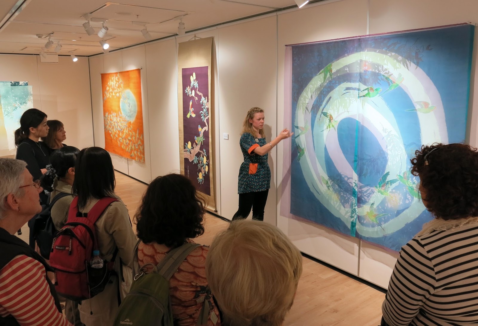
looking like a pro giving my floortalk for Japan Foundation Members before the opening

during the opening

the opening

workshops underway


workshops

Participants results from the workshops. really nice!!
It would be nice to do more workshops in future, maybe on less of a tight schedule next time!

Anyway, I'm now working towards new things for 2017. A few exhibitions on the horizon so I have to get making! 

Saturday, July 30, 2016

Solo Exhibition Coming up soon! Somé: Dyeing the Australian Landscape

"Somé: Dyeing the Australian Environment" will be on show at the Japan Foundation Gallery in Sydney from August 13 to September 17!!
It's a large space to work with and it means I can show some of my older works alongside new ones - all incorporating varying ratios of Australian imagery x Japanese dyeing techniques. 

I titled the show "Somé : Dyeing the Australian Environment" to emphasise a few things.

One is that I've been coming more and more to the conclusion that the term Textiles, in the manner that it exists in Australia, doesn't fully explain the work I do. I don't mean that in an arrogant way like "I'm so unique, the categories don't apply to me". I mean that the term Textiles in a bit misleading. I don't think just saying "dyeing" comes across the right way either. Especially with the surge of popularity in Natural dyeing and "eco-dyeing" in the last few years, perhaps the wrong image of simmering fabric in a pot is what people will think.

Somé (pronounced so, as in socks and me as in melinda)
means "dye" or "dyed work" and in Japan that is understood to include all manner of dyeing work - wax resist, paste resist, dip dyeing, natural dyes, hand painted dyes - plus more.
Textiles in Australia tends more to refer to woven, embroidered, printed and sculptural fibre-work. Though there are plenty of artists using dyeing as their medium in Australia, I don't know that the term Textiles alone describes pictoral dyed textiles.

It would be a whole lot easier if the term somé just existed in English!
There are already plenty of Japanese words bouncing around in everyday English. How about karate, sushi, manga, tempura, wabi-Sabi, bokeh and lately even Kaizen and Kintsugi! Why not add a new concept to the import list? After all sometimes a word in another language just does a feeling or concept better justice. 

So I titled the exhibition to reflect that aspect of textile work that doesn't tend to feature for Australians.

Also, it's about the Australian environment - and more broadly, imagery of Australian nature. When I first started learning katazome, my first urge was to mix in some Aussie influence - parrots, english lettering, rusty orange and bright blues. I think I went a bit too far in those early works on the "cheesy scale" but the same intent still remains: I want to show what the techniques can do when turned toward a whole new set of imagery and cultural connotations. 

Instead of plum blossoms and sparrows or cranes and pine trees, my works depict Rainbow Lorikeets and Banksias, Cockatoos and Gumtrees. In place of subdued landscapes with bamboo or chrysanthemums, I'm dyeing vibrant colours of wild-flowers and dry grasses.

I'm excited to be showing so much of my work all at once in Australia, especially in Sydney where I've never had the chance to do so before. I've also been lucky enough to get a grant from ArtsACT which means I can be present at the opening and run a couple of workshops too!

You can see the information about the exhibition here:
http://www.jpf.org.au/jpfevents/16-some/index.html


Friday, December 18, 2015

My Artwork going up in lights! 私の作品がプロジェクションマッピングで使われる!

I think I am finally allowed to share some exciting news...
今日はやっと嬉しいニュースを宣伝できます!

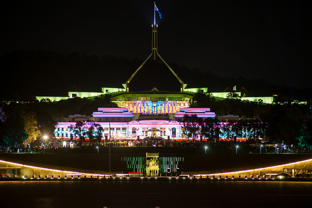
My artworks will be part of the projections on some of our National Institutions as part of the 6th Enlighten Festival in Canberra next March!
Over the 9 nights of the festival, many light-themed events bring Canberrans out to enjoy the crisp Autumn weather. The projections are a popular backdrop for live music, performances, roving performers, lit up art installations and the popular lantern-lit noodle markets.
See the promotional video below ↓


Enlighten 2014, The National Portrait Gallery

2016年3月、キャンベラで行われる「ENLIGHTEN祭」において、私の作品がいくつかのビルにプロジェクションマッピングで使われます。

来年のENLIGHTEN祭は六年目のイベントです。9日間の夜にかけて、光りをテーマにするパフォーマンス、ライブ、プロジェクションマッピング等が開催されて、キャンベラがとても賑やかになります。キャンベラは秋の3月から涼しくなるのをかかわらず、沢山の人が夜まで楽しむ祭りです。

キャンベラ市は計画都市なので、ビジネス街は一応都心部になっていますが、その南に大きな湖があって、その周りに全部の国立のビルが建てられました。(国立美術館、国立図書館、元の国会議事堂、現在の国会議事堂、国立高等裁判所, 国立なんとか、国立なんでも...)その辺の方が文化の中心地となっています。

Enlighten 2014 - Projections on the National Library of Australia

For next years' Enlighten, many national buildings will be lit up with the projections. Each building will have the work of several artists projected upon their exterior walls in a loop. I'm lucky enough to be developing imagery for three buildings: Old Parliament House (now known by the more fancy name of "The Museum of Australian Democracy"), Questcon (The National Science and Technology Centre) and the National Portrait Gallery.
Other main buildings included in the projections are the National Library and the National Gallery.


来年の祭では、5っのビルはプロジェクションマッピングに使用されます。色んなアーティストが選択されて、各ビルに数人の作品がループに写されます。
私は三つのビルの外側に写すイメージを作らせていただいています。
国立科学センター、国立ポートレートギャラリーと元の国会議事堂。

そういう偉いビルの外側なんかに私の作品がプロジェクションされるなんて想像しなかったものですね!
今は、作品を丁寧にビルの形に合わせていて、進んだらまたディテールをここでシェアしたいと思っています。
それまでには、去年の写真がこことここで見えます~

It's exciting and intimidating to think that my humble little artworks will be projected in gigantic form on the side of some of our iconic National buildings!! Especially Old Parliament House! It's such a classic building, built to house the first National Parliament of the new Federation of Australia from 1927. With all it's architraves, decorative railings and flat roof style (can you tell I know nothing about architecture?!) it is a beautiful artwork in itself.

I'm currently working on refining my planned artworks for the three buildings and hope to share some details with you as that progresses.