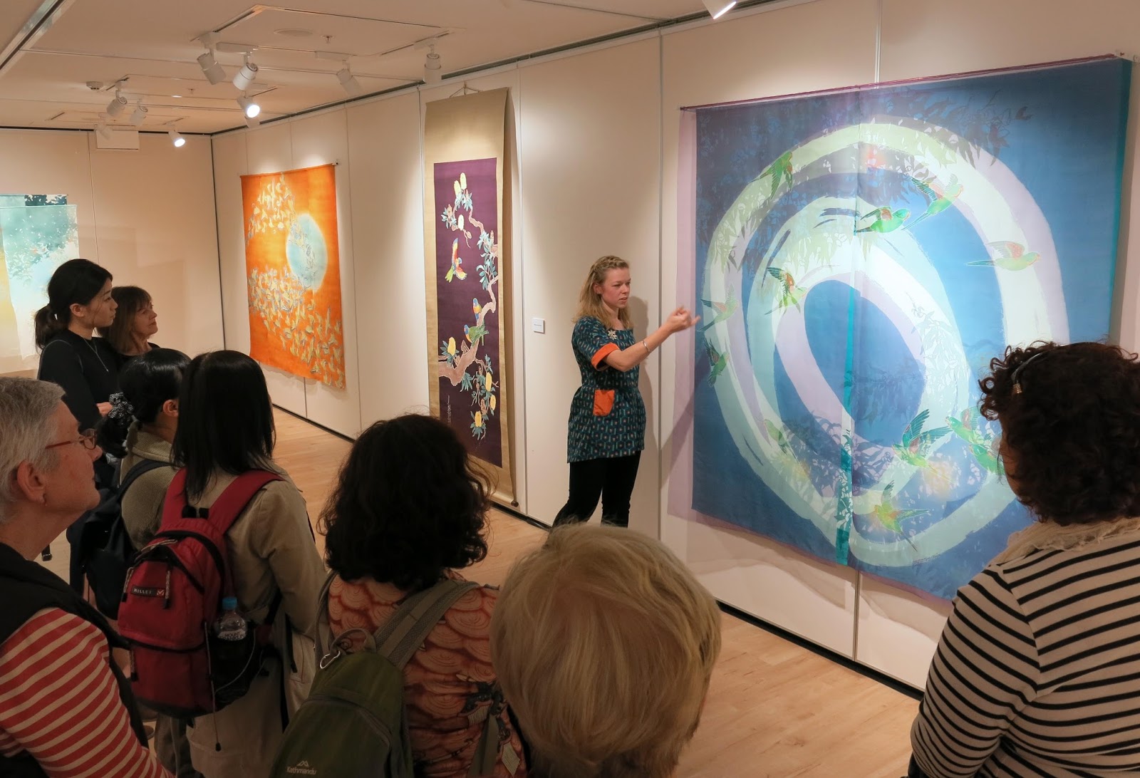
In August/September this year I was lucky enough to be invited to hold a solo exhibition of my work at the Japan Foundation Gallery in Sydney. It was titled "Somé - Dyeing the Australian Environment".
It's been a long while coming but here are some images from the show.
I made some new work for this show, a large noren for the entry to the gallery space and a series of pieces called "The Beautiful Weeds of Canberra".
Entrance to the exhibition. "A Hearty Welcome" on left
I called the noren "A Hearty Welcome", referencing its function as a gateway to the exhibition. I dyed it using katazome on hemp fabric which I sourced in Australia. Previously I'd dyed several noren but on Japanese linens which have a certain stiff feel to them and are rather open weaves so that a glimmer of the space behind the curtain is also visible. I'm yet to find a fabric with similar qualities in Australia but the hemp fabric was a new experiment using a natural looking slubby cellulose fibre. It's a little softer than I would like, as it creases easily and softens in the washing stage of katazome.
The noren was tied back during the opening event - Photo by Document Photography
The imagery I used for the stencil was of the droopy branches of Eucalyptus Cinerea (Argyle Apple). I've used them as subject matter before because I love their dusty blue-green leaves with their almost circular forms. They really lend themselves to being carved into a silhouette-y stencil.
The other new work I produced was a series I've been calling "The Beautiful Weeds of Canberra". I've become even more obsessed with weeds since starting these pieces but the idea behind them is that our natural environment is a composite of all kinds of species native and otherwise. When you look closer you realise that a good many of them are actually "weeds" but to me they are familiar parts of the landscape and also quite beautiful in their own right.
Keeping a little distance from the complex conservation and environmental problems connected with "weeds" I'm trying to just depict them in all their weedy glory - kind of weed portraits.
This is a series I will be further developing and expanding for future exhibitions but the initial weeds I've dyed are Wild Blackberry, Rosehip, Umbrella Sedges and Japanese Honeysuckle. For these pieces I used vibrant acid dyes to dye the weeds themselves - true to nature- and applied natural dyes as the background colour. I really like the russets and orange tones you can extract from local eucalyptus varieties and onion skins so I've used a combination of these against the vibrant colours of the weeds I chose.
Blackberries and Sedges - first trials in "the Beautiful Weeds of Canberra" series.
Japanese Honeysuckle - Beautiful Weeds of Canberra. A garden favourite in Japan but a creeping weed in South East Australia.
For future pieces I'm planning on featuring many many more beautiful weeds and trying to get even deeper, richer background colours. I've also started research for a series on "the Beautiful Weeds of Kyoto". It's interesting to see which weeds overlap with Australia; the weeds which we "share". It's also cool finding those species which are natives in Australia but invasive in Japan or the reverse. I think there's some deeper subject you could read into that if you chose to.
detail of "Sedges" - Beautiful Weeds of Canberra Series. 2016
Anyway, back to my exhibition in Sydney, the general response from the audience was really good. I had never shown work in Sydney, let alone so many pieces all at once before, so it was great to come across all these people who I'd never have had the chance to meet. I held a floor talk and two workshops whilst I was there too. Both went really well. It was my first time to hold workshops with so many participants but everyone was very enthusiastic and got great results.
Each participant dyed two washi postcards using powdered pigments.
looking like a pro giving my floortalk for Japan Foundation Members before the opening
during the opening
the opening
workshops underway
workshops
Participants results from the workshops. really nice!!
It would be nice to do more workshops in future, maybe on less of a tight schedule next time!
Anyway, I'm now working towards new things for 2017. A few exhibitions on the horizon so I have to get making!
Studying the techniques of Katazome and Yuzen in Japan opened my eyes not only to the unique and culturally-ingrained processes and materials of these techniques, but also to the mind-set surrounding them.; the way the finished textiles are categorised, presented and discussed.
Since returning to Australia, it's been no real surprise to see that Textiles here (with a capital T) is an entirely different kettle of fish.
TEXTILES TODAY: black and red. cardigans. berets and wine. apparently.
テキスタイルの現状なのか。服は赤と黒で決まっているみたい。もちろんワインも登場しないと。
Earlier this year I was accepted for inclusion in theWangaratta Contemporary Textile Award Exhibition for 2015. I didn't win the prize (of course, the 10K prize went to an artist already rolling in recognition and opportunities... sorry, still a little bitter...) but my work ("Canberra Blues") was displayed in a beautiful historic building along with that of 48 others!
Wangaratta Contemporary Textile Award Exhibition 2015
my work displayed beside beautiful wooden doors and stained glass
The exhibition really had a bit of everything
I was unable to attend the opening (Wangaratta is over 400km away from Canberra...if only Australia had Bullet-trains!) but went down later to see the show on display. I was really impressed with the breadth of textiles included. There were a few pieces that I wasn't too sure about, like miniature origami units of patterned envelope insides forming a large wall piece (how is that a Textile?) and a ceramic Budgie with a pair of "budgie smugglers"(speedo's) tossed on it's head (Yes, I can understand the Textile in that one but not the point...)
Anyway, I thought the selection committee and organisers had done a really good job of representing the many facets of what it means to make Textile Art. There was a bit of everything; and all of a really high standard. It felt like each piece had something to say. But contemporary Textiles is not always so well represented or carefully curated...
Wangaratta市美術館。煉瓦の本館は元々教会だったらしい
The Wangaratta Art Gallery heritgae building with lovely
red-brick, stained glass, high ceilings and polished wooden
floors. Apparently it used to be a Presbyterian Church.
I may be about to offend people...but I need to say it anyway.
What's with the way that Textiles is a Naff-magnet? (naff is such a great word...)
Other genres of Art, let's take Painting as an easy example, may attract masses of mediocre artists or uninteresting paintings. There may be plenty of ordinary Print-makers or average Sculptors, or maybe uninspired Photograhers. But Textiles, unlike the others, seems to have this unrivaled ability to generate the Naff. The Tacky. The just...not quite right.
This is probably in part because of the way that Textiles teeters on the cusp of "Art" and "Craft" (whatever they are anyway) and seems to encompass such a huge breadth of things. I'm all for diversity in Art, and in Textile Art. I'm all for using whatever medium or technique allows you to express yourself best. But I can't be the only one who is sick of the fluffy reputation hanging round Textiles. What's the deal?!
What spurred this rant was when I made an attempt to connect with the Textiles scene outside of Japan by joining some moderated groups on Facebook. One is called "Textile Arts" which purports to showcase Textile ART, to the point of declaring this mission statement,
"Our mission: To elevate textile fine art beyond the craft arena into the realm of conventional galleries. View the latest works from both well known and emerging artists.
and they even show this visual guideline for prospective posters. And yet....
...I am constantly awed by the, shall we say "variety", of posts to the group.
Textile "art" posted to the group
I'm sorry but WHAT THE?
Don't misunderstand me. I'm not trying to make an arrogant proclamation that MY TEXTILES IS THE ONLY WAY or DOWN WITH CRAFT!
But I think the way Textile Art is spoken about is confused.
To put a Textile in the Art basket, I think it needs to be addressing an idea; trying to say something of value. I think this is why I was so impressed by the Wangaratta exhibition, the artists all had something unique and interesting to say with their work, and that made it interesting!
View Denise Ferris' website here → http://www.deniseferris.com/
Denise Ferris, an Australian artist, Photography Lecturer and current Head of the ANU School of Art comments in a recent article about focusing on technique versus saying something with that technique.
Denise.."specialises in nineteenth century photographic techniques, but says it’s important not to get too caught up in the technical aspects of photography.
“For us (Canberra School of Art practitioners) it’s never just about the skills, it’s about the body of work that talks about concepts through materials,” says Ferris.
“I practice these old world techniques, but I’ve never practised this for the skill itself. I’m only interested when it’s parlayed to a concept or an idea, and is about pushing those ideas further.
“That might not seem so revolutionary, but I think...this research and practice mentality is something different for [other Art Schools]”
With this way of thinking, quilts, knitting or felting could be quite welcome on "Textile Art"s Facebook page - but only if they are exploring or untangling some kind of idea.
This Artist Luke Haynes might be onto something. I still have reservations but at least he is pushing the envelope and creating quilts that are more like contemporary art. Maybe it's something he can get away with because he's not a woman. Also, he graduated from Cooper Union, which is supposed to give him instant hipster Art street-cred. Youtube Link
Or perhaps this quilt of a $10,000 note by Nina Paley is on the right track. It ticks the conceptual box... but I disagree with her opinon about high art being a price tag issue.
Having said all this, I'm not sure an exclusive mindset is beneficial for Textiles practice. It doesn't leave room for the talented makers with amazing skills. Nor does it leave room for Textile-ans who are still finding their voice.
But it sure would be nice for a change if Textile Art could lose it's fluffy reputation.
I was only back in Australia for 10 weeks to the day when I found myself in Canberra setting up my next exhibition with my Dad. (Thanks Dad!)
オーストラリアへ帰国したばかりという気持ちがした10週目のところで、キャンベラでの個展の搬入なんてしていました!
My first solo show in Australia, "The Traces Between" opened on August 6th in the long and narrow space of Gallery 3 at M16 Artspace. The opening was a packed event as three separate shows opened all at once. It was great that the visitors who came to see the group show in the main gallery then drifted through to both mine and Keith Bailey's Solo shows in the two smaller galleries. Hooray for capitalising on other people's friends!
オーストラリアで初ての個展です。キャンベラのM16 Artspaceで細長いギャラリーで展示しています。そのArtspaceにて、三つのギャラリースペースがあって、同時に三つの展覧会も開きます。オープニングにたくさんの人が来ました。
Me explaining some of my work on opening night オープニングのパーティーで、友人に作品を説明している私。
Yay! other people's friends (plus lots of my friends and family too :)) 三つの展覧会が同時に始まるので、三つの作家さんの知り合いや友だちが来るわけ。いいシステムですね!
I called my exhibition the slightly vague and arty sounding "The Traces Between". I wasn't trying to be vague or sound arty (goodness knows I've learnt a whole dictionary of meaningless arty tripe I could roll out if I wanted to). Instead I was referring to a variety of gaps both literal and not.
One is the physical and visible gap that appears between areas of dyed colour when you use a resist technique like Katazome or Yuzen. In yuzen, that will be where you have drawn fine lines of paste with a metal-tipped tube. They leave behind the colour of the fabric below; white traces. A stencil is used for katazome, so you get a distinctive silhouette-style image. This positive image is merely the reverse of lots of blank gaps and spaces where resist paste was applied.
一つの「間」は、作品に見える防染された間です。友禅の場合では、防染糊の線の所ですね。型染の型紙を通した糊のところは出来上がった作品には、ただの間にすぎないです。
That is to say, resist-paste techniques rely on the preservation of the under fabric and then upon revealing them in the final piece.
つまり、防染糊の技法を使うと、糊が守った生地の色は、完成した作品には跡になります。
Yuzen detail: the writing is where the resist paste was. In the final piece it is just a trace. A blank space. 友禅の防染した文字。染め上がった作品から糊の存在が消されて、跡しか残らない。
In the case of Katazome, the blank negative space forms the image. In between all those gaps, the imagery is brought to life. 型染の場合、余白があるからこそ、イメージが見えてくる。
Another gap I was trying to allude to is the physical space between layers of fabric; the gaps that air can flow through. Since late 2012, I have been layering sheer silks in my pieces, leaving gaps in between them and allowing them to catch the breeze or the draft from an air conditioner.
もう一つの見える「間」は、生地の層のあいだにある空気です。2012年後半から、何枚かの絹を染めて、重ねる作品を作り続いています。この薄くて透明絹が風もちくはエアーコンに振られます。
By not framing my work, or stretching them tightly over a wooden board, they have a sense of life.
縁やパネルを使わないと、何かのイキイキ感がでる気がします。
sometimes the gaps between layers are even big enough to get inside! 2枚を重ねた作品です。時には入れるぐらいの間です!
Degradation series from 2014 where I made a point of spacing layers out from each other. 2014年のシリーズでは3枚の絹を重ねて、わざと5センチずつの間で展示してみたら、良い感じでした。
Cross cultural spaces? Australian foliage meets Japanese noren
A non-physical gap is that between Art and Craft. I don't yet know where my work fits in those terms but I get the feeling it's somewhere in between; somewhere on the divide.
作品には見えない間もあると思います。それは「美術」と「工芸」の間。自分の作品はどちらに近いというのがまだわかりませんけど、確かにその真ん中に寄っていると思います。
You could also say that it straddles cultures too, swaying somewhere in the grey area between Australian and Japanese but let us not get carried away with ourselves! 文化の間というのもあると言えるでしょうが、今はあんなに自慢するのをやめよう!笑
This show is a combination of larger works that I completed whilst undertaking my Master's degree in Kyoto as well as a collection of new work. My graduation piece from Kyoto Seika University which features the migration cycle of the endangered Swift Parrot is the centrepiece (it can be helped since it's over 5 metres long!) and it catches the air nicely as people walk by in the space.
今回の展覧会は、京都で作った大き目の作品と、帰ってから創ってみたもっと小さな作品の組み合わせです。
My Graduation work from Kyoto Seika in March 2015 is the star centrepiece of this show. 京都精華大学の大学院終了作品で作った「オトメインコの渡り」が今回の個展では、メイン作品になっています。5メートル以上なので仕方ないですけど!
Amongst the new work (some of which were completed at very VERY closely to the finish line!) are some small pieces I'm excited about that combine the fine line-work of yuzen with locally sourced natural dyes. In some inital research (much more to be had), I managed to find foliage from three eucalypts found around my suburb and boiled them down to extract some shades of yellow-brown and peachy orange-brown. Then I used those dyes to dye little "portraits" of Eucalyptus blooms and leaves. Haha! see what I did there? it's like a textiles pun or something.
新作の中、近所にあるユーカリから煮出した染料でユーカリのイメージを染めたちいさな作品もあります。まだまだ植物染料について沢山調べないといけないと分かりましたが、はじめての実験としてとてもうれしい結果です。
New small experiments in natural eucalyptus dyes are also on show.
Anyway, the show is on at M16 Artspace in Canberra until Sunday August 23, so be sure to check it out if you are in town. Otherwise, look forward to more photos after the show is complete!
さて、個展は8月23日までです!終わったらまた写真をアップしますから楽しみにしてください!
Late in May (how is it mid-July already?!) I went on a whirlwind day-trip with a friend in search of Katazome and Katagami. We headed first to Nagoya to see a large-scale exhibtion of my professor Toba Mika's Katazome artworks and then we jumped on another train to Shiroko in Mie Prefecture to visit the Ise Katagami Stencil Museum. 五月下旬(まさかもう7月の中旬ですか!?)型染と型紙を見ようとした冒険に行ってきました。ギリギリ日帰りで行けない三重県の白子と名古屋の清須へ行って、鳥羽美花の型染展と伊勢型紙資料館も見えました。
"From the Eternal Place Beyond Time and Space"
The exhibition was Toba Mika's, "From the Eternal Place Beyond Time and Space" held from April 12-June 8 2014 at Kiyosu City Haruhi Art Museum, just outside of Nagoya City. 鳥羽美花展は愛知県清須市はるひ美術館で開いていた「「時空を超えて―辿りついた場所より」 でした。
Toba Mika "Leaving Da Nang" 2001 197x570cm
I had seen a lot of my Sensei's artwork before but never so many at once. Toba-Sensei is working in katazome, creating large-scale folding screens that are vibrant and painterly. Her imagery alternates between that of Japan and scenery of Vietnam. I am always impressed by her use of colour, in particular the way she can use many different colours and tones of dye within one piece and yet makes it look so unified.
今まで鳥羽先生の作品は何回も見える機会がありましたが、このように一つの場所にたくさんの作品が見えるのは初めてでした。鳥羽先生は大きい屏風等の作品に、日本やベトナムの風景を型染で染めて描写しています。色の感覚は素敵だといつも思います。一枚の作品にあんなに沢山の色を使うのに、違和感がないのはすごい尊敬しています!
"The place to embrace calm" 2007 230x540cm
Toba-Sensei also has a unique way of incorporating texture into her work using coloured nori resist paste, that is, paste mixed with dye. By using this in areas she is effectively printing though detailed stencils directly with dyes. I think this effect helps to soften the harsh sharp lines of katazome and adds a further layer of interest. また、「色糊」の使用によって、鳥羽先生は型染の作品にもう一層の面白さを加えていると思います。型染の硬い線を柔らかくする効果がある気がします。
Detail showing texture from Toba-sensei's "Labyrinth"
Toba-sensei's folding screen on display in Vietnam 2013
Most impressive though was a display of Toba-sensei's hand-cut katagami stencils hanging in the second-floor space of the museum with it's 360 degree glass windows. Because her works are large, (often a set of panels measuring at least 90cm wide by 2 metres or more tall) it means that Toba-sensei's katagami stencils are accordingly of a matching grand scale. Seeing them hanging there in the space you could see how detailed and yet enormous they were. 今回一番感動したのは、はるひ美術館の二階にあるガラス張りの部屋に飾られた「型紙」の展示でした。鳥羽先生の作品が大きいから、当たり前ですが、型紙も大きいです。目の前につるされて、裏に緑の畑の風景が見えたり、風に動いたりしていた型紙の細かさを改めて気づきました。
just one corner of the katagami display on the second floor. image taken from this site.
Image from Toba Mika describing the steps in her katazome process
To the viewer with no knowledge of katazome or textile dyeing, they are beautiful hand-cut artworks. If you know about katazome then you know what these stencils are destined for and that they are just one stage in an involved process. But that doesn't lessen their beauty. Actually, as someone doing katazome it was interesting to see the stencils displayed in that way because we get so used to seeing then just as a tool or an implement in the process and roll them up and stash them away once we've printed the resist paste through them. Seeing them hanging there in all their glory reminded me the stencils are an artwork in themselves too.
the cover of one of Toba-sensei's catalogues shows details of a stencil of finely cut cherry blossoms.
The katagami stencil paper that Toba Sensei and many other contemporary dyeing artists use today is a wide, plastic-like paper. Traditional Katagami (or shibugami) was something much more sensory; darker in colour, produced in smaller sized textured sheets and with a strong smell you won't quickly forget. 鳥羽先生や現在型染をする人の多くは、昔と違う型紙を使っています。水で縮まない、幅が広いプラスチック製の物です。昔に使われた型紙(又は渋紙)はまた違うものです。小さい一枚ずつは手触りが粗くて、色は濃くて、記憶に絶対残り香りもします。
Katagami 'Autumn Sakura' from the Tanaka Nao Collection held at Kyoto Seika's Gallery Fleur. Edo Period 京都精華ギャラリーフロール所蔵の型紙。江戸時代。「秋桜」
What is now known as “Ise Katagami” has been produced in the
Suzuka area of Mie Prefecture for over 1000 years. Katagami was used in the
dyeing of patterns on Kimono and other fabrics. Thanks to a painting by Kano
Yoshinobu (1552-1640) depicting an artisan using katagami, we can assume it has
been around since at least the Muromachi Era (1336-1573).
Katagami production flourished during the Edo period thanks
to it’s popularity for understated kimono pattern dyeing but today the stencil
paper is only manufactured in Shiroko in Mie.
Painting by Kano Yoshinobu depicting a dyers workshop
an eye-popping Pine-tree stencil design using circular punches, from the Tanaka Nao Collection, Gallery Fleur, Kyoto Seika University Katagami Collection 切彫りの型紙「松」。京都精華大学ギャラリーフロール所蔵
The paper is made by layering 3
pieces of fine Kozo washi (paper from mulberry fibre) in alternate directions
and then painting them with astringent Persimmon juice. This is left to dry in
the sun and then hung and smoked in a room which gives it this amazing woody, cinnamony
smell. The whole process takes about a month and half before even taking a
blade to it!
There are four main techniques for carving Ise-katagami
stencils:
1. Shaped punches dougu-bori 道具彫り
Shaped punches. including Petals, rice grains, sea cucumbers, waves, horse hooves, fish scales... Chart from specialist Katagami shop Osugi, they are so friendly there! http://www.osugi.co.jp/
The blade tips of these punches are specially made into tiny
shapes like sakura petals or crescents or waves. The carver holds the punch
upright with their left hand, steadies the blade tip with the right and then
pushes the punch perfectly straight with their cheek! It sounds a little odd
but it enables them to work quickly and accurately.
桜の花びら、波、米などの形に作られた細かい刀で型紙を彫ります。この場合は小刀を慎直に持って、ほほで押すという不思議なやり方です!
2. Semi-circular punches kiri-bori 錐彫り
The metal blade tip on these punches is a semi-circle. The
action of pushing it into the katagami stencil paper and rotating it results in
cutting a full circle shape. Patterns are created by repeating these very fine
circles and often various sized circles are used to create clever effects.
Apparently there are examples of katagami that have 100 circles cut within 1cm2
!!
半円形の小刀を型紙に突いて回したら、円形が彫れます。様々なサイズの円を合わせて面白い模様ができます。1センチ四方に100個のまるが切ってある例があるらしいです!
3. Freehand Cutting tsuki-bori 突き彫り
whaaaaat!!?? へえええぇ!?細かい突き彫り。
This is apparently the oldest carving technique and the one
that is maybe most akin to contemporary katagami carving. In the case of tsuki-bori, the blade is not dragged to
slice the paper but pushed vertically through the paper with a kind of sawing
action. A mat with a hole in it is placed below the paper being carved to allow
the blade to pass through the layers of paper without damage. The blade for
these intricate patterns can be as small as 3mm wide and 1mm thick.
突き彫りはもっとも古い彫り方だそうです。小刀を引っ張って切るのではなく、まっすぐに押して、上下に動きながら切っていくという感じです。突き彫りに使う小刀は小さいと幅3ミリ厚さ1ミリだそうです!
4. Striped Designs shima-bori 縞彫り
These finely striped stencils are carved with a small blade
and a metal ruler. Once cut, these very fine lines are held in place with a net
of fine silk threads that keeps the stripes straight and the whole stencil in
one sturdy piece. The impressive step in this technique comes once all the
stripes have been cut and the layers of katagami that were stacked up during
cutting are separated from each other and what looks like brown hair falls away.
Such fine work!
定規と小刀で細い縞模様を彫る方法です。最後に残っている線動かないように、絹の糸を横に付けます。
These techniques are being practiced, documented and kept
alive by the so-called “Association for the preservation of Ise-Katagami” which
has been classified an ‘Important Intangible Cultural Asset’. Check out this
beautiful video that shows 5 members of the association demonstrating carving stencils using these techniques. 伊勢型紙技保存会で様々な知識を残そうとしています。このビデオはとてもいい感じで、保存会の5人も登場します。ぜひ見てください!
I think this is one of the great things that sets Katazome or Textile dyeing apart from just "Art". There is this extra layer of history, of techniques and of tools that are all behind the scenes and whilst unknown to the viewer of the final piece (and in come cases unbelievable to them), these things all form an important part of making the work.
型染や染色がこの技術・歴史・道具のことで「アート」とはちょっと違って、素晴らしいと思います。このもの全部出来上がった作品には見えないですが、制作に欠かせないものです。
It was a nice experience to see the hidden background tools of Katagami being shown off and highlighted for what they were: not simply tools but beautiful objects in themselves.
普通は皆に見せない道具に焦点を当てたことで、ただの道具じゃなく、そのもの自体も美しい作品というだと感じました。