Showing posts with label gallery. Show all posts

Saturday, August 4, 2018

Rocks Rock! Experiments with local Pigment Colours

Rocks are so cool. In case you hadn't noticed.
More on that later! First, a bit of background...

When I was in Japan studying katazome, I was introduced to dyeing paper (and sometimes fabric) using 'ganryo' pigments.

"Ganryo" just means colourant, it is the colour in powdered form without any binder. (Though it can be sold in the form of paint-pans or solid sticks). It can be a naturally occuring colourant, like yellow ocher (ohdo) calcium carbonate (gohfun), cinnabar (ginshu which is natural but ironically, toxic!) indigo (ai), ultramarine (gunjoh) or iron oxide (bengara) etc etc. They can also be chemically altered versions of these (to produce whitened tones etc) or just straight up synthetic pigments (basically a chalk substrate dyed different, sometimes nasty colours)

A small portion of my collection of commercially available Ganryo pigments. The ones in stick form are already mixed with a binder.


Pigments are also used in Nihonga (Japanese-style Painting) but they are slightly more complicated - see my older post all about it, and painting broccoli, here.

That one time, when I spent 5 days painting a broccoli portrait in Japanese pigments...

As I was saying, pigments are also used in combination with the katazome technique. Most famously, rich pigment colours are used in the Okinawan Bingata technique (similar to katazome - see more here) and I suspect that's why they are in the katazome repertoire in the first place. In both cases, the powdered pigment is mixed with a binder - soymilk - to create a thick paint-like liquid. These can then be applied to the fabric or washi being dyed in the same manner as dyes (with a stiff bristled brush, from the front side).

Mixing commercial pigments with soymilk to a painty consistency.
Some bits and pieces I dyed on washi (kozo paper) using commercial pigments and the katazome technique. 

Just to point out that pigments have different characteristics to dyes, it might be important to remember:
A DYE is colourant dissolved in liquid which grabs onto a fibre - it really gets into the fabric and you faciliate a chemical reaction (with steam or an alkali etc to ensure that it links sucessfully and stays on that fibre).
A PIGMENT, on the other hand, is insoluble and the particles sit on the fabric, rather than seep into the fibres. They are matte finish and can appear to look more like paint.
Bingata technique utilises this unique difference by dyeing colours first (transparent colours, which grip the fibres) then adding details on top in pigment colours (matte colours that sit on top of the fibres. This step is called "kuma-doi" lit. adding shadows). This creates a sense of depth which can't be achieved by using only layers of dye.

a detail of a bingata pattern on cotton cloth from the 19th Century. You might be able to see the heavy red pigments in the centre of the petals creating depth, versus the translucent blue dye of the background.

ANYWAY!

Having known that pigments can be used with the katazome technique and having played around with them in a short Nihonga course, I wondered if I could make my own, Australian pigment colours. Canberra is well known for "Canberra Red Bricks", churned out here from 1913 to the 1970's, so I knew that at the very least there would be a clay around here that I could use for pigment.

Rewind a bit to last September.

sketching with dirt and a lump of charcoal,
September 2017
As one of four artists chosen to take part in Craft ACT's inaugural 'Spring Tidbinbilla Residency", I spent time out at Tidbinbilla Nature Reserve, sketching, hiking and photographing. During a hike back down from Gibraltar Peak, I stopped to sketch the view of the mountains. I had found a pinch of some clay-ish dirt up the track and little and wanted to try using it as paint. Nearby where I'd sat to draw I also found some burnt tree stump and it worked perfectly as a charcoal.
This simple drawing sparked an obsession.


Fast forward and I've collected 100 Natural Pigments and counting.

a growing collection of local pigment colours.

Since February this year, I have been keeping my eyes on the ground. In non-descript walking paths and parks, along rivers, on the tops of hills and some trips to beaches, I've found colours in rocks, dirt, shells, ash and charcoal.

Mostly, I've smashed, sifted, ground, re-sifted and re-ground rocks to get these colours. Some rocks give themselves up easily, crumbling after one strike. Others are like trying to shatter steel.

smashing up rocks - this one gave itself up easily.
after sifting and grinding.

I've been sort of playing at faux-Geologist. Mostly I've been smashing and seeing what happens. I've also been trying to understand which rocks are found where by using these visually stunning but scientifically overwhelming Geological maps.

beautiful but cryptic Geological Map from Geosicence Australia

WOOO! Rocks!

The most exciting part of this whole experiment has been to do what I first intended - use these colours I've collected as pigments for katazome. The chance for this arose when an exhibition was borne of Craft ACT Spring Residency at Tidbinilla last September. The show wrapped up this past weekend at the Tuggeranong Arts Centre in Canberra. The work all came together beautifully, without intending to, all four of us artists used complementary textures, colours, as well as references to stones and foliage. Narelle Phillips at the Tuggeranong Arts Centre did an excellent job of curation and organising everything.

Traversing Tidbinbilla, Tuggeranong Arts Centre July 6-28, 2018. To the right is work by fellow artist Sally Mumford.

Here are a few close ups of the work I exhibited. You'll see works on paper - these are all made with my pigments mixed with soymilk, applied to kozo washi. I also tried the pigments on different weights of silk, in an installation piece depicting Eucalyptus Cinerea foliage. Finally, I wanted to display my vials of pigment in the manner of a old fashioned museum, you can see this in the wooden box in the pictures.

Foliage Series, 2018. Katazome on washi using local pigments. 38 x 40cm
Left to Right, 'Welcome Swallow', 'Eastern Yellow Robin' & 'Grey Shrike-thrush' 2018. Katazome on washi using local pigments. each 25 x 31cm
Flame Robin (Male) 2018

In all these works on paper, I selected ground pigments from what I had collected, mixing them with soymilk in small mortars. I didn't really mix different colours together, just used what I had as is or layering one colour over another. Charcoal from found burnt logs was good for giving strong blacks. The hardest colours to represent were a vivid yellow and red for the Flame robin and the Eastern Yellow Robin. In real life, the breast feathers of these birds are nearly fluorescent. I had to settle for earthier versions.


Cinerea Breeze. 2018. Katazome and earth pigments on silk. The cottage we stayed at out at Tidbinbilla during the residency is called Cinerea Cottage, so this piece has extra meaning :)
Floaty detail of Cinerea Breeze. The foliage is dyed using pigments and the background beige and orange tones were dyed in a natural dye bath of Eucalyptus Cinerea leaves. 


Lastly, here's my (Tiny) Museum of Natural Pigments. I love that colours which seemed so ordinary and similar when I spotted them, appear completely different when crushed and lined up next to each other. Many of these were successful as pigments to dye paper but a lot of them were too gritty or crystal-y to be an effective colourant. Still, they are pretty as a powder amongst their fellows.

*I'd like to make clear that I have only taken small amounts of colour from locations that aren't national park or designated nature reserves. I definitely didn't take from spots where it would damage the area. I know there will be some people who will take issue with me having done this. I have tried to honour the spirit of nature and her beauty through these works. If I'm found to have done something wrong, I'm sure I will hear about it...*

In an exciting development, this exhibition will now travel to be exhibited in the gallery at the Tidbinbilla Visitors Centre, from Friday August 3rd until the 14th of October 2018! It will be great to see the works so close to the location that inspired them and I hope lots of interstate and international visitors get to see them too.

The next step in this Pigment adventure is looking further afield for different colours that aren't present in the ACT and also, trying to make pigment colours from natural dye baths - as 'lake pigments'. This a science-y process that I haven't had much luck with yet (though admittedly, I haven't tried very hard yet!). Watch this space!

Monday, November 28, 2016

Somé - Dyeing the Australian Environment

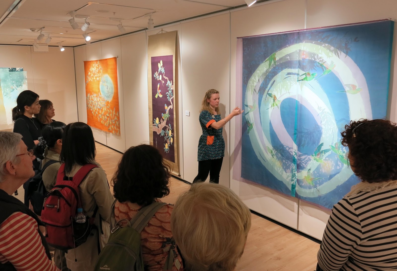
In August/September this year I was lucky enough to be invited to hold a solo exhibition of my work at the Japan Foundation Gallery in Sydney. It was titled "Somé - Dyeing the Australian Environment".
It's been a long while coming but here are some images from the show.


I made some new work for this show, a large noren for the entry to the gallery space and a series of pieces called "The Beautiful Weeds of Canberra".

Entrance to the exhibition. "A Hearty Welcome" on left

I called the noren "A Hearty Welcome", referencing its function as a gateway to the exhibition. I dyed it using katazome on hemp fabric which I sourced in Australia. Previously I'd dyed several noren but on Japanese linens which have a certain stiff feel to them and are rather open weaves so that a glimmer of the space behind the curtain is also visible. I'm yet to find a fabric with similar qualities in Australia but the hemp fabric was a new experiment using a natural looking slubby cellulose fibre. It's a little softer than I would like, as it creases easily and softens in the washing stage of katazome.

The noren was tied back during the opening event - Photo by Document Photography
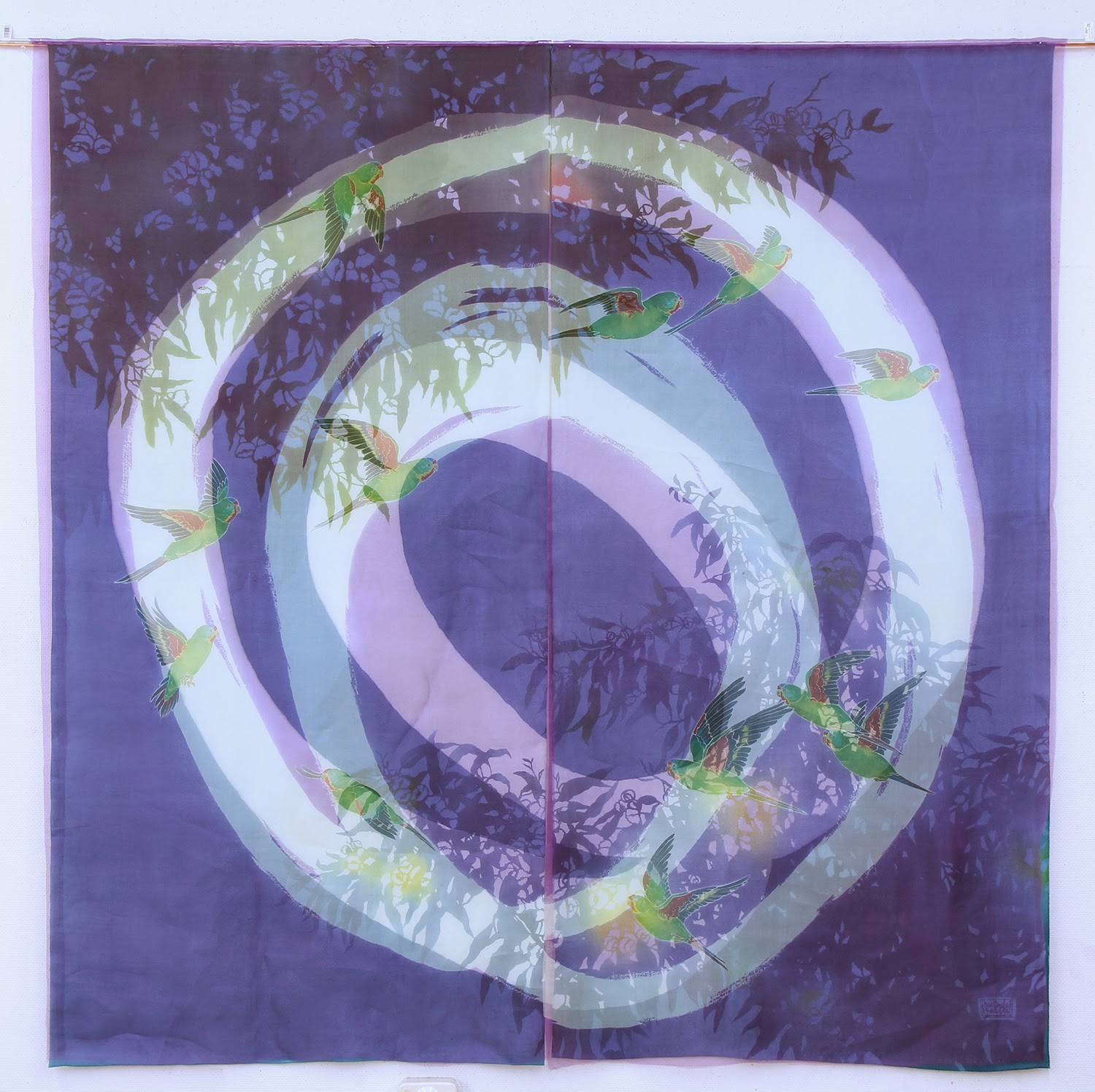
The imagery I used for the stencil was of the droopy branches of Eucalyptus Cinerea (Argyle Apple). I've used them as subject matter before because I love their dusty blue-green leaves with their almost circular forms. They really lend themselves to being carved into a silhouette-y stencil.


The other new work I produced was a series I've been calling "The Beautiful Weeds of Canberra". I've become even more obsessed with weeds since starting these pieces but the idea behind them is that our natural environment is a composite of all kinds of species native and otherwise. When you look closer you realise that a good many of them are actually "weeds" but to me they are familiar parts of the landscape and also quite beautiful in their own right. 

Keeping a little distance from the complex conservation and environmental problems connected with "weeds" I'm trying to just depict them in all their weedy glory - kind of weed portraits.


This is a series I will be further developing and expanding for future exhibitions but the initial weeds I've dyed are Wild Blackberry, Rosehip, Umbrella Sedges and Japanese Honeysuckle. For these pieces I used vibrant acid dyes to dye the weeds themselves - true to nature- and applied natural dyes as the background colour. I really like the russets and orange tones you can extract from local eucalyptus varieties and onion skins so I've used a combination of these against the vibrant colours of the weeds I chose.

Blackberries and Sedges - first trials in "the Beautiful Weeds of Canberra" series.

Japanese Honeysuckle - Beautiful Weeds of Canberra. A garden favourite in Japan but a creeping weed in South East Australia.

For future pieces I'm planning on featuring many many more beautiful weeds and trying to get even deeper, richer background colours. I've also started research for a series on "the Beautiful Weeds of Kyoto". It's interesting to see which weeds overlap with Australia; the weeds which we "share". It's also cool finding those species which are natives in Australia but invasive in Japan or the reverse. I think there's some deeper subject you could read into that if you chose to. 

detail of "Sedges" - Beautiful Weeds of Canberra Series. 2016
Anyway, back to my exhibition in Sydney, the general response from the audience was really good. I had never shown work in Sydney, let alone so many pieces all at once before, so it was great to come across all these people who I'd never have had the chance to meet. I held a floor talk and two workshops whilst I was there too. Both went really well. It was my first time to hold workshops with so many participants but everyone was very enthusiastic and got great results.
Each participant dyed two washi postcards using powdered pigments.

looking like a pro giving my floortalk for Japan Foundation Members before the opening

during the opening

the opening

workshops underway


workshops

Participants results from the workshops. really nice!!
It would be nice to do more workshops in future, maybe on less of a tight schedule next time!

Anyway, I'm now working towards new things for 2017. A few exhibitions on the horizon so I have to get making! 

Wednesday, October 28, 2015

Why does Textiles have such a fluffy reputation? 「テキスタイル」はなぜダサい傾向がある の?

Studying the techniques of Katazome and Yuzen in Japan opened my eyes not only to the unique and culturally-ingrained processes and materials of these techniques, but also to the mind-set surrounding them.; the way the finished textiles are categorised, presented and discussed.

Since returning to Australia, it's been no real surprise to see that Textiles here (with a capital T) is an entirely different kettle of fish.
 
日本に4年間も住んで、型染と友禅を勉強したら、日本に独特な材料、長い歴史のある道具や工程などについてだけではなく、それ以上に勉強できたのがあの染織作品は「どうのように思われている・発表されている・論じ合われている」ということだった。

オーストラリアへ帰国してから気づいたのは、驚くことではないけれど、ここの「テキスタイル」は日本とは全く違うものなのだ。

TEXTILES TODAY: black and red. cardigans. berets and wine. apparently.
テキスタイルの現状なのか。服は赤と黒で決まっているみたい。もちろんワインも登場しないと。

Earlier this year I was accepted for inclusion in the Wangaratta Contemporary Textile Award Exhibition for 2015. I didn't win the prize (of course, the 10K prize went to an artist already rolling in recognition and opportunities... sorry, still a little bitter...) but my work ("Canberra Blues") was displayed in a beautiful historic building along with that of 48 others!


Wangaratta Contemporary Textile Award Exhibition 2015
my work displayed beside beautiful wooden doors and stained glass

The exhibition really had a bit of everything
I was unable to attend the opening (Wangaratta is over 400km away from Canberra...if only Australia had Bullet-trains!) but went down later to see the show on display. I was really impressed with the breadth of textiles included. There were a few pieces that I wasn't too sure about, like miniature origami units of patterned envelope insides forming a large wall piece (how is that a Textile?) and a ceramic Budgie with a pair of "budgie smugglers"(speedo's) tossed on it's head (Yes, I can understand the Textile in that one but not the point...)

Anyway, I thought the selection committee and organisers had done a really good job of representing the many facets of what it means to make Textile Art. There was a bit of everything; and all of a really high standard. It felt like each piece had something to say. But contemporary Textiles is not always so well represented or carefully curated...


Wangaratta市美術館。煉瓦の本館は元々教会だったらしい
The Wangaratta Art Gallery heritgae building with lovely
red-brick, stained glass, high ceilings and polished wooden
floors. Apparently it used to be a Presbyterian Church.


6月に2015年度の「Wangaratta市現代テキスタイル賞展」に出品させていただきました。毎回ヴィクトリア州のかなり小さい都市であるWangaratta市の美術館で行われていますが、国内のテキスタイル世界では人気なイベントになっています。美術館自体も素敵な煉瓦のビルです!

日本の素晴らしい新幹線や特急電車が存在しないオーストラリアでは、420KMも離れているWangaratta市美術館でのオープニングには行きにくかったが、開催中に見に行きました。(車で京都から神奈川までぐらいの距離!)

今までにオーストラリアで見たテキスタイル展の中で、一番キュレーションがよかったかもしれないです。
「現代テキスタイル」という範囲に限られたのに、作家さんや作品の幅が広かったです。刺繍の作品、インスタレーションの作品、染めの作品、織りの作品、編み物の作品も展示されていました。どんな作品も個性や技術があって面白かったけど、一番いい所は、全部の作品は何かを言おうとしていたことでした。


I may be about to offend people...but I need to say it anyway.
What's with the way that Textiles is a Naff-magnet? (naff is such a great word...)

Other genres of Art, let's take Painting as an easy example, may attract masses of mediocre artists or uninteresting paintings. There may be plenty of ordinary Print-makers or average Sculptors, or maybe uninspired Photograhers. But Textiles, unlike the others, seems to have this unrivaled ability to generate the Naff. The Tacky. The just...not quite right.

This is probably in part because of the way that Textiles teeters on the cusp of "Art" and "Craft" (whatever they are anyway) and seems to encompass such a huge breadth of things.  I'm all for diversity in Art, and in Textile Art. I'm all for using whatever medium or technique allows you to express yourself best. But I can't be the only one who is sick of the fluffy reputation hanging round Textiles. What's the deal?!


でもテキスタイルって、よくダサい勝ちじゃないですか??

日本の「染織」もその傾向があるでしょうが、オーストラリアやアメリカでの「テキスタイル」は得にダサいがちだと思います。

テキスタイル以外の美術をちょっと考えてみましょう。例えば絵画。絵画では確かに、技術が低くて、なにも個性がない作家というのは時々居ますよね。版画の世界にも居るでしょう。なにも感動させない写真家も居るはず。面白くない彫刻家も絶対どこかに居ます。

しかし、テキスタイルの場合はちょっと違う気がします。
面白くないや個性がないだけじゃなくて、
フワフワな、女性っぽい雰囲気がなんとなくあります。

これはテキスタイルって美術と工芸の峠に存在するからだろうし、ジャンルとして幅が広いのもあるでしょう(染め、織り、編み物、レース、裁縫、シルクスクリーン、綴れ織り、絞り、インスタレーション、等々も含んでいます!)テキスタイルの多様性は祝うべき物だと思いながら、フワフワな名声が嫌になっています。

What spurred this rant was when I made an attempt to connect with the Textiles scene outside of Japan by joining some moderated groups on Facebook. One is called "Textile Arts" which purports to showcase Textile ART, to the point of declaring this mission statement,
"Our mission: To elevate textile fine art beyond the craft arena into the realm of conventional galleries. View the latest works from both well known and emerging artists.
 and they even show this visual guideline for prospective posters. And yet....


...I am constantly awed by the, shall we say "variety", of posts to the group.


Textile "art" posted to the group
I'm sorry but WHAT THE?
Don't misunderstand me. I'm not trying to make an arrogant proclamation that MY TEXTILES IS THE ONLY WAY or DOWN WITH CRAFT!

But I think the way Textile Art is spoken about is confused.

To put a Textile in the Art basket, I think it needs to be addressing an idea; trying to say something of value. I think this is why I was so impressed by the Wangaratta exhibition, the artists all had something unique and interesting to say with their work, and that made it interesting! 


この問題について考えるきっかけは、FBで「テキスタイル・アート」というグループに参加したときです。このグループの目標は次のように書いてありました。
「私たちの目標:
工芸の枠を超えて、テキスタイルをギャラリーのレベルまで上げること。
よく知られている作家の作品も、新鋭作家の作品を見せること。」

にもかかわらず、右のようなものが載っていました。毎日こんな物はグループに追加されています。何なんだ!

テキスタイルはこうだよ!とか、工芸はダメだ!とかを言おうとしていませんよ。ただ、テキスタイルのジャンルは理解されていなくて、もっとアートに近づきたいグループとしては成功していないと思います。

テキスタイル・アートにしたいなら、メッセージがないといけないと思うようになりました。技法は面白くても、手の仕事がいくら丁寧であっても、作品のメッセージ(テーマじゃなくて、個人の考えや気持ち)が欠けているととアートとはいえないと思います。

View Denise Ferris' website here → http://www.deniseferris.com/
Denise Ferris, an Australian artist, Photography Lecturer and current Head of the ANU School of Art comments in a recent article about focusing on technique versus saying something with that technique.

Denise.."specialises in nineteenth century photographic techniques, but says it’s important not to get too caught up in the technical aspects of photography. 
“For us (Canberra School of Art practitioners) it’s never just about the skills, it’s about the body of work that talks about concepts through materials,” says Ferris.

“I practice these old world techniques, but I’ve never practised this for the skill itself. I’m only interested when it’s parlayed to a concept or an idea, and is about pushing those ideas further. 
“That might not seem so revolutionary, but I think...this research and practice mentality is something different for [other Art Schools]”

Red Window - Photograph by Denise Ferris

オーストラリア国立大学美術学の学長・写真家のデニース・フェリッス氏は、19世紀の写真技術を用いています。しかし、自分は技法そのものではなく、技法を通して表現する、と最近の記事で書きました。

「技法ばかりのではなく、技法を通して作る作品のコンセプトは大事だと思います。古い技法を用いってるのですが、技法だけで面白くない。この技法はコンセプトか、何かのアイディアを探る場合にしか興味をもっていないです。 」

With this way of thinking, quilts, knitting or felting could be quite welcome on "Textile Art"s Facebook page - but only if they are exploring or untangling some kind of idea.

こういう風に考えるならば、キルト、編み物、フェルトなども上述したFBページにも載せれるけど、コンセプトがある物に限られます。

下の作家さん、ルーク・ヘインズ(米国)は現代的なキルトを作っています。こういうのだったら、Textile Artとは言えると思いますが、フワフワな雰囲気がないのは男性なのだからかもしれない。


This Artist Luke Haynes might be onto something. I still have reservations but at least he is pushing the envelope and creating quilts that are more like contemporary art. Maybe it's something he can get away with because he's not a woman. Also, he graduated from Cooper Union, which is supposed to give him instant hipster Art street-cred. Youtube Link

Or perhaps this quilt of a $10,000 note by Nina Paley is on the right track. It ticks the conceptual box... but I disagree with her opinon about high art being a price tag issue.
またこういうキルトもアートなのでしょうか。1万ドル札のキルトで、キルトの売る値段は材料・作る時給のお金より安いという皮肉なメッセージも含んでいます。


Having said all this, I'm not sure an exclusive mindset is beneficial for Textiles practice. It doesn't leave room for the talented makers with amazing skills. Nor does it leave room for Textile-ans who are still finding their voice.

But it sure would be nice for a change if Textile Art could lose it's fluffy reputation.

結局なの結論になったか分からないですが、
テキスタイルアートはこれからフワフワ、B級、ダサい雰囲気を無くしていけば、いいなあと思っています。テキスタイルでアートを目指しているなら、アートのように自分には大事なメッセージを表現しましょう。
きっと、最新鋭のジャンルになれるので。

Saturday, March 14, 2015

Why can't you touch Art? 作品を触っちゃダメって何?

The lady in her lurid yellow fitted jacket raced over to me and told me not to touch the artwork.

I told her, "But I'm the one who made it; this is my artwork!"

She frowned and did that Japanese suck-air-through-your-teeth thing and said that if I touched it, other people would think it's okay to touch it too.
In the moment, I couldn't gather my thoughts well enough to give a level-headed response so I just sort of nodded. What I really wanted to say was "So what?! What if I actually don't mind people reaching out and touching my work? Its fabric, it's washable, it's FINE!"

Pretty sure it's not just me that sees something like this fabric and hears a little voice scream "touch me!!!!" こういうのを見て、触りたくなるのが私だけじゃないでしょう?!

派手な黄色スーツ姿のおばさんが走ってきた。「すみません、作品にはさわらないでください。」

「あっ、でも、私の作品です」と返事したら、黄色のおばさんが困ったように歯の間から息を吸って、「すみませんが、他のお客様が触っているのを見るなら、触ってもいいと思ってしまうので」と言った。
その場で上手く返事ができなかったけれども、言いたかったのは「それで!?別に触ってもいいんだよ。生地だし、洗えるし、逆に触って欲しいかも」

This was just another glimpse of conservative Kyoto that I got when I exhibited at the Kyoto Museum last month.まあ、京都のミュージアムでも、世界のミュージアムでもそういう態度ですね。

The work I recently exhibited at the Kyoto Museum: "floriferous - 咲き乱れる" 
京都文化博物館で展示した作品です。

Perhaps a MUSEUM is not the place for textiles.
ミュージアムという場所は、もしかしたら染色の作品を展示するには合ってないのではないか?

As a kind of pipe dream, I would love to make textile installations. Wait! Don't roll your eyes at the word "installation", often used by arty-farty types as a blanket term to legitimise anything from a room full of bits of garbage to an empty room with a soundtrack on loop.
いつか将来に作りたいの一つは「染色インスタレーション」なのです。「インスタレーション」という言葉がこの頃使われすぎで、意味なくなるぐらいように色んなものがインスタレーションと呼ばれています。(何も置いていない暗い部屋がインスタハレーションだとか、古い工場の床に散らされたゴミがインスタレーションだとか)

Fly free my pretties! "Freshly" dyed and washed pieces of fabric hanging out in this wicked autumn wind as if trying to get free. It was a beautiful sight and I stopped there and thought: "THIS! this is what a textile is supposed to be like" 水洗いしたあと、乾かしている生地の動きが本当に綺麗で感動した!その瞬間に「テキスタイルってこれや!!」と思った。

What I mean is, a room or even better a semi-outdoor space full of hanging dyed fabric, that you walk through, look at, which moves as you walk by and shows off the best of Australia's brilliantly coloured scenery or birds. And it would be something you are free to touch.
そういうわけわからないインスタレーションではなく、私が作ってみたいのが自然光がたっぷり入る一部屋(または半野外の場所)に染めた生地をいっぱい吊り下げたインスタレーションです。生地にオーストラリアの鳥や色や言葉を。人が通ると生地が動く。森へ覗きこんでいるように感じる。何よりも、触ってもOKの物を作りたいと思っています。

This time there was no gallery minders and no alarms to set off!
卒展で自分の作品をよく触ったよ!
You can't do this kind of installation in your average museum or city gallery-type space. For one thing, they often don't allow you to hang anything from the ceiling (another sticking point I'm still annoyed about with the Kyoto-city Municipal Museum of Art), which reduces you to hanging against a wall or to creating some kind of nifty wall-fittings. And then there's those sneaky Gallery Minders (as in the ones in yellow suit jackets) who are going to tell you off for touching, photographing, getting too close, using your phone, reaching for a pen... This kind of stuffy, rigid atmosphere somehow doesn't allow the artwork to be what I intended.
普通の美術館または博物館では、こういったインスタレーション作品は無理ですね。できない理由の一つは、ほとんどの場合、天井から作品を吊り下げるのは不可。それと、触ろうと・携帯を使おうと・ペンを出そうと・近すぎに行こうとしたら、最初に書いた厳しい当番の人に言われますね。このかたい雰囲気で作品が楽しめますか??

Sneaking a photo amongst my own work at Some-seiryukan Gallery in Kyoto, November 2014. 自分の作品に入って写真を取っちゃった。去年の11月、京都の染・清流館で。
I liked the way the author of this article “PLEASE DON’T TOUCH THE (TOUCHABLE) ART” described this gap between museums and the art shown in them: 
"...more and more contemporary art is created by artists who intend you to play with it. The full meaning and experience of the work requires you to interact...
Unfortunately, for...contemporary artwork that gets its primary meaning, emotion and significance from interacting with it, keeping it locked behind glass isn't good enough. Most museums and galleries have not caught up to this idea...All objects, regardless of the artist’s intent, are treated the same."
*私の適当な訳*「作品と遊んで欲しい作家さんが増えています。その作品を理解・経験するには、作品と接する必要があると。しかし、ミュージアムでのガラス張りの所に展示したりすると、そういった作品の意味がなくなる。殆どのミュージアムやギャラリーはこのギャップを気付いていない。つまり、作家(が触ってほしいなど)の意志にかかわらず、ミュージアムで展示するすべての物は同じく扱われる。」*

So it doesn't really matter how eccentric or open an artist might be about displaying their work, when you go it stick it in the museum mould, you're stuck playing by their rules.
つまり、作家さんが作った物に対していくらでも自由に考えていても、ミュージアムで展示してしまうと、ミュージアムでのルールに従わないといけないですね。

Weee--ooooo---Weeee-ooooo! Can you hear the alarms going off?
It's an unfortunate catch 22 (which is probably changing for the better but still remains, especially in the considerably conservative art scene of Kyoto) that artists feel they have to exhibit in museums or art galleries to feel validated as a "real", "made-it-and-can-afford-to-stop-eating-cereal-as-dinner" artists when those are the very places curbing the unique creative streaks which make them artists in the first place.
作家たちが、いわゆる「プロの作家」になりたかったらギャラリーやミュージアムで展示しなきゃと思ってしまうですね。でも、そういった場所はルールがいっぱいあるから、作家になるには必要な「創造性」こそが抑えられます。ジレンマですね。。。

Another part of this is the way we've managed to make art so precious and segregated; raising it to un-touchable status (literally) in galleries and museums. The art world manages to segregate itself with it's words too.
この問題に含んでいるのが、Artが手が届けないもの(文字通りの意味でも!)にする概念です。ミュージアムやギャラリーで展示することによって偉いものにしてしまうし、ARTについて話す時に使う言葉によっても、別の世界にしてしまうことがあります。

An old favourite, http://www.artybollocks.com/ which generates random artist statements and shows you just how meaningless they really are
and you can refresh and refresh the page into increasing obscurity...
I was reading this really great article by Steve Lambert about artists using vague speech and losing the chance to engage ordinary people because of their wordiness. Here's a quote,

"artists are already too cloistered off from the rest of our culture; isolated in elite institutions, appreciated by small numbers, and/or segregating ourselves in confusing social difference alone as some kind of admirable attribute. Around 45 years ago John Berger disparagingly called this phenomena the needless “mystification” of art. If we want to change this, and we should, we need to speak clearly in a language people can understand – not by adopting academic language for institutional appeal or trying to cover over our insecurity with pompous nonsense"

*適当な訳*
作家さんはもう一般社から離れすぎている。偉い学校に閉じ混んでいたり、少人数にしか認められていない。あれは尊敬する資質のように思っているのか?45年前にジョン・バージャーさんが、この行為を「アートの秘訣化」と呼びました。この事情を変えたたかったら (変える必要がある)、使っている言葉を変えるべき。学的な言葉や、自分自身不足を隠すようなわけわからない言葉じゃなくて、皆が分かるような言葉ではっきり表現しないといけない。


The way we show and speak about art has the potential to scare people away. The kinds of airy-fairy words as in the randomly generated statements like the ones above can make people uncomfortable. Hey, even just the word ART can make some people feel out of place.
アートについて話す時に使う言葉を考える必要があると思います。ARTというだけで、避ける人もいるから、もっとリアルに作品やコンセプトを説明したりしないともったいないと思います。

There's a need for artists to be less exclusive and more relate-able. One way to do that could be to bring art out of the museums and galleries and put it into real life. I don't mean reproducing artworks onto cushions for the masses or in the sense of having beautiful things in our homes, I mean actually putting the real deal artwork into public places. Why not? What's the point of making art if you're going to show it to only some  people, or let it be touched only sometimes ?
美術の作品をもっと日常の物にすればいいじゃないか?作品をより日常生活にありそうな雑貨にするのではなく、美術作品自体を色々な場面に出すのはどうでしょうか?

Maybe it's fabric dyed with plants that hangs from a naturally lit ceiling in a shopping centre? Maybe it could be dyed birds and John Gould text across the walls of the cafe? Maybe it's a see-through hanging beside the rest area in a hospital? Maybe it's an artwork in an office space, as a giant room divider? Maybe it's in artwork hanging in a national park information centre?
例えば、モールの天上から草木染の生地の作品を吊り下げる?カフェの壁に鳥と鳥類者の文章が染めてある作品を展示する?大きな半透明の作品を事務室の間仕切りに使ってもらう?病院の接客室に掛ける?国立公園のビジターセンターに展示する?

I touched that thing endlessly to make it, but for some reason, you're not allowed to touch it once its done. 作る最中は触るばかりのに、出来上がった作品は触っちゃダメだ。不思議だなぁ。
I don't know but I'm getting the feeling that making artworks needs to involve an act of generosity, of adding value to peoples lives. Not the unconscious act of telling people they are not worthy because they are not "art people".
色々が分からないし、考え方は甘いかもしれないですが、最近はこういう人々にすこしでも何か貢献する作品は一番いいだろうと思ってきました。ちょっとでも日常生活にアートとの接する機会があると。

Because in the end, we are all born artists and you show me one person out there whose first natural instinct is to NOT touch the artwork.

だって、人間はみんな生まれながらのArtistだもの。本能的に作品に触りたくない人間って世の中居ないはずのだ。