Showing posts with label japan. Show all posts

Monday, December 11, 2017

2017 - a hectic year of TRYING

Wow, how is it already December!?

Apologies to my sadly neglected blog but this year has been a heck of a ride.

In looking back over all the things I've done and struggled with this year, I suddenly had a (mildly incensed) urge to write it all down and make sense of it before another year rolls around.

Let me paint a picture of the hectic year just gone.

→ I dyed a commissioned noren (split curtain) for an Australian Tea-master who lives up in Newcastle with his own tatami-floored tea-room. It's a homage to spring with magpies, which also happen to be the emblem of the area where he studied Tea.

privately commissioned Noren featuring Australian magpies

→ I started making textile jewellery that I've called tameshi, using trial dye samples and un-used edges from dyed works. These have been proving popular and I feel good about the fact that they are mini artworks in themselves and re-use fabrics that I would have thrown away or put in a box somewhere.

Tameshi jewellery - tameshi means sample or test. Available through stockists in Canberra and on my etsy store https://www.etsy.com/au/shop/someru

→ I sent work to a group show by dyeing artists in New York. As the only artist out of the group who wasn't Japanese, apparently people said mine looked the most Japanese! With all the deadlines for later in the year, I didn't manage to get to go the US to see the show but still, it felt like an achievement.

My series of 6 yuzen/katazome dyed works on display as part of "Wafting II" at Medialia Gallery in New York, June-July 2017

→ I participated in a four-day residency out at Tidbinbilla nature reserve thanks to Craft ACT. Four of us selected artists got to stay in a newly renovated cottage inside the reserve and spent four lovely sunny days at the tail-end of winter hiking in the bush, sketching, writing and sharing tales over cheese and wine.

The delights of early spring at Tidbinbilla - Gibraltar Peak, Early Nancy, Flame Robin.

→ I travelled to Japan and held a solo exhibition in Galerie H20 in Kyoto. My first solo show there in 4 and a half years, always a joy to be there and to catch up with so many friends and new connections.

entryway and Japanese garden at Galerie H20 in downtown Kyoto

view of solo show at Galerie h20, October 2017

→ Whilst in Japan I made time to visit and interview a bunch of great humans, friends new and old who are doing innovative and interesting dye-work. The plan is to write up a series of interviews from all the meetings and I've created a new project Somé 20:20 to house them and to move forward with. It's a reference to being able to see clearly - without acknowledging tradition how do we move forward? and how will dyeing art survive into the future, 2020 is just around the corner. A work in progress, my new website for the project is over at some-20-20.com

the wonderful people who agreed to be interviewed for my Somé 20:20 project.

→ I came back and setup another solo show at ANCA gallery in Canberra! The theme of my works this year have been "beautiful weeds", and I managed to create some new works that are really where I've been wanting to head for a while now; layered and sheer works that are a new form of collaged landscape.

Solo Exhibition "Naturescapes" at ANCA Gallery & Studios, Canberra, Oct-Nov 2017

detail of "The Beautiful Weeds of Canberra" series, on show at ANCA Gallery, Canberra

→ I ran workshops and demonstrations in dyeing at the 2017 Canberra-Nara Candle Festival. For the demonstrations, I dyed a massive 9 metre length of resist-printed cotton in one go while a crowd watched and revealed pattern and birds and text as I went. The workshops saw nearly 100 people dye their own kata-yuzen bookmark using pigments and stencils.

Kata-yuzen workshops and Hikizome demonstration at the Canberra Nara Candle Festival, October 28, 2017

→ I ran another afternoon of workshops on the last day of my exhibition, dyeing katazome postcards. Participants could dye pre-printed washi and wash away the paste to reveal the patterns. We had great warm weather and it was a lovely bunch of enthusiastic people who came along.

wonderful postcards dyed by participants, drying on the outside windows at ANCA

→ I even had an article published in the Kyoto Journal, on katagami stencils.

Kyoto Journal, a volunteer-run publication, making a return to print from this issue.
It's great! you can get your hands on a copy here


PHEW!

What this run-sheet doesn't show is the sleep-deprivation, self-doubt, expenses, rejection letters, missed deadlines, extensive preparations, hours spent at a day-job and the constant juggle.

On paper, (or in digital text, I suppose) this looks like a hugely successful year. In a sense it was.
But it was also really, really hard.
I don't think this level of productivity is sustainable, or even very enjoyable.
I also didn't really sell much art. Not through exhibitions.
Where I really made progress and, to some extent, a profit, was through connecting with like-minded people, through making custom pieces, through sharing affordable things, and through trying to promote the unique genre of Somé.
Which has me re-thinking my approach to all of this.

Given that my work places me in a sort of odd position in between ART, CRAFT & RESEARCH, (odd in the sense that I don't fall neatly into funding categories or job titles) I'm thinking that instead of struggling against that and trying to slot myself into prescribed categories, why not embrace it?

Can I be a CRAFTISAN?
Can I be a RESEARCHIST?
Can I be a CRAFTIST?

I'm tired of feeling like my specialties (being able to dye pictorial textiles, being interested in craft, being knowledgeable about tradition, having Japanese abilities -though not bilingual by any means, being interested in smaller, affordable art) are a liability, or something I need to adjust so I can be in the same game as everyone else. And of feeling like my particular set of skills don't add up to anything. When in fact they do! and they are a killer combination despite what the grants categories, arts bodies, or professional membership organisations would have me think.

So consider this my personal passion project for 2018; finding a way to be my own kind of craftisan, pursuing research and researching through making.


Thank you for putting up with the silence on this blog but do feel free to check in over at my website and project site to see what things I get up to in 2018.

Wednesday, October 28, 2015

Why does Textiles have such a fluffy reputation? 「テキスタイル」はなぜダサい傾向がある の?

Studying the techniques of Katazome and Yuzen in Japan opened my eyes not only to the unique and culturally-ingrained processes and materials of these techniques, but also to the mind-set surrounding them.; the way the finished textiles are categorised, presented and discussed.

Since returning to Australia, it's been no real surprise to see that Textiles here (with a capital T) is an entirely different kettle of fish.
 
日本に4年間も住んで、型染と友禅を勉強したら、日本に独特な材料、長い歴史のある道具や工程などについてだけではなく、それ以上に勉強できたのがあの染織作品は「どうのように思われている・発表されている・論じ合われている」ということだった。

オーストラリアへ帰国してから気づいたのは、驚くことではないけれど、ここの「テキスタイル」は日本とは全く違うものなのだ。

TEXTILES TODAY: black and red. cardigans. berets and wine. apparently.
テキスタイルの現状なのか。服は赤と黒で決まっているみたい。もちろんワインも登場しないと。

Earlier this year I was accepted for inclusion in the Wangaratta Contemporary Textile Award Exhibition for 2015. I didn't win the prize (of course, the 10K prize went to an artist already rolling in recognition and opportunities... sorry, still a little bitter...) but my work ("Canberra Blues") was displayed in a beautiful historic building along with that of 48 others!


Wangaratta Contemporary Textile Award Exhibition 2015
my work displayed beside beautiful wooden doors and stained glass

The exhibition really had a bit of everything
I was unable to attend the opening (Wangaratta is over 400km away from Canberra...if only Australia had Bullet-trains!) but went down later to see the show on display. I was really impressed with the breadth of textiles included. There were a few pieces that I wasn't too sure about, like miniature origami units of patterned envelope insides forming a large wall piece (how is that a Textile?) and a ceramic Budgie with a pair of "budgie smugglers"(speedo's) tossed on it's head (Yes, I can understand the Textile in that one but not the point...)

Anyway, I thought the selection committee and organisers had done a really good job of representing the many facets of what it means to make Textile Art. There was a bit of everything; and all of a really high standard. It felt like each piece had something to say. But contemporary Textiles is not always so well represented or carefully curated...


Wangaratta市美術館。煉瓦の本館は元々教会だったらしい
The Wangaratta Art Gallery heritgae building with lovely
red-brick, stained glass, high ceilings and polished wooden
floors. Apparently it used to be a Presbyterian Church.


6月に2015年度の「Wangaratta市現代テキスタイル賞展」に出品させていただきました。毎回ヴィクトリア州のかなり小さい都市であるWangaratta市の美術館で行われていますが、国内のテキスタイル世界では人気なイベントになっています。美術館自体も素敵な煉瓦のビルです!

日本の素晴らしい新幹線や特急電車が存在しないオーストラリアでは、420KMも離れているWangaratta市美術館でのオープニングには行きにくかったが、開催中に見に行きました。(車で京都から神奈川までぐらいの距離!)

今までにオーストラリアで見たテキスタイル展の中で、一番キュレーションがよかったかもしれないです。
「現代テキスタイル」という範囲に限られたのに、作家さんや作品の幅が広かったです。刺繍の作品、インスタレーションの作品、染めの作品、織りの作品、編み物の作品も展示されていました。どんな作品も個性や技術があって面白かったけど、一番いい所は、全部の作品は何かを言おうとしていたことでした。


I may be about to offend people...but I need to say it anyway.
What's with the way that Textiles is a Naff-magnet? (naff is such a great word...)

Other genres of Art, let's take Painting as an easy example, may attract masses of mediocre artists or uninteresting paintings. There may be plenty of ordinary Print-makers or average Sculptors, or maybe uninspired Photograhers. But Textiles, unlike the others, seems to have this unrivaled ability to generate the Naff. The Tacky. The just...not quite right.

This is probably in part because of the way that Textiles teeters on the cusp of "Art" and "Craft" (whatever they are anyway) and seems to encompass such a huge breadth of things.  I'm all for diversity in Art, and in Textile Art. I'm all for using whatever medium or technique allows you to express yourself best. But I can't be the only one who is sick of the fluffy reputation hanging round Textiles. What's the deal?!


でもテキスタイルって、よくダサい勝ちじゃないですか??

日本の「染織」もその傾向があるでしょうが、オーストラリアやアメリカでの「テキスタイル」は得にダサいがちだと思います。

テキスタイル以外の美術をちょっと考えてみましょう。例えば絵画。絵画では確かに、技術が低くて、なにも個性がない作家というのは時々居ますよね。版画の世界にも居るでしょう。なにも感動させない写真家も居るはず。面白くない彫刻家も絶対どこかに居ます。

しかし、テキスタイルの場合はちょっと違う気がします。
面白くないや個性がないだけじゃなくて、
フワフワな、女性っぽい雰囲気がなんとなくあります。

これはテキスタイルって美術と工芸の峠に存在するからだろうし、ジャンルとして幅が広いのもあるでしょう(染め、織り、編み物、レース、裁縫、シルクスクリーン、綴れ織り、絞り、インスタレーション、等々も含んでいます!)テキスタイルの多様性は祝うべき物だと思いながら、フワフワな名声が嫌になっています。

What spurred this rant was when I made an attempt to connect with the Textiles scene outside of Japan by joining some moderated groups on Facebook. One is called "Textile Arts" which purports to showcase Textile ART, to the point of declaring this mission statement,
"Our mission: To elevate textile fine art beyond the craft arena into the realm of conventional galleries. View the latest works from both well known and emerging artists.
 and they even show this visual guideline for prospective posters. And yet....


...I am constantly awed by the, shall we say "variety", of posts to the group.


Textile "art" posted to the group
I'm sorry but WHAT THE?
Don't misunderstand me. I'm not trying to make an arrogant proclamation that MY TEXTILES IS THE ONLY WAY or DOWN WITH CRAFT!

But I think the way Textile Art is spoken about is confused.

To put a Textile in the Art basket, I think it needs to be addressing an idea; trying to say something of value. I think this is why I was so impressed by the Wangaratta exhibition, the artists all had something unique and interesting to say with their work, and that made it interesting! 


この問題について考えるきっかけは、FBで「テキスタイル・アート」というグループに参加したときです。このグループの目標は次のように書いてありました。
「私たちの目標:
工芸の枠を超えて、テキスタイルをギャラリーのレベルまで上げること。
よく知られている作家の作品も、新鋭作家の作品を見せること。」

にもかかわらず、右のようなものが載っていました。毎日こんな物はグループに追加されています。何なんだ!

テキスタイルはこうだよ!とか、工芸はダメだ!とかを言おうとしていませんよ。ただ、テキスタイルのジャンルは理解されていなくて、もっとアートに近づきたいグループとしては成功していないと思います。

テキスタイル・アートにしたいなら、メッセージがないといけないと思うようになりました。技法は面白くても、手の仕事がいくら丁寧であっても、作品のメッセージ(テーマじゃなくて、個人の考えや気持ち)が欠けているととアートとはいえないと思います。

View Denise Ferris' website here → http://www.deniseferris.com/
Denise Ferris, an Australian artist, Photography Lecturer and current Head of the ANU School of Art comments in a recent article about focusing on technique versus saying something with that technique.

Denise.."specialises in nineteenth century photographic techniques, but says it’s important not to get too caught up in the technical aspects of photography. 
“For us (Canberra School of Art practitioners) it’s never just about the skills, it’s about the body of work that talks about concepts through materials,” says Ferris.

“I practice these old world techniques, but I’ve never practised this for the skill itself. I’m only interested when it’s parlayed to a concept or an idea, and is about pushing those ideas further. 
“That might not seem so revolutionary, but I think...this research and practice mentality is something different for [other Art Schools]”

Red Window - Photograph by Denise Ferris

オーストラリア国立大学美術学の学長・写真家のデニース・フェリッス氏は、19世紀の写真技術を用いています。しかし、自分は技法そのものではなく、技法を通して表現する、と最近の記事で書きました。

「技法ばかりのではなく、技法を通して作る作品のコンセプトは大事だと思います。古い技法を用いってるのですが、技法だけで面白くない。この技法はコンセプトか、何かのアイディアを探る場合にしか興味をもっていないです。 」

With this way of thinking, quilts, knitting or felting could be quite welcome on "Textile Art"s Facebook page - but only if they are exploring or untangling some kind of idea.

こういう風に考えるならば、キルト、編み物、フェルトなども上述したFBページにも載せれるけど、コンセプトがある物に限られます。

下の作家さん、ルーク・ヘインズ(米国)は現代的なキルトを作っています。こういうのだったら、Textile Artとは言えると思いますが、フワフワな雰囲気がないのは男性なのだからかもしれない。


This Artist Luke Haynes might be onto something. I still have reservations but at least he is pushing the envelope and creating quilts that are more like contemporary art. Maybe it's something he can get away with because he's not a woman. Also, he graduated from Cooper Union, which is supposed to give him instant hipster Art street-cred. Youtube Link

Or perhaps this quilt of a $10,000 note by Nina Paley is on the right track. It ticks the conceptual box... but I disagree with her opinon about high art being a price tag issue.
またこういうキルトもアートなのでしょうか。1万ドル札のキルトで、キルトの売る値段は材料・作る時給のお金より安いという皮肉なメッセージも含んでいます。


Having said all this, I'm not sure an exclusive mindset is beneficial for Textiles practice. It doesn't leave room for the talented makers with amazing skills. Nor does it leave room for Textile-ans who are still finding their voice.

But it sure would be nice for a change if Textile Art could lose it's fluffy reputation.

結局なの結論になったか分からないですが、
テキスタイルアートはこれからフワフワ、B級、ダサい雰囲気を無くしていけば、いいなあと思っています。テキスタイルでアートを目指しているなら、アートのように自分には大事なメッセージを表現しましょう。
きっと、最新鋭のジャンルになれるので。

Sunday, October 18, 2015

One last Studio Visit - Edo-style Komon Dyeing 工房見学 ‐ 「古今」 江戸時代の小紋を守りながら、現代の染色を作り出す

**This post is really going back now...I visited this studio over 6 months ago! I was so warmly welcomed there though, that I at least owe them this blogpost...better late than never!**

In the last weeks of my big Kyoto Adventure, I was invited out to visit a dyeing Atelier in the west of Kyoto called "古今 Kokon". I was taken there by a friend of a friend, Kumie-san, resulting in Chinese-whispers style communications that meant all I knew was that we were going to see a dyeing studio that does "amazingly detailed katazome". Okay, I figured, count me in!


**この投稿はもう6ヵ月間も下書きのままに残しちゃったけど、工房のスタッフにとても暖かく迎えられたから、遅くても書かないよりはまし!**

4月、京都で最後の二週間に帰る準備でバタバタしていましたが、友だちから「すごく細かい型染をやっているところがあるのよ!絶対見に行った方がいいよ!」と言われたので、友だちの友だち久美江さんに連れて行ってもらいました。「染処古今」という工房で、四条西小路の交差点から徒歩10分ぐらいのところで、普通の住宅街に挟んでいる感じでした。

We walked for about 10 mins from Shijo/Nishikoji streets through backstreets and L-shaped short-cuts to arrive at the Kokon Atelier, established on a narrow suburban street in between ordinary looking family houses.

Mr Yasue, the fourth-generation head of the company, was there to greet us and kindly showed me all the different steps of their process in creating their unique line of kimono and obi. Turns out I even got a mention on Mr Yasue's Blog as "a very enthusiastic" visitor!

古今四代目の安江さんに迎えられて、古今の独特な着物や帯を作る工程を丁寧に説明してくれました。安江さんのブログにも登場しました!

You can see Kokon's website HERE ←これは古今のホームページです!
The process they are using at Kokon is "komon", (lit. small motif) very fine and detailed stencilled patterns. It is a form of katazome, popularized during the Edo-period when elaborate and showy clothing was periodically banned by the government.

Super-fine Komon-dyed fabric on display at Kokon 古今の超細かい小紋はステキな色で染められています。
Komon-style dyeing, in it's most traditional form, involves: 

- Carving a stencil from katagami stencil paper, using fine metal-tipped punches, or by hand with a fine cutting blade

- Applying a soft, sticky rice-flour based resist-paste through the stencil onto the fabric

- Dyeing the fabric by brush or dip-dyeing (in the latter case, the stencil is used to print the resist paste onto both the front and back of the fabric, matching the tiny pattern perfectly!!! brain explosion!!)

- Steaming the fabric to set the dye

- Rinsing off the resist-paste and revealing the delicate tiny komon patterns, which remain the white colour of the base fabric.

Just one of the crazy detailed Katagami stencil papers on display at Kokon, this one carved by a National Treasure, Nanbu Yoshimatsu 1894-1976 人間国宝南部芳松に彫られた細か~い型紙!


古今で、小紋を染めています。伝統的な小紋の工程を簡単に説明したら、

☆ 型紙を細かい刀で彫る、それとも丸きりなどの道具で模様を彫リます。

☆ 場合によって型紙を丈夫するため、漆で絹の紗を表に張ります。

☆ 型紙を布に載せて、柔らかい餅粉と糠からできている糊をヘラで敷いて、模様は布に置かれます。

☆ 刷毛で布の表を染めます。乾いた糊は染料を防ぎます。浸染する場合もあって、その時は布の両面に糊を置かないといけない。しかも、両面の模様がぴったり合うようにしないと!(なんてこと!!)

☆ 染料を布に定着するため、100度で蒸します。

☆ 布を洗って、糊を落とします。やっと繊細な模様が見えます。糊が置かれたところは布の色のままです。つまり模様は白いです。


multicoloured patterns are their trademark at Kokon. Yasue-san said he spends hours figuring out colour combinations that  are just right. 古今に特有の色合い。

At Kokon Atelier, they are using a more modern technique which allows the application of multiple colours. That is, instead of applying plain resist paste onto white fabric resulting in a dyed background with a fine white pattern, 
they are also sometimes applying a coloured resist paste and dyeing the background, resulting in both a coloured background and finely detailed coloured patterns. This way, none of the white base fabric is left showing through.

If I managed to confuse you just now (sorry!), then check out the below photo.
The black and white fabric has used traditional resist paste + black dye, whilst the second fabric has used a khaki paste, then a black dye.

Top fabric= normal rice/bran resist paste, then dyed black.
Bottom fabric= a green tinted resist paste, then dyed black.

染めどころ「古今」にて、伝統的な小紋の知識を守りながら、現代な雰囲気も加えていると感じました。得に使っている色によって感じます。昔の小紋といったら、白い生地に一色の模様が染められました。(細かい模様はもう織物に見える!)古今で、色糊の使用によって、生地も模様の所も染められます。(上の写真を参考に)。また、色糊の上に暈し染をしたり、何枚かの細かい小紋をデザインの中に使ったりするから、とてもフレッシュな雰囲気の染物が出来上がります。

The practice of using coloured resist paste became popular during the Meiji era when chemical dyes were introduced from Europe (they had been discovered and developed in France, England and Germany) which could be mixed straight into the traditional rice flour/rice bran resist paste. This meant the paste was both colouring the fabric where it was applied as well as resisting the colour of any additional layers on top of it. Clever, huh!

色糊は明治時代に発達されました。ヨーロッパ(特にイギリス、ドイツ)の研究者が開発した化学染料は日本へ輸入されました。化学染料は糊と混ぜることができて、新しい染め方が現れました。
染料が入っている色糊は、上から挿される染料を防ぎながら、置いた所も染めてしまいます。
かしこいでしょう!

見学した時、糊の作る段階が見えました。古今では、色糊は毎回、職人さんの感覚で作られています。染料は何パーセントとかのレシピが無しで、普通の糊に、染料を少しづつ加えて、良さそうな色になると、生地に敷いて、蒸して洗います。色は予想と異なると、染料の量を調整して、もう一回蒸して洗ったりするの繰り返しでやっと糊ができます。
すごい努力の要る作業だと思っていましたが、安江さんたちがこだわっている綺麗な「生じゃない色」を作るにはやっぱり必要ですね。

Normal paste on left, dye concentrates, then a Blue paste getting mixed on right. 左は普通の防染糊、真ん中は各色の染料、右はできた青色の色糊。とても濃く見えますが、蒸して洗うとかなり薄い色になてしまうから何回も確認しないと。

Mr Yasue showed me their rows of tubs of mixed coloured resist paste and was explaining to me how they mix the colours.  He told me they don't use measures or a notebook of dye to paste ratios but by mix their colours by eye. Every time!

To do this, they have various dye concentrates all lined up and add these to a bucket of plain paste little by little to produce a batch of paste in the desired colour. This colour sample needs to be dried, steamed and washed to check what the true resulting colour will be. They continue to adjust and repeat the tests until the desired colour is achieved. This seems like an awfully tedious way of mixing colours, but as Mr Yasue pointed out, this ensures they achieve rich, subtle colours; colours that do not look like they came "straight-out-of-the-tube".

Yasue-san showing me their swatch book of paste colours. This is only a visual reference though because they remix the colours by eye each time! (写真は古今のブロッグから)

糊の作業場から、型紙の展示へ移動しました。何人かの人間国宝に彫られた型紙も所蔵されているそうです。「道具彫り」に使う道具も見せてもらいました。道具自体は美しいと思いました。丸、葉っぱ、月などの形を切る道具もあって、これらは職人さんが自分で作るらしいです。型紙を彫る職人さん、何名も「人間国宝」とされていますが、この道具も近いうちに国宝にもなるのではないか?将来に作れる職人さんが減ると貴重品になるでしょうね。

After the paste-mixing room, we had a look at the different kinds of stencils and cutting tools for komon. Aside from tiny blades, punch shapes are also used for cutting stencils (dougu-bori). The stencil-cutting artisans tend to make their own punches, hammering fine strips of metal to form the desired blade shapes (like dots or moons or small leaves). Many stencil-carvers have been designated as "National Treasures"; their craft is so skilled. Aren't the punches also beautiful objects?? They will become national treasures themselves before long because there are now very few craftsmen actually making these amazing tools.

The one-off handmade cutting tools, some shaped like crescent moons, others circles and dots 美しい道具。
次は大きな作業場へ入りました。頭の上に5メートルの糊板がたくさん並んでいて、背が高い人はここで働けないなあと思いました!笑 いくつかの板に帯や着物の反物が貼っていました。
Next, we went into the biggest workroom. The ceiling is very low as all the 5 metre long wooden pasting boards are stored up above their heads. Many had kimono and obi-belt fabric in progress pasted on them.
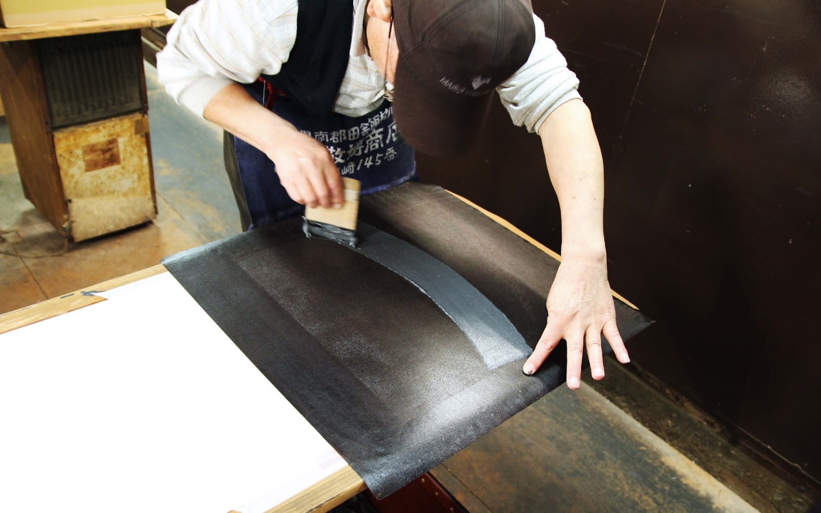
Three staff were working in the space. One was applying layers of lacquer to old stencils to prolong their use. Another was printing fabric, matching a ridiculously fine repeat pattern down a length of fabric and washing the stencil between every repeat (! they take pride in their product!)

Lacquering old stencils to extend their life. 古い型紙に漆を引いていました。 All the 5 metre long narrow pasting tables are stored overhead. Couldn't be a tall person working here!

In the middle of printing a fine pattern with coloured resist paste, very carefully matching the pattern repeat each time. You can barely even see the pattern at all here, but check out the next photo!!
小紋の糊置きの最中。毎回、柄がぴったり合うように練習が必要ですね!模様はここで見にくいですが、次のショットで見ると...

ギャー!こまかい!eeeeek! Super fine komon pattern freshly printed with a coloured resist paste.

Best of all though, was Mr Nomura. He has been with the company since he left school at 16 (I think his spine kind of gives that fact away..) and as such, he is the resident expert. He was printing when we went in, working to combine multiple fine patterns on what will become the ornate hemline of a kimono. 

最後に野村さんの仕事をお邪魔しました。16歳からこの工房で働いていたそうで、(姿勢を見るだけで分かるんですがね)小紋のプロです!見学のときは、ちょうど着物の裾の所に色んな小紋を一枚ずつ「熨斗」のデザインに入れ込んでいました。とても複雑な仕事ですが、結果はきれいですね。

Nomura-san, looking like a pro. because, well...he is. プロのしぐさですね!

Nomura san printing different patterns selectively to create the impressive effect below ↓
野村さんは小紋を部分的に糊を置くと下のような効果がでた↓
various komon patterns printed carefully within the design of "noshi" a curly ribbon-like motif in Japanese art and design.


Yasue-san surrounded by his company's products
古今の着物や帯に囲まれている安江さん


帰る前に、古今の商品が置いてあるビルを案内させていただきました。古今の複雑な工程を見たばかりので、完成品の帯や着物に感動しました。
Before heading out to a sushi lunch, Mr Yasue took us to a second compant building and showed us some of their finished products. After having seen the complex process Kokon uses to dye their fabrics, it was even more impressive to see the final products, all shiny and packaged up.

Obi with the same pattern in different colourways.
同じ柄の帯。ぜいたく!

I was really taken with the modern colour pallete they are using in their products. Without modifying the traditional process, tools or fabrics, they are giving their kimono and obi a really contemporary look just by using really unique colour combinations.

After all, this is reflected in the name of the company: Kokon. The two characters mean "Old" and "Now"; Bringing together the knowledge and expertise of the past generation and utilising it to skillfully make beautiful clothing for the generation of today.

古今でうまいことに小紋の道具、生地、素材を伝統のままにして、色やデザイン感覚だけを変えることによって、面白い染物を作り出していると思います。

「古今」の字のように、過去の職人さんの知識と技法を使って、現在の人々のテーストにあう染物をフレッシュな感じに作っている、と思います。小紋の伝統を次の世代にも伝えたらいいですね。