Showing posts with label 着物. Show all posts

Sunday, October 18, 2015

One last Studio Visit - Edo-style Komon Dyeing 工房見学 ‐ 「古今」 江戸時代の小紋を守りながら、現代の染色を作り出す

**This post is really going back now...I visited this studio over 6 months ago! I was so warmly welcomed there though, that I at least owe them this blogpost...better late than never!**

In the last weeks of my big Kyoto Adventure, I was invited out to visit a dyeing Atelier in the west of Kyoto called "古今 Kokon". I was taken there by a friend of a friend, Kumie-san, resulting in Chinese-whispers style communications that meant all I knew was that we were going to see a dyeing studio that does "amazingly detailed katazome". Okay, I figured, count me in!


**この投稿はもう6ヵ月間も下書きのままに残しちゃったけど、工房のスタッフにとても暖かく迎えられたから、遅くても書かないよりはまし!**

4月、京都で最後の二週間に帰る準備でバタバタしていましたが、友だちから「すごく細かい型染をやっているところがあるのよ!絶対見に行った方がいいよ!」と言われたので、友だちの友だち久美江さんに連れて行ってもらいました。「染処古今」という工房で、四条西小路の交差点から徒歩10分ぐらいのところで、普通の住宅街に挟んでいる感じでした。

We walked for about 10 mins from Shijo/Nishikoji streets through backstreets and L-shaped short-cuts to arrive at the Kokon Atelier, established on a narrow suburban street in between ordinary looking family houses.

Mr Yasue, the fourth-generation head of the company, was there to greet us and kindly showed me all the different steps of their process in creating their unique line of kimono and obi. Turns out I even got a mention on Mr Yasue's Blog as "a very enthusiastic" visitor!

古今四代目の安江さんに迎えられて、古今の独特な着物や帯を作る工程を丁寧に説明してくれました。安江さんのブログにも登場しました!

You can see Kokon's website HERE ←これは古今のホームページです!
The process they are using at Kokon is "komon", (lit. small motif) very fine and detailed stencilled patterns. It is a form of katazome, popularized during the Edo-period when elaborate and showy clothing was periodically banned by the government.

Super-fine Komon-dyed fabric on display at Kokon 古今の超細かい小紋はステキな色で染められています。
Komon-style dyeing, in it's most traditional form, involves: 

- Carving a stencil from katagami stencil paper, using fine metal-tipped punches, or by hand with a fine cutting blade

- Applying a soft, sticky rice-flour based resist-paste through the stencil onto the fabric

- Dyeing the fabric by brush or dip-dyeing (in the latter case, the stencil is used to print the resist paste onto both the front and back of the fabric, matching the tiny pattern perfectly!!! brain explosion!!)

- Steaming the fabric to set the dye

- Rinsing off the resist-paste and revealing the delicate tiny komon patterns, which remain the white colour of the base fabric.

Just one of the crazy detailed Katagami stencil papers on display at Kokon, this one carved by a National Treasure, Nanbu Yoshimatsu 1894-1976 人間国宝南部芳松に彫られた細か~い型紙!


古今で、小紋を染めています。伝統的な小紋の工程を簡単に説明したら、

☆ 型紙を細かい刀で彫る、それとも丸きりなどの道具で模様を彫リます。

☆ 場合によって型紙を丈夫するため、漆で絹の紗を表に張ります。

☆ 型紙を布に載せて、柔らかい餅粉と糠からできている糊をヘラで敷いて、模様は布に置かれます。

☆ 刷毛で布の表を染めます。乾いた糊は染料を防ぎます。浸染する場合もあって、その時は布の両面に糊を置かないといけない。しかも、両面の模様がぴったり合うようにしないと!(なんてこと!!

☆ 染料を布に定着するため、100度で蒸します。

☆ 布を洗って、糊を落とします。やっと繊細な模様が見えます。糊が置かれたところは布の色のままです。つまり模様は白いです。


multicoloured patterns are their trademark at Kokon. Yasue-san said he spends hours figuring out colour combinations that  are just right. 古今に特有の色合い。

At Kokon Atelier, they are using a more modern technique which allows the application of multiple colours. That is, instead of applying plain resist paste onto white fabric resulting in a dyed background with a fine white pattern, 
they are also sometimes applying a coloured resist paste and dyeing the background, resulting in both a coloured background and finely detailed coloured patterns. This way, none of the white base fabric is left showing through.

If I managed to confuse you just now (sorry!), then check out the below photo.
The black and white fabric has used traditional resist paste + black dye, whilst the second fabric has used a khaki paste, then a black dye.

Top fabric= normal rice/bran resist paste, then dyed black.
Bottom fabric= a green tinted resist paste, then dyed black.

染めどころ「古今」にて、伝統的な小紋の知識を守りながら、現代な雰囲気も加えていると感じました。得に使っている色によって感じます。昔の小紋といったら、白い生地に一色の模様が染められました。(細かい模様はもう織物に見える!)古今で、色糊の使用によって、生地も模様の所も染められます。(上の写真を参考に)。また、色糊の上に暈し染をしたり、何枚かの細かい小紋をデザインの中に使ったりするから、とてもフレッシュな雰囲気の染物が出来上がります。

The practice of using coloured resist paste became popular during the Meiji era when chemical dyes were introduced from Europe (they had been discovered and developed in France, England and Germany) which could be mixed straight into the traditional rice flour/rice bran resist paste. This meant the paste was both colouring the fabric where it was applied as well as resisting the colour of any additional layers on top of it. Clever, huh!

色糊は明治時代に発達されました。ヨーロッパ(特にイギリス、ドイツ)の研究者が開発した化学染料は日本へ輸入されました。化学染料は糊と混ぜることができて、新しい染め方が現れました。
染料が入っている色糊は、上から挿される染料を防ぎながら、置いた所も染めてしまいます。
かしこいでしょう!

見学した時、糊の作る段階が見えました。古今では、色糊は毎回、職人さんの感覚で作られています。染料は何パーセントとかのレシピが無しで、普通の糊に、染料を少しづつ加えて、良さそうな色になると、生地に敷いて、蒸して洗います。色は予想と異なると、染料の量を調整して、もう一回蒸して洗ったりするの繰り返しでやっと糊ができます。
すごい努力の要る作業だと思っていましたが、安江さんたちがこだわっている綺麗な「生じゃない色」を作るにはやっぱり必要ですね。

Normal paste on left, dye concentrates, then a Blue paste getting mixed on right. 左は普通の防染糊、真ん中は各色の染料、右はできた青色の色糊。とても濃く見えますが、蒸して洗うとかなり薄い色になてしまうから何回も確認しないと。

Mr Yasue showed me their rows of tubs of mixed coloured resist paste and was explaining to me how they mix the colours.  He told me they don't use measures or a notebook of dye to paste ratios but by mix their colours by eye. Every time!

To do this, they have various dye concentrates all lined up and add these to a bucket of plain paste little by little to produce a batch of paste in the desired colour. This colour sample needs to be dried, steamed and washed to check what the true resulting colour will be. They continue to adjust and repeat the tests until the desired colour is achieved. This seems like an awfully tedious way of mixing colours, but as Mr Yasue pointed out, this ensures they achieve rich, subtle colours; colours that do not look like they came "straight-out-of-the-tube".

Yasue-san showing me their swatch book of paste colours. This is only a visual reference though because they remix the colours by eye each time! (写真は古今のブロッグから)

糊の作業場から、型紙の展示へ移動しました。何人かの人間国宝に彫られた型紙も所蔵されているそうです。「道具彫り」に使う道具も見せてもらいました。道具自体は美しいと思いました。丸、葉っぱ、月などの形を切る道具もあって、これらは職人さんが自分で作るらしいです。型紙を彫る職人さん、何名も「人間国宝」とされていますが、この道具も近いうちに国宝にもなるのではないか?将来に作れる職人さんが減ると貴重品になるでしょうね。

After the paste-mixing room, we had a look at the different kinds of stencils and cutting tools for komon. Aside from tiny blades, punch shapes are also used for cutting stencils (dougu-bori). The stencil-cutting artisans tend to make their own punches, hammering fine strips of metal to form the desired blade shapes (like dots or moons or small leaves). Many stencil-carvers have been designated as "National Treasures"; their craft is so skilled. Aren't the punches also beautiful objects?? They will become national treasures themselves before long because there are now very few craftsmen actually making these amazing tools.

The one-off handmade cutting tools, some shaped like crescent moons, others circles and dots 美しい道具。
次は大きな作業場へ入りました。頭の上に5メートルの糊板がたくさん並んでいて、背が高い人はここで働けないなあと思いました!笑 いくつかの板に帯や着物の反物が貼っていました。
Next, we went into the biggest workroom. The ceiling is very low as all the 5 metre long wooden pasting boards are stored up above their heads. Many had kimono and obi-belt fabric in progress pasted on them.
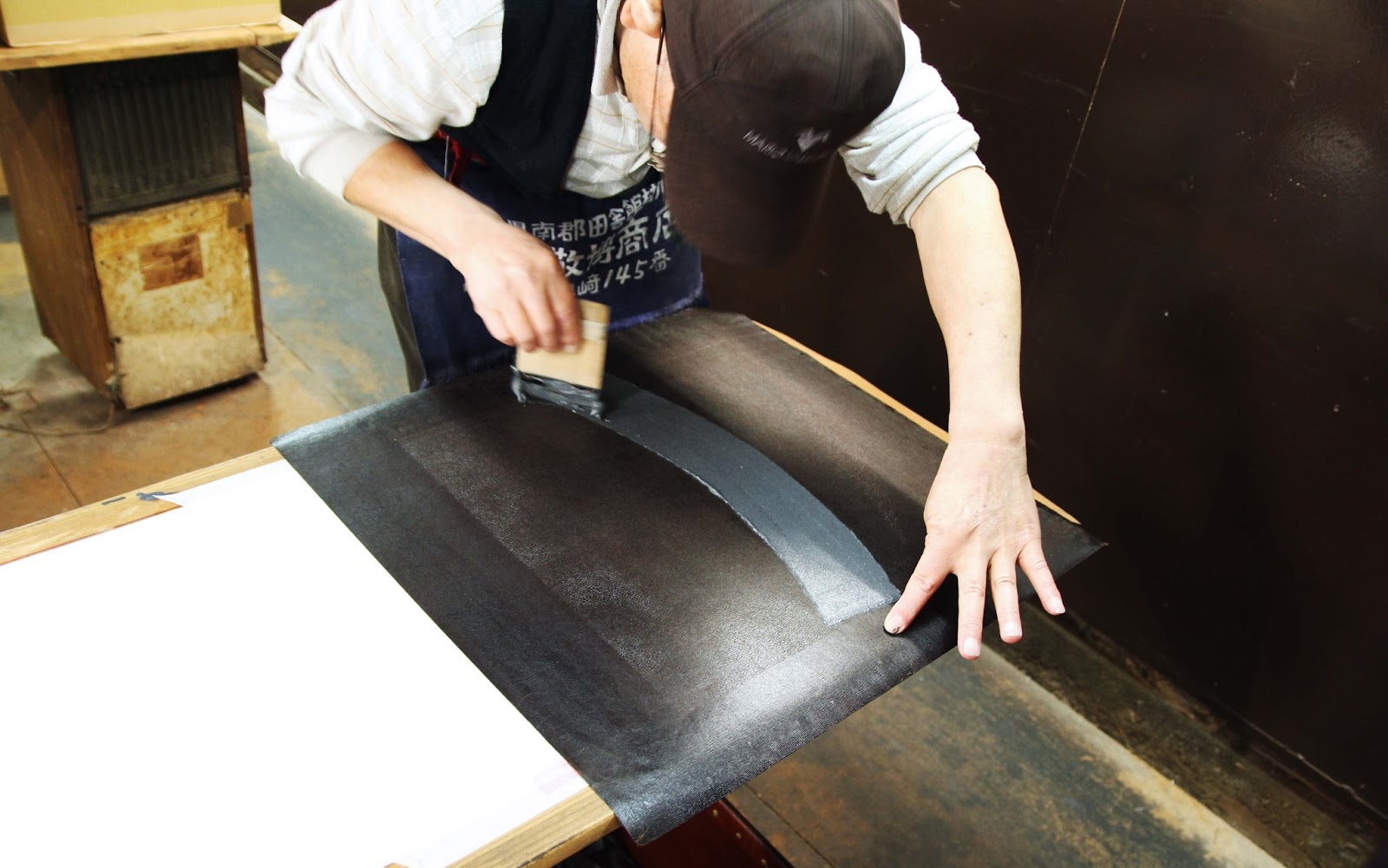
Three staff were working in the space. One was applying layers of lacquer to old stencils to prolong their use. Another was printing fabric, matching a ridiculously fine repeat pattern down a length of fabric and washing the stencil between every repeat (! they take pride in their product!)

Lacquering old stencils to extend their life. 古い型紙に漆を引いていました。 All the 5 metre long narrow pasting tables are stored overhead. Couldn't be a tall person working here!

In the middle of printing a fine pattern with coloured resist paste, very carefully matching the pattern repeat each time. You can barely even see the pattern at all here, but check out the next photo!!
小紋の糊置きの最中。毎回、柄がぴったり合うように練習が必要ですね!模様はここで見にくいですが、次のショットで見ると...

ギャー!こまかい!eeeeek! Super fine komon pattern freshly printed with a coloured resist paste.

Best of all though, was Mr Nomura. He has been with the company since he left school at 16 (I think his spine kind of gives that fact away..) and as such, he is the resident expert. He was printing when we went in, working to combine multiple fine patterns on what will become the ornate hemline of a kimono. 

最後に野村さんの仕事をお邪魔しました。16歳からこの工房で働いていたそうで、(姿勢を見るだけで分かるんですがね)小紋のプロです!見学のときは、ちょうど着物の裾の所に色んな小紋を一枚ずつ「熨斗」のデザインに入れ込んでいました。とても複雑な仕事ですが、結果はきれいですね。

Nomura-san, looking like a pro. because, well...he is. プロのしぐさですね!

Nomura san printing different patterns selectively to create the impressive effect below ↓
野村さんは小紋を部分的に糊を置くと下のような効果がでた↓
various komon patterns printed carefully within the design of "noshi" a curly ribbon-like motif in Japanese art and design.


Yasue-san surrounded by his company's products
古今の着物や帯に囲まれている安江さん


帰る前に、古今の商品が置いてあるビルを案内させていただきました。古今の複雑な工程を見たばかりので、完成品の帯や着物に感動しました。
Before heading out to a sushi lunch, Mr Yasue took us to a second compant building and showed us some of their finished products. After having seen the complex process Kokon uses to dye their fabrics, it was even more impressive to see the final products, all shiny and packaged up.

Obi with the same pattern in different colourways.
同じ柄の帯。ぜいたく!

I was really taken with the modern colour pallete they are using in their products. Without modifying the traditional process, tools or fabrics, they are giving their kimono and obi a really contemporary look just by using really unique colour combinations.

After all, this is reflected in the name of the company: Kokon. The two characters mean "Old" and "Now"; Bringing together the knowledge and expertise of the past generation and utilising it to skillfully make beautiful clothing for the generation of today.

古今でうまいことに小紋の道具、生地、素材を伝統のままにして、色やデザイン感覚だけを変えることによって、面白い染物を作り出していると思います。

「古今」の字のように、過去の職人さんの知識と技法を使って、現在の人々のテーストにあう染物をフレッシュな感じに作っている、と思います。小紋の伝統を次の世代にも伝えたらいいですね。

Wednesday, July 30, 2014

Creativity within Constraints - Kimono Design 着物をデザインする自由・規則

You may recall that I dyed my own Kimono about a year and a half ago.
You might also remember that the whole process took a full 6 months from beginning (trying to get my brain around how you even design a kimono) to end!! (holding the precisely folded, shiny, freshly sewn, expensive beast in my very own hands) 
前に振袖を染めたと覚えていますか。
六ヶ月間もかかったことも覚えていますか?!「着物をいったいどうやってデザインするんの?!」という始点から、綺麗に仕上げて貰ったものを両手に持つ終わりまでに。

my kimono. started in September 2012, finished march 2013.

They say that things which you fear are probably the things that are most worthwhile doing. There's a mild pulse of terror going through me when I admit to myself that I may want to try dyeing another...kimono *gasp! There, I said it. I'm envisioning vivid flocks of parrots streaming across the sleeves of a pale heavy silk or white Corellas on a desert sand rusty orange background...
できないだろうと思うことこそすれば価値があると言われていますね。もう一回着物を染めてみたいと思ったら、恐ろしい気分になるのはそのためのでっしょう。怖いからいい経験になるでしょうが。。。薄い色の紬に、鮮やかなインコが飛んでいる着物とか、濃い落ち葉色の生地に真っ白のオウムの群の着物とか想像したら作りたくなります。

Little Corellas in Central Australia by Geoff Thompson 
But I'm held back from committing to it by a whole array of reasons and things I don't understand.
The thing that confounds me most when it comes to designing Kimono is the dilemma that you can do anything on a kimono but at the same time, you can't. There is this push and pull between absolute freedom and very defined limitations.

でも、分からないことばっかりで、色んな理由のせいで、「作ろう!」となかなか決められないです。
着物をデザインする際に最も分からないのは、着物に何の模様でもいいだが、同時に何でもいいというわけではない、という点です。つまり、完全な自由さがあるのに、かなり窮屈な規則もあるというアンバランスを感じます

the age of the wearer determines various features of formal kimono: brightness, size of motifs, level of decoration, sleeves...and on and on... 年齢によって礼儀もかなり変わりますね。袖、色合い、模様の位置など。
Colour, motifs, size of said motifs, sleeve length, fabric type, fabric weight, location of pattern on the body, amount of decoration, lining... these are just some of the variables you can adjust to give infinite outcomes. How about that for freedom of creative expression!?

色、模様、模様の大きさ、袖の長さ、生地の種類、生地の厚さ、体に模様がどこに来るか、装飾の程度、裏地など、これ以上の可変によって無限の違っている着物も作れるわけです。

the variations are endless....着物のバリエーションは無限でしょう。
Oh, but wait, that's right! There's also rules for each of those variables. Young women wear long sleeves, older women wear more subtle patterns, unlined kimono can't be worn in winter, heavy silk is too nice for everyday kimono, spring flower patterns shouldn't be worn in autumn, a giant flower that sits right on the wearer's behind when worn is probably not a good idea, et cetera, et cetera.
それで、上の可変の全部にもルールがあります!例えば、袖の長さだと20代の女には長い袖、50代には短い袖。50代だと模様を少なめに。冬だと裏地が付いていない着物が着れない。日常生活では、上級な絹は不適切。おしりの真ん中に来るデカい花模様は考え直した方がいいなど。考えないといけないことがいっぱいあります。

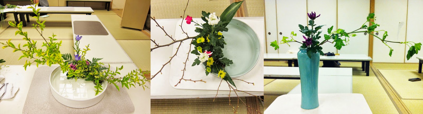
So while it seems like a creative free-for-all which then has all the fun taken out of it, this is something that is present in many art-forms in Japan. Take the example of Ikebana - Japanese flower arranging. I was actually a member of Ikebana club for one year at my university and it was the very embodiment of taking virtually any kind of flower or plant, and creating something of beauty within very strict principles.
着物はとても自由な「キャンバス」であっても、デザインする楽しさは全部ルールでおさえられると感じます。こういうコントロールは他の芸能にもよく見えます。例えば生花。生花では、様々な自然のままの枝や花を手に取って、それを決まっている形、線に従わせて、美しさを求めます。

some of my arrangements from 1 year in Ikebana club. Arrangements have to take into account curves, negative space, colours, simplicity, shape of vase....嵯峨御流の華道部に入っていた1年間の写真から。色、花瓶、枝の形、花が咲く方向などを考えないと。
We were being taught to take into consideration the natural curvature of the stems you are working with, the spirit of each of the materials, the negative space created in the arrangement, the choice of vessel, the season, the angle from which to view it...and so on.
生け花にも、色んな事を考えないといけないです。植物の季節感、枝の自然の動き、枝の間の空間、器の種類、まだ咲いていない花はどこに咲いてくるとか。

I suppose what I am saying is that I am encountering this concept of 'controlled beauty' and finding that it is not an approach that comes naturally to me. 「抑えた美しさ」という考え方はなかなか慣れないわけです。

old kimono with a pattern of books
kimono with a pattern depicting the old capital, Kyoto

Despite the rules, (in terms of kimono these are probably just perpetuated and perceived rules, not as hard and fast as some would have you believe) there are some fantastic examples of fun, unique and sometimes just plain wacky kimono even from the Edo period (1603-1867). We are so used to the serene and conservative kimono of today that some of these designs seem pretty edgey. We tend to forget that there has always been innovation and boundary pushing; in every generation.
「ルール」にもかかわらず、(着物に対するルールは多分みんな思っているよりゆるいなんですが)江戸時代でも楽しい、独特の着物の例はあります。現在、晴着の着物に慣れてきた私たちにはこういう例は結構変わっているかもしれないが、どの時代にも革新的なファションがありますね。

Some great examples can be seen in so-called 'hinagata' booklets which flourished around the 1660's to the 1820's. They were basically printed catalogues of fashionable kimono designs which were used by dyers and kimono producers as a kind of custom order starting point. The black and white line drawings give a broad design idea which a customer could then have dyed to their size and colour preferences. Some of these would have been pretty interesting if they were actually created. (These books are amazing, I think I'll have to do another post just on hingata)

「雛型本」(ひながたぼん)には色んな着物デザインが見えます。雛型は1667年~1820年ごろに刊行されました。「小袖のデザインブック」のような本で、客さんの好み等に合わせて独自の着物が作れたガイドでした。

two-page spread of fairly classic kimono designs in a hinagata book. 雛型に見える古典的な着物デザインもあるけど。。。
or how about some scholarly young boys all over your kimono!?
or a selection of caged animals? 籠に入っている動物の模様どうですか?
perhaps some swords...I guess this is intended for Men's or Boy's kimono刀の模様。多分男性用。
This design appears to be imitating imported block printed designs これは更紗に似ていない?
Perhaps some flower arrangements dancing around your back? 生花はいかが?!

When I made my first kimono, I think I was trapped by ideas of "what a kimono should be like" and also some professors seemed to be telling me certain 'rules' about kimono. But you know what, after seeing these old hiinagata and looking around me, the kimono is as diverse of a  'canvas' as it is standard. 
私は初めて着物を作った時、「着物はこうだ」と硬く考えていたと思います。でも、雛型の独特の着物やあちこち着られている着物をよく見たら、着物のなかで信じられない多様性もあります。

Anything goes: Designs 67 & 68 from this particular hinagata book, showing design options for some very extravagant hem linings.
Like any venture into a field you are inexperienced in, the more you step inside, the more you realise just how deep and vast the place is! You scrape the surface of kimono design and realise what a can of worms it is. Having sort of bluffed my way through my first kimono I am having visions of can after can of worms if I were to dye another one.
素人として新しい分野へ入って勉強すればするほど、自分が何も知らないと分かリます。着物の世界も、知識が深い玄人がいっぱい居ますし、とても複雑な勉強だと思います。初めての着物をなんだか染めましたが (ビギナーズラック)もう一回染めたら、色んな失敗が出そうです。 

I also have doubts about dyeing kimono as a foreigner. Whilst in no way do I have plans to make some kind of sloppy imitation kimono or treat it like a novelty, I am worried that people may see it as an unusual novelty, once they know I am not Japanese. This is an idea I come across often in making my work in traditional techniques and I don't think it is easily explained away or ignorable. I am still feeling with this topic and I'm still not sure how I feel about it.

Japanese fashion
foreigners + kimono. contentious. from flickr
But Kyoto is THE Textile and kimono industrial centre of Japan. Around me I have the facilities, the space, the tools, the traditional materials, the old traditional shops selling the various fabrics, the teachers with the knowledge to impart...
Perhaps it's time to take the risk of being misread and just put my parrots on a kimono. 
色んな疑問があっても、京都って染の中心地であり、作らないのがもったいないかもしれない。京都には染める場所、設備、道具やさん、生地やさんもあって、知識を持っている先生もいます。
日本に居る間にしか作れない独特なインコの着物を制作してみようかな。。。

Friday, December 6, 2013

Maida Yuzen Studio Visit - Kanazawa 加賀友禅を接する

After telling anyone that wanted to listen that I was dying to visit Kanzawa, (dyeing to?!? hahaha) I finally made it there last week. I was especially interested since learning that Kanazawa is home to a particular style of yuzen dyeing called Kaga Yuzen. (Kaga is the historic name of the region) From what I saw in books, I felt the Kaga style had some parallels to my own work so I really wanted to go and see it in real life.
長ーい間、金沢に行ってみたいと言っていた私はやっと行ってきました!金沢には「加賀友禅」という友禅技法があると知っていた以来は本物をすごく見に行きたかったです。

I managed to visit two different studios making dyed work in the Kaga-yuzen technique. The main one was Maida Yuzen, thanks to my teachers' connections. The current head of the Maida studio is acclaimed dyer Maida Kenji, and I was shown around the atelier by his son and assistant dyer, Maida Hitoshi. (check out their nice website, lots of pictures)

 
「やまあい」訪問着、毎田友禅 Maida Yuzen's Homongi Kimono, Yama-ai Motif (a kind of plant that produces an indigo colour)

田染画工芸工房にて
加賀友禅工房を二つにも行けました。一つ目は先生のつながりのおかげで行けた所だけど、もう一つは偶然通った工房でした。先に金沢にある「毎田染画工芸」という加賀友禅の工房を見学させてもらいました。加賀友禅の世界では有名である毎田健治氏の工房で、息子・弟子の毎田仁嗣さんに工房の説明をもらいました。

毎田染画工芸。三人も同じ着物に色差しをしていました。 At Maida Yuzen. Here, 3 dyers were working on filling in the detailed dyed areas on the one kimono. (split into two long lengths of fabric)
In the true Japanese spirit of having regional specialties that are only slightly different to each other (to the untrained eye?), comparisons are often drawn between Kyoto style yuzen and Kaga Yuzen even though both were borne of the innovations made by former Kyoto resident and fan painter, Miyazaki Yuzensai.
「似ていますが、地方によると少し違う」という、日本人が大好きな概念の通り、京都友禅と加賀友禅がいくつかの点では異なっていると言われています。両方は京都の祇園に住んでいた宮崎友禅斎という扇子画家による作られた技法から始まっているんですが。

Example of Kaga style Yuzen at Maida Studio. The flowers are quite realistic and painterly. 毎田工房での「加賀友禅」の例。花や葉っぱが割と絵画的ですね。
Example of Kyoto style Yuzen (Kyo-yuzen) by well-known Kyoto company Chiso. You can see its very patterned and decorative. 京友禅の「千總」の振袖。模様的で鮮やかな感じですね。
Kaga Yuzen is said to be elegant and chic as opposed to the sometimes gaudy, over embellished Kyoto yuzen. Kaga style yuzen predominantly uses patterns based on realistic and painterly depictions of flowers, plants and birds etc. The painterly effects are achieved with delicate shading which traditionally goes from light at the centre of flowers to dark at the petal tips, whereas in Kyoto (how's this for too much information?) the motifs are paler towards the edges. They also like to say there are '6 colours of Kaga' : Indigo blue, deep rouge red, chrome yellow, grass green and royal purple. Anyway, it's all part of the marketing surrounding Kaga Yuzen.
加賀友禅というのは、落ち着いていて粋なスタイルで、主に写実的な花草をモチーフにしているものです。それと、丁寧なぼかしで絵画的な表現であり、いわゆる「加賀五彩」(臙脂・藍・黄土・草・古代紫の五色)で構成されていると言われています。

Another example of Kaga Yuzen, here a black formal tomesode with patterning only around the hem by Maida Kenji. 加賀友禅の黒留袖。毎田健治の作品です。
I'm not really into drawing such clear divisive lines between techniques because they are all complementary but I was impressed by the Kaga-yuzen use of colours which you don't see in Kyoto yuzen. Maybe it's because of the above "Kaga colours" but Maida studio was using quite deep blues and purples and greens alongside more familiar pale gradients. They were also mixing gofun (white chalk powder) into their dyes as well as using it on its own to achieve matte pastel colours that really sing and flat bright white sections. 
染色の中で技法は重なったりするから、技法はを堅く分けるのがあんまり好きじゃないけれども、確かに京友禅に見えない色合いは素敵でした。「加賀五彩」という概念の影響かどうかはわからないですが、毎田友禅では、馴染みがある暈した薄い色と一緒にかなり濃い青・緑・紫などを使っていました。それと、染料に胡粉を入れる又は樹脂と混ぜるだけで使って、パステルカラー、鮮やかな色やマットの白ができます。

 
detail of Furisode (long sleeved) kimono by Maida Kenji. very vivid colours! you can also see the use of white on some of the petals. 毎田健治の振袖の部分。鮮やかな色!胡粉で白くした花びらも見えますね。

Hem section of a furisode by Maida Kenji 毎田健治の振袖
Another thing that stood out (and I'm not sure if this is unique to Maida Yuzen or if it is a Kaga-yuzen trademark) was the clever use of texture to give the design depth and interest. The way I understood it from Hitoshi's explanation was that they dye one colour, then apply small dots/texture with thinned down resist paste, then when that is dry they dye over it again with a deeper colour or a slightly different tone. The result is a duotone speckled effect that can be as subtle or bold as you choose. 薄めた糊を染めたところにおいて、そのうえにまた濃いかちょっと違う色を塗ると、面白いテキスチャを作るというやり方も面白かった。これは加賀友禅の特徴か毎田さんのところに独特かどうかはわかりませんが。
you can see some of the speckled effect on the paler blue petals. This is taken while the paste is still on the fabric, once washed the speckled effect is more dramatic. 糊はまだ付いているけど、洗うとテキスチャがもっと目立ちます。
Unlike Kyoto-style yuzen that uses quite decorative patterns and pretty typical traditional motifs, the kimono (but also panels and some small things) I saw were mostly depicting flowers and birds: dyed artistically but also with botanical accuracy. The depictions of birds were of course of particular interest to me. There weren't any bird motifs being worked on when I was at Maida's studio but there are some great depictions of birds in other Kaga yuzen pieces. 京友禅の伝統的なモチーフや装飾的な感じに対して、加賀友禅では、花・草・鳥などは生き写しとは言えないが、かなり自然に近いように描かれています。私は(もちろん!)特に加賀友禅での鳥の描写に興味があります。見学のとき、鳥のモチーフは染めていなかったが、他の加賀友禅には素敵な例が見えます。


detail of a hanging piece by Teranishi Ikkou 寺西一紘の作品
Lively depiction of cranes on a hanayome noren: Bridal Curtain. 花嫁のれんの生き生きしてい鶴たちhttp://kd-rinya.com/noren/
It was a nice little trip to Kanazawa to see Kaga-yuzen up close. It makes you realise that despite the efforts to define Kaga yuzen as very different from Kyoto yuzen they are fundamentally very similar. I think using a combination of both styles, stradling the border line would really give you scope to create some amazing work. Also, seeing the way that Kaga yuzen artists value drawing from life, realistic depiction and delicate shading gives me confidence that my own approach to yuzen is legitimate and also inspires me to rely even more on drawing from observation.  That's really the only way to create something that feels lively and authentic. And on that note, I'm off to sketch for my next work!!
金沢に行って加賀友禅を目の前に見えてよかったです。京友禅と加賀友禅を別のものにする努力があるのに、実は基本的に同じ技法だということを気づきました。両方の特徴を生かして、間ぐらいで制作したら素敵なものが作れるのだと思いました。
それで、加賀友禅の作家がスケッチ、現実的な描写、丁寧なぼかしを重視することに、自分の作品にも自信を吹き込んでくれました。これから、もっと写生したいと思いました。生き生きとした作品にしたいなら、写生に頼るしかないのではないでしょうか?それでは、次の作品のスケッチをしにいきます!!

Tuesday, June 4, 2013

Looking and Learning - Studio Visits 工房見学によってエネルギーを。

「クリエーションに必要なことは、できるだけ多くのものを見たり、体験したり、勉強したり、また遊んだり、そんないろんなことで自分自身の感性を豊かにしていくことだと思います。経験は時間やお金に変えがたいものです。一日一日すべての事の積み重ねが自分達を成長させるエネルギーです。」今井 淳裕、千總 図案家

(my own translation) "To be able to create something you need to look at, experience, study and play with a wide variety of things. I believe all of these things enrich your own sensitivities. Money and time are no match for EXPERIENCE. The accumulation of your experiences each and every day become the energy that allows you to grow and move forward." Imai Atsuhiro, Designer for Chiso, Kyoto-Yuzen Kimono Company

この言葉が机の上に張ってあります。去年、今井さんが京都精華大学で毎年開催されている「京都の伝統美術工芸」講座に発表した時にこの言葉に感動しました。確かに制作したい気持ちを持つだけのが足りないですね。日本で大学院に入ったばかりで、これからの二年間を今井さんがおっしゃったのように時間を豊かに使いたいです!ということで、この二週間に三つの工房を見学しに行って来てしまいました!

I have these words pinned up above my desk. I was able to sit in on a talk given by Imai-san at Kyoto Seika University last year as part of the regularly run course "Kyoto's Traditional Arts & Crafts". As a creator of sorts just starting out, these words really resonated with me. It's true that you can't force creation in a vacuum and something will always be lacking if you produce work with blinders on. Having just entered the 2 year master's course at Kyoto Seika, I am especially keen to make the most of my time and widen my experiences as Imai-san suggested. And so, partly by chance, it happens that I visited 3 different dyeing studios in Kyoto in the past 2 weeks.


The central garden space in Takahashitoku 高橋徳YDSの庭。素敵!
 行って見た一つ目は「高橋徳」という友禅工房。味がある伝統的なビルにあって、一階が座敷のギャラリーと友禅小物の展示室になっています。中心に素敵な庭もあります!それで、二階には素敵なものが作られています!作業中の様子が見えて、染めている着物を見たら、「細かい!」と思うしか出来なかった。防染糊としてゴム糊が使われていて、指で触ってみたら生地に何も置いていないと思うほど細かい糊の線でした。染める人々が1人ずつのスペースがあって、筆や染料が色の試し布が全部並べていた。そういうきちんと整っている作業場所を見ると何よりも羨ましかった!

The first was "Takahashitoku" a Kyoto Yuzen Dyeing Workshop that has been around for 100 years or so in the heart of textiles territory in Kyoto's west. They create quite traditional looking yuzen dyed items and work as a contractor for other kimono companies in Kyoto. It's in this beautiful old building with a gallery and shop downstairs and the magic happening upstairs. We were able to see some kimono being dyed and...just, wow! The resist lines of the yuzen were so fine that you would barely see them were they not using a blue rubber based resist paste. The dedicated workspace for each dyer, with rows of brushes and small dishes with the various colours of dye all ready to go really appealed to the perfectionist in me! I'm standing there thinking, "What am I doing in Master's?! I want to come here and just concentrate on dyeing this ridiculously detailed kimono for 6 hours straight a day!" Call me crazy, perhaps. I was also happy and relieved to see that what I thought were my shonky methods (using laundry pegs and old plastic containers etc) are totally legitimate! Well, I'm not the only one, at least. 


Laundry clips and plastic containers and creative mess is legit! Phew!! 
訪ねてみた二件目は「栗山工房」でした。京都の右京区にあって、自然に囲まれている綺麗な場所です。オーストラリアから旅行に来たイラストレーターに一緒に行きました。工房のツアーで色んな段階を見せてくれました。大きな部屋には染作業に集中している6人ぐらいが居ました。1人ずつが着物一反を染めていくらしいです。それで、糊置きの部屋も見えました。糊板がびっしり頭の上に並べていました。その時間糊置きはしていなかったですが、紙の上に親切に糊置きのやりかたを見せました。何十年もやっている手しかできない速さで丁寧に型紙を繰り返して模様を完璧にあわせました。さすが!

The second atelier I visited was "Kuriyama Kobo" a katazome studio out on the beautiful western edge of Kyoto. I went with a fellow textiles fanatic, Tallulah who was visiting from Australia. We were given a tour of the various parts of the studio. First, the dyeing area where a group of dyers were each quietly working away on one entire length of kimono fabric, kept taut on a special roller system. Clever! Also the pasting room with a very low ceiling where one man was busy smoothing a length of kimono silk (approx 12 metres) onto a sticky wooden table, making sure it remains straight and wrinkle free. This then gets left in the hands of the very skilled paster. There wasn't anything being printed while we were there but the pasting man kindly gave us a quick demo on some paper, flicking the spatula around with such confidence. The studio had a great family vibe about it, the older staff supporting fresh graduates who have recently entered the company and everyone working closely together.


The dyers at Kuriyama Kobo. I want one of these roller systems! 栗山工房の染所
Mmm, blue resist paste. They put this strong blue coloured pigment in their paste to make it easy to see. Looks nasty though. 栗山工房では糊に青いを入れています。使いやすいかもしれないが、見た目はなんか気持ち悪い。
He's never done this before. Not. 全然糊置きしたことないようね。嘘です。
perfectly matched detailed printing. 完璧にあわせた細かい模様。
apparently there are some avid bird watchers at the studio!工房の誰かが鳥が好きそうです^^
one of the dyers was dyeing a goldfish pattern. I think this was on linen. 金魚の模様が色差し中。
それでは、最後の工房はロウケツ染めの「青野工房」でした。(今気付いたばっかりだけど、3軒とも違う防染技法を使っている工房だった!)京都の西本願寺の近くにあります。1980年に工房を設立した青野保夫さんがその日居て、とても楽しい出会いでした。工房の壁にビートルズの時計やジョン・レノンの写真とかがあったり、ギターも隅に置いたというような雰囲気がある工房で作られている着物や帯は確かにカッコイイ物ばっかりです!今までに見た着物とは全然違う気がします。青野さんの性格がその鮮やかで独特なデザインに出ていると思います。

And finally, (I've just realised that I managed to visit 3 different studios using 3 different resist dyeing techniques! Go me!!) "Aono Kobo" a rouketsu-zome (wax resist dyeing) studio tucked away in the suburbs not too far from Kyoto Station, near Nishi Honganji Temple. This place was such a treat. Aono Yasuo the master of the place is such a character and we were lucky that he was there that day. The walls are decorated with Beatles paraphenalia and the bathroom has become guitar storage, The Kimono that Aono kobo produce are so different from what I have seen before and I think it's really the playful, independant attitude of Aono-san coming through in the designs. Think kimono with words like "PEACE" and "LOVE" spelled out in large abstracted lettering or flame designs or bright blocks of colour with aztec-like border designs. 
Aono-san doing his thing. Applying dye after the wax resist had been hand-painted on. ロウが筆で置いたあと、手早く染めている青野さん。
Aono-san working on this kimono influenced by city nightscapes. 
It was great to hear Aono-san talking (and laughing) about what Kimono mean to him and how others in the Kimono world may view his style as almost taboo but that making something the same way as someone else serves no purpose. He is dedicated to the traditionally held virtue of kimono, that is, beautiful to look at on display as well as bringing out the beauty of the wearer. But at he really builds on this is very playful and unconventional with the placement of design elements, use of colours and fabrics. It was a breath of fresh air to meet someone (especially someone who is Japanese) with an open-minded approach to Kimono. It gives me the hope that Kimono may be able to be kept alive and relevant to young generations.

工房の見学っていうのは他人の創造的な脳にお邪魔するのようなことだと思います。作業のやりかた、何から影響を受けているのか、生活の中に作業がどういう風にに入れているなどが見えます。そういう大切なところが見えてすごくありがたいです。この3つの工房を見に行ってから新しいアイディアやインサイトが出来て、今井さんが京都精華での発表に言った「エネルギー」も与えられたと気がします。

Visiting a studio is like going inside somebody else's creative brain. You see how they work, what they are influenced by, how they integrate their life and their creation. I'm really grateful to have been allowed to see inside these quite private places. These visits have given me new insights and ideas and the energy to move forward that Imai-san spoke about in his lecture.