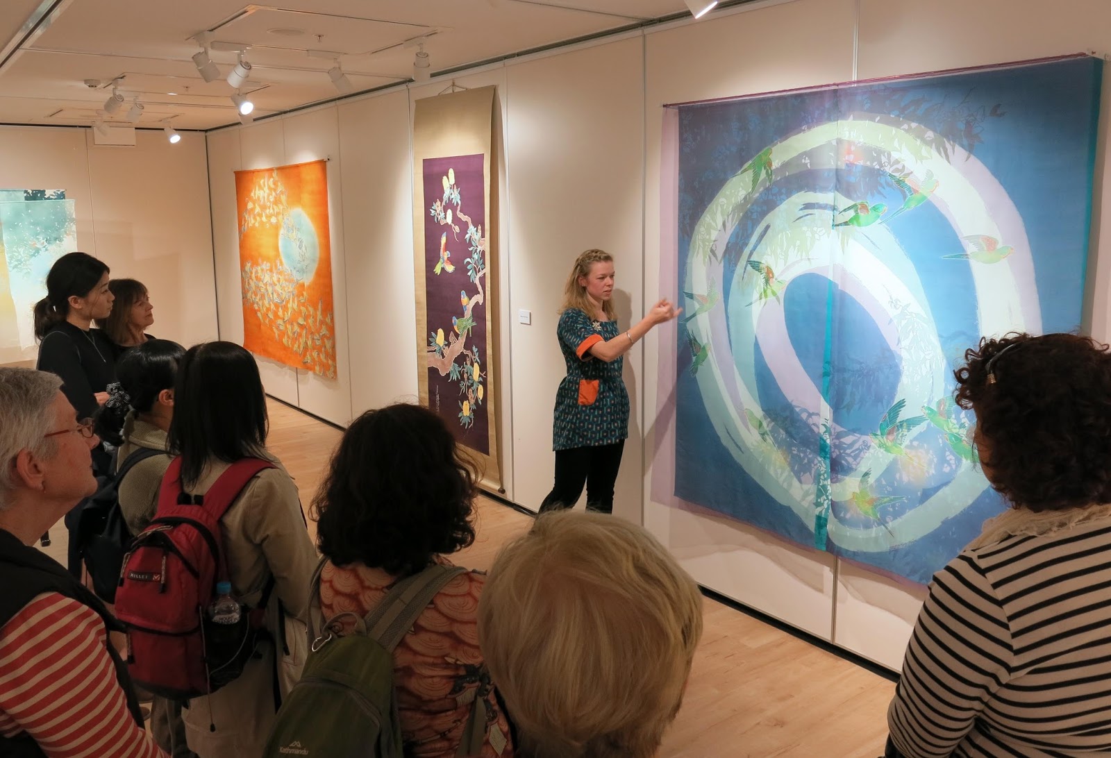
In August/September this year I was lucky enough to be invited to hold a solo exhibition of my work at the Japan Foundation Gallery in Sydney. It was titled "Somé - Dyeing the Australian Environment".
It's been a long while coming but here are some images from the show.
I made some new work for this show, a large noren for the entry to the gallery space and a series of pieces called "The Beautiful Weeds of Canberra".
Entrance to the exhibition. "A Hearty Welcome" on left
I called the noren "A Hearty Welcome", referencing its function as a gateway to the exhibition. I dyed it using katazome on hemp fabric which I sourced in Australia. Previously I'd dyed several noren but on Japanese linens which have a certain stiff feel to them and are rather open weaves so that a glimmer of the space behind the curtain is also visible. I'm yet to find a fabric with similar qualities in Australia but the hemp fabric was a new experiment using a natural looking slubby cellulose fibre. It's a little softer than I would like, as it creases easily and softens in the washing stage of katazome.
The noren was tied back during the opening event - Photo by Document Photography
The imagery I used for the stencil was of the droopy branches of Eucalyptus Cinerea (Argyle Apple). I've used them as subject matter before because I love their dusty blue-green leaves with their almost circular forms. They really lend themselves to being carved into a silhouette-y stencil.
The other new work I produced was a series I've been calling "The Beautiful Weeds of Canberra". I've become even more obsessed with weeds since starting these pieces but the idea behind them is that our natural environment is a composite of all kinds of species native and otherwise. When you look closer you realise that a good many of them are actually "weeds" but to me they are familiar parts of the landscape and also quite beautiful in their own right.
Keeping a little distance from the complex conservation and environmental problems connected with "weeds" I'm trying to just depict them in all their weedy glory - kind of weed portraits.
This is a series I will be further developing and expanding for future exhibitions but the initial weeds I've dyed are Wild Blackberry, Rosehip, Umbrella Sedges and Japanese Honeysuckle. For these pieces I used vibrant acid dyes to dye the weeds themselves - true to nature- and applied natural dyes as the background colour. I really like the russets and orange tones you can extract from local eucalyptus varieties and onion skins so I've used a combination of these against the vibrant colours of the weeds I chose.
Blackberries and Sedges - first trials in "the Beautiful Weeds of Canberra" series.
Japanese Honeysuckle - Beautiful Weeds of Canberra. A garden favourite in Japan but a creeping weed in South East Australia.
For future pieces I'm planning on featuring many many more beautiful weeds and trying to get even deeper, richer background colours. I've also started research for a series on "the Beautiful Weeds of Kyoto". It's interesting to see which weeds overlap with Australia; the weeds which we "share". It's also cool finding those species which are natives in Australia but invasive in Japan or the reverse. I think there's some deeper subject you could read into that if you chose to.
detail of "Sedges" - Beautiful Weeds of Canberra Series. 2016
Anyway, back to my exhibition in Sydney, the general response from the audience was really good. I had never shown work in Sydney, let alone so many pieces all at once before, so it was great to come across all these people who I'd never have had the chance to meet. I held a floor talk and two workshops whilst I was there too. Both went really well. It was my first time to hold workshops with so many participants but everyone was very enthusiastic and got great results.
Each participant dyed two washi postcards using powdered pigments.
looking like a pro giving my floortalk for Japan Foundation Members before the opening
during the opening
the opening
workshops underway
workshops
Participants results from the workshops. really nice!!
It would be nice to do more workshops in future, maybe on less of a tight schedule next time!
Anyway, I'm now working towards new things for 2017. A few exhibitions on the horizon so I have to get making!
Studying the techniques of Katazome and Yuzen in Japan opened my eyes not only to the unique and culturally-ingrained processes and materials of these techniques, but also to the mind-set surrounding them.; the way the finished textiles are categorised, presented and discussed.
Since returning to Australia, it's been no real surprise to see that Textiles here (with a capital T) is an entirely different kettle of fish.
TEXTILES TODAY: black and red. cardigans. berets and wine. apparently.
テキスタイルの現状なのか。服は赤と黒で決まっているみたい。もちろんワインも登場しないと。
Earlier this year I was accepted for inclusion in theWangaratta Contemporary Textile Award Exhibition for 2015. I didn't win the prize (of course, the 10K prize went to an artist already rolling in recognition and opportunities... sorry, still a little bitter...) but my work ("Canberra Blues") was displayed in a beautiful historic building along with that of 48 others!
Wangaratta Contemporary Textile Award Exhibition 2015
my work displayed beside beautiful wooden doors and stained glass
The exhibition really had a bit of everything
I was unable to attend the opening (Wangaratta is over 400km away from Canberra...if only Australia had Bullet-trains!) but went down later to see the show on display. I was really impressed with the breadth of textiles included. There were a few pieces that I wasn't too sure about, like miniature origami units of patterned envelope insides forming a large wall piece (how is that a Textile?) and a ceramic Budgie with a pair of "budgie smugglers"(speedo's) tossed on it's head (Yes, I can understand the Textile in that one but not the point...)
Anyway, I thought the selection committee and organisers had done a really good job of representing the many facets of what it means to make Textile Art. There was a bit of everything; and all of a really high standard. It felt like each piece had something to say. But contemporary Textiles is not always so well represented or carefully curated...
Wangaratta市美術館。煉瓦の本館は元々教会だったらしい
The Wangaratta Art Gallery heritgae building with lovely
red-brick, stained glass, high ceilings and polished wooden
floors. Apparently it used to be a Presbyterian Church.
I may be about to offend people...but I need to say it anyway.
What's with the way that Textiles is a Naff-magnet? (naff is such a great word...)
Other genres of Art, let's take Painting as an easy example, may attract masses of mediocre artists or uninteresting paintings. There may be plenty of ordinary Print-makers or average Sculptors, or maybe uninspired Photograhers. But Textiles, unlike the others, seems to have this unrivaled ability to generate the Naff. The Tacky. The just...not quite right.
This is probably in part because of the way that Textiles teeters on the cusp of "Art" and "Craft" (whatever they are anyway) and seems to encompass such a huge breadth of things. I'm all for diversity in Art, and in Textile Art. I'm all for using whatever medium or technique allows you to express yourself best. But I can't be the only one who is sick of the fluffy reputation hanging round Textiles. What's the deal?!
What spurred this rant was when I made an attempt to connect with the Textiles scene outside of Japan by joining some moderated groups on Facebook. One is called "Textile Arts" which purports to showcase Textile ART, to the point of declaring this mission statement,
"Our mission: To elevate textile fine art beyond the craft arena into the realm of conventional galleries. View the latest works from both well known and emerging artists.
and they even show this visual guideline for prospective posters. And yet....
...I am constantly awed by the, shall we say "variety", of posts to the group.
Textile "art" posted to the group
I'm sorry but WHAT THE?
Don't misunderstand me. I'm not trying to make an arrogant proclamation that MY TEXTILES IS THE ONLY WAY or DOWN WITH CRAFT!
But I think the way Textile Art is spoken about is confused.
To put a Textile in the Art basket, I think it needs to be addressing an idea; trying to say something of value. I think this is why I was so impressed by the Wangaratta exhibition, the artists all had something unique and interesting to say with their work, and that made it interesting!
View Denise Ferris' website here → http://www.deniseferris.com/
Denise Ferris, an Australian artist, Photography Lecturer and current Head of the ANU School of Art comments in a recent article about focusing on technique versus saying something with that technique.
Denise.."specialises in nineteenth century photographic techniques, but says it’s important not to get too caught up in the technical aspects of photography.
“For us (Canberra School of Art practitioners) it’s never just about the skills, it’s about the body of work that talks about concepts through materials,” says Ferris.
“I practice these old world techniques, but I’ve never practised this for the skill itself. I’m only interested when it’s parlayed to a concept or an idea, and is about pushing those ideas further.
“That might not seem so revolutionary, but I think...this research and practice mentality is something different for [other Art Schools]”
With this way of thinking, quilts, knitting or felting could be quite welcome on "Textile Art"s Facebook page - but only if they are exploring or untangling some kind of idea.
This Artist Luke Haynes might be onto something. I still have reservations but at least he is pushing the envelope and creating quilts that are more like contemporary art. Maybe it's something he can get away with because he's not a woman. Also, he graduated from Cooper Union, which is supposed to give him instant hipster Art street-cred. Youtube Link
Or perhaps this quilt of a $10,000 note by Nina Paley is on the right track. It ticks the conceptual box... but I disagree with her opinon about high art being a price tag issue.
Having said all this, I'm not sure an exclusive mindset is beneficial for Textiles practice. It doesn't leave room for the talented makers with amazing skills. Nor does it leave room for Textile-ans who are still finding their voice.
But it sure would be nice for a change if Textile Art could lose it's fluffy reputation.
The magic moment comes when the resist paste is washed away to reveal your completed design. This final step in the process is when you really feel a sense of satisfaction and it's what excites you to move on and create the next thing. The tickle of motivation to do it all over again.
This was the idea behind the title of "resist & reveal", an exhibition of works by myself and Amy Kerr-Menz which we held from September 23rd to October 5th in Canberra. Amy and I both studied Textiles and Japanese at ANU, where we met, and we both later went on to spend one year on exchange at Kyoto Seika University, Amy in 2007 and myself the following year. What we met on exchange was the technique of katazome, stenciled paste-resist dyeing. 「防染糊を洗い落としたら、魔法のように染めたデザインがやっと現れる。この段階は工程の最後で、満足感を感じる上に、次の物を作りたい気持ちも湧いてくる瞬間なのだ。」 こういう気持ちを踏まえて、「resist (防ぐ)& reveal (現れる)」という二人展を エイミー・カーメンズと一緒に開催しました。オーストラリア国立大学の美術学校の中にある「FoyerGallery」で9月23日~10月5日まで展示しました。エイミーさんと私はオーストラリア国立大学で同じ日本語とテキスタイルコースに入ってから出会いました。2007~2009年、一人ずつ京都精華大学で交換留学生として一年過ごしました。私たちは京都精華大学で「型染」に魅力されました。
In this exhibition we brought our different artworks together in the ANU School of Art's Foyer Gallery space. I displayed my "Degradation"series of 3 works "Daimonji & Black Kites" piece, my round work "Loss & Worth : Orange-bellied Parrots"and one small recent work depicting Eucalyptus leaves. (See more images of these works on my website) 今回FoyerGalleryにて、型染と友禅染めの作品を一緒に展示しました。私は6点を出品していました。ウェッブサイトで写真が見えます)
One view of our exhibition "resist & reveal" at the ANU Foyer Gallery, Canberra. Sept 23-Oct 5 2014. photo (c) Andrew Sikorski 2014 入り口から展示の風景
Amy had many of her beautiful hand cut katagami stencils on display, including a series based on Kyoto urban scenery, a series of geometric patterns and (my personal favourite) intricate katagami of repeat patterns formed by repeated hiragana characters (a, i, u, e, o). エイミーさんは細かくて美しい型紙をたくさん展示しました。その中、京都らしい絵的な型紙シリーズ、幾何学的な模様の型紙シリーズと、写真に見えるひらがなを繰り返している模様的な型紙シリーズ「あいうえお」もありました。
amazing hand-cut katagami stencils by Amy Kerr-Menz which are patterns formed using repeated Japanese hiragana syllabry. エイミーカーメンズさんによる繊細な型紙シリーズ。ひらがなの一文字をアレンジした模様になっています。
If you couldn't read Japanese, you wouldn't know these are hiragana all rearranged. And because the patterns are beautiful on their own, often even those who CAN read Japanese don't pick up on it at first. 日本語が読めない人はひらがなでできている模様だと気づかないうえ、日本人でも最初は気づかないのが多いです!写真の手前に見えるのはひらがなの「あ」ですね。 Amy also displayed a series of her most recent dyed works, using a palette of natural dyes and the katazome technique. These were dyed on washi paper and depict Australian Native flora combined with the first letter of their scientific name.
The careful set up process 気を付けながら展示していたところ
Amy Kerr-Menz's dyed flora series 2014. photo (c) 2014 Andrew Sikorski
We had a great turn out to our opening event on the 23rd of September. It was so nice to show my work to an Australian audience for a change and to experience a real exchange of ideas and interactions that is often lacking between Japanese artists and other artists/the public. I got some great compliments you'd never get in Japan like, "Mesmerizing!" and "Amazeballs!"
オープニングパーティーは思ったより人が来てくれて、盛り上がりました!来た皆さんに感謝!英語で客さんや他の作家さんと喋ったり、アイディアを交換したりがいいねと思いました!
The opening reception for "resist & reveal" on 23rd Sept. Cheese, sushi, nama-yatsuhashi and wine were an amazing combination! オープニングにて、「巻きずし・ワイン・生八つ橋・チーズ」という不思議な盛り合わせで乾杯しました。
Jill Mowbray-Tsutsumi from the ANU kindly opened the exhibition for us! オーストラリア国立大学のJill Mowbray-Tsutsumiにオープニングスピーチーをしていただきました!
Galleries tend to be small in Japan so exhibiting in a larger more open space for a change was also refreshing. The ANU's Foyer Gallery is glass-fronted so that you can see into the show as you are approaching the gallery but it also lets you see a backdrop of gumtrees and blue sky out the windows and lets in a lot of natural light. 日本のギャラリーは狭いがちなので、自然光で溢れている広々した空間で展示するのが新鮮でした。美術学校のFoyerGalleryはガラス張りので近づくと中の作品が見えるし、中から外へ見ると、ユーカリとか青空が見えていい感じです。
近付くと作品がちょっと見えてくる。The all-glass back entrance to the Foyer Gallery means the artworks are visible from the outside.
...it also means that there is plenty of natural light during the day それで自然光が結構入る
The Eucalypts outside also form a nice backdrop! 外のユーカリも背景になります!(c) 2014 Andrew Sikorski
We also held an artist's talk as part of the ANU School of Art's Art Forum free lecture series on October 1st. It was great to be able to show the techniques we use to people who had mostly never seen them before.
期間中にも、美術学校のレクチャーシリーズ「Art Forum」でアーティストトークをしました。糊防染の技法について殆ど知らない人に説明ができていい経験でした。 And so, after a few Aussie adventures (mostly culinary) We packed the show up again and I'm back in Kyoto. I had virtually no downtime and spent the last month making new work which went on show in a new exhibition this past weekend!! 無事に終わって後、次の日に京都へ戻ってきました。休まずに制作に飛び込んで、あっという間に次の展覧会が始まりました!!
This time, it's a big exhibition with 5 other young dyeing artists and myself. We were selected by our professors and come from Kyoto, Tokyo, Hiroshima and (obviously) Australia. Our common thread (textile pun!) is that we all use resist dyeing techniques but all in very different ways and not necessarily in the traditional sense. Below is a (ahem...classy?!) video where you can see some of the gallery setup and artist's talk but it's on until November 24th so if you have time, please check it out!
今回、京都にある染め専門ギャラリー「染・清流館」で5人の若い人と一緒に展示しています。鳥羽先生に推薦されて嬉しかったです。京都へ来た以来、よく清流館の展示を見に行ったりしたので、長い間憧れたギャラリーでした!
6人の出品者は皆「防染」の技法を新鮮な気持ちで使っている若い作家さんです。ビデオでちょっとだけギャラリーの風景が見えますが、11月24日までにやっていますから、時間がある方ぜひ見に来てください!