Showing posts with label dyeing. Show all posts

Monday, December 11, 2017

2017 - a hectic year of TRYING

Wow, how is it already December!?

Apologies to my sadly neglected blog but this year has been a heck of a ride.

In looking back over all the things I've done and struggled with this year, I suddenly had a (mildly incensed) urge to write it all down and make sense of it before another year rolls around.

Let me paint a picture of the hectic year just gone.

→ I dyed a commissioned noren (split curtain) for an Australian Tea-master who lives up in Newcastle with his own tatami-floored tea-room. It's a homage to spring with magpies, which also happen to be the emblem of the area where he studied Tea.

privately commissioned Noren featuring Australian magpies

→ I started making textile jewellery that I've called tameshi, using trial dye samples and un-used edges from dyed works. These have been proving popular and I feel good about the fact that they are mini artworks in themselves and re-use fabrics that I would have thrown away or put in a box somewhere.

Tameshi jewellery - tameshi means sample or test. Available through stockists in Canberra and on my etsy store https://www.etsy.com/au/shop/someru

→ I sent work to a group show by dyeing artists in New York. As the only artist out of the group who wasn't Japanese, apparently people said mine looked the most Japanese! With all the deadlines for later in the year, I didn't manage to get to go the US to see the show but still, it felt like an achievement.

My series of 6 yuzen/katazome dyed works on display as part of "Wafting II" at Medialia Gallery in New York, June-July 2017

→ I participated in a four-day residency out at Tidbinbilla nature reserve thanks to Craft ACT. Four of us selected artists got to stay in a newly renovated cottage inside the reserve and spent four lovely sunny days at the tail-end of winter hiking in the bush, sketching, writing and sharing tales over cheese and wine.

The delights of early spring at Tidbinbilla - Gibraltar Peak, Early Nancy, Flame Robin.

→ I travelled to Japan and held a solo exhibition in Galerie H20 in Kyoto. My first solo show there in 4 and a half years, always a joy to be there and to catch up with so many friends and new connections.

entryway and Japanese garden at Galerie H20 in downtown Kyoto

view of solo show at Galerie h20, October 2017

→ Whilst in Japan I made time to visit and interview a bunch of great humans, friends new and old who are doing innovative and interesting dye-work. The plan is to write up a series of interviews from all the meetings and I've created a new project Somé 20:20 to house them and to move forward with. It's a reference to being able to see clearly - without acknowledging tradition how do we move forward? and how will dyeing art survive into the future, 2020 is just around the corner. A work in progress, my new website for the project is over at some-20-20.com

the wonderful people who agreed to be interviewed for my Somé 20:20 project.

→ I came back and setup another solo show at ANCA gallery in Canberra! The theme of my works this year have been "beautiful weeds", and I managed to create some new works that are really where I've been wanting to head for a while now; layered and sheer works that are a new form of collaged landscape.

Solo Exhibition "Naturescapes" at ANCA Gallery & Studios, Canberra, Oct-Nov 2017

detail of "The Beautiful Weeds of Canberra" series, on show at ANCA Gallery, Canberra

→ I ran workshops and demonstrations in dyeing at the 2017 Canberra-Nara Candle Festival. For the demonstrations, I dyed a massive 9 metre length of resist-printed cotton in one go while a crowd watched and revealed pattern and birds and text as I went. The workshops saw nearly 100 people dye their own kata-yuzen bookmark using pigments and stencils.

Kata-yuzen workshops and Hikizome demonstration at the Canberra Nara Candle Festival, October 28, 2017

→ I ran another afternoon of workshops on the last day of my exhibition, dyeing katazome postcards. Participants could dye pre-printed washi and wash away the paste to reveal the patterns. We had great warm weather and it was a lovely bunch of enthusiastic people who came along.

wonderful postcards dyed by participants, drying on the outside windows at ANCA

→ I even had an article published in the Kyoto Journal, on katagami stencils.

Kyoto Journal, a volunteer-run publication, making a return to print from this issue.
It's great! you can get your hands on a copy here


PHEW!

What this run-sheet doesn't show is the sleep-deprivation, self-doubt, expenses, rejection letters, missed deadlines, extensive preparations, hours spent at a day-job and the constant juggle.

On paper, (or in digital text, I suppose) this looks like a hugely successful year. In a sense it was.
But it was also really, really hard.
I don't think this level of productivity is sustainable, or even very enjoyable.
I also didn't really sell much art. Not through exhibitions.
Where I really made progress and, to some extent, a profit, was through connecting with like-minded people, through making custom pieces, through sharing affordable things, and through trying to promote the unique genre of Somé.
Which has me re-thinking my approach to all of this.

Given that my work places me in a sort of odd position in between ART, CRAFT & RESEARCH, (odd in the sense that I don't fall neatly into funding categories or job titles) I'm thinking that instead of struggling against that and trying to slot myself into prescribed categories, why not embrace it?

Can I be a CRAFTISAN?
Can I be a RESEARCHIST?
Can I be a CRAFTIST?

I'm tired of feeling like my specialties (being able to dye pictorial textiles, being interested in craft, being knowledgeable about tradition, having Japanese abilities -though not bilingual by any means, being interested in smaller, affordable art) are a liability, or something I need to adjust so I can be in the same game as everyone else. And of feeling like my particular set of skills don't add up to anything. When in fact they do! and they are a killer combination despite what the grants categories, arts bodies, or professional membership organisations would have me think.

So consider this my personal passion project for 2018; finding a way to be my own kind of craftisan, pursuing research and researching through making.


Thank you for putting up with the silence on this blog but do feel free to check in over at my website and project site to see what things I get up to in 2018.

Wednesday, March 29, 2017

"Translating" a Technique in a Different Country - Katazome in Australia

It's been 8 years since I first tried to replicate katazome resist dyeing in Australia. After spending a year on exchange at Kyoto Seika University during my undergraduate studies, I'd come back with a burning enthusiasm to try and see if the same technique could be achievable with local supplies. It turns out, yes - but with much modification.

When you start to look at traditional crafts without applying the lens of "sacred and untouchable", you find at the core of it all a basic process that utilises a series of specific tools and ingredients to achieve a beautiful end result. The gadgets and materials that have come to be synonymous with a particular traditional craft (think shibugami stencil paper with katazome) have only obtained that status because they've developed over time in line with that culture and with other industries developing simultaneously.

What I mean is,
Dye brushes at Kuriyama-kobo, a katazome company
on the western edge of Kyoto
why would katazome use deer-hair brushes? Probably because 1. there were deer around and 2. an industry already existed making deer-hair brushes for use in traditional painting. Why would one utilise thin rods of bamboo with sharp spikes at the end to stretch fabric taut? Presumably because bamboo was already being formed into products for other purposes at the time. Katagami stencil paper could not have developed without the existing Japanese skills in washi papermaking - from which the stencil paper is made.

Very traditional stencil paper - shibugami
The thing is, if we look at the technique of katazome as it stands now, there is a very polished, established and institutionalised way of practicing it. It is basically understood to involve a set of specific tools and materials (mochi rice flour, komon rice bran, stencil paper, soybean & seaweed derived fixative). These are presumed to be the ultimate, most refined and correct way to achieve the best results. Of course it is fair to think that. These are not tools and materials that are used by accident - they have gone through a few hundred years of use and modification.

Whilst there is now some deviation from these very traditional and quintessential ingredients and processes, like a modified plasticised stencil paper or a chemical pre-dye fixative, there is still a very set way of doing things.

Newer plasticised stencil paper
How about if you want to use katazome in a country where those quintessential tools and materials are not only unavailable, they're simply not part of our culture. Bamboo, deer hair, rice flour and washi paper have only, if at all, recently been part of our vocabulary let alone available to purchase. They simply aren't part of our natural environment or resources.

Applying shinshi stretchers to long narrow fabric

So okay, why not seek to uncover what function these ingredients and tools perform within the katazome process and utilise something locally available to perform the same task?

Instead of lamenting that shinshi (bamboo fabric stretchers) are unavailable in Australia (they have no reason to be; historically we've never needed to be able to stretch a narrow kimono-width fabric out to dry) why not consider what function they are performing (stretching the fabric taut whilst leaving the back side accessible) and seek to replicate that function? A wooden frame with pins to hold the fabric out taut performs the same function. Of course, this is not as flexible as the centuries-tried-and-true shinshi approach but it is a workable solution.

Funori - looks natural and traditional, I guess
Manutex - not pretty but same stuff on the inside
Alright, what about the funori  - a seaweed derived gloopy thickener used in the pre-dye fixative? Well, if you get down to the nitty-gritty of what's actually in that stuff, you'd find that it's the same seaweed gloop that we use as a food thickener in Australia and it also already exists as a substrate for use in screen printing. Powdered "Manutex F" does not have the same natural look or roll off the tongue as nicely as funori, sure, but it performs the same basic function. 

And so you can continue with all the necessary tools and ingredients in the hallowed katazome tomes and see what can be used to achieve the same result.


For some ingredients the swap is simple. Others are proving more difficult. Soft, dense dye brushes, fine de-fatted rice-bran, water erasable ao-bana ink.... But it is really just a matter of thinking outside the box. To be able to source tools and materials locally would be the ideal situation. Not to remove the technique from its Japanese roots entirely, but to make it viable.


There are many specialised businesses in Kyoto, for example, which have operated as family-run enteprises for some hundreds of years. They each have their own niche of the textile process to support; the nori (resist paste) manufacturer and shop, the shinshi (bamboo stretcher) specialist, the kimono-width silk salesroom, the specialised craftsmen making circular punches for intricate stencil carving...More and more these businesses are struggling to survive. With the demise of the kimono as daily and common wear, these businesses that thrived and supported the kimono industry now have little patronage to subsist on. If I were still in Kyoto, I would continue to support these businesses with my own hard-owned yen and utilise them in my artwork but I fear even that is simply not enough.

Just one example of the many kimono industry support businesses that are often now finding it hard to stay afloat

If, and it would seem likely, these businesses continue to shut-down, there is no-one left to make the traditional katagami, to bulk-produce batches of nori paste, to make specific lengths of shinshi, to craft tiny sharp circular punches. Like any loss of knowledge and skills, this is tragic, it really is. But this is the way it goes. Crafts are only in demand so much as they are an active and necessary part of our daily lives. Without that demand, they become obsolete. There are many example of innovative companies and individuals who are thinking outside the box to continue supporting Kyoto's craft industries and make them relevant to today's society (these are something I plan to touch on in future) but I think we also need to be realistic. Whilst continuing to support traditional industry where possible, I think we need to start accepting that there are alternatives, so that the techniques can actually survive - even if some of the tools cannot.

It seems to me that in the end, even if it means modifying many of the components of the technique, having the ability to actually practice the technique at all, and see it survive into the future is the best way to honour tradition.

A tradition is kept alive only by something being added to it. - Henry James

On that note, I'm off to continue testing out new resist-paste recipes!

Monday, November 28, 2016

Somé - Dyeing the Australian Environment

In August/September this year I was lucky enough to be invited to hold a solo exhibition of my work at the Japan Foundation Gallery in Sydney. It was titled "Somé - Dyeing the Australian Environment".
It's been a long while coming but here are some images from the show.


I made some new work for this show, a large noren for the entry to the gallery space and a series of pieces called "The Beautiful Weeds of Canberra".

Entrance to the exhibition. "A Hearty Welcome" on left

I called the noren "A Hearty Welcome", referencing its function as a gateway to the exhibition. I dyed it using katazome on hemp fabric which I sourced in Australia. Previously I'd dyed several noren but on Japanese linens which have a certain stiff feel to them and are rather open weaves so that a glimmer of the space behind the curtain is also visible. I'm yet to find a fabric with similar qualities in Australia but the hemp fabric was a new experiment using a natural looking slubby cellulose fibre. It's a little softer than I would like, as it creases easily and softens in the washing stage of katazome.

The noren was tied back during the opening event - Photo by Document Photography
The imagery I used for the stencil was of the droopy branches of Eucalyptus Cinerea (Argyle Apple). I've used them as subject matter before because I love their dusty blue-green leaves with their almost circular forms. They really lend themselves to being carved into a silhouette-y stencil.


The other new work I produced was a series I've been calling "The Beautiful Weeds of Canberra". I've become even more obsessed with weeds since starting these pieces but the idea behind them is that our natural environment is a composite of all kinds of species native and otherwise. When you look closer you realise that a good many of them are actually "weeds" but to me they are familiar parts of the landscape and also quite beautiful in their own right. 

Keeping a little distance from the complex conservation and environmental problems connected with "weeds" I'm trying to just depict them in all their weedy glory - kind of weed portraits.


This is a series I will be further developing and expanding for future exhibitions but the initial weeds I've dyed are Wild Blackberry, Rosehip, Umbrella Sedges and Japanese Honeysuckle. For these pieces I used vibrant acid dyes to dye the weeds themselves - true to nature- and applied natural dyes as the background colour. I really like the russets and orange tones you can extract from local eucalyptus varieties and onion skins so I've used a combination of these against the vibrant colours of the weeds I chose.

Blackberries and Sedges - first trials in "the Beautiful Weeds of Canberra" series.

Japanese Honeysuckle - Beautiful Weeds of Canberra. A garden favourite in Japan but a creeping weed in South East Australia.

For future pieces I'm planning on featuring many many more beautiful weeds and trying to get even deeper, richer background colours. I've also started research for a series on "the Beautiful Weeds of Kyoto". It's interesting to see which weeds overlap with Australia; the weeds which we "share". It's also cool finding those species which are natives in Australia but invasive in Japan or the reverse. I think there's some deeper subject you could read into that if you chose to. 

detail of "Sedges" - Beautiful Weeds of Canberra Series. 2016
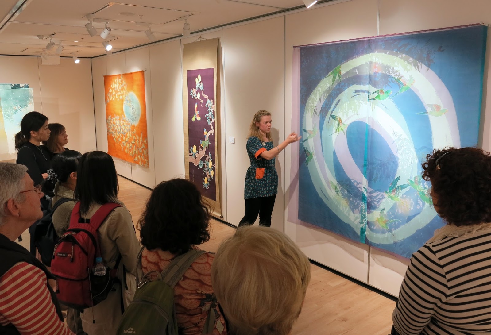
Anyway, back to my exhibition in Sydney, the general response from the audience was really good. I had never shown work in Sydney, let alone so many pieces all at once before, so it was great to come across all these people who I'd never have had the chance to meet. I held a floor talk and two workshops whilst I was there too. Both went really well. It was my first time to hold workshops with so many participants but everyone was very enthusiastic and got great results.
Each participant dyed two washi postcards using powdered pigments.

looking like a pro giving my floortalk for Japan Foundation Members before the opening

during the opening

the opening

workshops underway


workshops

Participants results from the workshops. really nice!!
It would be nice to do more workshops in future, maybe on less of a tight schedule next time!

Anyway, I'm now working towards new things for 2017. A few exhibitions on the horizon so I have to get making! 

Wednesday, September 28, 2016

Somé no Bunka - Fukumoto Shigeki's introduction to the unique magic of Somé

It took me many months to read, but I successfully worked my way through a book by Japanese artist and researcher Fukumoto Shigeki called "Somé no Bunka", or "The Culture of Dyeing".

Part of the motivation behind my exhibition (and especially the choice of title) last month at the Japan Foundation in Sydney was to introduce more people to the genre of somé. Somé means 'dyeing' in Japanese and the term separates it from other forms of textiles. 

In Japanese it is common practice to divide the field of textiles into dyeing and weaving (somé & ori 染め、織り). The name of the textiles course in many Japanese universities is senshoku (dyeing and weaving 染織) which is the just a different reading of the characters for somé+ori.

Somé is different from weaving, obviously, but it is also distinct from surface design or 'textiles'. It's a complicated division and of course there are overlaps but Fukumoto's book reiterates the unique history and way of thinking behind Somé.

Fukumoto is a practitioner and proponent of Textile dyeing. His own work is diverse but is characterised by free-form dyeing with gradations, folds and wax resist.


This is a beautiful video showing him and one of his techniques. I have to say it's a little bit contradictory to the things he says about flatness and tactility but it's interesting nonetheless.


I thought I might translate a few short passages from Somé no Bunka here for you. (Please excuse the Engrish-y feel of them!)

Preface
"There is a curious pleasure to be found in dyeing work, almost without realising. It’s something you sense during the actual work of the dyeing process; a joy perhaps only privy to those who’ve tried it. 

There’s the feeling of pleasure when impurities and excess dyes are washed away. Or in the final rinse, one feels a sense of accomplishment as the dye stops running from the fabric and the water runs clear.
You see the vibrancy of the dyed colours in the soaking fabric.
Relaxing the fabric with steam, it becomes supple and fresh again.
Touching the freshly dyed fabric, and knowing it is clean and clear of impurities is a joyous moment.
As well as the many possible dye-effects, there is a satisfaction in knowing the finished artwork is still simply a single piece of cloth. 
There is a joy not simply the making of the work, but also in the sensation of touching it with the skin.
I question that perhaps I enjoy this too much."

Regarding mounting textiles ↓

"Dyeing requires cloth and dye. 
Unlike painting with pigments, for example, dyeing is borne of the need to fix colour onto cloth without spoiling the fabric's characteristics. 
That is, the basis of dyeing is using methods that don't alter the feel of the cloth.

If you go and frame or mount a dyed piece of fabric, it becomes a flat artwork. That piece of cloth is transformed into a mere surface and it loses its meaning as a soft, pliable cloth.
If it's an illusory flat surface you want, what's wrong with using canvas, or paper, wooden board or a wall?
If you insist on using fabric even though the final product will be hard and flat, what's the point of going to all that trouble dyeing it to maintain it's fabric qualities? You're probably not interested in the tactility of the cloth - the direct interaction with the skin.
 In which case, your choice to insist on using fabric is nonsense."

- YEAH! you tell 'em Mr Fukumoto!

He also goes into a lot of depth regarding the relationship between Japan's dyeing history and culture and European and American understandings of dyeing. He is particularly scrupulous about the Surface Design Association in the U.S and their development from a weaving-dominated association to one that covers all kinds of textiles. I think Australia went through a very similar progression, from crafts-based textile skills, to 1960's/1970's free-form fibre-work and dyeing to a contemporary Textile scene we see today.

Though Dyeing tends to be subsumed under the heading of Surface Design in Australia and the U.S, Fukumoto maintains that Somé and Surface Design are not one and the same. He advocates using the word Somé as an alternative, to avoid the inevitable connotations of words like Textile Design, Surface Design or Fibre Art.

He's actually quite adamant, "Sashimi, Karate, Anime and Shibori are already incorporated into our internationalising vocabulary. Why not just call it Somé? Japanese dyeing culture is highly regarded around the world. If people are so enthusiastic about learning those traditions and skills, first they should just use the word Somé!!"

I would love to share more of his writing in future posts - but for now just these tasters!

-- keep an eye out, I hope to post images from my exhibition in the near future!

Saturday, July 30, 2016

Solo Exhibition Coming up soon! Somé: Dyeing the Australian Landscape

"Somé: Dyeing the Australian Environment" will be on show at the Japan Foundation Gallery in Sydney from August 13 to September 17!!
It's a large space to work with and it means I can show some of my older works alongside new ones - all incorporating varying ratios of Australian imagery x Japanese dyeing techniques. 

I titled the show "Somé : Dyeing the Australian Environment" to emphasise a few things.

One is that I've been coming more and more to the conclusion that the term Textiles, in the manner that it exists in Australia, doesn't fully explain the work I do. I don't mean that in an arrogant way like "I'm so unique, the categories don't apply to me". I mean that the term Textiles in a bit misleading. I don't think just saying "dyeing" comes across the right way either. Especially with the surge of popularity in Natural dyeing and "eco-dyeing" in the last few years, perhaps the wrong image of simmering fabric in a pot is what people will think.

Somé (pronounced so, as in socks and me as in melinda)
means "dye" or "dyed work" and in Japan that is understood to include all manner of dyeing work - wax resist, paste resist, dip dyeing, natural dyes, hand painted dyes - plus more.
Textiles in Australia tends more to refer to woven, embroidered, printed and sculptural fibre-work. Though there are plenty of artists using dyeing as their medium in Australia, I don't know that the term Textiles alone describes pictoral dyed textiles.

It would be a whole lot easier if the term somé just existed in English!
There are already plenty of Japanese words bouncing around in everyday English. How about karate, sushi, manga, tempura, wabi-Sabi, bokeh and lately even Kaizen and Kintsugi! Why not add a new concept to the import list? After all sometimes a word in another language just does a feeling or concept better justice. 

So I titled the exhibition to reflect that aspect of textile work that doesn't tend to feature for Australians.

Also, it's about the Australian environment - and more broadly, imagery of Australian nature. When I first started learning katazome, my first urge was to mix in some Aussie influence - parrots, english lettering, rusty orange and bright blues. I think I went a bit too far in those early works on the "cheesy scale" but the same intent still remains: I want to show what the techniques can do when turned toward a whole new set of imagery and cultural connotations. 

Instead of plum blossoms and sparrows or cranes and pine trees, my works depict Rainbow Lorikeets and Banksias, Cockatoos and Gumtrees. In place of subdued landscapes with bamboo or chrysanthemums, I'm dyeing vibrant colours of wild-flowers and dry grasses.

I'm excited to be showing so much of my work all at once in Australia, especially in Sydney where I've never had the chance to do so before. I've also been lucky enough to get a grant from ArtsACT which means I can be present at the opening and run a couple of workshops too!

You can see the information about the exhibition here:
http://www.jpf.org.au/jpfevents/16-some/index.html


Sunday, October 18, 2015

One last Studio Visit - Edo-style Komon Dyeing 工房見学 ‐ 「古今」 江戸時代の小紋を守りながら、現代の染色を作り出す

**This post is really going back now...I visited this studio over 6 months ago! I was so warmly welcomed there though, that I at least owe them this blogpost...better late than never!**

In the last weeks of my big Kyoto Adventure, I was invited out to visit a dyeing Atelier in the west of Kyoto called "古今 Kokon". I was taken there by a friend of a friend, Kumie-san, resulting in Chinese-whispers style communications that meant all I knew was that we were going to see a dyeing studio that does "amazingly detailed katazome". Okay, I figured, count me in!


**この投稿はもう6ヵ月間も下書きのままに残しちゃったけど、工房のスタッフにとても暖かく迎えられたから、遅くても書かないよりはまし!**

4月、京都で最後の二週間に帰る準備でバタバタしていましたが、友だちから「すごく細かい型染をやっているところがあるのよ!絶対見に行った方がいいよ!」と言われたので、友だちの友だち久美江さんに連れて行ってもらいました。「染処古今」という工房で、四条西小路の交差点から徒歩10分ぐらいのところで、普通の住宅街に挟んでいる感じでした。

We walked for about 10 mins from Shijo/Nishikoji streets through backstreets and L-shaped short-cuts to arrive at the Kokon Atelier, established on a narrow suburban street in between ordinary looking family houses.

Mr Yasue, the fourth-generation head of the company, was there to greet us and kindly showed me all the different steps of their process in creating their unique line of kimono and obi. Turns out I even got a mention on Mr Yasue's Blog as "a very enthusiastic" visitor!

古今四代目の安江さんに迎えられて、古今の独特な着物や帯を作る工程を丁寧に説明してくれました。安江さんのブログにも登場しました!

You can see Kokon's website HERE ←これは古今のホームページです!
The process they are using at Kokon is "komon", (lit. small motif) very fine and detailed stencilled patterns. It is a form of katazome, popularized during the Edo-period when elaborate and showy clothing was periodically banned by the government.

Super-fine Komon-dyed fabric on display at Kokon 古今の超細かい小紋はステキな色で染められています。
Komon-style dyeing, in it's most traditional form, involves: 

- Carving a stencil from katagami stencil paper, using fine metal-tipped punches, or by hand with a fine cutting blade

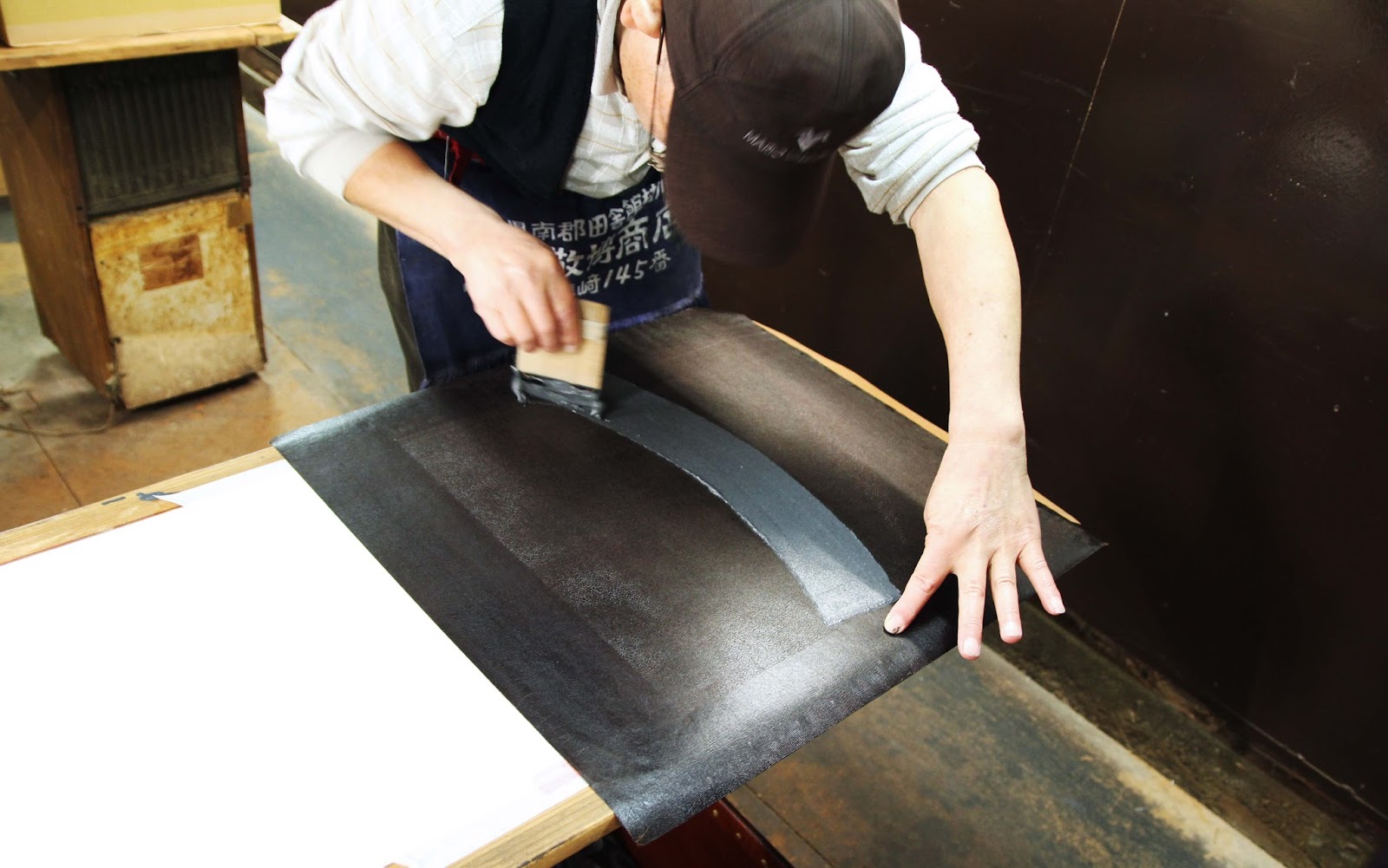
- Applying a soft, sticky rice-flour based resist-paste through the stencil onto the fabric

- Dyeing the fabric by brush or dip-dyeing (in the latter case, the stencil is used to print the resist paste onto both the front and back of the fabric, matching the tiny pattern perfectly!!! brain explosion!!)

- Steaming the fabric to set the dye

- Rinsing off the resist-paste and revealing the delicate tiny komon patterns, which remain the white colour of the base fabric.

Just one of the crazy detailed Katagami stencil papers on display at Kokon, this one carved by a National Treasure, Nanbu Yoshimatsu 1894-1976 人間国宝南部芳松に彫られた細か~い型紙!


古今で、小紋を染めています。伝統的な小紋の工程を簡単に説明したら、

☆ 型紙を細かい刀で彫る、それとも丸きりなどの道具で模様を彫リます。

☆ 場合によって型紙を丈夫するため、漆で絹の紗を表に張ります。

☆ 型紙を布に載せて、柔らかい餅粉と糠からできている糊をヘラで敷いて、模様は布に置かれます。

☆ 刷毛で布の表を染めます。乾いた糊は染料を防ぎます。浸染する場合もあって、その時は布の両面に糊を置かないといけない。しかも、両面の模様がぴったり合うようにしないと!(なんてこと!!)

☆ 染料を布に定着するため、100度で蒸します。

☆ 布を洗って、糊を落とします。やっと繊細な模様が見えます。糊が置かれたところは布の色のままです。つまり模様は白いです。


multicoloured patterns are their trademark at Kokon. Yasue-san said he spends hours figuring out colour combinations that  are just right. 古今に特有の色合い。

At Kokon Atelier, they are using a more modern technique which allows the application of multiple colours. That is, instead of applying plain resist paste onto white fabric resulting in a dyed background with a fine white pattern, 
they are also sometimes applying a coloured resist paste and dyeing the background, resulting in both a coloured background and finely detailed coloured patterns. This way, none of the white base fabric is left showing through.

If I managed to confuse you just now (sorry!), then check out the below photo.
The black and white fabric has used traditional resist paste + black dye, whilst the second fabric has used a khaki paste, then a black dye.

Top fabric= normal rice/bran resist paste, then dyed black.
Bottom fabric= a green tinted resist paste, then dyed black.

染めどころ「古今」にて、伝統的な小紋の知識を守りながら、現代な雰囲気も加えていると感じました。得に使っている色によって感じます。昔の小紋といったら、白い生地に一色の模様が染められました。(細かい模様はもう織物に見える!)古今で、色糊の使用によって、生地も模様の所も染められます。(上の写真を参考に)。また、色糊の上に暈し染をしたり、何枚かの細かい小紋をデザインの中に使ったりするから、とてもフレッシュな雰囲気の染物が出来上がります。

The practice of using coloured resist paste became popular during the Meiji era when chemical dyes were introduced from Europe (they had been discovered and developed in France, England and Germany) which could be mixed straight into the traditional rice flour/rice bran resist paste. This meant the paste was both colouring the fabric where it was applied as well as resisting the colour of any additional layers on top of it. Clever, huh!

色糊は明治時代に発達されました。ヨーロッパ(特にイギリス、ドイツ)の研究者が開発した化学染料は日本へ輸入されました。化学染料は糊と混ぜることができて、新しい染め方が現れました。
染料が入っている色糊は、上から挿される染料を防ぎながら、置いた所も染めてしまいます。
かしこいでしょう!

見学した時、糊の作る段階が見えました。古今では、色糊は毎回、職人さんの感覚で作られています。染料は何パーセントとかのレシピが無しで、普通の糊に、染料を少しづつ加えて、良さそうな色になると、生地に敷いて、蒸して洗います。色は予想と異なると、染料の量を調整して、もう一回蒸して洗ったりするの繰り返しでやっと糊ができます。
すごい努力の要る作業だと思っていましたが、安江さんたちがこだわっている綺麗な「生じゃない色」を作るにはやっぱり必要ですね。

Normal paste on left, dye concentrates, then a Blue paste getting mixed on right. 左は普通の防染糊、真ん中は各色の染料、右はできた青色の色糊。とても濃く見えますが、蒸して洗うとかなり薄い色になてしまうから何回も確認しないと。

Mr Yasue showed me their rows of tubs of mixed coloured resist paste and was explaining to me how they mix the colours.  He told me they don't use measures or a notebook of dye to paste ratios but by mix their colours by eye. Every time!

To do this, they have various dye concentrates all lined up and add these to a bucket of plain paste little by little to produce a batch of paste in the desired colour. This colour sample needs to be dried, steamed and washed to check what the true resulting colour will be. They continue to adjust and repeat the tests until the desired colour is achieved. This seems like an awfully tedious way of mixing colours, but as Mr Yasue pointed out, this ensures they achieve rich, subtle colours; colours that do not look like they came "straight-out-of-the-tube".

Yasue-san showing me their swatch book of paste colours. This is only a visual reference though because they remix the colours by eye each time! (写真は古今のブロッグから)

糊の作業場から、型紙の展示へ移動しました。何人かの人間国宝に彫られた型紙も所蔵されているそうです。「道具彫り」に使う道具も見せてもらいました。道具自体は美しいと思いました。丸、葉っぱ、月などの形を切る道具もあって、これらは職人さんが自分で作るらしいです。型紙を彫る職人さん、何名も「人間国宝」とされていますが、この道具も近いうちに国宝にもなるのではないか?将来に作れる職人さんが減ると貴重品になるでしょうね。

After the paste-mixing room, we had a look at the different kinds of stencils and cutting tools for komon. Aside from tiny blades, punch shapes are also used for cutting stencils (dougu-bori). The stencil-cutting artisans tend to make their own punches, hammering fine strips of metal to form the desired blade shapes (like dots or moons or small leaves). Many stencil-carvers have been designated as "National Treasures"; their craft is so skilled. Aren't the punches also beautiful objects?? They will become national treasures themselves before long because there are now very few craftsmen actually making these amazing tools.

The one-off handmade cutting tools, some shaped like crescent moons, others circles and dots 美しい道具。
次は大きな作業場へ入りました。頭の上に5メートルの糊板がたくさん並んでいて、背が高い人はここで働けないなあと思いました!笑 いくつかの板に帯や着物の反物が貼っていました。
Next, we went into the biggest workroom. The ceiling is very low as all the 5 metre long wooden pasting boards are stored up above their heads. Many had kimono and obi-belt fabric in progress pasted on them.
Three staff were working in the space. One was applying layers of lacquer to old stencils to prolong their use. Another was printing fabric, matching a ridiculously fine repeat pattern down a length of fabric and washing the stencil between every repeat (! they take pride in their product!)

Lacquering old stencils to extend their life. 古い型紙に漆を引いていました。 All the 5 metre long narrow pasting tables are stored overhead. Couldn't be a tall person working here!

In the middle of printing a fine pattern with coloured resist paste, very carefully matching the pattern repeat each time. You can barely even see the pattern at all here, but check out the next photo!!
小紋の糊置きの最中。毎回、柄がぴったり合うように練習が必要ですね!模様はここで見にくいですが、次のショットで見ると...

ギャー!こまかい!eeeeek! Super fine komon pattern freshly printed with a coloured resist paste.

Best of all though, was Mr Nomura. He has been with the company since he left school at 16 (I think his spine kind of gives that fact away..) and as such, he is the resident expert. He was printing when we went in, working to combine multiple fine patterns on what will become the ornate hemline of a kimono. 

最後に野村さんの仕事をお邪魔しました。16歳からこの工房で働いていたそうで、(姿勢を見るだけで分かるんですがね)小紋のプロです!見学のときは、ちょうど着物の裾の所に色んな小紋を一枚ずつ「熨斗」のデザインに入れ込んでいました。とても複雑な仕事ですが、結果はきれいですね。

Nomura-san, looking like a pro. because, well...he is. プロのしぐさですね!

Nomura san printing different patterns selectively to create the impressive effect below ↓
野村さんは小紋を部分的に糊を置くと下のような効果がでた↓
various komon patterns printed carefully within the design of "noshi" a curly ribbon-like motif in Japanese art and design.


Yasue-san surrounded by his company's products
古今の着物や帯に囲まれている安江さん


帰る前に、古今の商品が置いてあるビルを案内させていただきました。古今の複雑な工程を見たばかりので、完成品の帯や着物に感動しました。
Before heading out to a sushi lunch, Mr Yasue took us to a second compant building and showed us some of their finished products. After having seen the complex process Kokon uses to dye their fabrics, it was even more impressive to see the final products, all shiny and packaged up.

Obi with the same pattern in different colourways.
同じ柄の帯。ぜいたく!

I was really taken with the modern colour pallete they are using in their products. Without modifying the traditional process, tools or fabrics, they are giving their kimono and obi a really contemporary look just by using really unique colour combinations.

After all, this is reflected in the name of the company: Kokon. The two characters mean "Old" and "Now"; Bringing together the knowledge and expertise of the past generation and utilising it to skillfully make beautiful clothing for the generation of today.

古今でうまいことに小紋の道具、生地、素材を伝統のままにして、色やデザイン感覚だけを変えることによって、面白い染物を作り出していると思います。

「古今」の字のように、過去の職人さんの知識と技法を使って、現在の人々のテーストにあう染物をフレッシュな感じに作っている、と思います。小紋の伝統を次の世代にも伝えたらいいですね。