Friday, December 6, 2013

Maida Yuzen Studio Visit - Kanazawa 加賀友禅を接する

After telling anyone that wanted to listen that I was dying to visit Kanzawa, (dyeing to?!? hahaha) I finally made it there last week. I was especially interested since learning that Kanazawa is home to a particular style of yuzen dyeing called Kaga Yuzen. (Kaga is the historic name of the region) From what I saw in books, I felt the Kaga style had some parallels to my own work so I really wanted to go and see it in real life.
長ーい間、金沢に行ってみたいと言っていた私はやっと行ってきました!金沢には「加賀友禅」という友禅技法があると知っていた以来は本物をすごく見に行きたかったです。

I managed to visit two different studios making dyed work in the Kaga-yuzen technique. The main one was Maida Yuzen, thanks to my teachers' connections. The current head of the Maida studio is acclaimed dyer Maida Kenji, and I was shown around the atelier by his son and assistant dyer, Maida Hitoshi. (check out their nice website, lots of pictures)

 
「やまあい」訪問着、毎田友禅 Maida Yuzen's Homongi Kimono, Yama-ai Motif (a kind of plant that produces an indigo colour)

田染画工芸工房にて
加賀友禅工房を二つにも行けました。一つ目は先生のつながりのおかげで行けた所だけど、もう一つは偶然通った工房でした。先に金沢にある「毎田染画工芸」という加賀友禅の工房を見学させてもらいました。加賀友禅の世界では有名である毎田健治氏の工房で、息子・弟子の毎田仁嗣さんに工房の説明をもらいました。

毎田染画工芸。三人も同じ着物に色差しをしていました。 At Maida Yuzen. Here, 3 dyers were working on filling in the detailed dyed areas on the one kimono. (split into two long lengths of fabric)
In the true Japanese spirit of having regional specialties that are only slightly different to each other (to the untrained eye?), comparisons are often drawn between Kyoto style yuzen and Kaga Yuzen even though both were borne of the innovations made by former Kyoto resident and fan painter, Miyazaki Yuzensai.
「似ていますが、地方によると少し違う」という、日本人が大好きな概念の通り、京都友禅と加賀友禅がいくつかの点では異なっていると言われています。両方は京都の祇園に住んでいた宮崎友禅斎という扇子画家による作られた技法から始まっているんですが。

Example of Kaga style Yuzen at Maida Studio. The flowers are quite realistic and painterly. 毎田工房での「加賀友禅」の例。花や葉っぱが割と絵画的ですね。
Example of Kyoto style Yuzen (Kyo-yuzen) by well-known Kyoto company Chiso. You can see its very patterned and decorative. 京友禅の「千總」の振袖。模様的で鮮やかな感じですね。
Kaga Yuzen is said to be elegant and chic as opposed to the sometimes gaudy, over embellished Kyoto yuzen. Kaga style yuzen predominantly uses patterns based on realistic and painterly depictions of flowers, plants and birds etc. The painterly effects are achieved with delicate shading which traditionally goes from light at the centre of flowers to dark at the petal tips, whereas in Kyoto (how's this for too much information?) the motifs are paler towards the edges. They also like to say there are '6 colours of Kaga' : Indigo blue, deep rouge red, chrome yellow, grass green and royal purple. Anyway, it's all part of the marketing surrounding Kaga Yuzen.
加賀友禅というのは、落ち着いていて粋なスタイルで、主に写実的な花草をモチーフにしているものです。それと、丁寧なぼかしで絵画的な表現であり、いわゆる「加賀五彩」(臙脂・藍・黄土・草・古代紫の五色)で構成されていると言われています。

Another example of Kaga Yuzen, here a black formal tomesode with patterning only around the hem by Maida Kenji. 加賀友禅の黒留袖。毎田健治の作品です。
I'm not really into drawing such clear divisive lines between techniques because they are all complementary but I was impressed by the Kaga-yuzen use of colours which you don't see in Kyoto yuzen. Maybe it's because of the above "Kaga colours" but Maida studio was using quite deep blues and purples and greens alongside more familiar pale gradients. They were also mixing gofun (white chalk powder) into their dyes as well as using it on its own to achieve matte pastel colours that really sing and flat bright white sections. 
染色の中で技法は重なったりするから、技法はを堅く分けるのがあんまり好きじゃないけれども、確かに京友禅に見えない色合いは素敵でした。「加賀五彩」という概念の影響かどうかはわからないですが、毎田友禅では、馴染みがある暈した薄い色と一緒にかなり濃い青・緑・紫などを使っていました。それと、染料に胡粉を入れる又は樹脂と混ぜるだけで使って、パステルカラー、鮮やかな色やマットの白ができます。

 
detail of Furisode (long sleeved) kimono by Maida Kenji. very vivid colours! you can also see the use of white on some of the petals. 毎田健治の振袖の部分。鮮やかな色!胡粉で白くした花びらも見えますね。

Hem section of a furisode by Maida Kenji 毎田健治の振袖
Another thing that stood out (and I'm not sure if this is unique to Maida Yuzen or if it is a Kaga-yuzen trademark) was the clever use of texture to give the design depth and interest. The way I understood it from Hitoshi's explanation was that they dye one colour, then apply small dots/texture with thinned down resist paste, then when that is dry they dye over it again with a deeper colour or a slightly different tone. The result is a duotone speckled effect that can be as subtle or bold as you choose. 薄めた糊を染めたところにおいて、そのうえにまた濃いかちょっと違う色を塗ると、面白いテキスチャを作るというやり方も面白かった。これは加賀友禅の特徴か毎田さんのところに独特かどうかはわかりませんが。
you can see some of the speckled effect on the paler blue petals. This is taken while the paste is still on the fabric, once washed the speckled effect is more dramatic. 糊はまだ付いているけど、洗うとテキスチャがもっと目立ちます。
Unlike Kyoto-style yuzen that uses quite decorative patterns and pretty typical traditional motifs, the kimono (but also panels and some small things) I saw were mostly depicting flowers and birds: dyed artistically but also with botanical accuracy. The depictions of birds were of course of particular interest to me. There weren't any bird motifs being worked on when I was at Maida's studio but there are some great depictions of birds in other Kaga yuzen pieces. 京友禅の伝統的なモチーフや装飾的な感じに対して、加賀友禅では、花・草・鳥などは生き写しとは言えないが、かなり自然に近いように描かれています。私は(もちろん!)特に加賀友禅での鳥の描写に興味があります。見学のとき、鳥のモチーフは染めていなかったが、他の加賀友禅には素敵な例が見えます。


detail of a hanging piece by Teranishi Ikkou 寺西一紘の作品
Lively depiction of cranes on a hanayome noren: Bridal Curtain. 花嫁のれんの生き生きしてい鶴たちhttp://kd-rinya.com/noren/
It was a nice little trip to Kanazawa to see Kaga-yuzen up close. It makes you realise that despite the efforts to define Kaga yuzen as very different from Kyoto yuzen they are fundamentally very similar. I think using a combination of both styles, stradling the border line would really give you scope to create some amazing work. Also, seeing the way that Kaga yuzen artists value drawing from life, realistic depiction and delicate shading gives me confidence that my own approach to yuzen is legitimate and also inspires me to rely even more on drawing from observation.  That's really the only way to create something that feels lively and authentic. And on that note, I'm off to sketch for my next work!!
金沢に行って加賀友禅を目の前に見えてよかったです。京友禅と加賀友禅を別のものにする努力があるのに、実は基本的に同じ技法だということを気づきました。両方の特徴を生かして、間ぐらいで制作したら素敵なものが作れるのだと思いました。
それで、加賀友禅の作家がスケッチ、現実的な描写、丁寧なぼかしを重視することに、自分の作品にも自信を吹き込んでくれました。これから、もっと写生したいと思いました。生き生きとした作品にしたいなら、写生に頼るしかないのではないでしょうか?それでは、次の作品のスケッチをしにいきます!!

Saturday, November 23, 2013

熱心がある間に On running with the stroke of inspiration

It's been coming to my attention more and more recently that making good work is all about running when the inspiration hits.
最近、何回も気付いて来たのは、やる気・感激するアイディアが浮かぶと動かないといけないということです。

There are enforced arbitrary deadlines set by my professors where I have to come up with new work and often I really struggle to get a new work done in time. Sometimes it just doesn't flow and I struggle with the design stage for weeks before even starting in dyeing. Sometimes you just have no creative juice whatsoever and making new work becomes a real task.
大学で勉強しているから、もちろん(残念ながら!)先生の都合により指定される作品の締め切りがあります。その締め切りまでに新しい作品を仕上がるやる気がまったくない時もあります。やる気がないと何週間もデザインや下図に手間をかけてしまって、辛いことになってしまいます。

Which is why it's so awesome when inspiration strikes and you suddenly know exactly what you want to try and make and you're actually excited about it. I've found these moments often come when I'm already in the middle of working on something else, so it's easy to just think, oh well I'll write that awesome exciting idea down and save it for the next work; for when I'm done with this. But you know, I have a notebook full of those saved-for-later ideas. 
なので、ワクワクされるアイディアが出ると本当に素晴らしいことです!この「あっ!それを作りたい~!!」瞬間のほとんどは、他の作品を作る最中に起こりますね。だから、また後で作るためにノートに書いて置くのが簡単です。だけどさぁ、そういうアイディアだらけのノートがまるまる2冊があります!!

What if you just act on them as they come? Sure, it might mean you are doing multiple things at once and sure, it might mean you don't sleep properly for a weeks and sure, you might not get all that plan done BUT! I think if you don't act on that idea and start making or start doing some preparations on it, the moment is lost, the freshness of the idea is gone and most likely you'll never come back to it. 
その貴重なアイディアをその場で、熱心が覚める前に何かすれば?!アイディアを実現すると、しばらく寝不足可能、仕事が二倍になる可能もあるんです。でも!すぐにその感激したことをやらないと、熱心ややる気がなくなって、アイディアの新鮮さがおちてしまって、いつかやろうと言っても結局しないでしょう!

So what spurred all this was a recent body of work: a set of hand cut decorative stencils. I was in the middle of making work for our recent exhibition (which I'll write about soon!) and had this idea to make a set of katagami stencils that depict various endangered and vulnerable parrot species. I was inspired by old Ise stencils and I wanted to use katagami (persimmon juice strengthened stencil paper made from washi- how's that for long winded?!) in a way that Japanese people wouldn't; to do something surprising. And I had a great idea for it. 
この話を考えさせたのがとくにこの型紙シリーズです。展覧会へ向けて(もうすぐその写真などもアップロードします!) 他の作品を染める最中で、絶滅危惧種のインコを描写している装飾的な型紙も彫りたかったんです。日本人が思いつかない風に型紙を生かしたかったですね。
Some inspiration. Very delicately carved katagami stencil depicting an abacus and documents. 伊勢型紙からインスピレーション
Another inspiration image. This stencil uses the very fine metal punches to get these effects with dots. 細かい点々を使った型紙からインスピレーションを受けました。
I had the idea, I had most of the materials, I had the skills and tools, 
I just had very little time. A week to be exact. It was a fight or flight moment: Do I preserve my sanity and just take it easy for a week leading up to this exhibition and display what I have already made? Or do I run, and work right up to the last minute to create this work I'm excited about and exhibit it with all my other work? I decided to run.
アイディアがあった。道具や素材のほとんどを持っていた。技術もある程度知っていた。足りないのが時間だけだった。一週間しかなかった。今のところであきらめて、もう作ってある作品を展示して余っている一週間でちょっとゆっくりと準備とかするか、
今ちょうど勢いで作ってみて他の作品と一緒に展示するか?という選択だった。作ろうとしました。
ideas!!! at my desk at school 大学の机で。アイディアいっぱい!
Here's some images of the work installed. I called them 'Red Listed' as these 5 birds are all on the IUCN "Red List" of threatened species worldwide. I wanted to depict the birds as if they were fading out or being hidden. I tried various ways of showing this.完成した作品の写真です。「red listed - 消えてゆく」というタイトルをつけました。それは、この型紙の五種類のインコは前に説明したIUCN Red Listに書いてあるインコです。鳥が無くなっている・隠されているように描写しようとしました。
Paradise Parrot (Psephotus Pulcherrimus) 
Swift Parrot (Lathamus Discolour) オトメインコ
Orange-bellied Parrots (Neophema Chrysogaster) アカハラワカバインコ
detail of Orange-bellied Parrots stencil アカハラワカバインコの学名
Bit hard to see but this one is a Superb Parrot (Polytelis Swainsonii) ミカヅキインコ
Golden Shouldered Parrot (Psephotus Chrysopterygius) キビタイヒスイインコ
I had wanted to make 8. Then resigned myself to the fact that I only had time for 6. Then ran out of time and made 5. But I think the point is that I acted on that idea.
最初は8枚を彫りたかった。それで、時間的には6枚しか作れないと思うようになった。で、結局5枚に力を注ぎました。大切なのは、作ってみたことだと思います。

In making these, I was able to try out some new techniques, in particular using these tiny sharp circular stamps and to challenge myself on just how detailed I could cut. These are things that will help me in making new work. I also tried a different way of displaying them by having them up on windows in the gallery space so that they were backlit. This way you could see the intricate detail and it also brought out the warm brown colour of this traditional stencil paper.These days you can get a paler more plastic-y stencil paper that is less prone to shrinkage and more water resistant but this katagami stencil paper is the real deal that has been used for hundreds of years and it really has a different feel all together.
この五枚を作るとは勉強になりました。この小さい穴をあける「丸切り」を使ったり、どれぐらい細かく切れるかということも挑戦してみました。今からの作品にも役に立つ体験ですね。それで展示スペースの窓につけてみました。光が通ってくると細かいディテールが見えるし、型紙のあたたかい茶色が出ています。現在、一般に使われている型紙というのはもっと防水力を持っているプラチックっぽさがある洋型紙なんですが、何百年も使われているこの「渋紙」のほうが味がいいですね!

practicing using tiny punches on modern (less expensive) stencil paper.
現代の型紙で丸切り」の練習
I actually cut three layers at once, one of the traditional katagami for display, one of coloured paper as a decorative paper cut and another from modern plastic-like katagami for using to dye textiles with. Here you can see the design in ink on rice paper stuck to the stencil paper and cuttting through the whole lot. 同時に三枚も彫りましたー渋紙、洋型紙、色紙。墨で薄い和紙にデザインを描いて型紙に貼ってから全部彫っていく。
cutting three stencils at once and here peeling them delicately apart 一緒に彫った三枚を丁寧に引き離している。
detail of paradise parrot stencil with little house motifs 小さい家のモチーフを入れたゴクラクインコの型紙。
Since I made them just in time to exhibit, I was also able to receive feedback from my teachers and from the public about them. I got some good reactions and I think I even impressed the one hard-to-crack traditionalist professor who's always telling me I'm copying too much and need to find my own style.
展覧会までに作れたから、先生やお客さんの反応も聞こえました。いいコメントも貰いました。

Stencils as installed on the windows in our exhibition at Rissei Former Elementary school in Kyoto. 今間京都にある元の小学校「立誠小学校」の教室に型紙をこういうふうに展示しました。
stencils on the windows with the afternoon sun coming in 窓に貼って、陽射しが入ってくると暖かい感じですね。
It was nice that there was a small gardern just outside the windows so you could see real leaves through the leaf sections of the stencils too. 型紙の葉っぱの部分に、そとの実際の植物が見えて面白かった。

I've since caught up on the lost sleep and cleaned up the tornado that swept through my apartment in the week of non-housework and I want to encourage people who are making and creating to give in to the challenge and make what you want when the fancy takes you.
寝不足が直って、制作していた間に山ほどになっていた家事もできました。作って良かったと思っているので、制作している人を励したいです!作りたいものがあれば、熱心いっぱいの間で作りましょう!

Monday, November 4, 2013

Takeuchi Seiho: Paintings & Sketches at Kyoto Municipal Museum of Art

Over the weekend, I went to see the big show on at the Kyoto Municipal Museum of Art, the work of Modern Japanese Painting giant Takeuchi Seiho (竹内栖鳳). They have two shows on simultaneously, one showing his paintings and a second showing his amazing sketches and underdrawings.

It was AMAZING!! I'm finding this more and more recently but old Japanese Paintings (nihonga) which look kind of same-same and a bit bland in books and catalogues are something else entirely when you see them in real life. 

For one thing, it's the sheer SCALE of these works! They are huge! You can't compare standing in a corner of the library looking at a small reproduction of a Lion painting in book to being face to face with an enormous painting of a Lion on a gold leaf covered folding screen. 
Not just any Lion, a HUGE lion! This screen was over 2 metres tall. circa 1901
Another massive screen. Actually this was a pair of screens. Elephant 1904.
Another thing which simply doesn't translate in a book is the level of detail. That's something I really enjoy about Nihonga; whilst paintings can appear to be abstract upscaled versions of smaller paintings, they almost always incorporate some areas of intricate detail. This large folding screen painting of deer was just such an example. Upon closer inspection, their fur is so realistic! Fluffy deer!


Young Deer Gathering  1924.
hard to see but they are oh so fluffy
Takeuchi Seiho lived from 1864-1942. In 1900 he travelled to Paris and it's interesting to see the way this influenced some of his artwork. I thought this pair of paintings was unusual, "Historic Spot of Rome, 1903" because the sense of perspective and the realistic depiction of space appears very western. Also the subject matter is obviously Roman building ruins whilst the materials and format he used remained very traditionally Japanese.

"Historic Spot of Rome, 1903"
Takeuchi also often used birds as motifs in his paintings and I thought they were really dynamic. He managed to depict them true to life, in the sense that he did piles and piles of sketches and drew them anatomically correctly but painted them with a looseness and energy too. 
Fighting Cocks
Detail of Sparrows in the Snow. 
My favourite work in the exhibition was this painting below, 秋興 or "The pleasantness of Autumn" from 1927. For starters, it uses colours very similar to my most recent artwork; this beige and vibrant blue-green. It's an unusual composition to have the ducks sort of in the centre and then lotus leaves coming in from the bottom and the top, hiding the birds in places.

"The Pleasantness of Autumn" 1927
Takeuchi was so prolific that they are splitting the exhibition into two sessions. I will have to go again in the second half!

 You can read more about Takeuchi Seiho and his life here 

International Exhibition of Art and Design + New Work 国際交流総合展+新作

This past 6 days, I had my latest artwork on show as part of a large group exhibition called the "International Exhibition of Art and Design". It was held in the Annex Building of the Kyoto Municipal Museum of Art. While the title (albeit vague) may perhaps conjure up images of grandeur and shiny display cases, don't let your imagination get carried away for the reality is that was a much more humble, honest display put on by a bunch of genuinely nice Artists from Japan and Abroad.
この6日間、新作が京都市美術館の別館で行われた「国際交流総合展」に展示していました。日本の作家と色んな国から来た作家による展覧会でした。
Group shows are by nature, a display by a very diverse group of people. In this case, there were many different techniques, countries and ages represented. Textiles, Sculpture, Illustration, Painting, Ink-work; Australia, Great-Britain, the US, Finland, Japan, China, Venezuela...to name a few. You can see work from the artists here. During the set-up we tried to make sure that works looked okay next to each other but whether you can make so many different artworks look good together, I'm not so sure.  There were also some works where you go, "errr, okay..?" but the majority of works were really impressive and well-done.
グループ展というのは色んな人によるもので、今回も結構幅広いジャンルや国や年齢の方が参加しました。染織、立体、イラスト、絵、墨の作品などもありました。参加した作家さんはたくさんの国から来た人で、ここで作品の例が見えます。
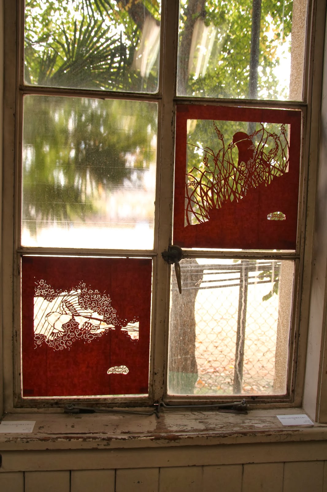
view of the exhibition. My work was next to a roketsu wax-resist work by Kobayashi Shoko.
It's a group show like so many others in Kyoto; run by some kind of art organisation with submissions mostly from regular members but with fresh faces each year. However, unlike others, this group encourages foreigners to participate and seeks to encourage the exchange of ideas and cultures between Japanese and International artists.
京都ではこういう大型グループ展が毎週行われています。ほとんど同じ感じの展覧会(何かのアート団体が行うもので、毎年出品している人が居るけど、毎回初めて出品する人もいるっていうような展覧会)ですが、この展覧会は特に海外の作家を呼んで、国際交流も目指しているものです。
looking towards the back of the exhibition. On the middle panel at the back is my friend Kiyomi's wax-resist work. The motif and colours are similar to the one shown here
gallery view
This year was my first year to be involved and it was a great experience. It was a good opportunity to meet artists working in totally different techniques and to hear what they had to say about my work and to form some new connections with International and Japanese artists working in and around Kyoto. 今年初めて出品しました。全然違うジャンルで作業している作家と話ができて、京都と周りの地域で作業している人と出会えていい経験でした。
gallery view
gallery view.
Without further ado, let me show you the work that I exhibited! It's called "Going, going, gone" which is an explanation of the three parrot species depicted in the artwork; from right to left they are the Swift Parrot (Conservation Status is ENDANGERED), the Orange-bellied Parrot (Status: CRITICALLY ENDANGERED) and finally the Paradise Parrot (EXTINCT).
では!展示した新作を紹介します!「Going, going, gone」というタイトルの意味は、「無くなっている、無くなっている、無くなった」のです。右から左へ行くと、描写してある三種類のインコは、オトメインコ(絶滅危惧)、アカハラワカバインコ(絶滅寸前)とゴクラクインコ(絶滅)。つまり、このインコはgoing, going, goneですね。
"Going, Going, Gone" 2013. 180x200cm Silk, Yuzen Resist, Chemical Dyes
Here's some of the Endangered Swift Parrots on the middle layer. You can see how it's partly see-through. 絶滅危惧種のオトメインコです。透明感のある生地を使いました。
These are Critically Endangered Orange-bellied Parrots. You can see the small sections of stylized text here which I`ll explain below. 絶滅寸前のアカハラワカバインコです。背景に文章が見えますね。下に説明します。
Here's a female and male Paradise Parrot, thought to have become extinct around the 1930's.
1930年代ぐらいに絶滅したゴクラクインコです。
In this piece, I used three different layers of silk fabric, beginning with a heavy silk at the back, then a lighter georgette silk, and finally a very transparent organza at the front. I wanted to create depth as well as give the impression of the birds coming in and out of focus; appearing and disappearing. Also, the flight from right to left is taken from the tendency to show the flow of time in Japanese paintings as running from right to left. 
今回初めて透明感のある絹を使ってみました。作品は3レヤーになっています。後ろにはしっかりしているちりめんと紬で、間中に半分透明のジョージェットを使って、一番前に薄くて透明なオルガンジを使いました。透明生地を使うのは、奥行きを表現したかったし、鳥が出たり隠されたりするのを見せたかったです。
"Going, going, gone" (detail) Here you can see from right to left, Swift, Orange-bellied and Paradise Parrots. 右から:オトメインコ、アカハラワカバインコ、ゴクラクインコ。
You may be able to see the texture in the work behind the birds? This is fragments of text from writings by ornithologist John Gould (1804-1881). He was an Englishman but spent several years in Australia (mostly in Tasmania) observing and writing about Australian birds. His writings are very descriptive and I love the flowery language he used. The tragic thing is when Gould wrote about these they were still common (well, the Paradise Parrot was already on his way out) but now they are in serious danger of disappearing. 
鳥の裏に文章が見えるでしょうか?それは19世紀の鳥類学者ジョン・グルドがこの三種類のインコについて書いた文章から取った部分です。彼の英語がとても華やかで面白いです。悲しいのグルドが書いたときにオトメインコとアカハラワカバインコはまだ多かったけど今はもう消える可能性があります。

I was really glad to see that my work was moving slightly in the gallery space, as people walked by or just in the air-conditioning. ギャラリーで作品が下のようにちょっと動いていてとてもよかったです。鳥が本当に飛んでいるのを感じさせます!
my work moving in the breeze

And so it's onward to the next exhibition!! Coming up so soon it's frightening is this group exhibition I am a part of with the 5 other Textiles Master's course students, "How How". It runs November 12-19 in Kyoto and more information can be found here. On that note, time to go get back to work!!
次の展覧会ももうすぐです!京都精華の大学院染織コースの6人による「HowHow」というグループ展です!京都にいらっしゃる方、ぜひみに来てください!
では、制作しなきゃ~!