Showing posts with label 作品. Show all posts

Saturday, August 4, 2018

Rocks Rock! Experiments with local Pigment Colours

Rocks are so cool. In case you hadn't noticed.
More on that later! First, a bit of background...

When I was in Japan studying katazome, I was introduced to dyeing paper (and sometimes fabric) using 'ganryo' pigments.

"Ganryo" just means colourant, it is the colour in powdered form without any binder. (Though it can be sold in the form of paint-pans or solid sticks). It can be a naturally occuring colourant, like yellow ocher (ohdo) calcium carbonate (gohfun), cinnabar (ginshu which is natural but ironically, toxic!) indigo (ai), ultramarine (gunjoh) or iron oxide (bengara) etc etc. They can also be chemically altered versions of these (to produce whitened tones etc) or just straight up synthetic pigments (basically a chalk substrate dyed different, sometimes nasty colours)

A small portion of my collection of commercially available Ganryo pigments. The ones in stick form are already mixed with a binder.


Pigments are also used in Nihonga (Japanese-style Painting) but they are slightly more complicated - see my older post all about it, and painting broccoli, here.

That one time, when I spent 5 days painting a broccoli portrait in Japanese pigments...

As I was saying, pigments are also used in combination with the katazome technique. Most famously, rich pigment colours are used in the Okinawan Bingata technique (similar to katazome - see more here) and I suspect that's why they are in the katazome repertoire in the first place. In both cases, the powdered pigment is mixed with a binder - soymilk - to create a thick paint-like liquid. These can then be applied to the fabric or washi being dyed in the same manner as dyes (with a stiff bristled brush, from the front side).

Mixing commercial pigments with soymilk to a painty consistency.
Some bits and pieces I dyed on washi (kozo paper) using commercial pigments and the katazome technique. 

Just to point out that pigments have different characteristics to dyes, it might be important to remember:
A DYE is colourant dissolved in liquid which grabs onto a fibre - it really gets into the fabric and you faciliate a chemical reaction (with steam or an alkali etc to ensure that it links sucessfully and stays on that fibre).
A PIGMENT, on the other hand, is insoluble and the particles sit on the fabric, rather than seep into the fibres. They are matte finish and can appear to look more like paint.
Bingata technique utilises this unique difference by dyeing colours first (transparent colours, which grip the fibres) then adding details on top in pigment colours (matte colours that sit on top of the fibres. This step is called "kuma-doi" lit. adding shadows). This creates a sense of depth which can't be achieved by using only layers of dye.

a detail of a bingata pattern on cotton cloth from the 19th Century. You might be able to see the heavy red pigments in the centre of the petals creating depth, versus the translucent blue dye of the background.

ANYWAY!

Having known that pigments can be used with the katazome technique and having played around with them in a short Nihonga course, I wondered if I could make my own, Australian pigment colours. Canberra is well known for "Canberra Red Bricks", churned out here from 1913 to the 1970's, so I knew that at the very least there would be a clay around here that I could use for pigment.

Rewind a bit to last September.

sketching with dirt and a lump of charcoal,
September 2017
As one of four artists chosen to take part in Craft ACT's inaugural 'Spring Tidbinbilla Residency", I spent time out at Tidbinbilla Nature Reserve, sketching, hiking and photographing. During a hike back down from Gibraltar Peak, I stopped to sketch the view of the mountains. I had found a pinch of some clay-ish dirt up the track and little and wanted to try using it as paint. Nearby where I'd sat to draw I also found some burnt tree stump and it worked perfectly as a charcoal.
This simple drawing sparked an obsession.


Fast forward and I've collected 100 Natural Pigments and counting.

a growing collection of local pigment colours.

Since February this year, I have been keeping my eyes on the ground. In non-descript walking paths and parks, along rivers, on the tops of hills and some trips to beaches, I've found colours in rocks, dirt, shells, ash and charcoal.

Mostly, I've smashed, sifted, ground, re-sifted and re-ground rocks to get these colours. Some rocks give themselves up easily, crumbling after one strike. Others are like trying to shatter steel.

smashing up rocks - this one gave itself up easily.
after sifting and grinding.

I've been sort of playing at faux-Geologist. Mostly I've been smashing and seeing what happens. I've also been trying to understand which rocks are found where by using these visually stunning but scientifically overwhelming Geological maps.

beautiful but cryptic Geological Map from Geosicence Australia

WOOO! Rocks!

The most exciting part of this whole experiment has been to do what I first intended - use these colours I've collected as pigments for katazome. The chance for this arose when an exhibition was borne of Craft ACT Spring Residency at Tidbinilla last September. The show wrapped up this past weekend at the Tuggeranong Arts Centre in Canberra. The work all came together beautifully, without intending to, all four of us artists used complementary textures, colours, as well as references to stones and foliage. Narelle Phillips at the Tuggeranong Arts Centre did an excellent job of curation and organising everything.

Traversing Tidbinbilla, Tuggeranong Arts Centre July 6-28, 2018. To the right is work by fellow artist Sally Mumford.

Here are a few close ups of the work I exhibited. You'll see works on paper - these are all made with my pigments mixed with soymilk, applied to kozo washi. I also tried the pigments on different weights of silk, in an installation piece depicting Eucalyptus Cinerea foliage. Finally, I wanted to display my vials of pigment in the manner of a old fashioned museum, you can see this in the wooden box in the pictures.

Foliage Series, 2018. Katazome on washi using local pigments. 38 x 40cm
Left to Right, 'Welcome Swallow', 'Eastern Yellow Robin' & 'Grey Shrike-thrush' 2018. Katazome on washi using local pigments. each 25 x 31cm
Flame Robin (Male) 2018

In all these works on paper, I selected ground pigments from what I had collected, mixing them with soymilk in small mortars. I didn't really mix different colours together, just used what I had as is or layering one colour over another. Charcoal from found burnt logs was good for giving strong blacks. The hardest colours to represent were a vivid yellow and red for the Flame robin and the Eastern Yellow Robin. In real life, the breast feathers of these birds are nearly fluorescent. I had to settle for earthier versions.


Cinerea Breeze. 2018. Katazome and earth pigments on silk. The cottage we stayed at out at Tidbinbilla during the residency is called Cinerea Cottage, so this piece has extra meaning :)
Floaty detail of Cinerea Breeze. The foliage is dyed using pigments and the background beige and orange tones were dyed in a natural dye bath of Eucalyptus Cinerea leaves. 


Lastly, here's my (Tiny) Museum of Natural Pigments. I love that colours which seemed so ordinary and similar when I spotted them, appear completely different when crushed and lined up next to each other. Many of these were successful as pigments to dye paper but a lot of them were too gritty or crystal-y to be an effective colourant. Still, they are pretty as a powder amongst their fellows.

*I'd like to make clear that I have only taken small amounts of colour from locations that aren't national park or designated nature reserves. I definitely didn't take from spots where it would damage the area. I know there will be some people who will take issue with me having done this. I have tried to honour the spirit of nature and her beauty through these works. If I'm found to have done something wrong, I'm sure I will hear about it...*

In an exciting development, this exhibition will now travel to be exhibited in the gallery at the Tidbinbilla Visitors Centre, from Friday August 3rd until the 14th of October 2018! It will be great to see the works so close to the location that inspired them and I hope lots of interstate and international visitors get to see them too.

The next step in this Pigment adventure is looking further afield for different colours that aren't present in the ACT and also, trying to make pigment colours from natural dye baths - as 'lake pigments'. This a science-y process that I haven't had much luck with yet (though admittedly, I haven't tried very hard yet!). Watch this space!

Monday, November 28, 2016

Somé - Dyeing the Australian Environment

In August/September this year I was lucky enough to be invited to hold a solo exhibition of my work at the Japan Foundation Gallery in Sydney. It was titled "Somé - Dyeing the Australian Environment".
It's been a long while coming but here are some images from the show.


I made some new work for this show, a large noren for the entry to the gallery space and a series of pieces called "The Beautiful Weeds of Canberra".

Entrance to the exhibition. "A Hearty Welcome" on left

I called the noren "A Hearty Welcome", referencing its function as a gateway to the exhibition. I dyed it using katazome on hemp fabric which I sourced in Australia. Previously I'd dyed several noren but on Japanese linens which have a certain stiff feel to them and are rather open weaves so that a glimmer of the space behind the curtain is also visible. I'm yet to find a fabric with similar qualities in Australia but the hemp fabric was a new experiment using a natural looking slubby cellulose fibre. It's a little softer than I would like, as it creases easily and softens in the washing stage of katazome.

The noren was tied back during the opening event - Photo by Document Photography
The imagery I used for the stencil was of the droopy branches of Eucalyptus Cinerea (Argyle Apple). I've used them as subject matter before because I love their dusty blue-green leaves with their almost circular forms. They really lend themselves to being carved into a silhouette-y stencil.


The other new work I produced was a series I've been calling "The Beautiful Weeds of Canberra". I've become even more obsessed with weeds since starting these pieces but the idea behind them is that our natural environment is a composite of all kinds of species native and otherwise. When you look closer you realise that a good many of them are actually "weeds" but to me they are familiar parts of the landscape and also quite beautiful in their own right. 

Keeping a little distance from the complex conservation and environmental problems connected with "weeds" I'm trying to just depict them in all their weedy glory - kind of weed portraits.


This is a series I will be further developing and expanding for future exhibitions but the initial weeds I've dyed are Wild Blackberry, Rosehip, Umbrella Sedges and Japanese Honeysuckle. For these pieces I used vibrant acid dyes to dye the weeds themselves - true to nature- and applied natural dyes as the background colour. I really like the russets and orange tones you can extract from local eucalyptus varieties and onion skins so I've used a combination of these against the vibrant colours of the weeds I chose.

Blackberries and Sedges - first trials in "the Beautiful Weeds of Canberra" series.

Japanese Honeysuckle - Beautiful Weeds of Canberra. A garden favourite in Japan but a creeping weed in South East Australia.

For future pieces I'm planning on featuring many many more beautiful weeds and trying to get even deeper, richer background colours. I've also started research for a series on "the Beautiful Weeds of Kyoto". It's interesting to see which weeds overlap with Australia; the weeds which we "share". It's also cool finding those species which are natives in Australia but invasive in Japan or the reverse. I think there's some deeper subject you could read into that if you chose to. 

detail of "Sedges" - Beautiful Weeds of Canberra Series. 2016
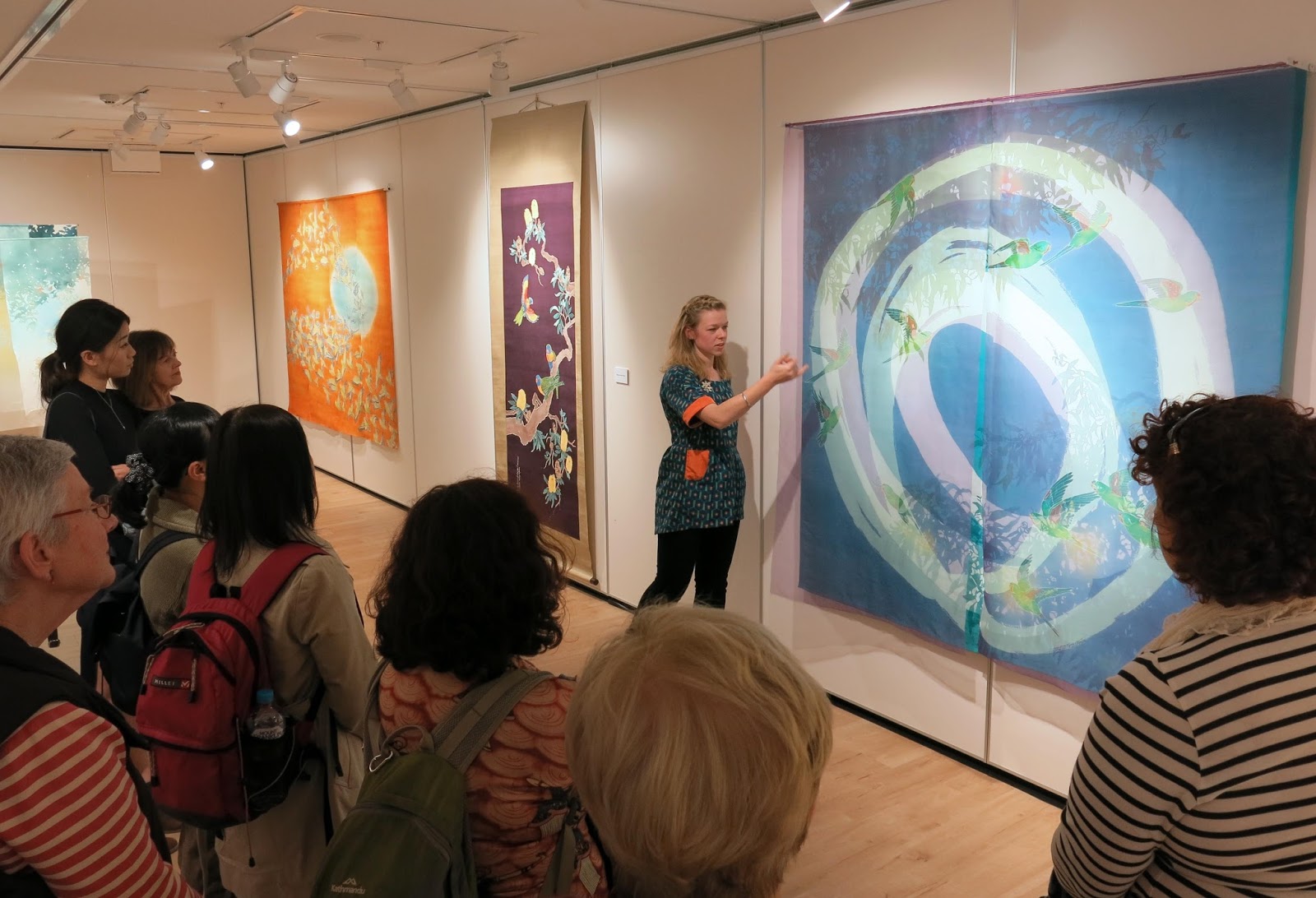
Anyway, back to my exhibition in Sydney, the general response from the audience was really good. I had never shown work in Sydney, let alone so many pieces all at once before, so it was great to come across all these people who I'd never have had the chance to meet. I held a floor talk and two workshops whilst I was there too. Both went really well. It was my first time to hold workshops with so many participants but everyone was very enthusiastic and got great results.
Each participant dyed two washi postcards using powdered pigments.

looking like a pro giving my floortalk for Japan Foundation Members before the opening

during the opening

the opening

workshops underway


workshops

Participants results from the workshops. really nice!!
It would be nice to do more workshops in future, maybe on less of a tight schedule next time!

Anyway, I'm now working towards new things for 2017. A few exhibitions on the horizon so I have to get making! 

Friday, December 5, 2014

ROKKAN Exhibition - Some・Seiryukan - 6人6感 染・清流館

Time has flown and before we knew it we were taking the show down again!
あっという間に展覧会が終わって、気づいたら搬出しているところだった。

For the month of November, I was part of a six person group show "ROKKAN" at a dyeing-specialist gallery in Kyoto called "Some Seiryukan". It was part of a regular series of exhibitions that highlight up-and-coming artists working in dyeing techniques. This time around, Katazome Artist and Kyoto Seika Professor Toba Mika was the director, choosing the 6 participants and overseeing the event. 
11月中、京都の「染・清流館」という染め専門ギャラリーで六人のグループ展「Rokkan」に参加させていただきました。毎年開催されている「将来を期待される新鋭染色作家展」というシリーズの展覧会で、今回の監修鳥羽美花先生でした。

Toba-sensei brought the 6 of us young artists together because we all utilise traditional dyeing techniques but we use them in fresh and interesting ways. As a group we covered the breadth of rōketsu wax dyeing, hand-drawn line resist (itome-nori), clamp resist dyeing (itajime), katazome and yuzen.
私たちを集めてくれた理由は、六人とも伝統的な染め技法を使用していることだったそうです。それで、昔ながらの技法でありながら、自分なりに用いていることが私達の共通点でした。ロウケツ・筒書き・型染・友禅・板締 という幅広い技法で制作しているグループです。
For this show, I displayed two new works (!!) and one earlier piece; my wild budgies "Murmurations" piece. In both of the new works I tried to achieve an effect of depth and movement using multiple and overlapping layers of semi-transparent fabrics.
今回大きい作品の3点も展示しました。2点は新作で、もう一枚は7月にできた「Murmurations」の作品でした。新作では、薄い生地を染めることによって、奥行きや動き感を表そうとしました。

With the smaller new piece, "Canberra Blues", I dyed 3 layers of silk (organza and georgette in the front and shantung as the back layer) and combined both yuzen and katazome. I used katazome to create areas of bold leaf silhouettes and then yuzen to echo these branch shapes as well as include more delicate leaf details. There is one little bird in the piece (A Yellow-throated Gerygone) but this time I was more interested in the lively curves and shapes formed by the "eucalyptus cinerea".
「Canberra Blues」 2014 Katazome and Yuzen on Silk. 150 x 150 x 10cm
一枚の新作は「Canberra Blues」という作品でした。この作品では、三層の絹地(オーガンジー、ジョージェット、シャンタン)を型染と友禅の両方で染めました。型染で背景のしっかりした枝のシルエットを染めました。友禅で、前に出ている細かいところを染めました。一匹の鳥がいますが、今回は鳥の環境という絵よりも、このユーカリの葉っぱの形と枝の流れを描写したかった作品です。

Detail of the layers of silk. Here, yuzen at the front and katazome at the back. 絹の層が見えます。前に友禅で、裏の絹に型染です。
There are many of these gum trees around Canberra; they are often used as street-trees and on median strips. Because of the blue-green foliage, I had been mistakenly calling them blue gums but they are actually called "argyle apple" or "silver dollar" gums. My title refers both to these (mistakenly named) trees and the way that they are so evocative of Canberra as to make me a little homesick.

detail of "Canberra Blues" 2014. Yuzen and chemical dyes on silk organza
キャンベラでは、このユーカリがよく街路樹として使われています。葉っぱは柔らかい青緑なので私はずっと「Blue-gums」(青のユーカリ)と呼んでいたんですが、本当はそうではなく、「Argyle Apple」や「Silver Dollar」(葉は硬貨の様に見えるから)と呼ばれているらしいです。

"Canberra Blues" 2014 detail of layers.
The largest work I had on display was this work depicting Little Corellas in flight. The white Corellas are whipping up into a flock and streaking across a warm, dusty Australian sky. Though it didn't come through strongly in the final piece, I was inspired by the use of dusty washed-out colours as seen in Australian Impressionist paintings, from the 1890's.
今回私が出した作品の中、このアカビタイムジオウムをモチーフにした作品が
一番大きかったです。イメージは、夏の暖かい空を飛び上がるオウムの大群です。出来上がった作品では、あまり分からないですが、色合いは1890年代から活動していた「オーストラリア印象派」にインスピレーションを受けました。その画家たちは、当時の洋画によく見えたヨーロッパの鮮やかな緑や雲っている空を否定して、初めてオーストラリアの独特な光や色をそのまま表現しようとしていた派でした。結果として、オーストラリアの印象派の絵では、乾燥した草の薄い茶色、南半球の空の暖かな青、内地の土の濃い錆色、眩しい日差しの金などがよく使われました。

"Shatter the Immense Summer Sky" 2014 Yuzen and own techniques on Cotton organza. approx 450 x 180 cm
友禅、独自染方、綿オーガンジー 約450x180センチ
I really liked these quotes from two of the most famous Australian Impressionist painters about our unique light and colours.
オーストラリアの印象派作家による気に入った言葉が見つけました。通訳しにくいですが、オーストラリアの特有の色と陽射しについて書いていました。

Frederick McCubbin, writing to Tom Roberts
"I fancy large canvases all glowing and moving in the happy light and others bright, decorative and chalky and expressive of the hot trying winds and the slow, immense summer"  
Also Arthur Streeton, writing at the group's countryside painting camp
"I sit on our hill of gold,...the wind seems sunburnt and fiery...north-east the very long divide is beautiful, warm blue far far away all dreaming and remote...Yet as I sit here in the upper circle surrounded by copper and gold...all the light, glory and quivering brightness passes slowly and freely before my eyes" 
I can easily imagine this scenery of being "surrounded by copper and gold". You can see this kind of sunburnt, toasted, sunlit landscape anywhere around the A.C.T or country NSW. 上の「アーサー・ストリートン氏」(オーストラリア印象派の代表的なメンバー)が書いた「銅・金色に囲まれて」というような風景はすぐ想像できます。キャンベラの周りでも、乾燥している草や山々が見えるから、どこか懐かしいものです。

Detail of the work, hanging in 5 seperate panels.
Although this piece was made in a ridiculous rush I had fun using some different techniques to dye the background. I dabbed coloured nori resist paste onto the fabric with a stiff brush in diagonal lines and also used semi dry brushes to create streaky lines at intervals. I hope I managed to create a sense of movement and lead the eye across the piece.

In this detail you can see the dots of coloured resist paste I dabbed on using a stiff scrubbing brush and the diagonal streaks of dye. たわしで載せた色糊や斜めの線が見えますかね?
この作品を作るペースはめちゃくちゃハードでしたが、(今まで一番しんどかったかもしれない!)ちょっと変わったやり方だったので楽しかったです。風や砂埃を表現するように、たわしで色糊を斜めに置いたり、染料を斜めに暈したり、かすかすの刷毛で線を引いたりしました。動き感を出したかったです。それと、目線が自然に左から右へ移動するよに工夫しました。

Entry to Rokkan Show. You can see work by Yuri Ohmura to the left and Haruka Masuda on the right. Rokkanの入り口にて。左で見えるのは大村さんの作品で、右は増田さんの型染作品です。
ROKKAN was a huge learning experience! Some-Seiryukan is a gallery I have been going to for 5 years or more and was always impressed with what I saw. Many of the great Sensei's of dyeing in Japan from the 70's or so onwards have shown work there. I never expected that I'd be showing my own work there one day! I also feel very privileged to have been the first (As far as I can tell!?) foreigner to be included in a show there.

My work and Masuda-sans work in the space.
「ROKKAN」はとても勉強になりました。 染・清流館は長い間行っているギャラリーで、沢山の偉い染めの先生の作品があそこに展示されていますので憧れの所でした。まさか私の作品もあそこに展示されるなんて思わなかったです。私が知っているかぎり、染・清流館で出品する初めての外国人作家でした!(嘘でしょう!?)それはとても感謝していることです。

Panorama shot  taken inside the gallery. From L-R, Yamamoto Aiko, Mine, Saya Okura. 
It was also my first time participating in an Artists talk event in Japanese, having to talk about my work and even answer questions from the audience! Whilst I can hold every day conversations in Japanese and write what I want to say, this kind of Ad-lib Japanese is definitely not my strong point!! Even though I tried to be prepared and practised some answers for potential questions, I was SO nervous and my Japanese ended up sounding very broken and sing-song. If you feel the desire to hear just how akward it was, here's a link to the talk show!

http://someseiryu.net/mp3/20141101.mp3
日本語で大人数のアーティスト・トークイベントで話すのも初めてでした!日常会話が平気なんですけど、こういうアドリブという形は凄く苦手です!友達が親切に準備に手伝ってくれましたのに、本日マイクを握るととても緊張してしまって、日本語があんまりスムーズに出なかったですが。気になる人、うえのリンクでトークショー全体聞こえます。

Something I really took away from this exhibition experience was how conservative Kyoto can still be. In particular, the dyeing circles in Kyoto are still very stuck in their ways and seem to have trouble welcoming the new generation into their midst. During the artists' talk there was an incident (which was carefully edited out of the audio above) where one of these Nonagenarian Kyoto Dyeing World gatekeepers (who feel it their appointed duty to protect the past) stood up and let the whole room know his opinion in no uncertain terms. His view basically (which could have been said with much less anger and in a far more subtle moment) was that even though we are young and innovative artists, we have to do things the way they have always been done at that gallery. Don't go try and do fancy things with technology or creativity or we'll get confused. We were just trying to play this movie we had made ourselves in the background of our talk.

この展覧会に学んだのは、京都での染め世界はまだとっっっても保守的という事実です。京都は昔から着物の産地だったという歴史はまだ大きく影響されていると思いますが。
ギャラリートークの途中、上のオーディオから上手く削除された出来事は起こりました。勝手に「自分が京都の昔からある染め世界を守らないといけない」と思っているそうなおじさんが、トークを聞きに来たみんなの前で怒って、自分の意見を叫びました。彼の意見は(うるさく言わなくてもよかったのに)、私たちは若くて、面白い形のトーク(自分たちで作った映像を流しながら話すって形)をやろうとしていても、このギャラリーがいつも開いているトークと同じようにしないとだめ、ということでした。

「染め」を現代にも続いてほしかったら、こういう旧派的な考え方どうするの?
If the older generation wants to see their beloved field of Dyeing, which they have dedicated their lives to, to continue into the future, what's with stubborn opinions like this? I guess there is this kind of resistance in the progression and change of any tradition or field. This guy really made me angry but it has given me something to think about in terms of what it means to work in a traditional technique.

onwards and upwards! My graduation work will feature Swift Parrots 卒業作品の準備最中です!今回はオトメインコをモチーフにします!
とにかく、次の作品を作らないといけないです!今卒業作品のデザインを終わるところです。型彫や染めの段階に楽しみにしています!卒業作品では、絶滅危惧種のオトメインコやユーカリをモチーフにします。楽しみにしてください!^^
ANYWAY! Onwards and upwards! The next deadline, which is fast encroaching, is my Graduation Artwork! Hard to believe I'm already making work for graduation for the Master's course! It feels like I only entered the course yesterday. I'm currently finishing the design and itching to start the hands-on part! My work will revisit the Endangered Swift Parrot and it's love of the "floriferous" Eucalypt blossoms. Watch this space!

Tuesday, November 4, 2014

Resist & Reveal - Exhibition Wrapped up in Canberra キャンベラでの展示が 終わりました。

The magic moment comes when the resist paste is washed away to reveal your completed design. This final step in the process is when you really feel a sense of satisfaction and it's what excites you to move on and create the next thing. The tickle of motivation to do it all over again. 
This was the idea behind the title of "resist & reveal", an exhibition of works by myself and Amy Kerr-Menz which we held from September 23rd to October 5th in Canberra. Amy and I both studied Textiles and Japanese at ANU, where we met, and we both later went on to spend one year on exchange at Kyoto Seika University, Amy in 2007 and myself the following year. What we met on exchange was the technique of katazome, stenciled paste-resist dyeing. 
「防染糊を洗い落としたら、魔法のように染めたデザインがやっと現れる。この段階は工程の最後で、満足感を感じる上に、次の物を作りたい気持ちも湧いてくる瞬間なのだ。」
こういう気持ちを踏まえて、「resist (防ぐ)& reveal (現れる)」という二人展を
エイミー・カーメンズと一緒に開催しました。オーストラリア国立大学の美術学校の中にある「FoyerGallery」で9月23日~10月5日まで展示しました。エイミーさんと私はオーストラリア国立大学で同じ日本語とテキスタイルコースに入ってから出会いました。2007~2009年、一人ずつ京都精華大学で交換留学生として一年過ごしました。私たちは京都精華大学で「型染」に魅力されました。

In this exhibition we brought our different artworks together in the ANU School of Art's Foyer Gallery space. I displayed  my "Degradation"series of 3 works "Daimonji & Black Kites" piece, my round work "Loss & Worth : Orange-bellied Parrots"and one small recent work depicting Eucalyptus leaves. (See more images of these works on my website)
今回FoyerGalleryにて、型染と友禅染めの作品を一緒に展示しました。私は6点を出品していました。ウェッブサイトで写真が見えます)


One view of our exhibition "resist & reveal" at the ANU Foyer Gallery, Canberra. Sept 23-Oct 5 2014. photo (c) Andrew Sikorski 2014 入り口から展示の風景
Amy had many of her beautiful hand cut katagami stencils on display, including a series based on Kyoto urban scenery, a series of geometric patterns and (my personal favourite) intricate katagami of repeat patterns formed by repeated hiragana characters (a, i, u, e, o). 
エイミーさんは細かくて美しい型紙をたくさん展示しました。その中、京都らしい絵的な型紙シリーズ、幾何学的な模様の型紙シリーズと、写真に見えるひらがなを繰り返している模様的な型紙シリーズ「あいうえお」もありました。

amazing hand-cut katagami stencils by Amy Kerr-Menz which are patterns formed using repeated Japanese hiragana syllabry. エイミーカーメンズさんによる繊細な型紙シリーズ。ひらがなの一文字をアレンジした模様になっています。
If you couldn't read Japanese, you wouldn't know these are hiragana all rearranged. And because the patterns are beautiful on their own, often even those who CAN read Japanese don't pick up on it at first.
日本語が読めない人はひらがなでできている模様だと気づかないうえ、日本人でも最初は気づかないのが多いです!写真の手前に見えるのはひらがなの「あ」ですね。
Amy also displayed a series of her most recent dyed works, using a palette of natural dyes and the katazome technique. These were dyed on washi paper and depict Australian Native flora combined with the first letter of their scientific name. 

The careful set up process 気を付けながら展示していたところ
Amy Kerr-Menz's dyed flora series 2014. photo (c) 2014 Andrew Sikorski
We had a great turn out to our opening event on the 23rd of September. It was so nice to show my work to an Australian audience for a change and to experience a real exchange of ideas and interactions that is often lacking between Japanese artists and other artists/the public. I got some great compliments you'd never get in Japan like, "Mesmerizing!" and "Amazeballs!" 
オープニングパーティーは思ったより人が来てくれて、盛り上がりました!来た皆さんに感謝!英語で客さんや他の作家さんと喋ったり、アイディアを交換したりがいいねと思いました!


The opening reception for "resist & reveal" on 23rd Sept. Cheese, sushi, nama-yatsuhashi and wine were an amazing combination! オープニングにて、「巻きずし・ワイン・生八つ橋・チーズ」という不思議な盛り合わせで乾杯しました。
Jill Mowbray-Tsutsumi from the ANU kindly opened the exhibition for us! オーストラリア国立大学のJill Mowbray-Tsutsumiにオープニングスピーチーをしていただきました!
Galleries tend to be small in Japan so exhibiting in a larger more open space for a change was also refreshing. The ANU's Foyer Gallery is glass-fronted so that you can see into the show as you are approaching the gallery but it also lets you see a backdrop of gumtrees and blue sky out the windows and lets in a lot of natural light. 
日本のギャラリーは狭いがちなので、自然光で溢れている広々した空間で展示するのが新鮮でした。美術学校のFoyerGalleryはガラス張りので近づくと中の作品が見えるし、中から外へ見ると、ユーカリとか青空が見えていい感じです。

近付くと作品がちょっと見えてくる。The all-glass back entrance to the Foyer Gallery means the artworks are visible from the outside.
...it also means that there is plenty of natural light during the day それで自然光が結構入る

The Eucalypts outside also form a nice backdrop! 外のユーカリも背景になります!(c) 2014 Andrew Sikorski

We also held an artist's talk as part of the ANU School of Art's Art Forum free lecture series on October 1st. It was great to be able to show the techniques we use to people who had mostly never seen them before. 
期間中にも、美術学校のレクチャーシリーズ「Art Forum」でアーティストトークをしました。糊防染の技法について殆ど知らない人に説明ができていい経験でした。
And so, after a few Aussie adventures (mostly culinary) We packed the show up again and I'm back in Kyoto. I had virtually no downtime and spent the last month making new work which went on show in a new exhibition this past weekend!! 無事に終わって後、次の日に京都へ戻ってきました。休まずに制作に飛び込んで、あっという間に次の展覧会が始まりました!!

This time, it's a big exhibition with 5 other young dyeing artists and myself. We were selected by our professors and come from Kyoto, Tokyo, Hiroshima and (obviously) Australia. Our common thread (textile pun!) is that we all use resist dyeing techniques but all in very different ways and not necessarily in the traditional sense. Below is a (ahem...classy?!) video where you can see some of the gallery setup and artist's talk but it's on until November 24th so if you have time, please check it out!
今回、京都にある染め専門ギャラリー「染・清流館」で5人の若い人と一緒に展示しています。鳥羽先生に推薦されて嬉しかったです。京都へ来た以来、よく清流館の展示を見に行ったりしたので、長い間憧れたギャラリーでした!
6人の出品者は皆「防染」の技法を新鮮な気持ちで使っている若い作家さんです。ビデオでちょっとだけギャラリーの風景が見えますが、11月24日までにやっていますから、時間がある方ぜひ見に来てください!

Some Seiryukan Details 染・清流館のアクセスなど


If you happen to be in Kyoto, please pop in! I'll be sharing more images from the show in the near future.

京都又は関西にいっらしゃる方ぜひ!
また近いうちにもっと写真アップします。