Monday, November 28, 2016

Somé - Dyeing the Australian Environment

In August/September this year I was lucky enough to be invited to hold a solo exhibition of my work at the Japan Foundation Gallery in Sydney. It was titled "Somé - Dyeing the Australian Environment".
It's been a long while coming but here are some images from the show.


I made some new work for this show, a large noren for the entry to the gallery space and a series of pieces called "The Beautiful Weeds of Canberra".

Entrance to the exhibition. "A Hearty Welcome" on left

I called the noren "A Hearty Welcome", referencing its function as a gateway to the exhibition. I dyed it using katazome on hemp fabric which I sourced in Australia. Previously I'd dyed several noren but on Japanese linens which have a certain stiff feel to them and are rather open weaves so that a glimmer of the space behind the curtain is also visible. I'm yet to find a fabric with similar qualities in Australia but the hemp fabric was a new experiment using a natural looking slubby cellulose fibre. It's a little softer than I would like, as it creases easily and softens in the washing stage of katazome.

The noren was tied back during the opening event - Photo by Document Photography
The imagery I used for the stencil was of the droopy branches of Eucalyptus Cinerea (Argyle Apple). I've used them as subject matter before because I love their dusty blue-green leaves with their almost circular forms. They really lend themselves to being carved into a silhouette-y stencil.


The other new work I produced was a series I've been calling "The Beautiful Weeds of Canberra". I've become even more obsessed with weeds since starting these pieces but the idea behind them is that our natural environment is a composite of all kinds of species native and otherwise. When you look closer you realise that a good many of them are actually "weeds" but to me they are familiar parts of the landscape and also quite beautiful in their own right. 

Keeping a little distance from the complex conservation and environmental problems connected with "weeds" I'm trying to just depict them in all their weedy glory - kind of weed portraits.


This is a series I will be further developing and expanding for future exhibitions but the initial weeds I've dyed are Wild Blackberry, Rosehip, Umbrella Sedges and Japanese Honeysuckle. For these pieces I used vibrant acid dyes to dye the weeds themselves - true to nature- and applied natural dyes as the background colour. I really like the russets and orange tones you can extract from local eucalyptus varieties and onion skins so I've used a combination of these against the vibrant colours of the weeds I chose.

Blackberries and Sedges - first trials in "the Beautiful Weeds of Canberra" series.

Japanese Honeysuckle - Beautiful Weeds of Canberra. A garden favourite in Japan but a creeping weed in South East Australia.

For future pieces I'm planning on featuring many many more beautiful weeds and trying to get even deeper, richer background colours. I've also started research for a series on "the Beautiful Weeds of Kyoto". It's interesting to see which weeds overlap with Australia; the weeds which we "share". It's also cool finding those species which are natives in Australia but invasive in Japan or the reverse. I think there's some deeper subject you could read into that if you chose to. 

detail of "Sedges" - Beautiful Weeds of Canberra Series. 2016
Anyway, back to my exhibition in Sydney, the general response from the audience was really good. I had never shown work in Sydney, let alone so many pieces all at once before, so it was great to come across all these people who I'd never have had the chance to meet. I held a floor talk and two workshops whilst I was there too. Both went really well. It was my first time to hold workshops with so many participants but everyone was very enthusiastic and got great results.
Each participant dyed two washi postcards using powdered pigments.

looking like a pro giving my floortalk for Japan Foundation Members before the opening

during the opening

the opening

workshops underway


workshops

Participants results from the workshops. really nice!!
It would be nice to do more workshops in future, maybe on less of a tight schedule next time!

Anyway, I'm now working towards new things for 2017. A few exhibitions on the horizon so I have to get making! 

Wednesday, September 28, 2016

Somé no Bunka - Fukumoto Shigeki's introduction to the unique magic of Somé

It took me many months to read, but I successfully worked my way through a book by Japanese artist and researcher Fukumoto Shigeki called "Somé no Bunka", or "The Culture of Dyeing".

Part of the motivation behind my exhibition (and especially the choice of title) last month at the Japan Foundation in Sydney was to introduce more people to the genre of somé. Somé means 'dyeing' in Japanese and the term separates it from other forms of textiles. 

In Japanese it is common practice to divide the field of textiles into dyeing and weaving (somé & ori 染め、織り). The name of the textiles course in many Japanese universities is senshoku (dyeing and weaving 染織) which is the just a different reading of the characters for somé+ori.

Somé is different from weaving, obviously, but it is also distinct from surface design or 'textiles'. It's a complicated division and of course there are overlaps but Fukumoto's book reiterates the unique history and way of thinking behind Somé.

Fukumoto is a practitioner and proponent of Textile dyeing. His own work is diverse but is characterised by free-form dyeing with gradations, folds and wax resist.


This is a beautiful video showing him and one of his techniques. I have to say it's a little bit contradictory to the things he says about flatness and tactility but it's interesting nonetheless.


I thought I might translate a few short passages from Somé no Bunka here for you. (Please excuse the Engrish-y feel of them!)

Preface
"There is a curious pleasure to be found in dyeing work, almost without realising. It’s something you sense during the actual work of the dyeing process; a joy perhaps only privy to those who’ve tried it. 

There’s the feeling of pleasure when impurities and excess dyes are washed away. Or in the final rinse, one feels a sense of accomplishment as the dye stops running from the fabric and the water runs clear.
You see the vibrancy of the dyed colours in the soaking fabric.
Relaxing the fabric with steam, it becomes supple and fresh again.
Touching the freshly dyed fabric, and knowing it is clean and clear of impurities is a joyous moment.
As well as the many possible dye-effects, there is a satisfaction in knowing the finished artwork is still simply a single piece of cloth. 
There is a joy not simply the making of the work, but also in the sensation of touching it with the skin.
I question that perhaps I enjoy this too much."

Regarding mounting textiles ↓

"Dyeing requires cloth and dye
Unlike painting with pigments, for example, dyeing is borne of the need to fix colour onto cloth without spoiling the fabric's characteristics. 
That is, the basis of dyeing is using methods that don't alter the feel of the cloth.

If you go and frame or mount a dyed piece of fabric, it becomes a flat artwork. That piece of cloth is transformed into a mere surface and it loses its meaning as a soft, pliable cloth.
If it's an illusory flat surface you want, what's wrong with using canvas, or paper, wooden board or a wall?
If you insist on using fabric even though the final product will be hard and flat, what's the point of going to all that trouble dyeing it to maintain it's fabric qualities? You're probably not interested in the tactility of the cloth - the direct interaction with the skin.
 In which case, your choice to insist on using fabric is nonsense."

- YEAH! you tell 'em Mr Fukumoto!

He also goes into a lot of depth regarding the relationship between Japan's dyeing history and culture and European and American understandings of dyeing. He is particularly scrupulous about the Surface Design Association in the U.S and their development from a weaving-dominated association to one that covers all kinds of textiles. I think Australia went through a very similar progression, from crafts-based textile skills, to 1960's/1970's free-form fibre-work and dyeing to a contemporary Textile scene we see today.

Though Dyeing tends to be subsumed under the heading of Surface Design in Australia and the U.S, Fukumoto maintains that Somé and Surface Design are not one and the same. He advocates using the word Somé as an alternative, to avoid the inevitable connotations of words like Textile Design, Surface Design or Fibre Art.

He's actually quite adamant, "Sashimi, Karate, Anime and Shibori are already incorporated into our internationalising vocabulary. Why not just call it Somé? Japanese dyeing culture is highly regarded around the world. If people are so enthusiastic about learning those traditions and skills, first they should just use the word Somé!!"

I would love to share more of his writing in future posts - but for now just these tasters!

-- keep an eye out, I hope to post images from my exhibition in the near future!

Saturday, August 6, 2016

It's all in the details.... The Making of Katazome and Yuzen works for my new exhibition! 型染と友禅での新作~工程動画

After some reluctance, much procrastination and a lot of shaky filming, I bring you some short video clips that give some insight into the processes I use in making my work. Katazome and Yuzen are mixed together in these but I have made them abstract on purpose - I just want to show the many and diverse steps in making a piece using these traditional methods. I hope you enjoy them!

Here's part one and two


and here's where these works will be on show from the 13th of August (one week from now!!)

http://www.jpf.org.au/jpfevents/16-some/


Saturday, July 30, 2016

Solo Exhibition Coming up soon! Somé: Dyeing the Australian Landscape

"Somé: Dyeing the Australian Environment" will be on show at the Japan Foundation Gallery in Sydney from August 13 to September 17!!
It's a large space to work with and it means I can show some of my older works alongside new ones - all incorporating varying ratios of Australian imagery x Japanese dyeing techniques. 

I titled the show "Somé : Dyeing the Australian Environment" to emphasise a few things.

One is that I've been coming more and more to the conclusion that the term Textiles, in the manner that it exists in Australia, doesn't fully explain the work I do. I don't mean that in an arrogant way like "I'm so unique, the categories don't apply to me". I mean that the term Textiles in a bit misleading. I don't think just saying "dyeing" comes across the right way either. Especially with the surge of popularity in Natural dyeing and "eco-dyeing" in the last few years, perhaps the wrong image of simmering fabric in a pot is what people will think.

Somé (pronounced so, as in socks and me as in melinda)
means "dye" or "dyed work" and in Japan that is understood to include all manner of dyeing work - wax resist, paste resist, dip dyeing, natural dyes, hand painted dyes - plus more.
Textiles in Australia tends more to refer to woven, embroidered, printed and sculptural fibre-work. Though there are plenty of artists using dyeing as their medium in Australia, I don't know that the term Textiles alone describes pictoral dyed textiles.

It would be a whole lot easier if the term somé just existed in English!
There are already plenty of Japanese words bouncing around in everyday English. How about karate, sushi, manga, tempura, wabi-Sabi, bokeh and lately even Kaizen and Kintsugi! Why not add a new concept to the import list? After all sometimes a word in another language just does a feeling or concept better justice. 

So I titled the exhibition to reflect that aspect of textile work that doesn't tend to feature for Australians.

Also, it's about the Australian environment - and more broadly, imagery of Australian nature. When I first started learning katazome, my first urge was to mix in some Aussie influence - parrots, english lettering, rusty orange and bright blues. I think I went a bit too far in those early works on the "cheesy scale" but the same intent still remains: I want to show what the techniques can do when turned toward a whole new set of imagery and cultural connotations. 

Instead of plum blossoms and sparrows or cranes and pine trees, my works depict Rainbow Lorikeets and Banksias, Cockatoos and Gumtrees. In place of subdued landscapes with bamboo or chrysanthemums, I'm dyeing vibrant colours of wild-flowers and dry grasses.

I'm excited to be showing so much of my work all at once in Australia, especially in Sydney where I've never had the chance to do so before. I've also been lucky enough to get a grant from ArtsACT which means I can be present at the opening and run a couple of workshops too!

You can see the information about the exhibition here:
http://www.jpf.org.au/jpfevents/16-some/index.html


Beautiful Weeds and the Sixth Extinction

What is a weed? A plant whose virtues have not yet been discovered.


Ralph Waldo Emerson

I've muttered a bit before about weeds and how they might not be the baddies we've condemned them to be - and can also be quite beautiful.

Since then, I've started doing some reading about said weeds - mostly to see whether I was being naive to suggest that "weeds" and "exotic pests" will probably just take over the landscape as part of the natural cycle of things. So far I'm still straggling through the thick scientific-ness of the books but I've found some interesting insights.

For one, I'm certainly not the first one to show a little sympathy to the poor weed. Really, it's a matter of nomenclature.

Beautiful invasive "weed" - Lantana Camara, spotted in Wakayama prefecture, Japan

Because really, there's no difference between a so called "plant" and a "weed". Weeds are just something we humans have decided are plants in the wrong place and are not advantageous for our purposes - eg invading an otherwise productive crop area, messing up a paddock we decided to graze sheep or cows in graze (also exotic, by the way), etc etc.
Some weeds can also be classified "invasive species", which, if you want to get finicky and historical, is mildly unfair, given we Australians got off boats from overseas and spread all over this place. (ha!) As a side note, see this interesting explanation of why some call Australia Day, which falls on January 26th "Invasion Day.

One book I've started reading is "Beyond the War on Invasive Species" by Tao Orion. She's all for taking a natural approach to controlling weeds and restoring habitats and one thing she says stands in the way of that is the way we talk about weeds using unscientific and emotional words like "invasive" and "noxious".

http://www.chelseagreen.com/beyond-the-war-on-invasive-species
Tao explains how some ecologists will make the case that introduced species are a threat because it can't be predicted exactly what long term effects they might have on their adopted habitat or neighbouring species. And yet, there are actions taken to eradicate certain invasive species using herbicides that have, when you look into it, highly questionable ingredients and effects which no doubt pose risks in the future that cannot be fully predicted.

Wouldn't it be easier to just let the "weeds" be? Probably that is too naive of me. I haven't read far enough into the book yet to see what Tao suggests instead of severe chemical eradication.

It's interesting how things have come to this point of demonising some plants over others. I guess it's a side effect of agricultural society. When really, 
the idea of "invasive species" is peculiar since all plants and animals are native to our singular and unique planet. 
Tao Orion, "Beyond the War on Invasive Species"pg 10

Blackberry - Invasive (and delicious...) image from Eurobodalla Shire Council

On a different note, did you know there is an official list called "Weeds of National Significance" in Australia? Sounds quite noble, doesn't it? (Not as much when you use their abbreviation of WoNS...) It's a list of 32 weeds that is: 
"a proactive attempt to strategically manage priority weeds that pose future threats to primary industries, land management, human or animal welfare, biodiversity and conservation values. It is an effective tool that...assists States/Territories to prioritise their weed management strategies for the benefit of Australians"

On the list of 32 WoNS, only some are found in the ACT. You can find more info here, if you're into that kinda thing. http://www.environment.gov.au/biodiversity/invasive/weeds/weeds/lists/wons.html

More info HERE
One more book I found, which is not as relevant for the humble weeds issue but interesting in general is "The Sixth Extinction" by Elizabeth Kolbert. Her book title refers to the wave of extinctions that have occurred in the last 500 million years or so; "The Big Five" Extinction events which have been altering the species on the planet and suggests that we are now in the Sixth wave. In other extinction events, climate and sea level changes could have been the triggers but this "Sixth Extinction" is said to have been caused by Humans. There's also suggestions we may be in a new epoch, the Anthropocene, marking the overwhelming human impact on recent modern history.

Kolbert's book documents, amongst other things, some of the species that are becoming extinct around the world, at remarkable rates and the efforts by scientists to study them. She makes an interesting point about the mixing of species across continents in the modern era. To me it seems unavoidable that plants will mix and collide and naturalise.

"From the standpoint of the world's biota, global travel represents a radically new phenomenon and, at the same time, a replay of the very old. The drifting apart of the continents that Wegener deduced from the fossil record is now being reversed - another way in which humans are running geologic history backwards and at high speed. Think of it as a souped-up version of plate tectonics minus the plates. By transporting Asian species to North America, and North American species to Australia, and Australian species to Africa, and European species to Antarctica, we are, in effect, reassembling the world into one enormous superccontinent - what biologists sometimes refer to as the New Pangaea."

(pg 208 The Sixth Extinction, An Unnatural History)

Some examples of plants "jumping continents". It's all give and take though...

Prickly Pears - weed gift from the Americas to Australia

Sweet Hakea a weed gifted from Western Australia to South Africa

Tasmanian Blue Gum - hey California, you're welcome!
Camphor Laurel - Thanks for that China & Japan! now a weed in NSW and QLD

ANYway. I'm still reading these books (well, let's be honest, there's not a whole lot of reading happening at the moment) and these are just tid-bits that have tickled my interest.

It's all been part of thinking about a new series of work I'm making, "The Beautiful Weeds of Canberra"

For this series, I've been sketching and dyeing some of the weeds found aoround nature reserves and suburbia in Canberra, kind of elevating them from ordinary stragglers to elegant, proud plants. As I've been sketching them, which takes a lot of concentrated observation, I've noticed how many are really quite beautiful. Well, re-noticed. I already had an inkling this was the case and it's proven true. I hope the weeds will come across as I intended when the works are complete. 

Here are a few progress shots. The finished works will be in show in Sydney next month. More to come on that next time!


Saturday, June 25, 2016

Using Katazome in Contemporary practice? 型染~伝統的な技法を現代のアートに

I never considered the issue of tradition much whilst a textiles student in Australia but Japanese textiles are so steeped in history that it becomes impossible to avoid.

オーストラリア国立大学でテキスタイルを専攻した時は、「伝統」というものをめったに考えませんでした。アボリジニの植物繊維で作られている籠や羽を使った服などを含まなかったら、オーストラリアではテキスタイルの歴史が短いです。ここで発展した技法などがなくて、現在のテキスタイルはだいたいイギリスやヨーロッパから来た刺繍・編み物・織物の継続なのです。
しかし、日本で染織を勉強したら、伝統だって避けられない複雑なものになりました。


For many Japanese artists I saw around me in Kyoto and Japan, the technique of katazome was just another technique at their disposal. 
In their eyes, it seemed to be a given that it could used to create dyed pictures or dyed artwork and they saw no disparity in utilising a traditional technique in a very contemporary context.
It may seem nothing special to you either but when you start to break it down, it's really quite an odd situation.


A contemporary artwork in katazome by fellow Kyoto Seika graduate Ohmura Yuri "Blue Evening" Katazome on Cotton, 2015  「青い夕方」 大村 優里 木綿/型染

日本、得に京都で出会ったテキスタイル作家さんにとっては、「型染」はただ表現のやり方の一つのようでした。伝統的なルーツがある型染を現代的な作品、または絵画みたいな作品に利用するとはなにも矛盾がなかったようです。

つまり、現代の作品を伝統的な技法で作るのは平気だったようです。

可笑しくないでもあるはずですが、この「現代の絵画アート」+「伝統的な工芸技法」という概念はどこかが奇妙じゃないですか?

Let's think about this using the example of katazome - stenciled resist dyeing. Katazome was traditionally used as a way to put a pattern onto fabric, often one that repeated down the length of a bolt of fabric. It could be used to reproduce very fine detailed patterns over and over.
This explains why it was popular as a way of dyeing bolts of kimono fabric, which are 12 metres or more long; it's efficient and detailed enough to produce patterns that resemble more costly fabrics like woven or embroidered cloth.
In this context, katazome is a technical process, used to achieve a certain known result and applied by craftsmen or workers who are experts in the technique.

型染めを例にしてちょっと考慮しましょう。型染めは江戸時代には、布に模様を染めるやり方でした。繰り返しで使ったら、一つの型紙で長い布が染められる大生産向きの技法なのです。
着物用の一反に繊細な模様を素早く、それに丁寧に染めることができる技法として人気を得ました。この場合、型染で布を染めた人々は、熟練した職人さんですね。今頭に浮かぶ「美術」とは関係なく、工芸のようなものでした。

Since there's now less man-power reliant ways of getting a detailed pattern onto fabric, katazome is rarely used in this way anymore. Cotton yukata (summer kimono) that were once dyed with katazome are now often dyed using an industrial rubber resist that is screen-printed onto folded fabric before dye is poured on (a process called Chuusen - lit. pour-dyed) . It's still an impressive process *check it out HERE* but it is far removed from the accurate and detailed nature of katazome (read: dirty and industrial)
.
Divorced from it's heavy role in industry, katazome is now being used as an art medium. From the 1950's and 60's onwards in Japan you can see dyed-work starting to make an appearance in art galleries and shifting perceptions of 'Dyeing as Craft' to 'Dyeing as Visual Art'. My Professors working in katazome or roketsu (wax resist) use traditional dyeing techniques in a contemporary way thanks to the generation of pioneers that came before them.

現在、布に模様を付けるにはもっと早い方法が沢山あるので、型染は産業的な役割を殆ど失いました。普通の店で買う浴衣は大体プリントされたか注染で染められたわけです。しかし、日本で1960年代ぐらいから型染をアートの感覚で利用した作家が登場しました。「型染は工芸」より、「型染はアート」のように使われて、展覧会にも型染の作品が展示されました。私の先生も、その

Here are just a couple of examples of artworks by my teachers and others - who are using katazome in this new pictorial way; to create something akin to a painting but with qualities that are essentially textile. By the way, this is the way that katazome is now taught in universities too - from the first lesson it is presented as a pictorial dye technique, not a repetitive patterning tool.


A visionary in pictorial katazome - Nishijima Takeshi. b1929-2003. katazome on tsumugi silk
西嶋武司の作品。現代風の作品に型染を使った先駆者の一人。

Toba Mika's dyed scenery take traditional katazome to a new scale. 'Early Morning - Seiryutei in February' 2009. Toba-sensei is a student of Nishijima (above). 鳥羽美花先生の作品。「払暁 清流亭 - 二月より」2009年


Naito Hideharu - "Tree" Indigo and plant dye (black) on cotton.
]「樹」 内藤英冶  木綿布、植物染料(黒)、藍/型染 2009

Though a Contemporary artwork made with Katazome might appear visually similar to a Painting (and some artist's strive to make it appear so) there are fundamental characteristics of a Katazome work - legacy of it's traditional process.
The two most obvious differences that characterize a contemporary piece executed in Katazome are
* the necessity of a stencil, & * the use of dyes.
Since the technique requires the use of a stencil (traditionally made from smoked, persimmon juice steeped Washi paper but now often made from thin plastic) there are certain limitations visually of what can be achieved. A design that is to be made into a stencil needs to have all its areas connected in some way so that when you cut it out, it remains as one unified piece. Therefore you have to make choices about how you incorporate this factor into your artwork. Different katazome artists find their own ways of doing this, congruent to their own style - some choose to include 'bridges' within the stencil design that are later erased during the printing stage, whilst others include sneaky 'bridges' as part of their design that you don't necessarily notice. Many will use both these approaches. It's certainly not something you have to think about when painting!  
Another factor, fundamentally different from a painting is the use of Dyes rather than pigments or paints. Unlike painting, where the pigment rests on top of the substrate and can be layered and can potentially completely cover previous layers, dyes soak into the fibres of the fabric and can't be reversed. This requires you to decide at the outset of dyeing what colours will go where and it what order/shade/brilliancy to achieve the desired outcome. Dyes can be bled into each other, faded out, applied in layers that maintain transparency, and watered down or concentrated. The liquid-y state of dyes also gives an interesting depth to colours - it's very hard to achieve a flat solid colour when brush applying dye by hand but this is one of katazome's advantages and can be a feature.
型染で作った現代の作品は見た目で似ていても、大きな違いが少なくとも二つあります。(わざと絵画にみえるように作る作家もいますけど)
この二つの違いは
*型紙の必要性
*染料の使用

というのは、絵画と違ってイメージを布・紙に染めるには型紙が必要です。型紙は渋紙(現代はプラスチック製の紙も多く使われている)を彫ったものです。デザインの彫らない部分が繋がっていないと、彫る時にバラバラになってしまいます。だから、デザインのあっちこっちが接しているように、線か三角形などの「ツリ」を含みます。作家によってやり方が異なるですが(例えばツリを入れるけど糊置きの時に糊で消すので最終的に作品には見えないとか、賢く気づかないようにデザインに残るツリを入れるとか、その両方とか。。。)
型紙が必要のため、上述の工夫によって型染の作品の雰囲気はなんとなく独特です。

そして、もう一つは染料の使用ですね。染料は生地の繊維まで染み込むものなので、うえから別の色で隠せないし、どの順番に、どの濃度で付けるかを最初から考えないといけないですね。でも染料の長所もあります。暈しができる、透明感がある、染めた色には深みがあって、混ぜ合わせると無限な色が作れます。

So okay, the technique of Katazome is different from say, Painting, on a technical and visual level. It is being used for Contemporary Art - in a way that is removed from it's traditional usage, but it is still undeniably connected to that history and tradition.
Are there any implications of this seemingly opposed pairing?
I think it can lead to some confusion over how it fits into our visual art world - but in my mind the best thing about using katazome in a contemporary context is that it opens doors to innovation and evolving traditions.


tradition and change. 

伝統そのものを守りすぎ傾向もあると思います。もちろん、昔のステキな技術を尊敬するべき、記録べきだと思います。しかし、考えれば、伝統だって、何百年、何千年の間に改良が加えられて、少しずつ変わってきた物ですね。

友禅染は偶然登場したわけではない。最初は布に墨などで描くやり方だけで、だんだん複雑な段階が発達された(染料を使う、防染糊を使う、染料に糊剤を入れる、乾いた糊の破片を撒くなどなど)。現在、本物の友禅ト呼ぶ「京友禅」や「加賀友禅」は沢山の変化や年月を経たものなのです。

でも今使われている「本友禅」は30年前、80年前行われた工程とあんまり変わらないです。つまり、「これは伝統的なものだ」と決めると、変化があんまり起こらないです。守りたいから。

でも、守れないんです。伝統が実はいつも少しずつ変わっていっているものなので無理な対処法なのです。

I think we can be too precious about 'tradition' sometimes. Of course it is important to value, respect and record ingenious traditional methods of creating things (whether it be dyeing or making pigments or carving stone or glazing ceramics). The very nature of a traditional skill is that it has been developed and honed over many generations, each perpetuating it and maintaining it. That is something to honour and appreciate.

But on the flip-side of that, weren't those very traditions borne of innovation and shifts it society's needs and tastes? Yuzen dyeing, for example, didn't just appear, it was a shift sideways from painting on fabric; a revolutionary idea that we have chosen to kryogenically freeze in about the 1800s and keep in perpetuation as "true yuzen". I think there is a danger in this idolisation of particular traditional practices - without allowing innovation to happen. I think it's important to acknowledge that traditions are fluid - they are borne of change and will continue to do so. And that is a good thing - not some betrayal of those who have gone before.

Try these on for size: 

“Those who feel guilty contemplating "betraying" the tradition they love by acknowledging their disapproval of elements within it should reflect on the fact that the very tradition to which they are so loyal—the "eternal" tradition introduced to them in their youth—is in fact the evolved product of many adjustments firmly but delicately made by earlier lovers of the same tradition.”
Daniel C. Dennett
"The word traditional has often been misleading and confusing. It connotes a static and fossilised art form, unchanged and unaffected, come what may, over the years. This is not true for what may be traditional today, may not necessarily be tomorrow. Societies change, and so must their arts, if they are to be meaningful, functional and express the sentiment inherent in that society. This is not a radical and complete break from the past, but rather a compatible and gradual modification to suit the new values, identities and concerns of that society."
- Vilsoni Tausie Art in the New Pacific. Fiji: Institute of Pacific Studies, 1979
 「『伝統』という言葉は紛らわしい。無変化、無転移、時代に影響されないような物という意味合いがある。そうでもない。今伝統であるものは明日そうでもないかもしれない。社会が変化する。芸術は社会の意見や好みを表すものだから、同時に変化しないといけない。変化によって過去との関係を断絶するわけではない。代わりに、少しずつ、社会にかかわるアイディアや需要と合うものになるように変化する。」 (注*私の適当な翻訳)
The same issue about freezing time and perpetuating something traditional often comes up with regard to Kimono. Some people may want to keep Kimono "pure" and "untainted", so to speak, but the very thing we call a kimono today has been changing and morphing for hundreds of years. From something worn loosely and tied at the hip during the Muromachi period to something with short fixed sleeves and no extra length during Edo, to something that gets folded and tucked and wrapped and tied tightly around the body today. Why then is it blasphemous to introduce kimono that are made in two pieces? Or to suggest that the Kimono fabric could be thick denim? Sticklers for tradition are eventually left behind if no space is allowed for gradual modification. Even worse, when there's no room for change, the traditions they were so desperate to see continue into the future are not carried forth in any form at all.

着物も「伝統」のままであってほしい声もありますね。でも、着物も様々な時代を経てスタイルが変わってきたものですね。室町時代のゆるいものから、江戸時代の短い袖の小袖へ、現在のギュッと着るものまで。これからも「着物」というものが変わっていくのが当然じゃないですか?

So to wrap up this meandering post, I think what I want to state is that yes, Katazome comes from a place of history and years of development. Yes, it is a complex and ingenious technique and the craftsmen and traditional practice deserve to be celebrated and appreciated. But there is also space for contemporary interpretations; katazome as contemporary visual art. In fact, by using katazome in contemporary work, isn't that the ultimate compliment? It honours the "tradition", keeps many of the tools and materials in demand (which supports those specialised businesses that boomed with the kimono industry but now struggle) and it keeps katazome relevant and meaningful to Today.

これは長くなって分からなくなってきた!
とりあえず言いたいとは、
型染の歴史や伝統を尊敬する同時に、現代アートに使う余裕もあります。
しかも、型染を現代に利用するのは褒めることでしょう。

Whether katazome could grow beyond Japanese borders and truly become a global medium of expression is another question but who's to say it can't?

Friday, April 29, 2016

Enlightened - Creating Artwork for Projections プロジェクションマッピング

Although the Enlighten Festival for 2016 wrapped up in Canberra last month, I wanted to share some images of the works I created and give a bit of a summary of the experience.

What is Enlighten, you ask?

Enlighten Canberra is an annual outdoor art and cultural festival featuring light installations and projections, performances from local and interstate musicians, dining and film events. This year it ran for nine nights and included free late-night openings at many cultural institutions and the ever-popular Night Noodle Markets.

The festival is an Australian Capital Territory (ACT) Government initiative held annually in early March, encouraging people to "See Canberra in a whole new light." The centrepiece of Enlighten Canberra is the illuminating of Canberra's cultural institutions after dark, including Old Parliament House, Parliament House, the National Gallery of Australia, the National Portrait Gallery and Questacon
You can see a general rundown of the festival in this video:


I was involved in creating some digital artworks for projection this year. It was something totally outside of my skill set, and a great chance to see my own creations splashed across some of Canberra's National buildings. I was asked to create pieces for the National Portrait Gallery, Questacon (The National Science & Technology Centre) and Old Parliament House.

The Electric Canvas is a Sydney company who were responsible for the projections - both finalising the digital artworks and all the physical equipment and technology to actually project the imagery. The six of us artists selected were able to make our projection imagery in our own style, encouraged to tie themes to the buildings themselves if we wanted to but not necessarily. After approval by the national institutes themselves, we turned our concepts into digital templates, with assistance from the Electric Canvas.

I'd like to show you the end result on the three buildings I was assigned, along with the official "blurb" I wrote to be displayed on small signs nearby the buildings.

The National Portrait Gallery
A Swift Migration


"Despite their size, these Swift Parrots make an impressive migratory journey each year from Tasmania to Victoria and back again, following the seasons. After breeding in the cooler Tasmanian summer, they fly over Bass Strait to spend the winter in South-east mainland Australia, apparently without stopping. They follow the flowering of gumtrees – a favourite food source.

One of only three migratory parrot species in the world, Swift Parrots are now Endangered. They are affected by predation, loss of nesting trees and habitat degradation.

This artwork is an attempt to capture and celebrate the Swifties’ unique journey and colourful characteristics."


Questacon
Call of the Crimson Rosellas

"Crimson Rosellas are a common sight around Canberra, flashing their red and blue plumage as they fly over the suburbs and nature reserves. Seeing and hearing them outside is always a nice reminder that this really is the “Bush Capital”. In this work, Crimson Rosellas take flight, accompanied by visual representations of their calls.

The data taken from their flight-call is transcribed in the style of a sonogram, visualising the change in the sound signal over time. Though you cannot hear this birdsong tonight, perhaps you can imagine their noisy cries, rising into the air as they fly by."


Old Parliament House (The Museum of Australian Democracy)
Imagining the Grassland


"When the construction of Old Parliament House began in the 1920’s, much of Canberra was still native grassland. Based upon historical photographs, paintings and newspaper articles, I have tried to imagine what this location would have been like prior to construction.

You can see native flora and fauna species as well as maps and quotes from the time. Several of these demonstrate the controversy of early Canberra; whilst some dismissed the new Capital as dry wasteland, others had grand visions for a modern city. Thankfully we can enjoy that visionary city today, still surrounded by a rich natural environment."


I have to say, working digitally is definitely not my forte; give me a pen, paper and scissors over a mouse and screen any day! I had some basic competence in Photoshop before starting this project - thanks to mandatory classes back at Art School and dabbling since then, but this work with templates really stretched me - and was at times incredibly frustrating. It's hard to have a vision in mind of what you want to achieve but not have quite the level of skills necessary to pull it off.

I did what I could with my templates but with two of them, the final creative work of animating and refining the files was carried out by the Electric Canvas. What they did was amazing - I have no idea how they did it (which is a shame because I can't replicate anything like this in the future) but the final animated pieces were impressive. It's hard to relinquish creative control over something so personal as an artwork you made and of course, somethings will be lost in that process. However, a collaboration like this means that your work is brought to life in a way you could never have achieved by yourself.


There was a lot of talk in the media and on social media following Enlighten when it was made clear that the artists (me and 5 others) were not paid for our work on the projections. I entered into this project knowing it would be unpaid in return for "exposure" and skills gained - whilst I can't say I got an awful lot of either of those, I'm resolved to the fact that sometimes that's just how the dice roll. Nonetheless, it would have been awfully nice to be financially compensated for the ridiculous number of hours I spent hacking away on Photoshop. When I heard that artists HAD been paid in previous years that made me feel pretty cheated and it's unfortunate because it reinforces the pattern of artistic work not being compensated in the same way as other professionals involved - I'm sure the security guards, noodle market workers, acrobats and projector/equipment operators were getting paid in money and not exposure...

If you are interested you can see articles here:  "The Dark Side of Enlighten", "Gov't Defends Unpaid Mentoring Program" and "Enlighten Artists Unpaid but Ecstatic" (to be taken with a grain of salt)

In any case, it's nice for Canberra to have an Autumn event as big as this which draws crowds out in the evenings and enjoying Art and Culture. It's events like these that help us celebrate our city and allow anybody to experience the arts without the pretension; without feeling like it's not for them. Hopefully with a little re-thinking of the budget for next year, this event can continue to be an engaging and exciting event for our city.


Thursday, March 3, 2016

Katagami Stencil Collection - 古い型紙に感動されました!

Hello! It's been a while, so welcome to 2016!
I was hoping I might clock up my 100th blogpost in 2015 but didn't quite make it, so there is another goal for this year! For now, here comes post #94. I think this is finally the last of my better-late-than-never posts, wrapping up some textile-y experiences from early 2015. Anyway, enjoy!

お久しぶりです!2015年はにあんまり投稿しなかったから、今年はもっと頑張りたいと思っています!(気づいたらもう3月になっちゃってびっくり!)2016年、100稿目に達しそうのでワクワクですが、とりあえず今回の94稿目をどうぞ楽しんでください。

It was last April and my Textiles Professor had a pile of enormous boxes on her desk. She opened the first one to reveal a mountain of amazing hand-carved katagami stencils. Each frail sheet was made from the old-style katagami paper; a rich brown washi that had been coated in persimmon juice and then smoked. That very particular earthy smell had faded from these 100-year-old stencils but the incredible craftsmanship was still preserved.

When told to take our time and leaf through as many we liked, the look on our faces must have been akin to that of a child being told they are allowed to help themselves to the lolly jar!

去年の4月でした。私の先生が大きな箱を何個も準備してくれていました。一つ目を開けて、古い型紙が山ほど入っていました。昔の型紙に使った渋紙の独特な香りはもう無くなっていましたが、繊細は技術は明らかでした。ゆっくりと一箱ずつに型紙を見て、感動しました。

OMG. Awed by the details is↑fellow Katazome-ian Amy from moyou.com.au
I've written about katagami before and the different cutting methods (although if you translate the Japanese terms, it's called carving). The boxes we were leafing through were filled with all different kinds of katagami, each as impressive as the next.

These stencils are part of a collection of pieces that were gifted to Kyoto Seika University by the Tanaka Nao Dye supply company of Kyoto. They were carefully sorted and catalogued by the University and since 2008 they form a part of their strong 'Traditional Craft' resources collection. They even house some of these resources in a special dedicated room in the library with lacquer-ware and things on display too! Oh, how I miss that little room....

この型紙は京都で有名な染料店「田中直」が京都精華大学に寄贈されたコレクションです。私が勉強していた間、京都精華大学は伝統技術や京都の産業を大事にしていると感じました。図書館の中に「伝統工芸・産業資料室」という部屋でもあって、工芸について色んな貴重な資料や、漆の展示もありました。あんなに珍しい本や専門の資料があったのを今考えたら、もっともっと勉強しに行けばよかったなぁとよく思いますね!

前にも型紙の種類について投稿しました。この箱にも色んな道具や技術を使った型紙がはいっていました。
さて、箱に入っていた型紙のハイライトを見ましょう。

So let's take a look at some of the different styles and techniques we found in this collection.

1. Dohgu-bori 道具彫りの型紙
Stencils carved with shaped punches.

These stencils are all cut with tiny, sharp metal-tipped punches, pressed with force through several layers of washi at once, over and over and over, with incredible precision. Often these punches have simple circular tips, but they can also be petal shaped, oblongs, crescents, leaves, you name it!

The most impressive dohgu-bori stencil we came to would probably have to be this one. The stencil itself was pretty worn out, a bit shrunken and wrinkled from use, but the combinations of different patterns was amazing! Waves, autumn leaves, autumn flowers...

a detail of the stencil above この一枚は凄くきれいでした。
Other impressive dohgu-bori stencils included this very fine design of bunches of grapes (i think?)

ブドウの模様なのかしら?
And below, this uber fine scalloped design! those "punched" circles are more like pin pricks in this one! Can you imagine sitting there and punching out each and every hole, one-by-one and still maintaining  symmetry? Not to mention your sanity?!

うわっ!この模様は超細くて、針で彫られたみたい!

2. Stencils that require silk thread mesh to keep them together.
紗張りされた型紙

In stencil cutting, you tend to avoid very long thin parts in a design because they are inherently weak. You also stay away from parts that jut out because they are likely to catch your spatula edge when it comes time to apply the resist paste over the top.

BUT! Never ones to shy away from difficult obstacles, the craftsmen of years gone by came up with a method of applying very fine silk threads to the stencil to reinforce it and keep all its parts aligned and secure. The threads are so fine that they do not affect the application of resist paste. This mesh method is still used today but the mesh is very uniform and machine made, often it is synthetic.

modern synthetic mesh applied to the front of one of my Katagami stencils from 2012

But the old mesh was more labour intensive. Sometimes it was strung up on a board by craftswomen, and sandwiched in between two sheets of the same stencil. At others, it was literally sewn in, to catch all the little edges.

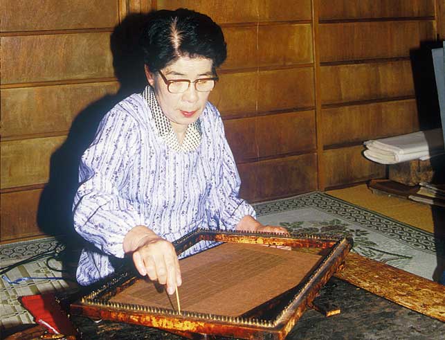
"Ito-ire" the meticulous process of creating a grid of silk threads and then sandwiching it in between the two layers of cut stencil with lacquer. Eek!

An example of a sewn-in mesh!

Willows and the surface of a pond, so so so detailed!

Here's the detail. you can see the little skimmer insect as well as the silk mesh

detail of mesh that has been sandwiched to keep these open curvy areas and long thin lines under control.

3. A clever style where the thickness of vertical lines creates a pattern within a pattern. 縞彫りの種類。

How cool is this? Edo-period craftsmen knew all about optical illusions! Just by carving varying thicknesses of lines, they can make you see clouds, birds, patterns, plants...These definitely have silk threads running horizontally to keep all those pesky verticals in place.

This one below, like most of the stencils, repeats on its long side. in the image below you can see two lines that stick out just a tiny bit further than the others. These are the "registration marks", if you want to use screen-printing terms. They are the tiny guides, to show where to match up the repeat each time it is printed.


Swallows, clouds, those diagonal lines may be representing rain because the swallows are numerous in the rainy season in Japan.


4. Pairs of stencils - 二枚型 Nimai-gata (or sometimes 文久小紋 Bunkyu-komon)

This type is really mind blowing. So a stencil has some limitations right? It's got to have parts that connect to each other so that the whole thing doesn't just fall apart That means you can't have design elements that float; everything has to be touching. BUT!
If you create two stencils, that get pasted one after the other in the same spot, you can actually "erase" some of those connecting parts and achieve the look of separate, floating design parts.

This is pretty hard to explain. The first or base stencil is called the "Main stencil" (omo-gata) and the second stencil applied on top is the "Erasing Stencil"(keshi-gata).

This Japanese site has excellent visual explanations and here is one example below.

Stencil one, 
plus stencil 2...
equals this! 
It is truly Japanese ingenuity in practice. What a lot of trouble to go to, simply to get a particular 'look'. These days, a screen-print can quickly produce the effect that the elaborate 'nimaigata' were developed to produce. But a machine-printed design will never have the same touch as one printed from a hand-carved stencil.

Here is one of a pair. We couldn't find it's matching stencil.
4. 最後に、とっても遅いですが、新年の祝いとして、松竹梅の型紙も!
And lastly, some very belated New Year wishes with an auspicious "Sho-chiku-bai" pattern. This traditional motif combines pine needles (a long-lived and evergreen tree), bamboo (produces many shoots) and plum blossom (flowers even in the cold season).