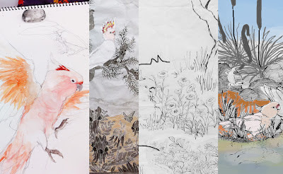
Sunday, December 16, 2012

着物を制作なんて!Making a Kimono...

In the textiles department at Kyoto Seika, students often make kimono. My teachers had been suggesting I dye my own kimono since July. I was scared!...the fabric is expensive, it takes a really long time to complete...but it's another of those 'only-in-Japan' opportunities, so for better or worse I am in the midst of producing a kimono!
京都精華でテキスタイルの学生は良く着物を作ります。7月以来教授たちは「着物を作ろう」と言っていましたけれども、怖かった!着物用の生地が高くて、制作は何月間が掛かるしと思ったが、やはり日本だけで掴まえる切っ掛けなので今自分の着物を作っています!
some initial sketch ideas 色々考えた
Creating a design for a dress is one thing, designing for a kimono is an entirely different beast. Parts of the kimono are folded upon wearing and are unseen except when displayed. When worn the front left overlaps the front right so that disappears too. The patterns and colours of a kimono vary depending on the age of the wearer and the occasion; older women wear smaller patterns and more delicate colours, young women can wear very bright and large motif designs. Some kimono are patterned all over, others only on the hem or on certain sections only. All of these things and more took a long time to get my head around but finally I came up with a design for a furisode - an unmarried woman's kimono with longer sleeves.
ワンピースなどの服のためのデザインを作るとは全然違います。例えば、着たら、長さを調節するためにあまった生地を折って重ねますし、着物の左側が上に巻きますので右側の模様を隠してしまいますし。後、年齢や行事によると、着物の柄や色が違います。こうゆうことを色々考えた上、やっと振袖のデザインを作り上げました。

this image clearly shows the difference in sleeve length between a furisode at left and a normal houmongi at right. http://img.blog.shitateya-ito.com/20121027_327721.jpg
This time I wanted to work with more flying birds, because they really lend an energy to the image. In my research of what birds are attractive in the air, I decided on the Rainbow Bee-Eater (merops ornatus). These tiny birds have spectacular green, blue and yellow feathers and spend most of their time in the air chasing their main food source of bees and insects. They are migratory birds that spend their winters in the north of Australia and New Guinea and then return to breed in Australia in summer.
今回のデザインでは、飛んでいる鳥をもっと入りたかったです。飛んでいる鳥は作品にはエネルギーを与えると思います。飛んでいる姿が綺麗な「Rainbow Bee Eater」(ハチクイ属)を染めることにしました。この鳥はハチや蛾を食べるので、いつもひらひらと飛び回っています。冬はオーストラリアの北部やニューギニアで過ごすけれども、繁殖期は夏で暖かい南オーストラリアに帰ってきます。
sketches
getting a rough idea of how the kimono would look displayed
building up the design with eucalyptus
Right now I'm tracing my design onto the silk fabric I bought using a blue ink called aobana. This is water-soluble and will come off the fabric at a later stage. The next steps will be to apply the resist paste using a reinforced paper cone with a metal tip and then commence brush dyeing using acid dyes.
今は「青花」という液体で、買った絹にデザインを写しています。次の段階は糊を置いて、酸性染料で染めるのを始めます。
tracing my design onto the fabric using aobana. You can see the silk I chose has a wave self-pattern running through it.
青花でデザインを絹に写します。生地は波の模様が入っています。
the hem of the kimono all traced on, satisfying! 裾に全部写した後。
So I'm afraid this is another cliff hanger. I will post more pictures as the Kimono really gets underway. Wish me luck!! 着物の作業が進んだらまた写真をアップロードしますので、楽しみに待ってください!

Learning the Art of Lacquer 漆を塗るし。

This semester I have been lucky enough to join a lacquer ware class offered by the Japanese Painting department at Kyoto Seika University. We were given free reign to create whatever design we liked, to be applied to a round platter shape called 'marubon'. I chose to keep with my research theme, and used a section of the Rainbow Lorikeet & Eucalyptus design I used to dye a dress last year. On the side of the image, I've included the scientific names of the two species in English lettering. It's so funny to hear Japanese classmates and my teachers say that English lettering looks so "chic" or "stylish". To me it's just English!

今学期、京都精華の日本画コースによる漆の授業を取らせて貰っています。丸盆に好きなデザインを塗るという課題です。テキスタイルの作品と同様な感じで塗っていくことにしました。それで、今年の3月に染めたワンピースのインコ(五色青灰鸚哥)とユーカリの模様を使いました。葉っぱの間に鳥と木の学名を英語で入りました。同級生や先生がよく、「英語がおしゃれですね!」と言いますが、私にはただの英語ですよ!

As you might expect from a Japanese technique, it is time and labour intensive!
日本の伝統的な技法だからやっぱり時間と手間がかかります!

After first polishing the sheen off our already black platters and ensuring they were nice and flat, we transferred our designs onto the surface with a chalky white paint called 'gofun' ("whitewash"). From there we painted a thin layer of black (almost transparent) lacquer and proceeded to sprinkle very fine silver and coloured powders onto the wet lacquer.
胡粉を使って、丸盆にデザインを写した後、段々白い線に沿って漆を塗って、その上に銀や色の粉を撒きました。

stage one was to transfer the design onto the platter with a white chalky paint, 'gofun'
最初は胡粉でデザインを写す。

the leaf on the right has just been painted with the black laquer, which acts as a glue. After sprinkling over the various powders, it looks like the leaf on the left.
右の葉は漆を塗った状態です。その上に粉を撒いたら、左の葉のようになります。


the "stylish" English lettering reads "Trichoglossus Haematodus Molucannus & Eucalyptus Leucoxylon Megalocarpa"
いわゆる「おしゃれ」な英字
Keep on adding layers of lacquer and silver and coloured powders and the design starts to appear
段々漆を塗って粉を撒きいったらデザインが出て来ます。

getting there....進んでいる。。。
Done with the powders! 全部撒いた後。
And then, in what seems like a backwards way of doing things, the whole thing gets a coat of thick black lacquer, which is left to dry til hard, then you polish the black away to reveal the design below, magic!
それで、全体的に黒うるしを厚く塗ります。それが乾燥すると、研いたら、ジャーン!!下に塗ってあるデザインが現して来ます!何かの魔法のように。

suffocating the lorikeet beneath a thick layer of lacquer...黒漆を全体に塗って(インコが可愛そう)
then digging him out again! で、研ぐとインコを解放する!
We still have 3 classes left, with some more polishing to take place. The surface will be all shiny and the silver will really sing once its all finished. I'll post pictures of the final product in January!!
授業はまだ3回残っています。ぴかぴか、つやつやになるまでもうちょっと研がないといけないです。1月に完成したらまた写真をアップしますので楽しみにしてくださいね!

Tuesday, October 23, 2012

My Very Own Folding Screen is Being Exibited! 屏風が新匠工芸会展に入選~

I previously did a post showing the end result of my Major Mitchell's Cockatoo 2 panel work. Here's a quick reminder of the work I'm talking about. 前に、大きなオウムの作品ができたと書きました。覚えっていないなら、この作品のことです。
This one! これだ!
At that stage, the work was simply two fabric panels; not really made into anything complete yet. At my review, several of my teachers suggested getting the work made into an authentic Japanese folding screen. I knew this would be expensive but agreed that it would be a nice solution and it suits the style of the piece.
その時は、染め終わったのけれど、まだ生地のままで、完成している作品とは言えませんでした。合評の時、教授が屏風にしたらいいんじゃないかと言われました。高いと思いながら、確かにこの作品は屏風になりそうな感じだねと理解していました。

In order to submit the piece to a public submissions competitive exhibition, a friend of my professor's was able to make the piece into a screen in a record breaking week. (normally these things take months!) I was very lucky he could do it at such short notice. It is only a basic screen (as that is all I can afford as a student) but I'm very happy with how it turned out. Have a look:
公募展に出したかったので、先生の友達である表具屋さんがいつもより短い期間で作ってくれました。すごいラッキーです!出来上がった屏風は大好きです。こんな感じです。
The screen opened out flat. 平面的に見ると。
But actually it would be displayed like this, with a slight angle. でも、本当はこのように展示しますね。
Soon after the screen was completed, I applied to the textiles section of the "Shinshokougeikai 67th Annual Public Submission Exhibition" (I suppose you could translate Shinshoukougeikai as New Artisan's Craft Association). I wasn't sure it would make the cut as it's a bit out there and not many foreigners seem to get their work accepted (or perhaps they just don't apply). BUT!! Last night I got a postcard in the mail to say my work has been accepted into the exhibition!! (Letting you know by postcard: how old school is that?)
This means my work will be displayed at the Tokyo Metropolitan Art Museum this week until Sunday and then the exhibition comes to the Kyoto City Art Gallery Annex from November 7th-11th. All very exciting!

出来上がった後、すぐ「新匠工芸会展」の染色分門に応募しました。昨日、入選されたというはがきが来ました!すごくうれしいです!今週は東京都美術館で展示されていますが、11月7日~11日は京都市美術館の別館で展示されます。時間がある方、見に行ってくださいね!

This is the website of the Shinshokougekai Association : http://www.shinsyoukougeikai.jp/ It's in Japanese but you can click on the button to the right of the HOME button and drop down menu lets you see images and prize winners from previous exhibitions.
上に書いてある新匠工芸会のホームページで以前の展覧会の様子や受賞の人などが見えます。

床の間 An Installation - Tokonoma

I'm currently showing some of my work as part of an installation at Kyoto Seika University. 6 of us Research students and Phd Students hailing from England, the United States, Denmark, Germany and Australia are utilising cupboards and wall spaces here and there in the Administration building on campus.
今週の土曜日まで、京都精華大学で勉強している研究生や博士課程の学生と一緒に展覧会をやっています。私たち六人が「独英米豪丁」のように、ドイツ、イギリス、アメリカ、オーストラリアとデンマーク出身です。京都精華大学内の本館を使って、3階から5階にある壁や倉庫を生かして展示しています。
International Postgraduate Students Exhibition. 独英米豪丁
I was allocated the 3rd floor storage cupboard beside the elevator. It's a narrow and airless room but it's in a location that has a lot of students and staff walk by. At first I wasn't sure how I could use this unusual space to display my work. I decided to create a relaxing space, in the style of a tokonoma.
私は3階の倉庫を使うことに決められました。エレベーターの側にある倉庫は狭くて、空気のない部屋なんですけど、たくさんの学生やスタッフが通る場所です。初めは、こんなスペースにどのように私の作品を展示すればいいか迷っていましたが、結局床の間のような空間を作ることにしました。

床の間って?
In a traditional Japanese home, one tatami room is reserved for entertaining guests which will have a set-in alcove on one side of the room called the tokonoma. This space is used to display artistic objects for quiet contemplation including hanging scrolls, calligraphy, decorative incense burners and flower arrangements. When observing the items in the tokonoma, you sit in seiza position; on your knees.
Here's a picture of my own 'Tokonoma'
これは私が作った「床の間」
My Tokonoma, open to visitors. 床の間ができた!
Peek inside to see my work and a nice place to sit. 覗き見るとこんな感じです。

Noren (split curtain) dyed on linen. I used silhouettes of eucalyptus leaves for this design. 麻で作ったのれん。デザインはユーカリの葉っぱのシルエットです。

A kind of logo I made last semester that I was able to print in the corner. It says "So-meru"
染めた「印鑑」染める・染Meru・染メル
I "wallpapered" the space and built a small raised tatami platform. One of my scrolls hung on the back wall and I arranged some flowers in front too. I was able to display some of the washi paper fans I made last semester on a side wall too. As an entrance to the cupboard and to empashize the tranquility of the space I dyed a noren hanging curtain on linen for the doorway. A zabuton cushion is on the floor in front of the work so that the viewer can sit quietly and enjoy the work.
壁に落ち着いている色を張って、畳の台を作っておきました。掛軸を奥の壁に掛けて、その前に花を生けました。(ちなみに精華の華道部に入っているんですけど、まだまだ初心者なので間違っているかもしれない!)左側の壁に和紙の団扇も展示しています。事務所からくっきり分けるために、のれんを倉庫の入り口に掛けました。見る人が座布団に座って、ゆっくり作品を眺めれるように工夫しました。

Just how I pictured the space being enjoyed. 友達が見に来た時の写真

Detail of the scroll. 掛軸

3 of the fans I made using Japanese paper. 染めた和紙で作った団扇。今回は3枚組
It was an interesting experience to make an installation for a change. I had a lot of fun putting together the look and feel of the room and am really excited to read comments left in the notebook in the room saying that people have enjoyed the feel of the space and spending time there. If you have time and happen to be in Kyoto, be sure to check out the exhibition until this Saturday.
ただの作品展示ではなく、全体的な空間を創造するのがとても面白かったです。部屋に置いたノートにたくさんの親切なコメントや感想をいただいてうれしいです。この土曜日までに見えるので、もし時間があれば立ち寄って、コメントを残してくださいね!

Friday, July 20, 2012

End of Semester Assesment 前期の「ミニ合評」

English Below

これから、日本語にも書こうかなと思っていますので、間違いがいっぱいかもしれないけど、よろしくお願いします!
月曜日に先生たちに前期に終わった作品を見せました。今は研究生なので、各年生の合評に入れなかったので、個人的な「ミニ合評」を行ってもらいました。下はミニ合評の風景です。
ミニ合評の風景です。My works up on display for my "mini Assesment" on Monday.

糸目糊(友禅染)で和紙を染めて、団扇に作りました。I dyed some washi (Japanese paper) using hand-drawn line resist (yuzen) and turned them into these summer fans.

これは型染めで染めた和紙で作った団扇。今回、古い団扇の紙を外して、新しく張りました。I dyed these fans using katazome on washi  and stuck the paper onto two old fans frames which I had dissected.
先生たちは皆、「いいね」「すごいな」「あ!きれいね!」といってくれたばかりなので、今からどこの点にもっと磨きをかけたほうがいいかどうかは分かりませんが、ほっとしました。^^
「着物を作ってみて」という声が多かったので、後期からの作品は着物です。夏休みの間に色々な着物の本や昔の着物の例を調べて、自分の着物をデザインするのを楽しみにしています!

I've decided I will try posting in Japanese and English from now on, so apologies that these become a bit longer and possibly hard to read! I had my assesment for the end of 1st semester on Monday this week. It ended up being me with about 6 teachers but they were all very positive, to the point where I didn't really recieve any constructive criticism to go off of, but I suppose this is a good thing!

You can see above how I had my works set up in the room, including the Major Mitchell's piece I recently finished, as well as a selection of Japanese fans I dyed, mainly for fun. Also, I hung up the two scrolls that I got made out of two of my textiles. They cost me a few limbs but I'm really happy with how they turned out. Here are a few details.

The correct way to store the scroll in its special box. I had to take a photo so I could remeber how! 紐の巻き方を覚えるように、初めて掛ける前に写真を撮りました!

Rainbow Lorikeets piece becomes a scroll! It's giant! Almost 2.5 metres tall... インコの作品は掛軸になりました!でっかい!2.5メートルに近い。

You can see there is a small border of gold silk in between my work and the edging silk. 作品と周りの間に金色の絹を少しだけ見える。

Red-rumped parrot piece as a scroll. The scroll-maker said he usually works with turning Calligraphic artworks into scrolls so he's used to black and white works that match with many colours. My colourful artworks were a new challenge for him! 表具屋さんはだいたい書道を掛軸にしているので、こんな鮮やかな作品に合わせる生地を選ぶのが新しいチャレンジと言いました!
After all that, I'm off on my summer holidays! Will catch you up with the kimono design progress in a month or so.

Wednesday, July 11, 2012

The Major Mitchell's Live!

After almost 3 months, I finally completed the piece I have been working on.

This time around I wanted to see if I could sucessfully combine the techniques of katazome and yuzen-zome (hand-drawn resist) in the one artwork. I was also hoping to depict birds in a lively way; to show them as if jumping off the fabric. I took a lot of inspiration from the world of nihon-ga Japanese Painting with regards to style, composition, and ideas about empty space. I'm pretty happy with how it has turned out. What do you think?
tentative title : 車冠鸚鵡図 Major Mitchell's Cockatoos
I'm still deciding what to call this work but I really like the Kanji for Major Mitchell's Cockatoo (yes! there is a kanji!) 車冠鸚鵡 (read as Kurumasaka Omu くるまさかオウム) so I think I might work that in there.
 The work is comprised of two fabric panels. I'm yet to decide how I will finish it, whether as two hanging fabric panels, as a folding screen (this would be the most expensive option!), or some other solution.

Here are a few details of the work and then I will give you some process photos so you can see how I went about producing this.


1. Sketching and preparing a design


I wrote previously about how much of a challenge this step was for me. It took a long period of sketching, rearranging, painting, cutting up, putting back together etc to get to what  you see at left.


2. Cutting a stencil for the katazome areas


I really like this step; it's sort of relaxing to just sit and cut out the small shapes with a cutter knife for a few solid days. I used the stencil to create the eucalyptus tree area of the design as I felt katazome is perfect for creating silhouette-like effects.


3. Apply resist paste with the stencil and dye the katazome areas


I used my stencil to apply the resist paste to the two panels of silk fabric. The paste is dried, hardens, and I used small flat brushes to apply a chemical dye-stuff onto the fabric. The fabric was steamed and washed and you can see what was left.

4. Filling in the gaps with hand-drawn resist paste


Using a resist paste made with rice flour and rice bran, I applied fine lines of resist onto my fabric. I chose to do the cockatoos and flowers in the design using this yuzen-zome technique because it allows a lot of fine detail and a sense of movement.


5. Yuzen-zome dyeing stage


Slowly but surely filling in all the areas using multiple brushes and applying dye in gradients. Once complete, the fabric gets steamed again.


6. Fuse-nori Covering resist paste/7. Background Dyeing


Another layer of resist paste is applied as a mask over the dyed areas to protect them and once that's dry the background colour can be dyed onto the fabric. In this case I used a water sprayer and some large brushes to create a pale yellow sky colour with gradation. After that I used some smaller brushes to fill in the ground and water areas. One final steam and wash and it's finally done!


In other exciting news...I have had two of my textiles made into traditional Japanese kakejiku (hanging scrolls). They look great! I am yet to show them to my professors. Will do that this week and put up some photos of the finished scrolls. Something to look forward to!

Saturday, June 9, 2012

The process of Kyo-Yuzen 京友禅

If you can ignore the1980's elevator music soundtrack, this is a really helpful video explaining the steps involved in Kyo-Yuzen, Kyoto style Yuzen dyeing.
Everytime I watch this I am reminded how far I have to go! These people are amazing at what they do, no doubt about it.

アニマル・アート展 Animal art Exhibition @ Metropolitan Fukujyuso

Animal Art! From the 19th of June to the 1st of July, I will be showing some work as part of this group exhibition!

It's a kind of celebratory show because the Kyoto City Zoo, just next door, has done some refurbishments and re-opened to the public in April this year. You can actually hear the tigers roaring and the elephants from the open windows of Fukujyuso.

Metropolitan Fukujyuso is a cafe as well as a gallery space, in an old Machiya style house. It's a traditional style interior with tatami flooring, wooden beams and sliding doors onto small vernadahs and a Japanese style garden. I'm excited to exhibit such a interesting and unique space.

you can read more about at the Fukujyuso Blog.
http://metropolita.blog.eonet.jp/default/2012/06/post-c569.html

Tuesday, May 22, 2012

The Struggle.

How long does it take to design an artwork?...how long is a piece of string?

I have spent the last 5 WEEKS (!!) struggling with a design for a new two panel textiles work. This is the longest I have ever taken to create a design and its killing me! I love to sketch and fiddle around with paint but large scale drawing and composition is just not my strong point. I'm so ready to move on to the fun steps of cutting a stencil, making print paste and dyeing but I can't until I've got this foundation step right.

It's been an eye opening experience. I've added sections. Taken parts away. Cut it up. Pasted on new bits. Painted colours in. Started all over again. Moved parts around. Made it bigger. Doubted the idea itself. Taken confidence. Almost reached an end point.


various stages of incompleteness
In my designing despair, I came across this heartening video. It's from an interview with writer Ira Glass, where he says that artists starting out need to keep on creating even though they feel what they are producing is inadequate.


Hopefully, the time spent on getting this design right will mean that the resulting artwork will be mostly sastifying. I will post images here as the work finally, at last, at length, gets off the ground.

Thursday, April 19, 2012

Kacho-ga 花鳥画 - The Art of Birds & Flowers

There is a genre in traditional Japanese painting called 花鳥画 kachou-ga, which literally translated means 'a painting of birds and flowers'. It has its roots in Chinese painting traditions where themes of natural beauty were highly valued. I've been reading about kachou-ga because my textiles are also essentially paintings of birds and flowers.

There are some things that are inherent in a kachou-ga that make it more than a mere image of a flower of bird or animal. These things are hard to define but according to Uemura Atsushi, a famous Japanese painter from a lineage of famous painters, the following is a clincher:

"Depicting natural phenomena as is doesn't make something a painting. To produce a work of art, the artist must give shape to the world he imagines in his own mind and heart" (forgive the translation)

Folding Screen by Suzuki Kiitsu, "White Crane & Willow Tree"
Another Japanese painter, Kawaguchi Naoyoshi, says that if an artist is to paint kachou-ga , they should not be painting the true to life external appearance of a subject but incorporating their own feelings and spirit into the work.

Also, Uemura adds that a frequent ingredient in kachou-ga is 「余白」yohaku, meaning "blank space". He says that it is by incorporating blank space in a work, the artist is hinting at this otherworldliness.

From the series "Birds & Flowers of the Twelve months" by Sakai Houitsu. Left: October. Right: September.
There's still a lot to read about kachou-ga but these are some of the most fundamental ideas.

I'm currently planning new work that follows some of the kachou-ga  styles and ideas, this time depicting Major Mitchell's Cockatoos. I'm still in the sketching and designing stage.


Also here's a few images from this week at school. I put up all the pieces I had finished during the spring break to show my professors. They were very positive and encouraging which was nice.