
In the last weeks of my big Kyoto Adventure, I was invited out to visit a dyeing Atelier in the west of Kyoto called "古今 Kokon". I was taken there by a friend of a friend, Kumie-san, resulting in Chinese-whispers style communications that meant all I knew was that we were going to see a dyeing studio that does "amazingly detailed katazome". Okay, I figured, count me in!

**この投稿はもう6ヵ月間も下書きのままに残しちゃったけど、工房のスタッフにとても暖かく迎えられたから、遅くても書かないよりはまし!**
4月、京都で最後の二週間に帰る準備でバタバタしていましたが、友だちから「すごく細かい型染をやっているところがあるのよ!絶対見に行った方がいいよ!」と言われたので、友だちの友だち久美江さんに連れて行ってもらいました。「染処古今」という工房で、四条西小路の交差点から徒歩10分ぐらいのところで、普通の住宅街に挟んでいる感じでした。
We walked for about 10 mins from Shijo/Nishikoji streets through backstreets and L-shaped short-cuts to arrive at the Kokon Atelier, established on a narrow suburban street in between ordinary looking family houses.
Mr Yasue, the fourth-generation head of the company, was there to greet us and kindly showed me all the different steps of their process in creating their unique line of kimono and obi. Turns out I even got a mention on Mr Yasue's Blog as "a very enthusiastic" visitor!
古今四代目の安江さんに迎えられて、古今の独特な着物や帯を作る工程を丁寧に説明してくれました。安江さんのブログにも登場しました!
古今四代目の安江さんに迎えられて、古今の独特な着物や帯を作る工程を丁寧に説明してくれました。安江さんのブログにも登場しました!
 |
| You can see Kokon's website HERE ←これは古今のホームページです! |
 |
| Super-fine Komon-dyed fabric on display at Kokon 古今の超細かい小紋はステキな色で染められています。 |
- Carving a stencil from katagami stencil paper, using fine metal-tipped punches, or by hand with a fine cutting blade
- Applying a soft, sticky rice-flour based resist-paste through the stencil onto the fabric
- Dyeing the fabric by brush or dip-dyeing (in the latter case, the stencil is used to print the resist paste onto both the front and back of the fabric, matching the tiny pattern perfectly!!! brain explosion!!)
- Steaming the fabric to set the dye
- Rinsing off the resist-paste and revealing the delicate tiny komon patterns, which remain the white colour of the base fabric.
古今で、小紋を染めています。伝統的な小紋の工程を簡単に説明したら、
☆ 型紙を細かい刀で彫る、それとも丸きりなどの道具で模様を彫リます。
☆ 場合によって型紙を丈夫するため、漆で絹の紗を表に張ります。
☆ 型紙を布に載せて、柔らかい餅粉と糠からできている糊をヘラで敷いて、模様は布に置かれます。
☆ 刷毛で布の表を染めます。乾いた糊は染料を防ぎます。浸染する場合もあって、その時は布の両面に糊を置かないといけない。しかも、両面の模様がぴったり合うようにしないと!(なんてこと!!)
☆ 染料を布に定着するため、100度で蒸します。
☆ 布を洗って、糊を落とします。やっと繊細な模様が見えます。糊が置かれたところは布の色のままです。つまり模様は白いです。
 |
| Just one of the crazy detailed Katagami stencil papers on display at Kokon, this one carved by a National Treasure, Nanbu Yoshimatsu 1894-1976 人間国宝南部芳松に彫られた細か~い型紙! |
古今で、小紋を染めています。伝統的な小紋の工程を簡単に説明したら、
☆ 型紙を細かい刀で彫る、それとも丸きりなどの道具で模様を彫リます。
☆ 場合によって型紙を丈夫するため、漆で絹の紗を表に張ります。
☆ 型紙を布に載せて、柔らかい餅粉と糠からできている糊をヘラで敷いて、模様は布に置かれます。
☆ 刷毛で布の表を染めます。乾いた糊は染料を防ぎます。浸染する場合もあって、その時は布の両面に糊を置かないといけない。しかも、両面の模様がぴったり合うようにしないと!(なんてこと!!)
☆ 染料を布に定着するため、100度で蒸します。
☆ 布を洗って、糊を落とします。やっと繊細な模様が見えます。糊が置かれたところは布の色のままです。つまり模様は白いです。
 |
| multicoloured patterns are their trademark at Kokon. Yasue-san said he spends hours figuring out colour combinations that are just right. 古今に特有の色合い。 |
At Kokon Atelier, they are using a more modern technique which allows the application of multiple colours. That is, instead of applying plain resist paste onto white fabric resulting in a dyed background with a fine white pattern,
they are also sometimes applying a coloured resist paste and dyeing the background, resulting in both a coloured background and finely detailed coloured patterns. This way, none of the white base fabric is left showing through.
染めどころ「古今」にて、伝統的な小紋の知識を守りながら、現代な雰囲気も加えていると感じました。得に使っている色によって感じます。昔の小紋といったら、白い生地に一色の模様が染められました。(細かい模様はもう織物に見える!)古今で、色糊の使用によって、生地も模様の所も染められます。(上の写真を参考に)。また、色糊の上に暈し染をしたり、何枚かの細かい小紋をデザインの中に使ったりするから、とてもフレッシュな雰囲気の染物が出来上がります。
If I managed to confuse you just now (sorry!), then check out the below photo.
The black and white fabric has used traditional resist paste + black dye, whilst the second fabric has used a khaki paste, then a black dye.
The black and white fabric has used traditional resist paste + black dye, whilst the second fabric has used a khaki paste, then a black dye.
 |
| Top fabric= normal rice/bran resist paste, then dyed black. Bottom fabric= a green tinted resist paste, then dyed black. |
染めどころ「古今」にて、伝統的な小紋の知識を守りながら、現代な雰囲気も加えていると感じました。得に使っている色によって感じます。昔の小紋といったら、白い生地に一色の模様が染められました。(細かい模様はもう織物に見える!)古今で、色糊の使用によって、生地も模様の所も染められます。(上の写真を参考に)。また、色糊の上に暈し染をしたり、何枚かの細かい小紋をデザインの中に使ったりするから、とてもフレッシュな雰囲気の染物が出来上がります。
色糊は明治時代に発達されました。ヨーロッパ(特にイギリス、ドイツ)の研究者が開発した化学染料は日本へ輸入されました。化学染料は糊と混ぜることができて、新しい染め方が現れました。
染料が入っている色糊は、上から挿される染料を防ぎながら、置いた所も染めてしまいます。
かしこいでしょう!
見学した時、糊の作る段階が見えました。古今では、色糊は毎回、職人さんの感覚で作られています。染料は何パーセントとかのレシピが無しで、普通の糊に、染料を少しづつ加えて、良さそうな色になると、生地に敷いて、蒸して洗います。色は予想と異なると、染料の量を調整して、もう一回蒸して洗ったりするの繰り返しでやっと糊ができます。
すごい努力の要る作業だと思っていましたが、安江さんたちがこだわっている綺麗な「生じゃない色」を作るにはやっぱり必要ですね。
 |
| Normal paste on left, dye concentrates, then a Blue paste getting mixed on right. 左は普通の防染糊、真ん中は各色の染料、右はできた青色の色糊。とても濃く見えますが、蒸して洗うとかなり薄い色になてしまうから何回も確認しないと。 |
Mr Yasue showed me their rows of tubs of mixed coloured resist paste and was explaining to me how they mix the colours. He told me they don't use measures or a notebook of dye to paste ratios but by mix their colours by eye. Every time!
To do this, they have various dye concentrates all lined up and add these to a bucket of plain paste little by little to produce a batch of paste in the desired colour. This colour sample needs to be dried, steamed and washed to check what the true resulting colour will be. They continue to adjust and repeat the tests until the desired colour is achieved. This seems like an awfully tedious way of mixing colours, but as Mr Yasue pointed out, this ensures they achieve rich, subtle colours; colours that do not look like they came "straight-out-of-the-tube".
To do this, they have various dye concentrates all lined up and add these to a bucket of plain paste little by little to produce a batch of paste in the desired colour. This colour sample needs to be dried, steamed and washed to check what the true resulting colour will be. They continue to adjust and repeat the tests until the desired colour is achieved. This seems like an awfully tedious way of mixing colours, but as Mr Yasue pointed out, this ensures they achieve rich, subtle colours; colours that do not look like they came "straight-out-of-the-tube".
 |
| Yasue-san showing me their swatch book of paste colours. This is only a visual reference though because they remix the colours by eye each time! (写真は古今のブロッグから) |
糊の作業場から、型紙の展示へ移動しました。何人かの人間国宝に彫られた型紙も所蔵されているそうです。「道具彫り」に使う道具も見せてもらいました。道具自体は美しいと思いました。丸、葉っぱ、月などの形を切る道具もあって、これらは職人さんが自分で作るらしいです。型紙を彫る職人さん、何名も「人間国宝」とされていますが、この道具も近いうちに国宝にもなるのではないか?将来に作れる職人さんが減ると貴重品になるでしょうね。
After the paste-mixing room, we had a look at the different kinds of stencils and cutting tools for komon. Aside from tiny blades, punch shapes are also used for cutting stencils (dougu-bori). The stencil-cutting artisans tend to make their own punches, hammering fine strips of metal to form the desired blade shapes (like dots or moons or small leaves). Many stencil-carvers have been designated as "National Treasures"; their craft is so skilled. Aren't the punches also beautiful objects?? They will become national treasures themselves before long because there are now very few craftsmen actually making these amazing tools.
After the paste-mixing room, we had a look at the different kinds of stencils and cutting tools for komon. Aside from tiny blades, punch shapes are also used for cutting stencils (dougu-bori). The stencil-cutting artisans tend to make their own punches, hammering fine strips of metal to form the desired blade shapes (like dots or moons or small leaves). Many stencil-carvers have been designated as "National Treasures"; their craft is so skilled. Aren't the punches also beautiful objects?? They will become national treasures themselves before long because there are now very few craftsmen actually making these amazing tools.
 |
| The one-off handmade cutting tools, some shaped like crescent moons, others circles and dots 美しい道具。 |
次は大きな作業場へ入りました。頭の上に5メートルの糊板がたくさん並んでいて、背が高い人はここで働けないなあと思いました!笑 いくつかの板に帯や着物の反物が貼っていました。
Next, we went into the biggest workroom. The ceiling is very low as all the 5 metre long wooden pasting boards are stored up above their heads. Many had kimono and obi-belt fabric in progress pasted on them.
Next, we went into the biggest workroom. The ceiling is very low as all the 5 metre long wooden pasting boards are stored up above their heads. Many had kimono and obi-belt fabric in progress pasted on them.
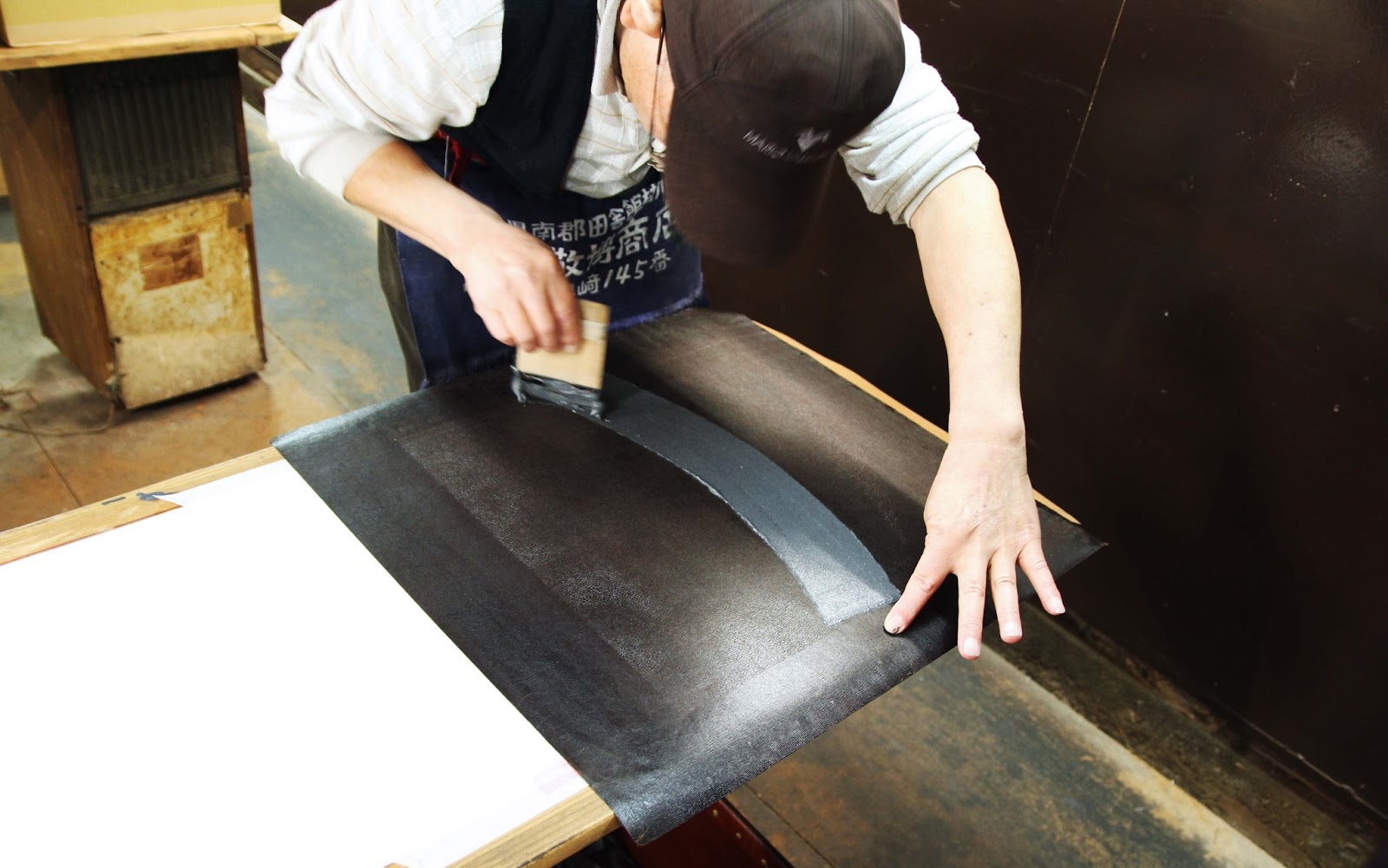
Three staff were working in the space. One was applying layers of lacquer to old stencils to prolong their use. Another was printing fabric, matching a ridiculously fine repeat pattern down a length of fabric and washing the stencil between every repeat (! they take pride in their product!)
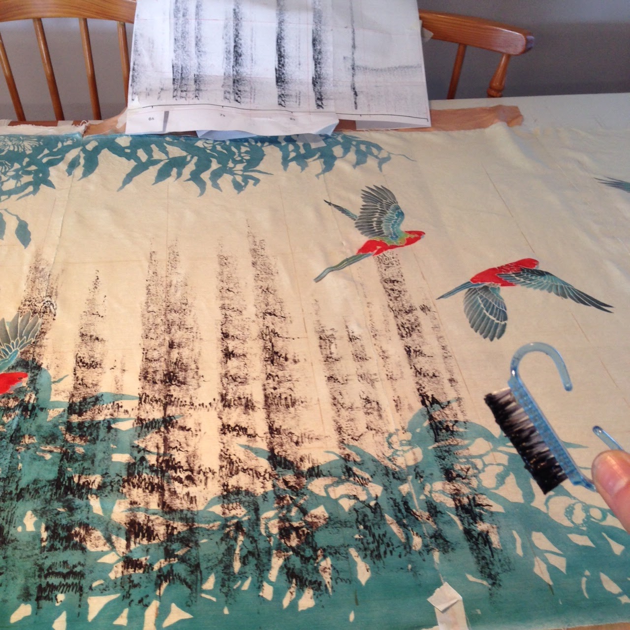
最後に野村さんの仕事をお邪魔しました。16歳からこの工房で働いていたそうで、(姿勢を見るだけで分かるんですがね)小紋のプロです!見学のときは、ちょうど着物の裾の所に色んな小紋を一枚ずつ「熨斗」のデザインに入れ込んでいました。とても複雑な仕事ですが、結果はきれいですね。
 |
| Lacquering old stencils to extend their life. 古い型紙に漆を引いていました。 All the 5 metre long narrow pasting tables are stored overhead. Couldn't be a tall person working here! |
 |
| In the middle of printing a fine pattern with coloured resist paste, very carefully matching the pattern repeat each time. You can barely even see the pattern at all here, but check out the next photo!! 小紋の糊置きの最中。毎回、柄がぴったり合うように練習が必要ですね!模様はここで見にくいですが、次のショットで見ると... |
 |
| ギャー!こまかい!eeeeek! Super fine komon pattern freshly printed with a coloured resist paste. |
Best of all though, was Mr Nomura. He has been with the company since he left school at 16 (I think his spine kind of gives that fact away..) and as such, he is the resident expert. He was printing when we went in, working to combine multiple fine patterns on what will become the ornate hemline of a kimono.
 |
| Nomura-san, looking like a pro. because, well...he is. プロのしぐさですね! |
 |
| Nomura san printing different patterns selectively to create the impressive effect below ↓ 野村さんは小紋を部分的に糊を置くと下のような効果がでた↓ |
 |
| various komon patterns printed carefully within the design of "noshi" a curly ribbon-like motif in Japanese art and design. |
 |
| Yasue-san surrounded by his company's products 古今の着物や帯に囲まれている安江さん |
帰る前に、古今の商品が置いてあるビルを案内させていただきました。古今の複雑な工程を見たばかりので、完成品の帯や着物に感動しました。
Before heading out to a sushi lunch, Mr Yasue took us to a second compant building and showed us some of their finished products. After having seen the complex process Kokon uses to dye their fabrics, it was even more impressive to see the final products, all shiny and packaged up.
I was really taken with the modern colour pallete they are using in their products. Without modifying the traditional process, tools or fabrics, they are giving their kimono and obi a really contemporary look just by using really unique colour combinations.
 |
| Obi with the same pattern in different colourways. 同じ柄の帯。ぜいたく! |
I was really taken with the modern colour pallete they are using in their products. Without modifying the traditional process, tools or fabrics, they are giving their kimono and obi a really contemporary look just by using really unique colour combinations.
After all, this is reflected in the name of the company: Kokon. The two characters mean "Old" and "Now"; Bringing together the knowledge and expertise of the past generation and utilising it to skillfully make beautiful clothing for the generation of today.
古今でうまいことに小紋の道具、生地、素材を伝統のままにして、色やデザイン感覚だけを変えることによって、面白い染物を作り出していると思います。
「古今」の字のように、過去の職人さんの知識と技法を使って、現在の人々のテーストにあう染物をフレッシュな感じに作っている、と思います。小紋の伝統を次の世代にも伝えたらいいですね。
古今でうまいことに小紋の道具、生地、素材を伝統のままにして、色やデザイン感覚だけを変えることによって、面白い染物を作り出していると思います。
「古今」の字のように、過去の職人さんの知識と技法を使って、現在の人々のテーストにあう染物をフレッシュな感じに作っている、と思います。小紋の伝統を次の世代にも伝えたらいいですね。


