Monday, September 16, 2013

Dyeing Endangered Parrots 絶滅危惧種を染める

研究生であった二年間、作品に描写したのが単に「オーストラリアの鳥と植物」だった。でも、最近はそのテーマから、ちょっと知的というか、何かのメッセージを持っている作品を作りたかったのだ。「知的」という点で誤解しないでね!くだくだしいアーティストステートメントを読むときや
どっかの作家さんに無理やりに作られたコンセプトのことを聞くと、笑ってしまう人間のだ。作品より文章を過大視しるのが好きじゃないから。けれども、色んなことを研究するのが楽しいから、研究したことを何とか作品にも表現するのが面白いだと思う。

In my work made whilst a research student, my main focus was simply Australian Parrots and Australian native flora. The fact that Australia has over 50 species of parrots means there is an incredible, colourful inventory to draw upon in making work. I recently wanted to move beyond simply depicting beautiful birds of Australia to making work that has something to say or has an intellectual touch. Don’t get me wrong, I’ll be the first person to gag when reading some long-winded pretentious artist’s statement (this arty bollocks generator always makes me laugh) or listening to an artist forcing some vague theories around their mediocre artworks. However, I do enjoy researching and it’s interesting to intertwine this and my artwork.

前に横浜絵、花鳥画や花鳥茶屋などを少しだけ研究したことがある。
Previously, this research included things like Yokohama Woodblock Prints,  Kacho-Ga Bird and Flower Paintings and Bird Tea Houses...

でも、今回興味を引いたのがオーストラリアの絶滅危惧種のだ。オーストラリア人は日常生活に色々なインコやオウムを普通に見るから、その中に絶滅の危険にさらされている種類が居るなんて知らないと思います。
This time, I've been interested to read about the endangered Parrot species of Australia. We have so many beautiful parrots as a natural part of our daily lives that we probably don’t even think much about some of them being endangered.

Just a small selection of threatened Australian Parrots. From Left to Right: Extinct Paradise Parrot, Critically Endangered Orange-Bellied Parrot, Critically Endangered Western Ground Parrot, Endangered Carnaby's Cockatoo and the Endangered Swift Parrot.
左から右:絶滅したゴクラクインコ, 絶滅寸前のアカハラワカバインコ、絶滅寸前のニシキジインコ、絶滅危惧のニシオジロクロオウム と絶滅危惧のオトメインコ
国際自然保護連合による作成されたレッドリストは絶滅のおそれのある種類を8つぐらいのカテゴリーに区分する。主にそのカテゴリーは「絶滅EX」、「野生絶滅EW」、「絶滅寸前CR」、「絶滅危惧EN」、「危急VU」、「準絶滅危惧NT」と「軽度懸念LC」だ。合わせたら20種類ぐらいのオーストラリア原産インコやオウムがレッドリストに載せている。

The IUCN Red List  (International Union for Conservation of Nature) is a global database of threatened species which classifies species into various degrees of conservation. In order of seriousness these are Extinct, Extinct in the Wild, Critically Endangered, Endangered, Vulnerable, Near Threatened and Least Concern (and then those with insufficient data). According to this list and to the Australian Government, Australia has 3 Extinct Parrot species (including the Paradise Parrot), 2 Critically Endangered species (Orange-Bellied Parrot, Night Parrot), 8 Endangered Parrots/Cockatoos and 6 Vulnerable Parrots/Cockatoos.

Extinct since the mid 1900's Paradise Parrot 1930年ごろ以来 絶滅したゴクラクインコ
1930年代に絶滅したゴクラクインコから初め、色々な種類の存在を脅かしているなんて悲しいことなんだ。オーストラリアは沢山の美しいの鳥の生息地けど、だんだん減っている。自分の作品では、この悲しさじゃなくて、鳥の綺麗さや特徴を貢物か保存として描写したいと思っている。前に出来た帯もその気持ちで作ったものだ。

The fact that we already managed to wipe out the Paradise Parrot, only as recently as the 1930’s and are still pushing other species to extinction is tragic to me. We have some of the most beautiful birds in the world and perhaps don’t realize this until we go overseas. I’m happy to know that there is a lot being done in terms of conservation and protection programs for these birds but still feel a sense of helplessness that they may not be saved. Rather than lamenting or making a cry for activism in my work I am simply interested in depicting these rare species before they disappear; as a kind of tribute or acknowledgement. It was in this spirit that I also made the Swift Parrot Obi that I showed you previously. 

今回の作品は上に前述した絶滅寸前のアカハラワカバインコをモチーフにした。帯に使ったオトメインコのように、珍しい渡りインコだ。夏を涼しいタスマニアで繁殖してから、バス海峡にある小さな島々を経て、南オーストラリア本土で冬を過ごすというサイクルだ。残念のは、春にタスマニアへ戻る鳥数は減っていて、野生の人口は現在30匹ぐらいのだ。
This latest work focused on the Critically Endangered Orange-Bellied Parrot (Neophema chrysogaster). Interestingly, (like the Swift Parrot in my obi design) these parrots are also migratory. The spend summer in the cool of Tasmania and then fly north across the islands of Bass Strait to arrive in Southern Australia for the warmer winter. Unfortunately, less parrots are returning to Tasmania for the breeding each year, so that the population in the wild is now around 30 birds.

At this point the work was unfinished, but this gives you an idea of what 5 metres long looks like!
この写真では作品がまだ製作中だったが、5メートルの長さが分かる写真。
このインコの特別な渡る習慣を表現するため、絵巻物のような横長い作品を染めることにした。出来た作品は長5.5メートルx縦38センチ。この11月に、京都精華大学の染織専攻大学院生6人で展覧会を開くとき、この作品を円形に展示したいと今思っている。そうすると、見る人が作品の外側を歩きながら、ストーリーが段々見えてくる。またその展覧会の詳しいことを知らせます!
In this piece I wanted to depict this cycle of migration and the passing of time. I chose to dye a long narrow piece (5.5 metres long and 38cm wide) that is reminiscent of Japanese hand scrolls, which are ‘read’ from right to left. I will be exhibiting this piece in November in an old elementary school in Kyoto (keep your eyes peeled for updates!) and intend to hang the work as a circular loop, whereby the viewer walks around the piece and sees the story slowly unfolding.

the first 'scene' of breeding in Tasmanian Eucalypts in the summer. the story progresses to the left from here.
左先:タスマニアのユーカリで繁殖している様子。ここから、ストーリーが左へ。

feeding on button grass in Tasmania
タスマニアにButton Grassが大事な食物になります。

close up. the bird was dyed in yuzen technique and the mountains behind using katazome.
鳥を友禅で染めた。背景にある山を型染めで染めた。

Flying north across Bass Strait for the winter. I really enjoyed doing this more abstract section. Its a combination of yuzen, katazome and free hand resist paste techniques.
バス海峡を渡る。こういうちょっと抽象的な部分を染めるのがとても楽しかった。

I included some topographical outlines
タスマニアの周りの地形図の線も含みました。

the birds finally flying back to Tasmania. It's thought that they travel at night time.
やっと春にタスマニアへ戻っているインコ。夜中に飛んでいくと思われている。

At this point the imagery matches back up to the start of the piece. I included a quote here that reads, "Mostly it is loss that teaches us about the worth of things"
最後の部分は最初のところと合わせるので、永遠なループになっている。ここで文章を入れてみました。訳してみると、「何かの大切さを考えさせるのが喪失のだ」というような文章です。
今回は作品の下図をなかなか長い時間取り組んだ。出来上がった作品は満足しているが、この延びた時間のせいで、モチーフを入れすぎたし、あんまりシンプルな作品にならなかった。毎回制作すると、シンプルなちょっと抽象的な作品を作ろうと思うのだけど、なかなか性格的にはそれが難しいのだ。次の作品を抽象的なものも入れたいです。今は試しをしているから、また写真をアップします。
I spent a very long time working on the design for this piece and in the end, whilst I am happy with it as a whole, I can see that I tried to put too much into one work. I’m always aiming for simplicity and some degree of abstraction but it’s a battle against myself and a slow learning process to move away from very tight, small designs. It’s this that I’ll be focusing on in my next work which I am currently doing some experimentation and samples for. Will keep you more updated this time, I promise!

Saturday, September 14, 2013

FLATNESS and the vague border region between Art and Craft

Excuse me while I get a little theoretical and ranty here. The idea of flatness in Textiles has been on my mind a lot recently.
今回のエントリーはなかなか論理的になってしまいましたので、すみませんが、日本語の訳は難しくて、あきらめました!

Having entered the Master’s program at Kyoto Seika this year, I have had to also start taking some compulsory Art theory courses. I was actually quite glad to get back into some academic art subjects because the practical courses at Kyoto Seika (I might get in trouble for saying this) and probably other Japanese Art universities too, are not so concerned with critical art analysis or having concepts as the foundation of your art practice.

One of these courses is run by a very charismatic (let’s call him) S-sensei, who is a researcher into Art criticism and an absolute fountain of knowledge concerning Western Art, Contemporary Art and the Philosphy of Art. The students in this particular class were from various specializations within the Arts faculty; Western-style Painting, Printmaking, Ceramics, Video, Japanese Painting and of course me and one other in Textiles. In one of our rambling discussion sessions in class, S-sensei got onto the topic of how Textiles students at Kyoto Seika often make their work flat, stretched around a panel, as if to make it a painting.

When I first came to Kyoto Seika as an exchange student over 5 years ago, I remember being taken aback by this same thing. The students in the first and second year classes all owned a wooden panel about 90x60cm that they reused for each set project as a base to stretch and pin their dyed fabric works on for critique. They will make the same sized work in wax-resist dyeing, hand drawn resist and katazome stencil dyeing. Some students continue to make panel-stretched works into 3rd and 4th year. Amongst those students studying dyeing techniques, I feel this is the majority.

A critique for Seika 2nd year Textiles students where they all presented their works tautly pinned to wooden panels.

It only takes a quick look at the works of the current dye technique Professors and their pre-decessors’ works to see that flat works are the order of the day.

Toba Mika, 'Kagerou' Hakusan Tsumugi Silk, Katazome, Acid Dyes. 198 x 340cm

Ichimura Fumio, 'Phase' Fuji Silk, Silkscreen print. 180x270cm

Asadu Shuji, 'WORK D2' Cotton, Pigments and Stencil. 197 x 324cm
\
Takaya Mitsuo, 'Coexistence' Shinshu Silk, Acid Dyes, Mixed Dye Techniques, Wax Resist. 140 x 160cm

Kawata Koro, '2002・MITTIE -Wall-’ Silk, Paper, Acid Dyes, Ink, Stencil Resist, Collage. 210x340cm

I’m not saying this is a bad thing, I’m just intrigued by why this is.

Afore-mentioned S-Sensei, being the inquisitive person that he is, is famed to have attended a Kyoto Seika Textiles critique and posed the very same question to the head of the department; ‘Why go to all the trouble of dyeing fabric only to stretch around a panel and make it flat?’. The story goes that the Textiles head Professor let rip about how panels were a tradition in themselves in dyeing and presentation and how S-sensei couldn’t possibly understand the complexities of the contemporary dyeing field. Needless to say, that’s not much of an answer.

I have some theories and they take us into tricky territory about what is art and what is not.

My first theory is this. Japanese art has long made use of the folding screen as an artistic surface. Great painters of the Rinpa movement or Yamato-e for example, used the folding screen format often. This form is so familiar in the field of Japanese art and perhaps those making panel and folding screen works today see no disparity at all. 

Sakai Houitsu of Rinpa School, 'Summer and Autumn Grasses' 「夏秋草図屏風」Collection of Tokyo National Museum

typical Japanese Folding Screen Paintings

These old examples of folding screens were painting on the panels. For this new textile folding screen category to have arisen, then it must have been concluded at some point and in a certain stream of the field that textiles can also function as painting. I feel that this was probably around the 1950’s when many textile dyers were starting to make these big abstract panels that were a split from the tradition of ‘functional textiles’, instead treating them as modern art. Today I think this ‘flat textiles as modern art’ idea still exists.


I'm thinking of people who were working at the point when functional textiles crossed over into artwork textiles such as Miyosawa Motoju. His works shown here on display in Kobe.

Also, from the 1950's, Minagawa Taizo. A work based on sketches of traditional homes in Hachijo, East Japan.

The second theory, or perhaps a contributing factor, is that of public entry juried exhibitions. These are the sort that are held by the “Such and Such art society of West Japan” or the “Something Something New Artists Association” where anybody can pay a fee to enter a work for consideration. These exhibitions most often split entry into categories; paintings, sculptures, craft objects, glass etc. The organisers usually specify that only artworks within certain size limitations will be accepted and some formats may be ineligible. 

You know the sort of exhibitions I mean. This is a lesser one, the annual Shinshokougeikai Exibition. 

Could it be that when this split occurred between functional textiles and modern-art-piece textiles that textile dyers wanted to enter their pieces as ‘art’? Perhaps they saw that to enter into the art category (and therefore the art sphere) as opposed to ‘craft’, they need to make their textiles look like what was commonly thought of as ‘art’. That is, art=flat, craft=object.

The Dyeing course in Kyoto Seika’s Textile department leans both ways, both towards this “dyed flat panel textiles=art” approach, and towards the traditional “dyed textile as kimono or functional object” approach. Which makes it a confusing place to ponder what textiles is.


Textiles Student's graduation works, Kyoto Seika 2008

Textiles works at the 2012 Graduation Exhibition, Kyoto Seika
Whether you call your textiles a piece of craft or art is probably not important. Perhaps it is both. These terms maybe do not even apply to a Japanese understanding of art and craft. What I am currently most interested in out of all of this is things like:
Are you just sticking your dyed artwork on a panel because that’s what everyone does? Or is the flatness of the panel important to the work you are making? Are you dyeing your fabric and then making a panel for it because you like it that way or because you think it needs to look like a painting otherwise it’s not really an ‘artwork’. Are you making something where its textile-ness is essential or could you just paint it?

There may not be answers because everyone’s approach is different and textiles is difficult to define as a field. Ultimately I just hope that people will maybe recognize these tendencies in the dyeing field and be aware of why they are making things the way they are making them. It would be great to see more diversity within Textiles in the traditional textile dyeing capital of Kyoto.

Sunday, June 30, 2013

The Obi Dyeing Challenge: Australia's 4 Seasons 帯を染める挑戦-オーストラリアの四季

For the first time, during this May and June, the Kyoto Seika Textiles department ran an obi dyeing class for the second year students. The project brief was to dye an Obi with the theme of the four seasons. You were allowed to focus on just one or all four of the seasons and could utilise katazome or yuzen techniques.
この六月、京都精華大学のテキスタイルコースが始めて二年生のために帯を作る授業を行いました。テーマは日本の四季で、型染や友禅染の技法をどちらも利用できました。

Myself and another Master's student, as well as one exchange student from Finland managed to join in with the class. I was given permission to focus on Australia's four seasons as my theme.
私ともう1人の大学院生とフィンランド出身の留学生が参加させてもらいました。オーストラリアの四季をテーマにしてもかまわないと言われました。

Whilst Australia (well, where I'm from at least) does have four distinct seasons, we aren't conscious of these changes in the same way that Japanese people are. Seasons and very subtle changes in between the standard four seasons are celebrated and marked in all kinds of ways in Japan: sweets are made in seasonal shapes such as cherry-blossom petals or hydrangea or pine needles, people send particular fruits and vegetables as seasonal gifts, imagery in Japanese art is tied up with symbolic seasonal combinations like Red leaves and a clear moon for autumn or morning glories and dragonflies for summer.etc etc
オーストラリアには(とくに自家があるキャンベラには)はっきりしている四季がありますが、日本人のように意識していないです。日本では、季節の移り変わりや微妙な違さは色々な場面で見えます。桜やアジサイの和菓子、お中元やお歳暮に旬の果物などを贈る、日本画に季節のシンボルがいっぱい使われているとか。

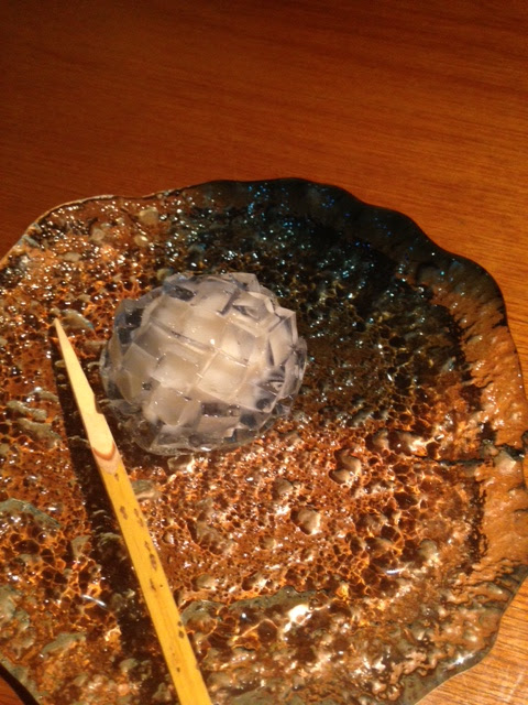
Japanese sweet I had just last week, shaped like a hydrangea, which flowers during this hot rainy month of June.
ちょうど先週食べたアジサイの生和菓子。さすが皿にも梅雨ってかんじますね。
When I thought about Australia's four seasons, the things that came to mind were things that you wouldn't really put on an obi: bushfires, floods, bright sunshine, Canberra's "fluff trees" that bloom in the spring (see ANU Fluff Trees ), sunburn...haha you get the idea. So instead, I chose to depict the changing cycles of the seasons by making a pattern with the Swift Parrot, a migratory parrot that breeds in Summer in Tasmania and flies across Bass Strait in one go to spend Winter in South Eastern Australia. It returns in the Spring and the cycle continues.
キャンベラの四季を考えて見たときは、帯の模様に適切じゃないことしか思い浮かべなかった!例えば、山火事、じりじりしている太陽、日焼け、大水などなど。だから、その代わりに、四季の流れを表現するために、渡りインコである「オトメインコ」を模様にしようとしました。このちっちゃいインコが夏にオーストラリアの南にあるタスマニア島で繁殖して、海峡をいっきに渡ってから、わりと暖かいビクトリア州で冬を過ごせます。春になるまで、タスマニアへ戻って、サイクルを繰り返します。

Here's an image of my design. I tried to include patterns of the ocean and the flowering eucalypts which the Swift Parrots follow as a main food source.模様にこのインコが探しに行く食材になっているユーカリの花や海を入れました。
almost one full repeat of the design I created to depict Swift Parrots オトメインコの模様
My design was a repeat, using one stencil and resist paste. I dyed all the circular sections first and then did a second run and after covering all those dyed circles with resist paste, dyed the background green. Oh and did I mention it  takes 5 METRES of fabric for an obi?! Luckily it's only 30-35cm wide but it certainly makes things take longer.一枚の型紙を繰り返して、帯に必要な5メートルにも糊をおきました。その後、この写真に見えるように、だんだん円形の中に染めていきました。

starting out, have pasted the repeat design onto the 5 metres of narrow silk and starting to dye the circles.

slowly but surely.だんだん染めていて。。。
もうちょっと!Just a little bit to go!

Swift Parrot dyed but with the brown katazome resist paste still on fabric
Being the keen bean that I am, I decided to dye my own lining for this obi too (yes, just another 5 metres!). I wanted it to be simple. I love the writings of John Gould, a famous English Ornithologist (bird-man!) who spent time in Tasmania and Australia studying birds. He published these lavish volumes of bird illustrations and writings that are just so wonderful to look at. I used parts of John Gould's fanciful paragraphs on the Swift Parrot to 'write' on the obi lining fabric.
帯の裏地も染めようと思いました!(また5メートルなんて!)ジョン・グールドは19世紀イギリス人鳥類学者であって、オーストラリアにもしばらく鳥を研究しながらすんでいました。その結果、とても素敵な「オーストラリア鳥類図譜」を5巻で出版しました。その本の文章が華やかで面白かったので、オトメインコについての文章を部分的に裏地に書きました。

John Gould's flowery writings about the Swift parrot, in yellow resist paste. ジョン・グールドの華やかな文章を黄色ぽくにした色糊で

after that, I dyed the whole length this dusty purple. それが乾いたら、この紫をそめました。
I am currently sewing the lining onto my finished fabric but here's a view of them together at the assesment day. Also some of the other student's obi. 
好評会で帯の表と裏地
好評会で二年生の帯生地。ピーマンやトマトや花紋や幾何的模様
some of the second year students' obi fabric. capsicums, tomatoes, circular floral motifs, geometric patterns


more second year obi. morning glories, Kibune Shrine, a giant Carp streamer, peonies 二年生の帯-朝顔、貴船神社と椿、鯉のぼり、牡丹
By the way!!! (once I finish sewing it up...) I will be exhibiting my finished obi at a group exhibition in Kyoto starting next week. It's called "Parade" at 3F Project Room from July 4-16. If you happen to be in Kyoto, please feel free to drop by!! http://www.3-gai.com/
ちなみに!!!完成した帯を来週から始まる「Parade」というグループ展で展示します!3Fプロジェクトルームで、7月4~16日です。もし興味があったらぜひ立ち寄ってください!http://www.3-gai.com/
Parade. 6 person group show, 3F Project Room Kyoto, 4-16 July 2013. 6人グループ展「Parade」3FProject Room 京都7月4~16日