オーストラリア国立大学でテキスタイルを専攻した時は、「伝統」というものをめったに考えませんでした。アボリジニの植物繊維で作られている籠や羽を使った服などを含まなかったら、オーストラリアではテキスタイルの歴史が短いです。ここで発展した技法などがなくて、現在のテキスタイルはだいたいイギリスやヨーロッパから来た刺繍・編み物・織物の継続なのです。
しかし、日本で染織を勉強したら、伝統だって避けられない複雑なものになりました。
可笑しくないでもあるはずですが、この「現代の絵画アート」+「伝統的な工芸技法」という概念はどこかが奇妙じゃないですか?
Let's think about this using the example of katazome - stenciled resist dyeing. Katazome was traditionally used as a way to put a pattern onto fabric, often one that repeated down the length of a bolt of fabric. It could be used to reproduce very fine detailed patterns over and over.
This explains why it was popular as a way of dyeing bolts of kimono fabric, which are 12 metres or more long; it's efficient and detailed enough to produce patterns that resemble more costly fabrics like woven or embroidered cloth.
In this context, katazome is a technical process, used to achieve a certain known result and applied by craftsmen or workers who are experts in the technique.
Since there's now less man-power reliant ways of getting a detailed pattern onto fabric, katazome is rarely used in this way anymore. Cotton yukata (summer kimono) that were once dyed with katazome are now often dyed using an industrial rubber resist that is screen-printed onto folded fabric before dye is poured on (a process called Chuusen - lit. pour-dyed) . It's still an impressive process *check it out HERE* but it is far removed from the accurate and detailed nature of katazome (read: dirty and industrial)
.
着物も「伝統」のままであってほしい声もありますね。でも、着物も様々な時代を経てスタイルが変わってきたものですね。室町時代のゆるいものから、江戸時代の短い袖の小袖へ、現在のギュッと着るものまで。これからも「着物」というものが変わっていくのが当然じゃないですか?
So to wrap up this meandering post, I think what I want to state is that yes, Katazome comes from a place of history and years of development. Yes, it is a complex and ingenious technique and the craftsmen and traditional practice deserve to be celebrated and appreciated. But there is also space for contemporary interpretations; katazome as contemporary visual art. In fact, by using katazome in contemporary work, isn't that the ultimate compliment? It honours the "tradition", keeps many of the tools and materials in demand (which supports those specialised businesses that boomed with the kimono industry but now struggle) and it keeps katazome relevant and meaningful to Today.
これは長くなって分からなくなってきた!
とりあえず言いたいとは、
型染の歴史や伝統を尊敬する同時に、現代アートに使う余裕もあります。
しかも、型染を現代に利用するのは褒めることでしょう。
Whether katazome could grow beyond Japanese borders and truly become a global medium of expression is another question but who's to say it can't?
For many Japanese artists I saw around me in Kyoto and Japan, the technique of katazome was just another technique at their disposal.
In their eyes, it seemed to be a given that it could used to create dyed pictures or dyed artwork and they saw no disparity in utilising a traditional technique in a very contemporary context.
It may seem nothing special to you either but when you start to break it down, it's really quite an odd situation.
日本、得に京都で出会ったテキスタイル作家さんにとっては、「型染」はただ表現のやり方の一つのようでした。伝統的なルーツがある型染を現代的な作品、または絵画みたいな作品に利用するとはなにも矛盾がなかったようです。
It may seem nothing special to you either but when you start to break it down, it's really quite an odd situation.
 |
| A contemporary artwork in katazome by fellow Kyoto Seika graduate Ohmura Yuri "Blue Evening" Katazome on Cotton, 2015 「青い夕方」 大村 優里 木綿/型染 |
日本、得に京都で出会ったテキスタイル作家さんにとっては、「型染」はただ表現のやり方の一つのようでした。伝統的なルーツがある型染を現代的な作品、または絵画みたいな作品に利用するとはなにも矛盾がなかったようです。
つまり、現代の作品を伝統的な技法で作るのは平気だったようです。
可笑しくないでもあるはずですが、この「現代の絵画アート」+「伝統的な工芸技法」という概念はどこかが奇妙じゃないですか?
Let's think about this using the example of katazome - stenciled resist dyeing. Katazome was traditionally used as a way to put a pattern onto fabric, often one that repeated down the length of a bolt of fabric. It could be used to reproduce very fine detailed patterns over and over.
This explains why it was popular as a way of dyeing bolts of kimono fabric, which are 12 metres or more long; it's efficient and detailed enough to produce patterns that resemble more costly fabrics like woven or embroidered cloth.
In this context, katazome is a technical process, used to achieve a certain known result and applied by craftsmen or workers who are experts in the technique.
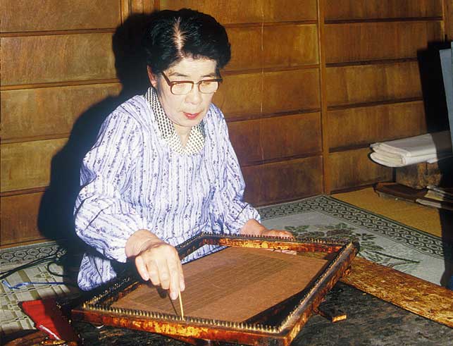
型染めを例にしてちょっと考慮しましょう。型染めは江戸時代には、布に模様を染めるやり方でした。繰り返しで使ったら、一つの型紙で長い布が染められる大生産向きの技法なのです。
着物用の一反に繊細な模様を素早く、それに丁寧に染めることができる技法として人気を得ました。この場合、型染で布を染めた人々は、熟練した職人さんですね。今頭に浮かぶ「美術」とは関係なく、工芸のようなものでした。
Since there's now less man-power reliant ways of getting a detailed pattern onto fabric, katazome is rarely used in this way anymore. Cotton yukata (summer kimono) that were once dyed with katazome are now often dyed using an industrial rubber resist that is screen-printed onto folded fabric before dye is poured on (a process called Chuusen - lit. pour-dyed) . It's still an impressive process *check it out HERE* but it is far removed from the accurate and detailed nature of katazome (read: dirty and industrial)
.
Divorced from it's heavy role in industry, katazome is now being used as an art medium. From the 1950's and 60's onwards in Japan you can see dyed-work starting to make an appearance in art galleries and shifting perceptions of 'Dyeing as Craft' to 'Dyeing as Visual Art'. My Professors working in katazome or roketsu (wax resist) use traditional dyeing techniques in a contemporary way thanks to the generation of pioneers that came before them.
現在、布に模様を付けるにはもっと早い方法が沢山あるので、型染は産業的な役割を殆ど失いました。普通の店で買う浴衣は大体プリントされたか注染で染められたわけです。しかし、日本で1960年代ぐらいから型染をアートの感覚で利用した作家が登場しました。「型染は工芸」より、「型染はアート」のように使われて、展覧会にも型染の作品が展示されました。私の先生も、その
Here are just a couple of examples of artworks by my teachers and others - who are using katazome in this new pictorial way; to create something akin to a painting but with qualities that are essentially textile. By the way, this is the way that katazome is now taught in universities too - from the first lesson it is presented as a pictorial dye technique, not a repetitive patterning tool.
Though a Contemporary artwork made with Katazome might appear visually similar to a Painting (and some artist's strive to make it appear so) there are fundamental characteristics of a Katazome work - legacy of it's traditional process.
The two most obvious differences that characterize a contemporary piece executed in Katazome are
* the necessity of a stencil, & * the use of dyes.
この二つの違いは
*型紙の必要性
*染料の使用
というのは、絵画と違ってイメージを布・紙に染めるには型紙が必要です。型紙は渋紙(現代はプラスチック製の紙も多く使われている)を彫ったものです。デザインの彫らない部分が繋がっていないと、彫る時にバラバラになってしまいます。だから、デザインのあっちこっちが接しているように、線か三角形などの「ツリ」を含みます。作家によってやり方が異なるですが(例えばツリを入れるけど糊置きの時に糊で消すので最終的に作品には見えないとか、賢く気づかないようにデザインに残るツリを入れるとか、その両方とか。。。)
型紙が必要のため、上述の工夫によって型染の作品の雰囲気はなんとなく独特です。
そして、もう一つは染料の使用ですね。染料は生地の繊維まで染み込むものなので、うえから別の色で隠せないし、どの順番に、どの濃度で付けるかを最初から考えないといけないですね。でも染料の長所もあります。暈しができる、透明感がある、染めた色には深みがあって、混ぜ合わせると無限な色が作れます。
So okay, the technique of Katazome is different from say, Painting, on a technical and visual level. It is being used for Contemporary Art - in a way that is removed from it's traditional usage, but it is still undeniably connected to that history and tradition.
Are there any implications of this seemingly opposed pairing?
I think it can lead to some confusion over how it fits into our visual art world - but in my mind the best thing about using katazome in a contemporary context is that it opens doors to innovation and evolving traditions.
But on the flip-side of that, weren't those very traditions borne of innovation and shifts it society's needs and tastes? Yuzen dyeing, for example, didn't just appear, it was a shift sideways from painting on fabric; a revolutionary idea that we have chosen to kryogenically freeze in about the 1800s and keep in perpetuation as "true yuzen". I think there is a danger in this idolisation of particular traditional practices - without allowing innovation to happen. I think it's important to acknowledge that traditions are fluid - they are borne of change and will continue to do so. And that is a good thing - not some betrayal of those who have gone before.
Try these on for size:
現在、布に模様を付けるにはもっと早い方法が沢山あるので、型染は産業的な役割を殆ど失いました。普通の店で買う浴衣は大体プリントされたか注染で染められたわけです。しかし、日本で1960年代ぐらいから型染をアートの感覚で利用した作家が登場しました。「型染は工芸」より、「型染はアート」のように使われて、展覧会にも型染の作品が展示されました。私の先生も、その
Here are just a couple of examples of artworks by my teachers and others - who are using katazome in this new pictorial way; to create something akin to a painting but with qualities that are essentially textile. By the way, this is the way that katazome is now taught in universities too - from the first lesson it is presented as a pictorial dye technique, not a repetitive patterning tool.
 |
| A visionary in pictorial katazome - Nishijima Takeshi. b1929-2003. katazome on tsumugi silk 西嶋武司の作品。現代風の作品に型染を使った先駆者の一人。 |
 |
| Toba Mika's dyed scenery take traditional katazome to a new scale. 'Early Morning - Seiryutei in February' 2009. Toba-sensei is a student of Nishijima (above). 鳥羽美花先生の作品。「払暁 清流亭 - 二月より」2009年 |
 |
Naito Hideharu - "Tree" Indigo and plant dye (black) on cotton. ]「樹」 内藤英冶 木綿布、植物染料(黒)、藍/型染 2009 |
The two most obvious differences that characterize a contemporary piece executed in Katazome are
* the necessity of a stencil, & * the use of dyes.
Since the technique requires the use of a stencil (traditionally made from smoked, persimmon juice steeped Washi paper but now often made from thin plastic) there are certain limitations visually of what can be achieved. A design that is to be made into a stencil needs to have all its areas connected in some way so that when you cut it out, it remains as one unified piece. Therefore you have to make choices about how you incorporate this factor into your artwork. Different katazome artists find their own ways of doing this, congruent to their own style - some choose to include 'bridges' within the stencil design that are later erased during the printing stage, whilst others include sneaky 'bridges' as part of their design that you don't necessarily notice. Many will use both these approaches. It's certainly not something you have to think about when painting!
Another factor, fundamentally different from a painting is the use of Dyes rather than pigments or paints. Unlike painting, where the pigment rests on top of the substrate and can be layered and can potentially completely cover previous layers, dyes soak into the fibres of the fabric and can't be reversed. This requires you to decide at the outset of dyeing what colours will go where and it what order/shade/brilliancy to achieve the desired outcome. Dyes can be bled into each other, faded out, applied in layers that maintain transparency, and watered down or concentrated. The liquid-y state of dyes also gives an interesting depth to colours - it's very hard to achieve a flat solid colour when brush applying dye by hand but this is one of katazome's advantages and can be a feature.型染で作った現代の作品は見た目で似ていても、大きな違いが少なくとも二つあります。(わざと絵画にみえるように作る作家もいますけど)
この二つの違いは
*型紙の必要性
*染料の使用
というのは、絵画と違ってイメージを布・紙に染めるには型紙が必要です。型紙は渋紙(現代はプラスチック製の紙も多く使われている)を彫ったものです。デザインの彫らない部分が繋がっていないと、彫る時にバラバラになってしまいます。だから、デザインのあっちこっちが接しているように、線か三角形などの「ツリ」を含みます。作家によってやり方が異なるですが(例えばツリを入れるけど糊置きの時に糊で消すので最終的に作品には見えないとか、賢く気づかないようにデザインに残るツリを入れるとか、その両方とか。。。)
型紙が必要のため、上述の工夫によって型染の作品の雰囲気はなんとなく独特です。
そして、もう一つは染料の使用ですね。染料は生地の繊維まで染み込むものなので、うえから別の色で隠せないし、どの順番に、どの濃度で付けるかを最初から考えないといけないですね。でも染料の長所もあります。暈しができる、透明感がある、染めた色には深みがあって、混ぜ合わせると無限な色が作れます。
So okay, the technique of Katazome is different from say, Painting, on a technical and visual level. It is being used for Contemporary Art - in a way that is removed from it's traditional usage, but it is still undeniably connected to that history and tradition.
Are there any implications of this seemingly opposed pairing?
I think it can lead to some confusion over how it fits into our visual art world - but in my mind the best thing about using katazome in a contemporary context is that it opens doors to innovation and evolving traditions.
tradition and change.
伝統そのものを守りすぎ傾向もあると思います。もちろん、昔のステキな技術を尊敬するべき、記録べきだと思います。しかし、考えれば、伝統だって、何百年、何千年の間に改良が加えられて、少しずつ変わってきた物ですね。
友禅染は偶然登場したわけではない。最初は布に墨などで描くやり方だけで、だんだん複雑な段階が発達された(染料を使う、防染糊を使う、染料に糊剤を入れる、乾いた糊の破片を撒くなどなど)。現在、本物の友禅ト呼ぶ「京友禅」や「加賀友禅」は沢山の変化や年月を経たものなのです。
でも今使われている「本友禅」は30年前、80年前行われた工程とあんまり変わらないです。つまり、「これは伝統的なものだ」と決めると、変化があんまり起こらないです。守りたいから。
でも、守れないんです。伝統が実はいつも少しずつ変わっていっているものなので無理な対処法なのです。
I think we can be too precious about 'tradition' sometimes. Of course it is important to value, respect and record ingenious traditional methods of creating things (whether it be dyeing or making pigments or carving stone or glazing ceramics). The very nature of a traditional skill is that it has been developed and honed over many generations, each perpetuating it and maintaining it. That is something to honour and appreciate.友禅染は偶然登場したわけではない。最初は布に墨などで描くやり方だけで、だんだん複雑な段階が発達された(染料を使う、防染糊を使う、染料に糊剤を入れる、乾いた糊の破片を撒くなどなど)。現在、本物の友禅ト呼ぶ「京友禅」や「加賀友禅」は沢山の変化や年月を経たものなのです。
でも今使われている「本友禅」は30年前、80年前行われた工程とあんまり変わらないです。つまり、「これは伝統的なものだ」と決めると、変化があんまり起こらないです。守りたいから。
でも、守れないんです。伝統が実はいつも少しずつ変わっていっているものなので無理な対処法なのです。
But on the flip-side of that, weren't those very traditions borne of innovation and shifts it society's needs and tastes? Yuzen dyeing, for example, didn't just appear, it was a shift sideways from painting on fabric; a revolutionary idea that we have chosen to kryogenically freeze in about the 1800s and keep in perpetuation as "true yuzen". I think there is a danger in this idolisation of particular traditional practices - without allowing innovation to happen. I think it's important to acknowledge that traditions are fluid - they are borne of change and will continue to do so. And that is a good thing - not some betrayal of those who have gone before.
Try these on for size:
“Those who feel guilty contemplating "betraying" the tradition they love by acknowledging their disapproval of elements within it should reflect on the fact that the very tradition to which they are so loyal—the "eternal" tradition introduced to them in their youth—is in fact the evolved product of many adjustments firmly but delicately made by earlier lovers of the same tradition.”
― Daniel C. Dennett
"The word traditional has often been misleading and confusing. It connotes a static and fossilised art form, unchanged and unaffected, come what may, over the years. This is not true for what may be traditional today, may not necessarily be tomorrow. Societies change, and so must their arts, if they are to be meaningful, functional and express the sentiment inherent in that society. This is not a radical and complete break from the past, but rather a compatible and gradual modification to suit the new values, identities and concerns of that society."
- Vilsoni Tausie Art in the New Pacific. Fiji: Institute of Pacific Studies, 1979
「『伝統』という言葉は紛らわしい。無変化、無転移、時代に影響されないような物という意味合いがある。そうでもない。今伝統であるものは明日そうでもないかもしれない。社会が変化する。芸術は社会の意見や好みを表すものだから、同時に変化しないといけない。変化によって過去との関係を断絶するわけではない。代わりに、少しずつ、社会にかかわるアイディアや需要と合うものになるように変化する。」 (注*私の適当な翻訳)The same issue about freezing time and perpetuating something traditional often comes up with regard to Kimono. Some people may want to keep Kimono "pure" and "untainted", so to speak, but the very thing we call a kimono today has been changing and morphing for hundreds of years. From something worn loosely and tied at the hip during the Muromachi period to something with short fixed sleeves and no extra length during Edo, to something that gets folded and tucked and wrapped and tied tightly around the body today. Why then is it blasphemous to introduce kimono that are made in two pieces? Or to suggest that the Kimono fabric could be thick denim? Sticklers for tradition are eventually left behind if no space is allowed for gradual modification. Even worse, when there's no room for change, the traditions they were so desperate to see continue into the future are not carried forth in any form at all.
着物も「伝統」のままであってほしい声もありますね。でも、着物も様々な時代を経てスタイルが変わってきたものですね。室町時代のゆるいものから、江戸時代の短い袖の小袖へ、現在のギュッと着るものまで。これからも「着物」というものが変わっていくのが当然じゃないですか?
So to wrap up this meandering post, I think what I want to state is that yes, Katazome comes from a place of history and years of development. Yes, it is a complex and ingenious technique and the craftsmen and traditional practice deserve to be celebrated and appreciated. But there is also space for contemporary interpretations; katazome as contemporary visual art. In fact, by using katazome in contemporary work, isn't that the ultimate compliment? It honours the "tradition", keeps many of the tools and materials in demand (which supports those specialised businesses that boomed with the kimono industry but now struggle) and it keeps katazome relevant and meaningful to Today.
これは長くなって分からなくなってきた!
とりあえず言いたいとは、
型染の歴史や伝統を尊敬する同時に、現代アートに使う余裕もあります。
しかも、型染を現代に利用するのは褒めることでしょう。
Whether katazome could grow beyond Japanese borders and truly become a global medium of expression is another question but who's to say it can't?